
Hello there, Polly Stefanie here with a template of Anita Design's called Winds of change, that I used as a starting point for my layout.I started with my photos and clipped papers into their respective spots within the template.Then I added some brownish flowers, alternating them to the left and right of the photo series. And I added the cute Elf and Christmas tree with some word art to visually ground them on the layout.And lastly I added the title, journaling and a doily bit on the left of the layout to bring the eye into the layout from the left hand side, as we like to look from left to right.I hope that this inspires you a little to add a little (or a lot) to any given template. … [Read more...]
Project Life – tutorial #2
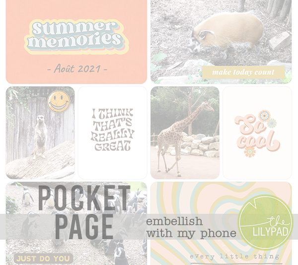
Hi everyone ! Guest Polly Gaelle here to show you how to make a pocket page using your phone/tablet and your favourite The Lilypad products.Last month, I introduced you to the Project Life app and showed you how easy it is to create a page. You can read (again) the article here.Today we're getting together to decorate our page a bit more by adding a few embellishments, because when we're scrapbooking we like to put little elements all over the page.Unfortunately, the Project Life application doesn't allow us to add embellissements. We're going to need another application : Studio. It's available free for iOS and Android for phones and tablets. However, you'll need to create an account the first time you use it. All you need to do is enter an email address.Last time, before starting the Project Life app, we prepared our pocket cards. Well, we're going to do the … [Read more...]
Project Life – tutorial #1
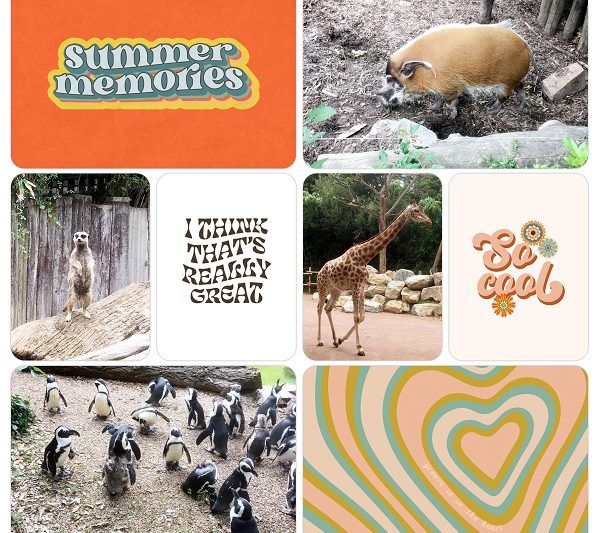
Hi everyone! Guest Polly Gaelle here to show you how to make a pocket page on your phone/tablet using the Project Life app and your favourite Lilypad products.During my Guest period, I want to show you how to make pocket pages easily with your phone or tablet. Today, we're going to take a look at the Project Life application, which lets you create the pages. Later we'll see how to add text (title and/or journaling), embellishments and how to personalize our layout.For several years now, I've been making a Project Life album every year. However, it took me some time to find the right way to present it. I started by making layouts based on the photos I had for each week, and as I didn't have many photos at the time, that was pretty easy. But as time went on, I started using my phone more and more to take photos and I ended up with far too many. So I tried ready-made templates in grid … [Read more...]
Tutorial: Using typography and baselines in your designs

Hello and Happy Thursday.When you use alphas, it is helpful to understand the "baseline" in typography in order to keep our letters in a straight line.In a baseline grid, there are invisible lines on which the text sits and is written. While there is one major horizontal baseline, there are other parallel lines to form the entire text baseline grid. It helps us make sure that the words are uniformly placed and spaced in a straight line.A baseline is so much more than an invisible horizontal line in designing. A baseline in typography is often used as a guideline to type letters and space them accordingly. Once you understand the concept, you can easily implement fonts in a baseline (or come up with your fonts as well). For this, you need to know the following concepts that are related to a baseline grid.Ascender and DescenderYou can see the small "p" has a downward stroke … [Read more...]
Digital Sketch Blending
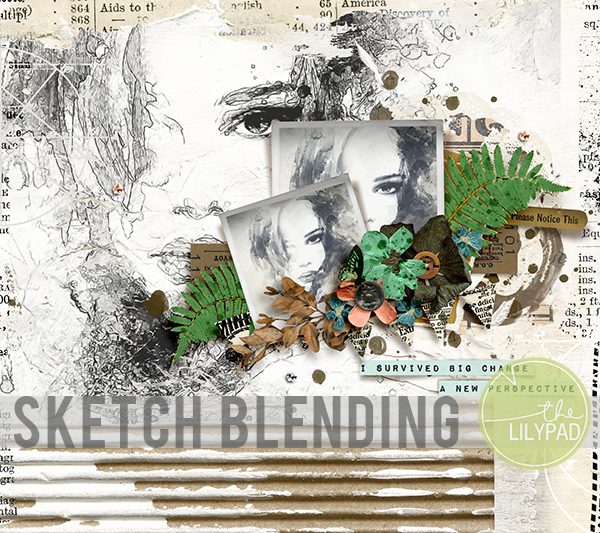
Hello all my artsy friends! I am back with a tip for quickly masking an area on digital paper. Have you ever wanted to constrict a photo, sketch or digital paper to a particular area on your page? I was working with these amazing mixed media pages by Rachel Jefferies (available in today's SOSN sale) and wanted to add a back ground sketch in the gessoed area. The sketch was larger than that area so I needed a quick way to create a mask that would match the edges. I initially added the sketch to the page and then tried to create the mask by hand by painting over the areas of the sketch that went beyond the gessoed part of the background. This method works, but takes quite a bit of time to complete. Instead I decided to try the Magic Wand tool to create a quick selection of the gessoed area. This method was much faster and I was able to create a mask for the … [Read more...]
Tutorial Thursday | Silhouette Photos

Hello scrappers, Kayla, aka keepscrappin, here with a Tutorial Thursday. The Threshold filter (Photoshop & PSE) is an adjustment filter that converts a photo to pure black and white, creating a silhouette.Here's the steps in PSE and they are similar in PSCC. Sorry I don't have the steps for other programs, but you can probably search the internet to find a way to get a similar effect in your program. Duplicate your photo (File -> Duplicate -> OK) and close the original. Double click the background layer to unlock it. Select the photo layer and go to the half filled circle in the layers palette or select Layer -> New Adjustment Layer -> Threshold from the menu bar. Click ok. You will get a threshold window. You can change the Threshold Level if you want. I moved the slider to the left to get more white and detail in the … [Read more...]
Mosaic Magic

Hello Scrappers,It's Kayla, aka keepscrappin, dropping in today to show you a quick trick to get some mosaic magic with your photos.I used Scrapping with Liz's Multi-Mini templates which are 50% off in today's SOSN sale for my layout. These templates work great for scrapping multiple photos, but did you know they also work like magic as a mosaic photo overlay for a single photo?Here's my layout using some products that are discounted in today's SOSN sale. Click on layout for full credits.It's easy to get the mosaic magic look in just a few steps.1. Duplicate and merge (ctrl, alt E) all the photo layers into one photo layer.2. Move merged photo layer below all the individual photo layers and rename it - all in one photo.3. Clip a photo (ctrl, alt G) to the all in one photo layer.4. Turn off the visibility (click eye on layer) for some of the photo layers, … [Read more...]
Wax Stamp Effect in Photoshop
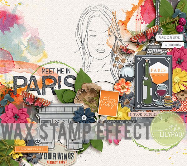
Hello all my artsy friends! I am dropping in today with a quick tip for creating a wax effect with digitally stamped elements or alphas in Photoshop. I love using this effect with alphas to create a waxed title. Here is a look at the effect in action: Notice how "Paris" looks like melted wax on the page? It was so easy to create this look! I used a rubber stamp alpha by Gina Miller on my page (similar to THIS ONE). Grungy, distressed digital stamps work the best with this technique. All you need to do is placed the stamp(s) on your page and apply a bevel. These are the settings I used on my page: Here is a close up of the technique on my page: I hope you have fun with this technique! I cannot wait to see your melted wax creations in the Lilypad Gallery. :) Until next time … [Read more...]
3 Ways to Post Your Scrapbook Layouts to Instagram

Hello scrappy friends!!!I'm so excited for The Lilypad's Halloween Bash this weekend!! There are so many fun games and challenges for you to participate in to get into the Halloween spirit. One of those challenges, that I just happen to be hosting, is the Instagram challenge to post your layouts to Instagram with the hashtag #TLPhalloweenbash2020. I have enjoyed hosting the Instagram challenge for our last several events at The Lilypad. It is a fun way to connect on social media, share creativity and find inspiration.I have had some questions about how to go about sharing layouts on Instagram, so I thought this is a great time to share three ways to do that so you'll be prepared for this weekend!First, you will need to set up an Instagram account if you do not already have one. Some scrapbookers and community members have a separate account just for posting their … [Read more...]
Tilted Layouts in Photoshop
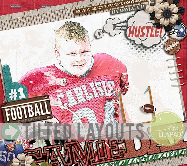
Happy Wednesday everyone! I am dropping in this week with a quick tip for creating consistently angled elements on your digital pages. I don't know about you, but I love change up my layout designs by tilting them at an angle. There are lots of awesome tilted templates that that help to create a tilted design, but when you are adding digital elements to those pages it can be difficult to make sure all the elements are tilted to the same degree as the background pieces. For example, look at this layout made with a template from the Oh so Fabulous Cheryl of Fiddle-Dee-Dee Designs: The background layers were pre-angled in the template, but all of the elements that I added (including the Game Day word art by Scrapping with Liz) were added on top of those background layers. Because I had a lot of linear elements, I wanted to make sure that they were all angled … [Read more...]