
Hey, hey scrappers,I'm here today with a quick tip for using journal/pocket cards on your layouts. Not a pocket scrapper you say... no worries, you can use all of the wonderful pocket cards and MPM packs in the TLP store with all kinds of styles of layouts. Let's say you don't have enough photos to fill all the spots on a favorite template. No worries, just open your template and use a pocket card in place of a photo and then scrap away!Here are some more examples of layouts where I used pocket cards in place of photos.So the next time you don't have enough photos to fill all the spots on your template, don't forget to reach for all those wonderful pocket card packs and memory pockets monthly (MPM) kits available in The Lilypad store.BTW: The newest MPM comes out on the last Friday of the month and that happens to be tomorrow... you're … [Read more...]
Patchwork Digital Backgrounds

Hello everyone and Happy Wednesday! As always, there is an amazing SOSN sale today with lots of digital kits available for 50% off. I am dropping in with a quick tip for creating a patchwork neutral digital background. Here is an example (made with some of the goodies in today's SOSN sale - click on layout for full credits): I love creating on neutral/white backgrounds, but sometimes I want to kick it up a notch. Patchwork backgrounds are an easy way to add some interest to a page without using patterned paper. Grid or Pocket Scrapping templates are a super easy way to create a patchwork background. I created the background on my page with these templates by NBK Design: Using neutral papers from Just Jaimee's Storyteller August 2019 kit and Kim Jensen's Temperate Painted Papers in all of the photo and background spaces on the … [Read more...]
Creating Paper Folds in Photoshop
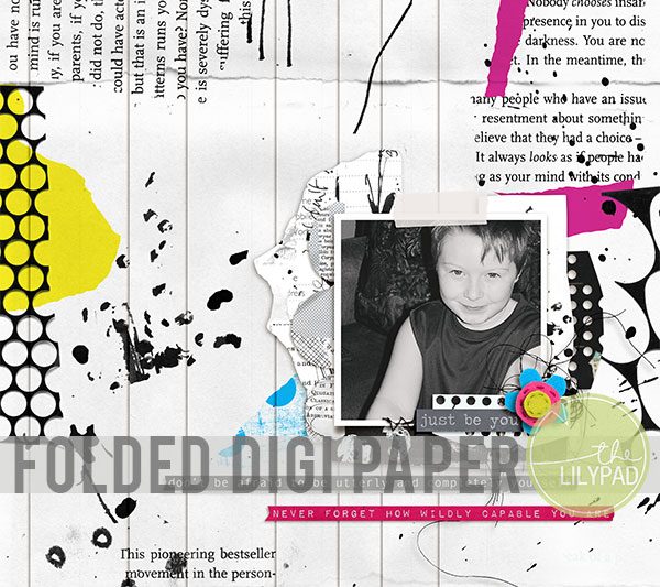
Hello everyone! I am dropping in today with a quick tip for creating a folded paper look in Photoshop (or PSE). You can see the tip in action on this page: Notice what appears to be paper folds across the background paper? Those were created with several paper strips shadowed only on one side. I used the background and paper strips from the "oh so awesome" Fiddle-Dee-Dee's The Magic of You {Dressed Up} templates. All you have to do to create this effect is place a background paper on the bottom. Then clip the same paper (in the same location) to each of the paper strips. When you add the drop shadow it makes it look like the paper was actually folded in a flattened accordion style. Here are the drop shadow settings I used: And that is all there is to it! I hope you have fun creating your own accordion fold backgrounds. … [Read more...]
Gradient Tool Blending in Photoshop

Hello everyone! I'm dropping in today with a tip for blending two designs together with the Gradient Tool in Photoshop. I love using journal cards on my digital scrapbooking pages - but sometimes instead of one perfect card, I find that I want to combine parts of two different cards. I did just that on this page (click on layout for gallery credits): Notice the focal card in the middle of the page? That is actually two journal cards that I combined with the Gradient Tool. Here is the Before and After: This technique is easy to accomplish in Photoshop. Step 1. Place the two journal cards directly on top of each other. Activate both journal cards in the layers palette by clicking one then, while holding down the Shift or Ctrl key, click on the other. Now use the alignment tools at the top of the workspace. I … [Read more...]
Shadowing Transparent Elements in Photoshop
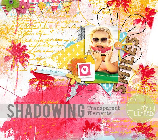
Hello artsy friends! I am dropping in today with a quick tip for shadowing transparent elements in Photoshop. There are some quirky and cute Frou Frou tulle flowers in today's SOSN Sale that are the perfect addition to any page. However, adding a drop shadow to a semi-transparent element like netting or tulle can be tricky. Getting the "lift" you want from the shadow on the outer edge of the element ends up darkening the middle. There is is super quick fix for this situation, though.You can see the tulle flower elements on the layouts below (created primarily with goodies from today's SOSN sale): Here is the fix. Add the drop shadow of your choice to the semi-transparent element. Once have it the way you want it (focusing on the effect around the edges of the element, not in the center), separate the shadow onto its own … [Read more...]
Mask Magic
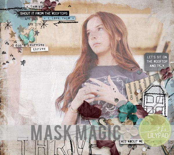
Masks are becoming an everyday part of life with the current Covid-19 situation. And while cloth masks are helpful in real life, I want to talk about another kind of mask that's helpful to digital scrappers. I'm talking about pre-made masks like the Painted Masks 1 released today by Rachel Jefferies. These pre-made masks are an easy way to add some magic to the photos on your layouts. Take a look at this layout for example.The instructions and screenshots below were created in Photoshop Elements 2019, but the steps are similar in other versions of PSE and Photoshop.1. Start with a favorite textured paper. It can be mostly solid or as much texture as you'd like. I'm using a textured paper from Rachel Jefferies' From The Rooftops: Mixed Media Paperie.2. Add a pre-made photo mask. I added the 9x12 version of a mask from Rachel Jefferies' Painted Masks 1 and turned it 90 … [Read more...]
Ghosted Titles in Photoshop

I hope everyone had a fabulous holiday weekend! I'm dropping in today with a quick tip for creating the look of ghosted titles in Photoshop. A ghosted title is one that is made to blend in with the background paper with a very subtle effect. Take a look at this page, for example: Notice the ghosted title "Beacon of Hope" on the background? I created it with just a couple of quick steps in Photoshop (or PSE) with an outer glow style. Start by using either a block-ish font or a digital alpha. (I used a digital alpha on my page.) Create your title (or just background words) and then merge the letters together on to one layer in the layers palette. Now clip a copy of the background paper to the merged letters. The letters will disappear when you do this. However, never fear because you can quickly make the letters reappear by applying an … [Read more...]
Creating Digital Texture with Transparencies in Photoshop

Happy Wednesday everyone! I'm dropping in with a quick tip today for using a transparent element (such as a page border) to add texture to a solid background. If you look at my Gallery, you will see that I adore using white-ish backgrounds on my pages. I've talked before about ways to add some texture and movement to a solid white background, and I am adding one more method to the list today - transparent elements. I used one of the fabulous border edges in Paula Kesselring's bundle (50% off in today's SOSN Sale) on this page: Notice the subtlety of the border edge? It adds just the slightest bit of texture to the solid white background and is the perfect finishing touch for the page. The technique is super easy as well, and can be done in any digital program that has blending modes. All I did to make the border on my page was clip a copy of … [Read more...]
Gradient Overlays in Photoshop
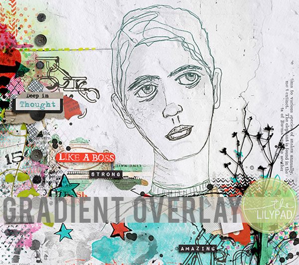
I hope everyone is safe, healthy and getting ready for the fabulous iNSD festivities coming up this weekend! I'm dropping in with a quick tip for adding a pop of color to a sketch in Photoshop - using a Gradient Overlay Style. You can see the effect in action on this layout (created with goodies in today's SOSN sale): I added some subtle variegated color to the sketch to blend it with the background elements and colors. This technique is super easy in Photoshop with the Gradient Overlay layer style. Here is how I added the effect to my page: Step 1. Activate the sketch layer and select Gradient Overlay from the layer styles menu (fx button at the bottom of the layers palette). Step 2. When the Gradient Editor Box pops up, click on the Gradient box to bring up the Gradient Editor. Once the … [Read more...]
Digitally Blended Text
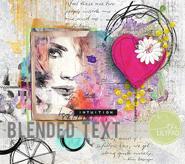
Hello everyone! I'm dropping in today with a quick tip for integrating text with painted elements. Have you ever found the perfect word art element and wanted to use it on top of a painted background? Take a look at this layout and the word art in the bottom right corner of the page: Notice that the left side of the first couple of lines looks like it was actually written over the pink paint. This is a super easy look to achieve in Photoshop or PSE with just a couple of blending mode adjustments. Let's start with a comparison of the before and after looks: Notice how the blended version has a more artistic effect? The writing appears as if it was integrated with the paint, not just sitting on top of it. It was "oh so easy" too with the blending modes in Photoshop and PSE. First, clip the word art to the … [Read more...]