Beginners Mixed Media: Make mine a Double!
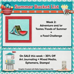
Hi there, if you haven’t already seen, TLP’s Summer Bucketlist event has started and not only are there extra challenges and some super cute pins to collect from participating but various whole categories of products are discounted in the store each a week so keep an eye on the forum and newsletters for the week’s sales news but this week is perfect for a Mixed Media Beginner to do some stash building with Art Journaling & Mixed Media, Ephemera and Stamps categories on sale so if there’s something from any of these categories in your Wishlist that you’ve been eyeing, here’s your chance!
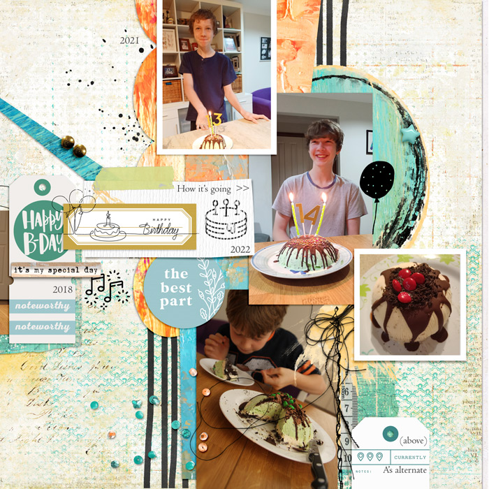
So with these sale categories and this week’s theme of Adventure and/or Tastes/Food of Summer in mind, I’m making a Summer birthday food essential Mixed Media page today for, and inspired by Rae’s own page for her challenge. Given how many photos I pulled out to use, I decided it called for a double page spread. I know, *gasp*, I don’t do that often anymore but I didn’t want the photos to be all squished or tiny. Since I only work with a laptop and no extra screens, single pages came to seem easier as I can see everything bigger and you can totally scrap one side at a time, but here’s one way to set up and scrap both pages together so you can see everything all at once and the way I prefer to approach double page scrapping using 2 single page templates.
Setting up a double page:
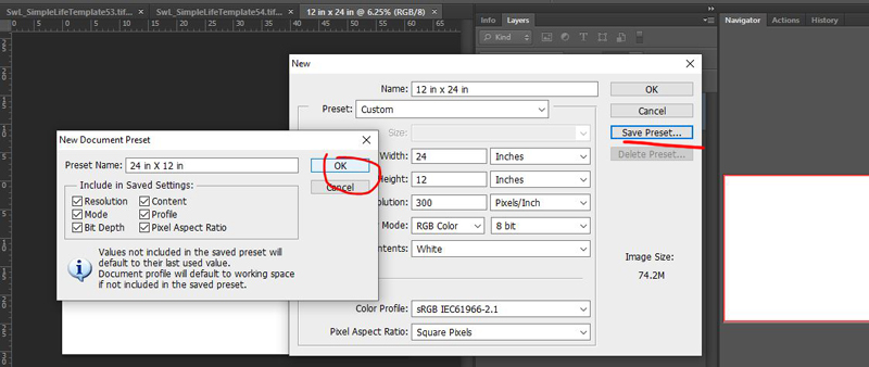
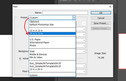
To make a new double page using standard 12×12 inch papers and templates, in the File menu go to New ( or use Ctrl+N ), in the pop-up box make a 12inch/30cm high by 24inch/60cm wide document; ensure the resolution is 300ppi.

(You can also save these settings for later by clicking ‘save preset’ and it will mean you just have to look under ‘custom’ to set up for another new double page).
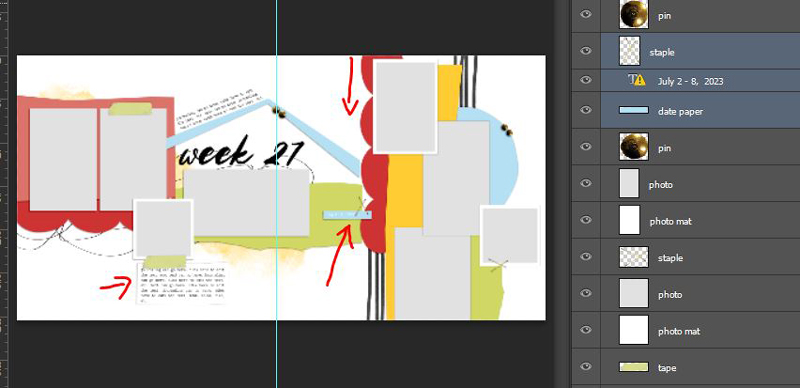
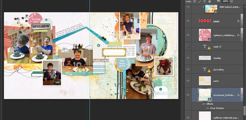
As you probably saw, I already have my templates picked out and open in tabs in PS but each contains a lot of layers and I don’t want anything to move or get left behind when I drag it into the new 12 x 24 spread. So I select all the Layers in the Layers Palette and hit (ctrl+G) to group them (I double click on the group layer name and rename each group to the template name to help me remember what I’m using for gallery credits) then I drag the entire group into the new 12 x 24 document.
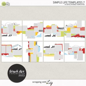
(Now let me rewind a second and show you the template pack I’ve grabbed to use. These are from Scrapping with Liz’s Simple Life 7 and all mix and match really well and are great for artsy, multiphoto pages!)
So I dragged in 2 different templates from SWL’s pack, grouped so the pieces stay together, into my new 12 x 24 inch canvas. I made them centre by holding ‘shift’ while dragging them in, and then dragged each group, in turn, to the opposite ends of the 12×24 rectangle, so they are now side by side on the same canvas.
To give me a visual reminder of where the 2 page spread will be cut for printing or book binding, so I don’t place anything important too close to the centre of the spread that may be trimmed and lost, I add a guide line by going to View > New Guide and putting in a vertical guide at 12inches (or 30cm if you usually have your ruler in centimeters like me).
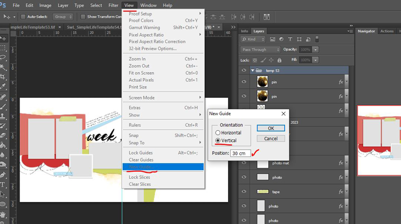 (I should also add that the aqua guide line it creates won’t print or be saved when you save a jpeg or PNG of the final layout, it’s just a kind of invisible helper line. I set these sometimes all around the page near the border so again I don’t put text or anything I wouldn’t want cut off near where a printer may have bleed and cut issues. Ages ago, I had a button element half cut off on a pageedge and that might not annoy everyone but in my head, I kept thinking I wouldn’t put half a button on a traditional paper scrapbook page so it annoyed me seeing it digitally too when my aim is generally for my digital pages to look like paper scrap pages).
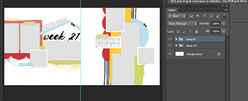
Now because some of these Simple Life template pieces extend a bit beyond the 12×12 background, you can open the groups up (click the little arrow next to the group name so you can see all the layers contained within the group again) and move some layers around to make a unique double page design if you want. It can also make the double page spread feel more connected and intentional which, as a single page scrapper, I don’t often get the chance to do or think about.
These are some possibilities to give an increasingly connected design with a photo spot emphasis just by shuffling template pieces across, starting with just removing the background on the right side so the inverted V piece above the title bridges across the central guide (and then you can flip one whole template 90/180/-90 degrees if you want even more design possibilities) but like I mentioned earlier, the mix and match possibilities with all the different templates included in each of SWL’s Simple Life line is really extensive.
So here is where I started dropping in my photos, and all the actual scrapping and mixed media work is fairly quick and easy by comparison, using previous Mixed Media Beginners principles and techniques.
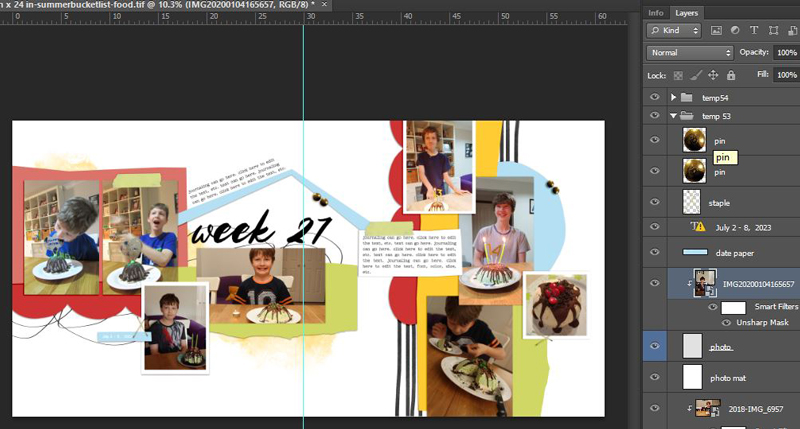
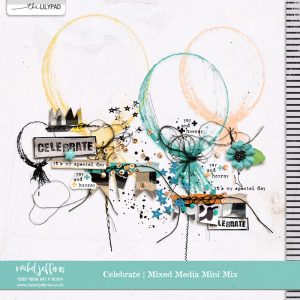
Back during the what am I going to scrap for Rae’s challenge stage, I pulled these products from the sales categories based on the theme and colours of my photos. I especially loved the artsy balloons & scatters in Rachel Jefferies Celebrate mixed media mini kit; the versatility, colours & mix of products in Sara Gleason’s Notetaking Ephemera pack and I am using NBK’s beKind artsy papers mix again (they’re an instant painted look paper full of texture and colour from my stash and I really like the ‘reuseable-ness’ of all things digi and it’s a timeless and again versatile mixed media product to me – it’s ‘8. Paper-mix’ in the drop down options in the store link).


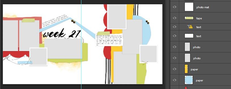
This is where I snap my fingers and the key elements are all placed
And snap! Papers!
In the spirit of transparency and keeping it real, it didn’t quite go that quickly.
I’ve previously mentioned in a Stash Mash post that by this stage in the page creation process I’ve become aware that the colours of a template (or scraplift page) start to influence my design and thinking, so I ‘Windows searched’ through previews in my stash for a predominantly red-ish paper. That cool red swirly one on the left (I’m still on a bit of a marble kick) and the greenish patterned one as the main background on the right, as well as the torn aqua/white dot paper in the middle, I pulled from LynneMarie’s Anthology papers also in this week’s sale and in a previous Mixed Media Beginners). I started with a darker orange paper in that spot from the NBK pack but to balance the red M&M topped ice-cream cake on the far right and given SWL’s red paper mat was there initially, the change to LynneMarie’s red felt like an improvement.

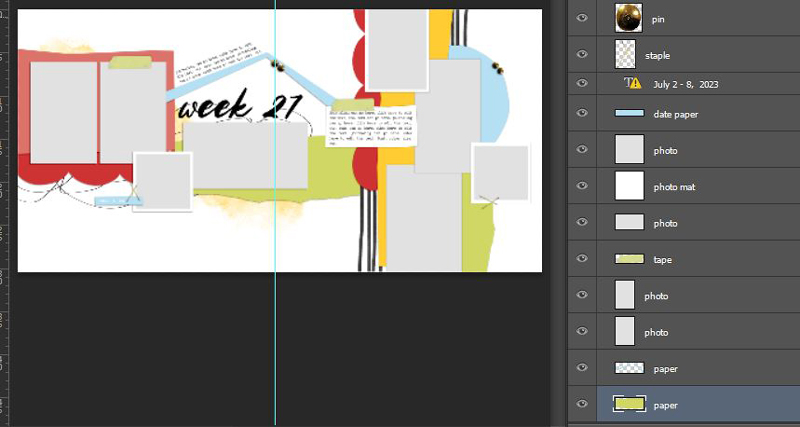
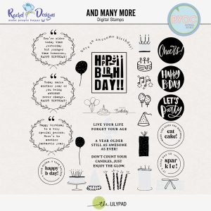
At this point, I didn’t have a title that would fit where the scripty Week 27 place holder went and thought that the initial big mixed media balloons from Rachel Jefferies’s Celebrate kit lost their ‘balloon-ness’ (I’m sure you get what I mean by that totally made up word) because of where I placed them, so I went looking for some balloon stamps in the Stamp category that’s currently on sale, and there I found Rachel Etrog Designs’ And Many More stamps.
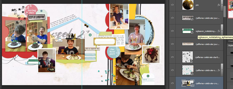
If I believed in signs then I could have interpreted that as the scrap gods telling me to pair both the Rachel’s balloons together and giving me a perfect title, not only is ‘And Many More’ a reference to common well wishes on birthdays but it succinctly sums up the likelihood of me making the same birthday icecream cake for my son again in future years. When you’re on a good thing, he apparently likes to stick with it, so here’s my finished double page with additional stamps from Rachel Etrog and giving the title a go in Jelytta font (to give it a bit more emphasis without going too big for the space, I duplicated the title and changed the colour to yellow and offset it slightly, giving it a coloured shadow or double stamped look).
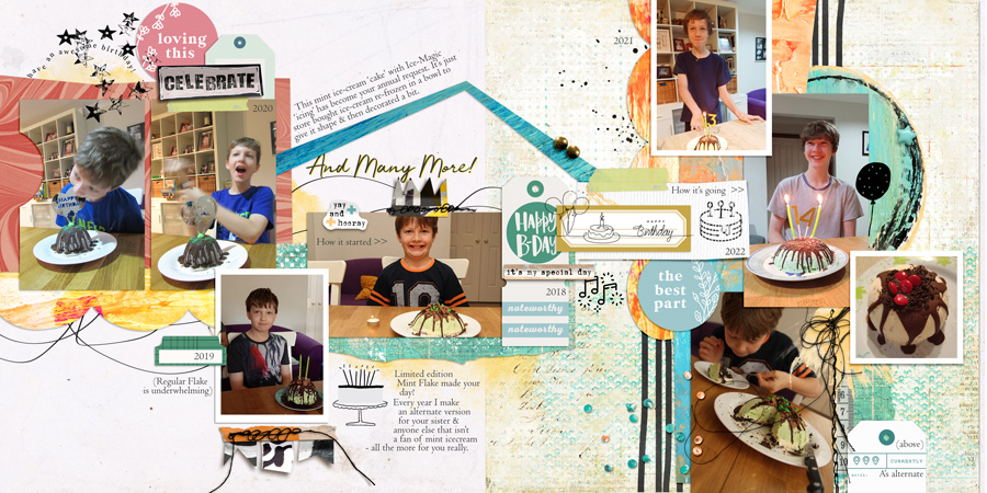
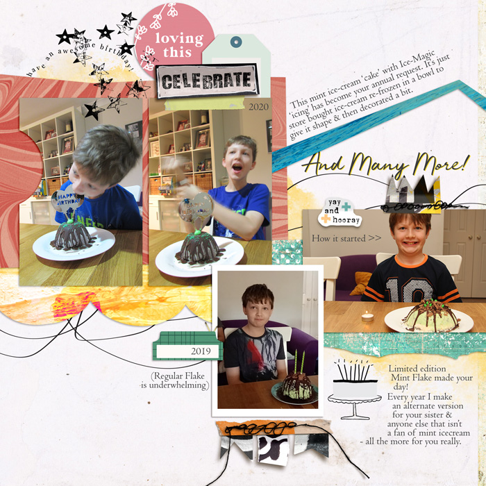
And here’s a closer look at each side.
Let me know if you scrap double pages or avoid them and why in the comments, I’d be interested to know, and you can subscribe to the Summer Bucketlist challenge forum to scrap along and collect the pins here. Bye!


