SOSN Stash Mash Scraplift! – May 2023
Hi there, if you are a regular visitor to the TLP Blog, you might remember the Monday Mash-up Series from last year, where we looked at strategies to step outside the ‘one kit only’ scrapping box to increase your confidence in mixing and matching and ability to stretch your stash. (And if you didn’t see any of them, you are forgiven LOL and the good news is you can still access them). Anyway, with all those lessons up our sleeves, this year I’m introducing the SOSN Stash Mash!
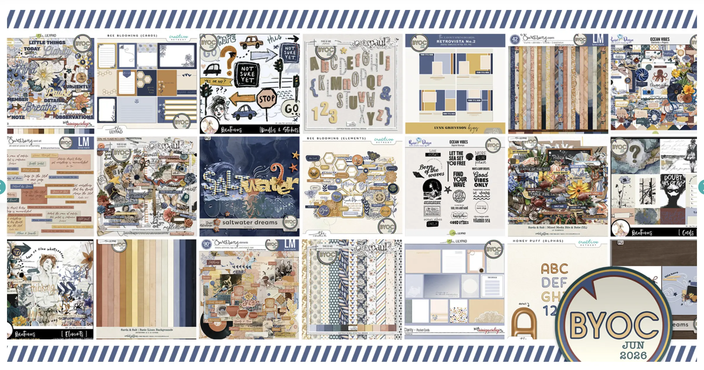
Every Wednesday when TLP Designers put a selection of goodies on sale at half price (here’s a link to this week’s specials category), I’m reminded of some specific treasures I have in my stash and feel inspired to pull them out from the depths of my harddrive again. And I know now that I can find a few kits among that day’s selection that will work perfectly together to tell my stories and support and enhance my pictures. So welcome to another SOSN Stash Mash!
_________________________________________________
What do you do if you aren’t using a template or have no starting point in mind other than you just have 2 photos and no real direction?
Some people might just throw everything on a blank canvas and move stuff around and once in a blue moon I might do that but more often, I will scraplift someone else’s page that I’ve had in my TLP Faves – ‘Watchlist’.
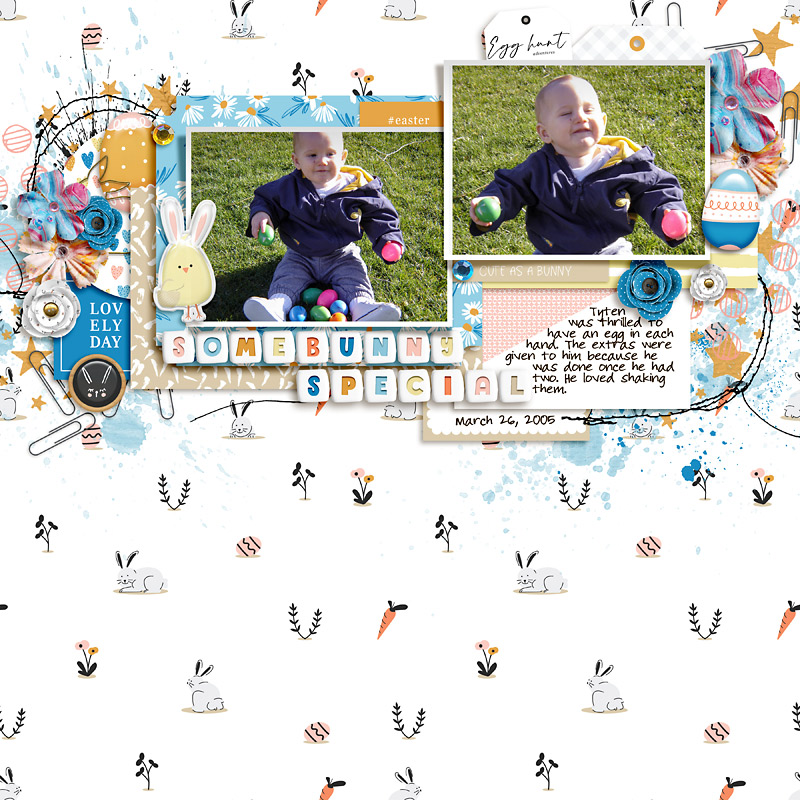
In what I can only call a case of ‘scrap serendipity’, it turned out that in grabbing some SOSN products to smash together this week, they made me think of 2 particular photos to use and because I hadn’t grabbed a template, I went to see what challenges were going for a bit more mental direction. Lo and behold, I saw Courtney/Polly bestcee mention me in her May Scraplift challenge, and I knew that was equivalent to someone shining a torch on a path in the dark and suggesting I go that way. After knowing her as a Polly for several years now, I trust Courtney as a tour guide and so much more, so after a quick look through her gallery (ok not so quick if I’m honest, I felt the need to comment on like a dozen pages but that’s on me), I faved a few for another rainy day and picked this page to scraplift. It is based on a template by FiddleDeeDee Designs but my page isn’t going to use the original template.
How do you digi- scraplift?
Well here’s my process, I use Courtney’s page as my template or sketch in Photoshop, and I start by dragging it in and using it as my base layer and so that’s where my screenshots will begin. (Her page may look a bit grainy because in dragging in the saved for web version, I’ve pulled her 72dpi image into my 300dpi blank canvas and enlarged it a lot (like 440%) to fill the space but it’s really just my guide so I don’t need it to look perfect).
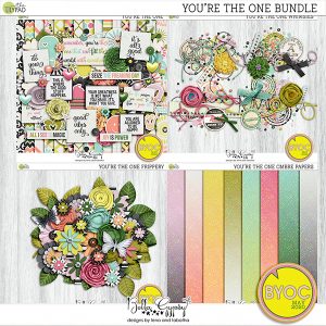
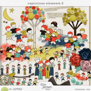
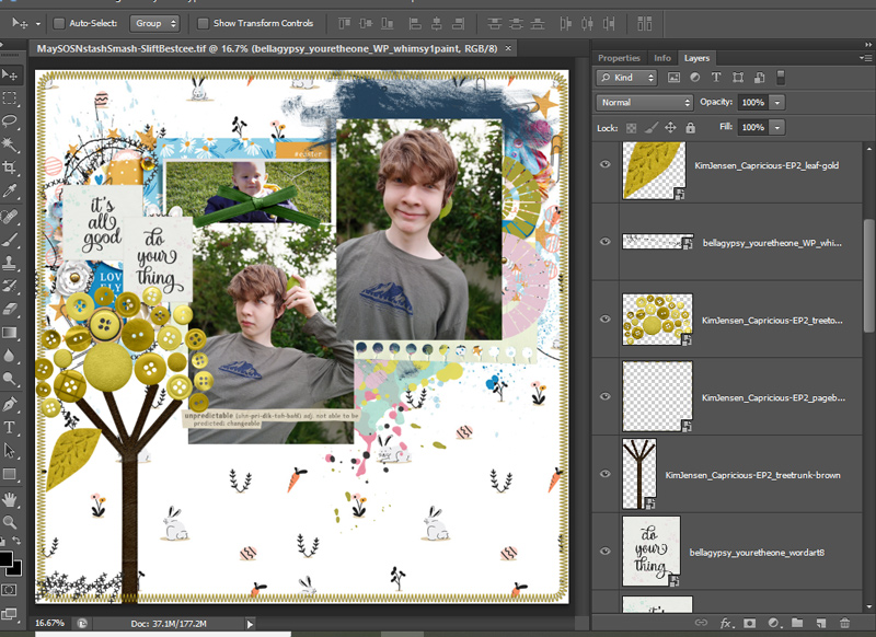
These are the SOSN Products I’m smash-mashing together today. Bella Gypsy’s You’re the One and Kim Jenson’s Capricious 2 – I was drawn to the button trees and the frippery packs are always a great mix of florals and foliage and after seeing the definitions in the Capricious pack too my brain started planning a mash-up page. I also still have ombre gradients on the brain after the Secrets post and that may have swayed me too, I’m sure I mentioned I’m a sucker for their ombre papers in that post.
So here’s my photos, key pieces and scraplift ideas as I begin.
-i have some wordart on the left that i’ll layer in behind paper pieces matting both my photos together but also giving the page some dimensions – layers add instant dimension
– i have some of the circle pieces down the right side
– i have feature stitching in a few places, leaves & buttons/tree will be my flowers, i have paint – try to ignore the purpley pink for right now, because yes, it looks a bit of a hot mess.
Here’s a scraplift confession – adding in some shadows right now on the layers I’ve got will help a bit but I will often get part way through a scraplift and feel like I don’t like my page and here are some of the reasons I have deduced over the years as to why that is – bear with me, it explains the next few steps.
At some point I realised I tend to pick papers last when I scraplift. I place my key elements like I would a normal page with a template but the difference here is that there is already a pattern paper in the background with my method of ‘lifting. When I’ve placed my photos and elements, and then shuffle papers in, for some reason, my brain often likes the lift paper more than the ones I shuffle in. And I can’t tell you how much this got to me and I avoided scraplifts for a rather long time because of it, but here’s what I figured out.
See Courtney’s page has basically a white background with a fairly sparse small print?
Ok well my brain subconsciously builds the page with that background in mind, and then when I get to what is usually my last step of adding a paper that is 99.9% of the time not that exact paper, it feels jarring and wrong and takes a lot of getting used to. I will walk away, come back, feel a bit disappointed again, walk away, come back… you get it but if I can recognise this going in (this is part of being aware of my own scrap-preferences or style I guess), and if I put a white-ish background with a similar sized or spaced print from whatever kit I’m using in as the first background I try, it doesn’t feel quite as wrong (not the perfect word for the feeling here but hopefully you get what I mean). Or similarly, if the original page has a brown-ish kraft paper, usually trying a similar shade and style paper first has become my initial go-to.
But before I even get to that point, I’ve learnt to turn the original page layer off and look at what I have. I’ve also just blocked in the paper layers using basic shape tools in a neutral colour. This is a bit like removing some visual noise (sorry Courtney if you’re reading this, your page is not visual noise! *back pedal, back pedal*) and now I can see where I am and where I’m going a bit more easily. (Actually I moved the top blue paint as well as shadowing stuff but other than turning visibility of Courtney’s page layer off, that’s all that’s different from the last screenshot).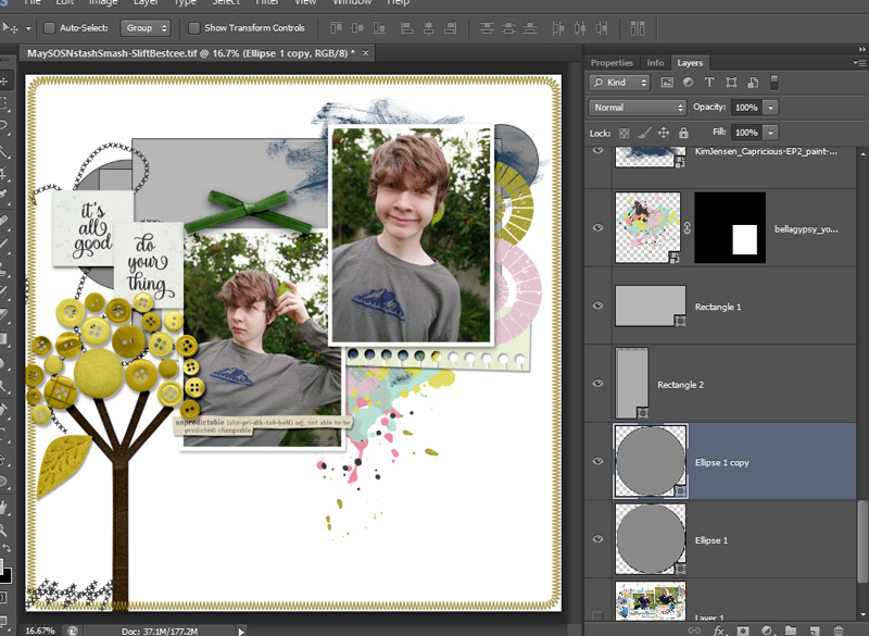
So now looking at this, I know I want more blue in there – Courtney’s page had blue wordart near the button tree and blue paper across the middle and I’m feel like I’m missing that. I’m not sold on that green bow, so that might go, and maybe just the placement of everything feels weird, like everything is floating in the ‘sky’ of the page, maybe because of the placement of the button tree?? I don’t know, and when I don’t know, my instinct is to move things around the page. So I select all the visible layers except for my border stitching and drag it around the page til it’s shifted down and to the right and I feel like this is better. Why does it feel better? Maybe because Courtney’s photos were landscape orientation and mine are portrait, maybe they may have needed more head space? I’m otherwise not sure but I know I want to add some layers above the photo cluster now like Courtney tags.
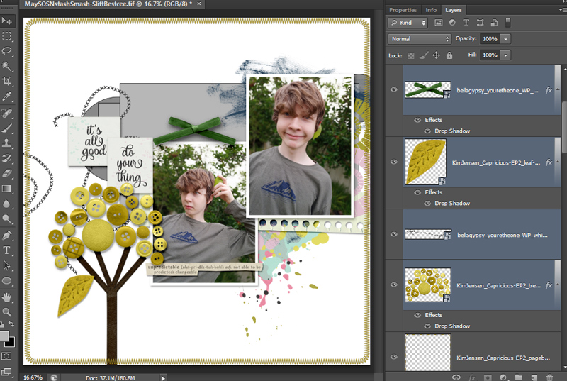
Here’s my first try at papers (and there is an absolute ton to choose from just in the BGD collection).

And you know what? I didn’t do the whole walk away thing, it’s not insta-love but it’s really not bad. It’s making me question the multicolour paint splotch near the bottom of the photos and still wanting more blue but that’s all really. And it’s not the purpley pink I’m having an issue with now, it’s the light blue – I like the navy kind at the top but the light blue is not working for me for some reason. I tried covering it up a bit with a star element but hmmm…
Well if the purple’s not a problem, I can add more. A little bit anyway. Layered flowers are good circle paper layers – and you’d never know I just tucked 2 in to get it to stretch the whole way behind the ‘it’s all good ‘ wordart. In the paper world, they probably would have cut 1 piece in half and that is an option here too, whatever works for you.
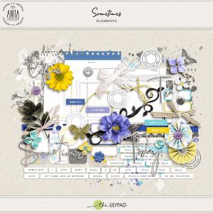
I’ve also decided that the mountain on his shirt (which I think is grey in real life) looks navy blue-ish on my screen and so maybe that’s why I’m preferring the darker blue without Courtney’s blue paper to tie it in? So sometimes you need to add to your mash ingredients and I went back to this week’s SOSN selection looking for blues and found Anita Design’s kit called Sometimes, and if Courtney’s challenge was a torch on a path, Anita’s kit title was a neon sign so this is the home stretch (because I’m running out of scrap time today).
I added in some more blue, mostly with labels as well as wordart and mixed media from the Sometimes kit – I loved the floral branch stamps and they allowed me to extend the photo cluster up like Courtney without needing to go find any tags and really I didn’t have time to search through my stash again at this point).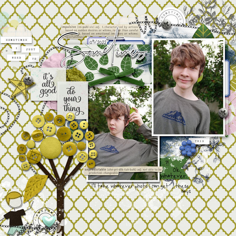
So here’s my SOSN Stash Smash Scraplift Side-by-Side comparison!
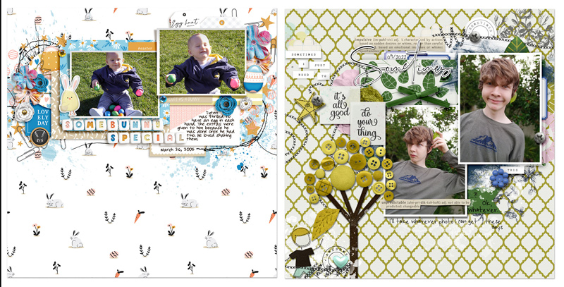
I went off the rails a bit, extending the cluster down into the left corner with the button tree scene and keeping the long rectangle of patterned paper largely uncovered except for the bow and title really above the first photo.
The papers I’ve chosen have made my page feel busier and heavier but otherwise I have kept to the original 2 layered photos design with feature stitching and circles and mixed media down the right side. Moving the Capricious star to the top left roughly where Courtney has a group of flowers allowed me to add in the Sometimes blue flower bead where Courtney has a blue flower under the right photo. I think it worked for me because it moved all the yellow-ish Capricious stuff into the same area, creating more of a colour block, while the blue bead created a visual triangle with the blue labels and paint that centred roughly over my son’s smile. I also put some journalling in the same basic spot.
And guess what? I did switch in a few papers at the end to see if any of the ombre shimmers from the Bella Gypsy collection would be better or if I should stack them and add a blend mode lightening the quatrefoil pattern, but the ‘not bad’ papers really grew on me and I decided to stick with them. That’s pretty good for me on any page, especially a scraplift.