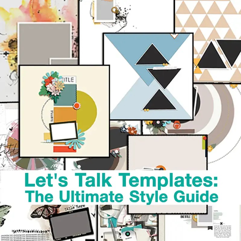
Today’s Template Trick…
Helllllllo, friends, and Happy Scrapping! This is Guest Polly Nancy, hoping you’ve had some enjoyable and memorable moments this month. In my first blog post as a guest Polly, I shared a favorite template technique, which I call “slice and split,” to separate sections of a template on a vertical, horizontal, or diagonal axis, then move them apart to make room in the center. As my final blog post for May, I want to share another favorite technique for modifying templates. My nickname for this modification the “shrink and slide.”
Although I shrink and slide all sorts of templates or parts of templates, it’s most straightforward and easy to see when applied to a template that has a gathering of photos and elements as a central focal point.
Example 1, Using a Cluster for Photos and Journaling
My first example uses the bottom right template in this versatile set by Designs by Irma, called “Swing In To Spring.”
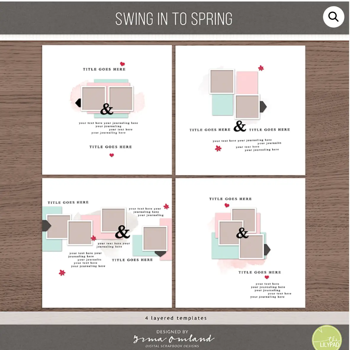
The template on the bottom right was perfect for my layout, where I needed space for two supporting photos and a few sentences of journaling. I copied the central cluster of items from the template and pasted onto a new page. Next, I shrank the cluster to 75 of its original size. When I have faces in my layout, I prefer to have them facing in towards the center, so I shifted the photo cluster over to the left side of the layout.
Leveraging off of Irma’s design skills and the central core of her template saved me a ton of time. The layout looks cohesive; if you didn’t see Irma’s template prior to seeing this layout, you wouldn’t know I’d used it.
Example 2 – Using a Grid as a Background for Elements
Here’s another example. My second layout uses the Boxed Number 1 Template Set by Rachel Jefferies. There are so many possibilities to shrink these templates and use them for little papers, photos, and elements!
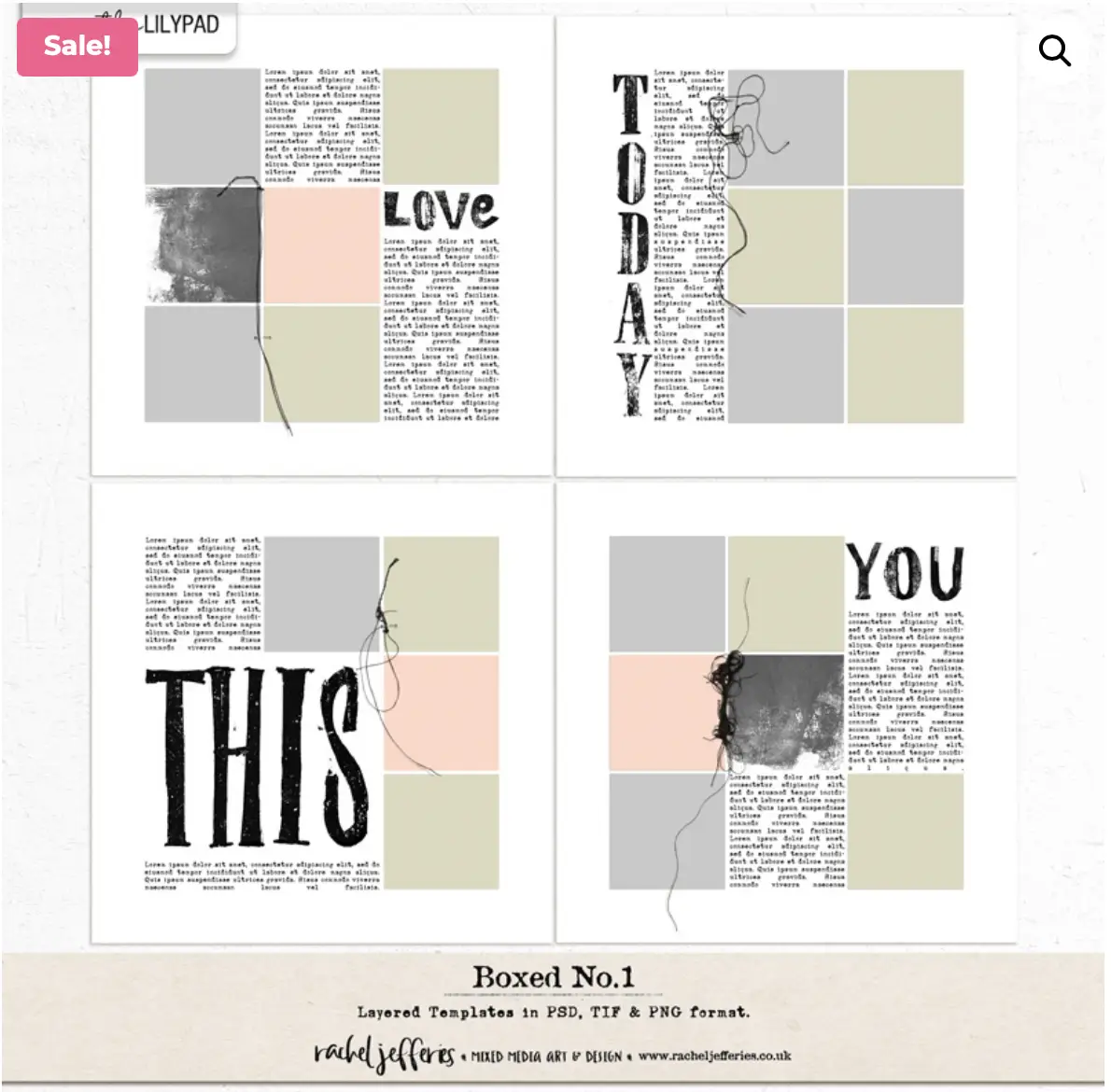
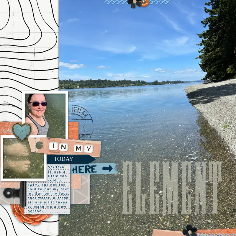
I had a photo of my daughter and her aunt playing at the beach, and a vision of small beach-related elements on a grid of squares. The top right template fit my vision perfectly. All I did was delete the journaling block, scoot the word art over closer to the squares, then shrink and slide the template to the right. From there, I designed the layout out and away from the template.

This layout came together in a little more than a half-hour. As a very slow scrapbooker, for me, that’s quick! If I hadn’t used a template, it would have taken a lot longer.
A Fun Surprise – Featuring Member Jagruti Patel
As I was writing this post, I saw a beautiful layout in the TLP gallery by member Jagruti Patel. Her design work with photos around the edge and white space in center is very eye-catching. She designed it all on her own without using a template, yet what do I see?
Looking back up to Rachel’s Boxed Number 1 template set, if I wanted to scrap-lift Jagruti’s layout with relative ease, I could start with the template on the bottom left and copy the four squares. From there, it would be a simple matter of paste, shrink, and slide, then copy again, rotate, and slide to the other corner. Once I started imagining segments of templates shrunk and re-arranged, I can’t stop seeing them!
Scrapchyk – Sliding a Cluster to Add a Photo
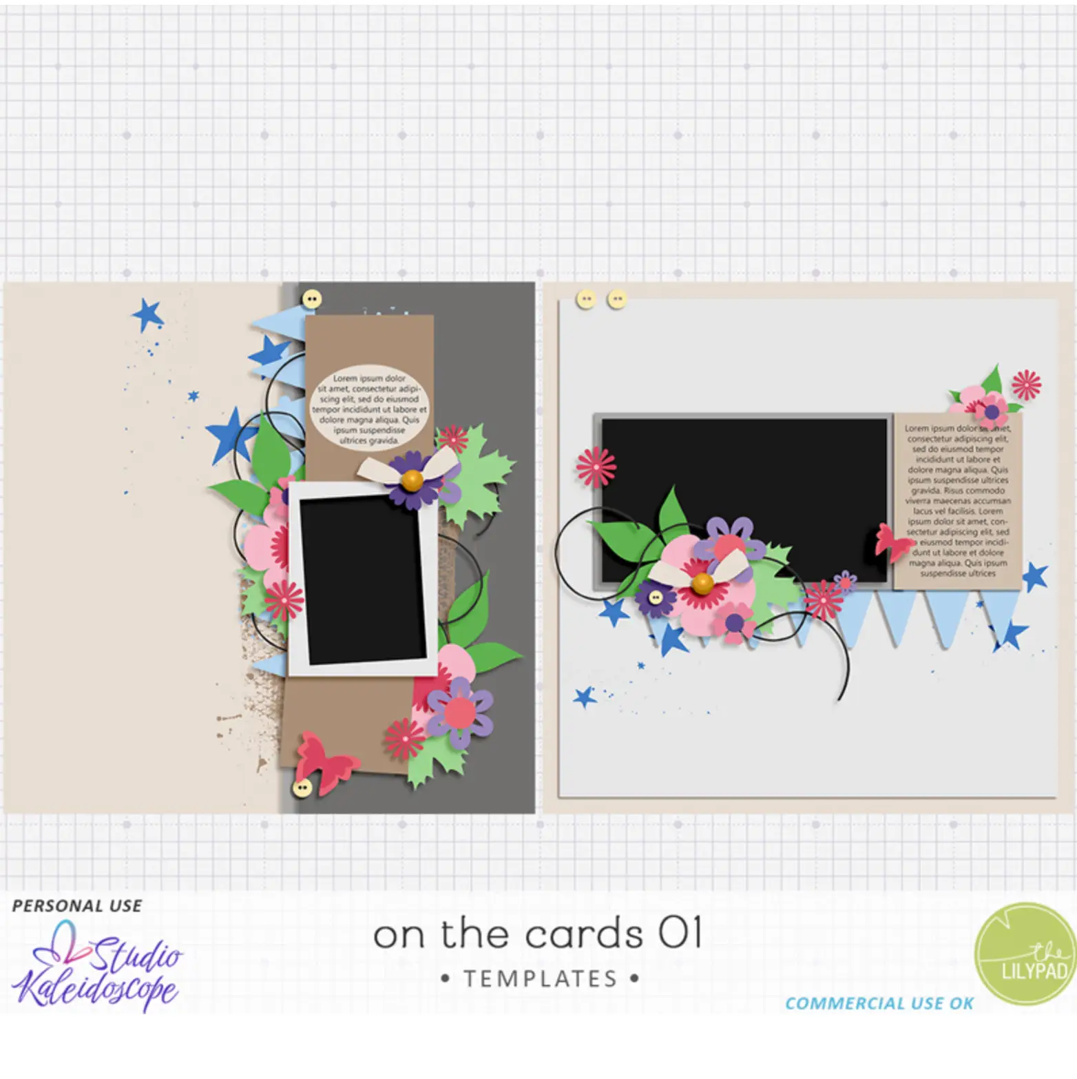
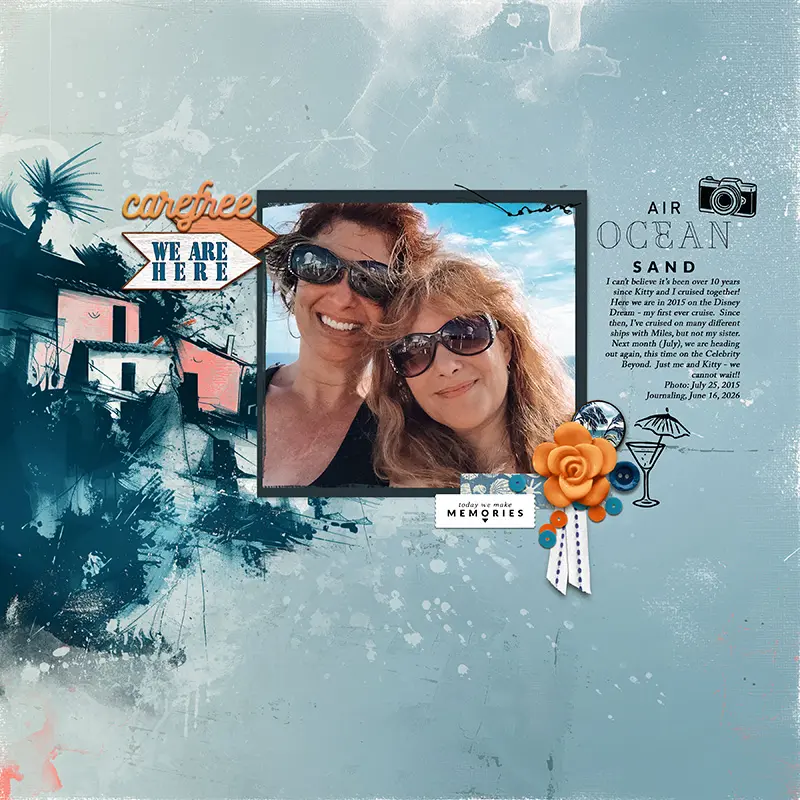
Polly, Becky, started with the On The Cards template by Studio Kaleidoscope. In the description she sent to me, she wrote, “I moved and reduced the main cluster that’s over the photo, divided the spot for photos up into a place for two photos, then added a circular photo over them.” Becky’s whole layout is stunning, and sliding the cluster down to add the close-up photo of the couple adds extra joy and emotion to the layout. Thank you, Becky!
Bellbird, Converting 8.5 x 11 to 12×12
Justine didn’t shrink, she stretched! This is a cool thing about using templates, you can make them work how you want to see them on your page. When Justine sent me her layout, she wrote, “I think i actually increased the size of the blocks (because i like being able to see photos) and just scooted them across on a 12×12 background (instead of the rectangle background she has) and added extra photos to that column in line with the gallery wall idea and then added the top and bottom border papers.”
Sure enough, Justine increased the size of her photos after she slid them over. She also made more dense use of the space – including 7 photos rather than the original 6 and adding journaling as well. Justine is expert at evoking energy and movement in her pages. Thank you, Justine!
Storykeeperbeth – Small Shift, BIG Change!
Beth did a thorough job describing her process, below. She kept the template almost entirely intact, yet by shrinking and shifting it, the layout has a very different look than the template. I love Beth’s special talent for scrapping about the beauty of everyday moments. Thank you, Beth!
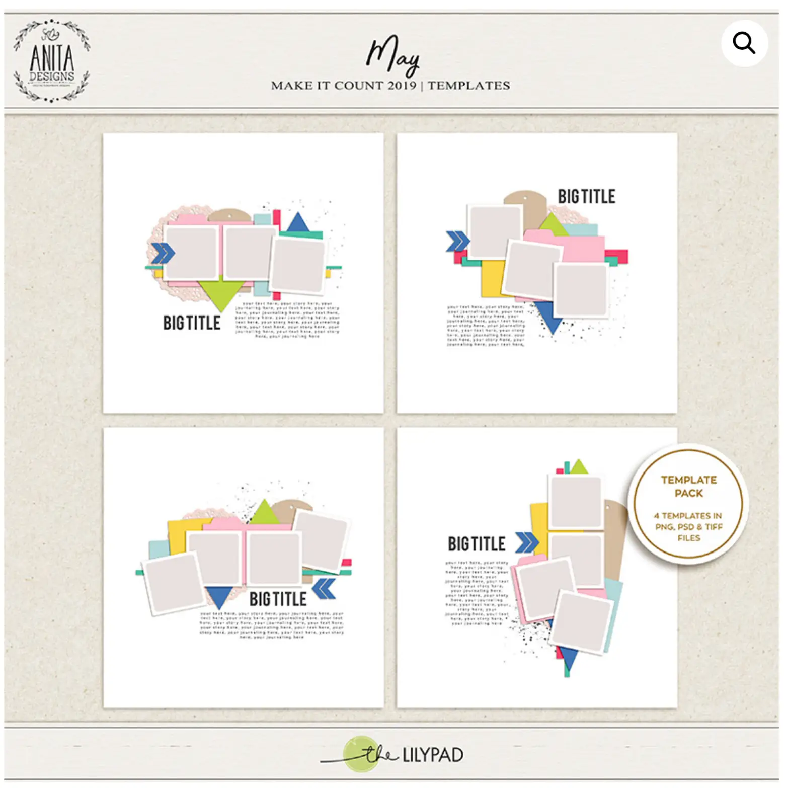
Beth’s process: “I wanted to highlight the photo of the window at Hazel’s Coffee & Cafe and I had a few other supporting photos that I wanted to include. I looked for templates in my collection that had space for 3 photos that I could resize so that they would be supporting features rather than the main feature. I chose a template by Anita Designs from the Make It Count May 2019 template set, the one in the top right corner. First I created a blank layout and positioned the feature photo on the top half of the page and added a photoshop style to give it a white border. Then I pulled the template layers into my layout with the feature photo and made everything smaller so that it would fit in the bottom left corner — because that’s where I thought it looked best. Lastly I added my supporting photos, and chose papers and elements for the layers in the resized template.”
Thanks! Now Go Out and Play With Your Templates!
I hope this post has given you some new ideas for what to do with the templates you already have, as well as a way to look at your potential new purchases for possibilities! From using it exactly as it is and adding your photos onto the designer’s template, to slicing, dicing, shrinking, shifting, and stretching…. there’s no wrong way to use a template!
Special thanks to Beth, Justine, and Becky for adding their creativity to my featured template trick. All of the Pollys at TLP are talented and generous with their art. It’s been special to work alongside them these two months.
Speak and spread love.


Another excellent post Nancy! Lots of inspiration here. I’ll miss your posts.
Thank you, Beth! I’ve been loving your layouts and posts. Have an amazing summer!!