Let’s Talk Templates: The Ultimate Style Guide to Digital Scrapbooking Templates
Hey, hey everyone! It’s Guest-Polly Deborrah, and I’m excited to present you with the first part of a three-part series about Digital Scrapbooking Templates.
Now, I LOVE TEMPLATES! If you were to peek at my digital scrapbooking hard drive right now, you would see folder upon folder of digital scrapbooking templates, and I am not even a little bit sorry about it. In my book, templates are easily one of the most powerful, time-saving, and sanity-preserving tools in a digital scrapper’s arsenal. They take the fear out of a blank white canvas and instantly give you a framework to start telling your stories.
But let’s be real. Not all templates are the same. You know, you buy a gorgeous template, open it up, and instantly get hit with total decision paralysis. There’s a maze of messy art masks or grids and masks that just don’t work for you. It’s frustrating, to say the least!
That’s exactly why we’re breaking things down today. Picking the right style for the photos you have before you start will save you tons of time and headaches. Think of this as your ultimate template matchmaker guide to help you find the perfect canvas for your photos so you can get back to what matters – faster, stress-free scrapping.
Digital Scrapbooking Templates & Styles
Digital Scrapbooking Template styles can be broken down into lots of different categories, but for the purposes of this blog post, I’m dividing them into six basic types: Clean & Simple, Artsy/Mixed Media, Pocket Style Grids, Minimalist, Geometric, and Typography-Driven. Each one of these has a particular style and can be used for a particular storytelling purpose. Let’s take a look!
1. Simple, Clean, & Lineal Templates
These template designs rely heavily on traditional graphic design principles, favoring crisp lines, uniform borders, and geometric alignment. You will see perfectly square or rectangular photo blocks arranged in structured rows, surrounded by generous amounts of breathing room. It is a timeless, classic look that keeps your page perfectly organized.
This style works best when you have a large batch of photos from an event and your main goal is to get them documented cleanly. I would avoid this style if I was using one special photo and wanted it to stand out as a heavily layered, artistic centerpiece.
There are some wonderful examples of this style in the shop!

Clean Capture Vol. 4 Templates by ninigoesdigi: This pack features simple, well-balanced photo blocks, intentional text space, and clean lines that focus entirely on the story without any visual clutter. PLUS, she has five volumes of these templates, and I wouldn’t be surprised if she will add more in the coming months. It’s the perfect collection to help you build a cohesive album!
Another great example of this style comes from Anita Designs.
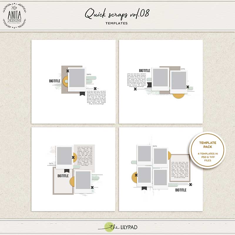
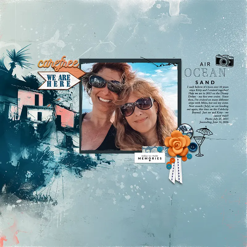
Anita’s Quick Scraps Templates are perfect for an ultra-streamlined workflow and offer perfect margins that make your pictures pop instantly. Each set gives you a handful of gorgeous, pre-arranged page layouts featuring perfectly neat photo frames and beautifully clean borders. Her designs leave just the right amount of cozy, empty background space on the canvas. This instantly gives your page a high-end, magazine-style look that keeps the spotlight on your photos.
2. Artsy, Blended, & Mixed Media Templates
Artsy templates treat the canvas like a physical mixed-media art journal, discarding rigid structures in favor of fluid, organic shapes. These templates are packed with complex layer masks, watercolor splatters, stamped textures, and torn-paper edges where photos blend directly into the background planes.
This style of template works best if you have one or two incredibly meaningful, high-quality photos (like a portrait or scenic shot) and want to evoke a deep mood. It also works great for highlighting one particular photo. As a general rule, I wouldn’t use this style for a series of photos or need to display a strict chronological sequence of events. The photos would get lost.
There is no better example of this template style than one from the Hear My Voice series by Lynn Grieveson & Rachel Jefferies.
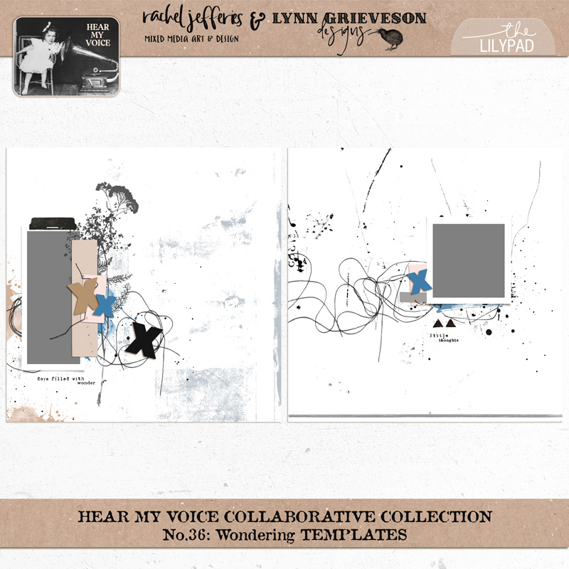
This set is an absolute dream come true if you love the art journal look. Their template packs feel just like a real, touchable paper journal. Each file is already loaded with gorgeous messy machine stitching, loose threads, paint splatters, and fun paper layers that let your photos slide right into the background. They completely take away that scary feeling of staring at a blank screen and give you a beautiful, artistic canvas to start telling your deep or everyday stories.
3. Pocket-Style Grids
If you’ve ever seen those physical pocket scrapbooking albums with the plastic protector slots, you already know exactly how these work! Pocket templates divide your 12×12 page into a neat little grid of smaller 4×6 and 3×4 boxes. It is honestly like a fun, stress-free puzzle. You just drop your photos into some of the boxes, and pop cute decorative journaling cards or your typed stories into the others. Everything fits perfectly!
I find this style to be an absolute lifesaver when tackling a big, ongoing project, like tracking my family week-by-week or making a massive vacation album. It’s also perfect if you have a giant mountain of random everyday snapshots. Because the structured boxes keep everything in line, you can easily fit 6, 8, or even 10+ photos onto one single page without it looking messy or chaotic. This style doesn’t work well with a “breaking the rules” approach. Large angled titles are not for this template, nor are lots of messy scattered elements. Believe me, I’ve tried!
It does work well with stitching around the edges and there are some templates that have a digital plastic sheen overlay on top so it looks like a real physical pocket album page! These give the grid effect a more cozy feel.
There are a ton of examples of this style at the Shop, but I’ll highlight two that caught my eye:
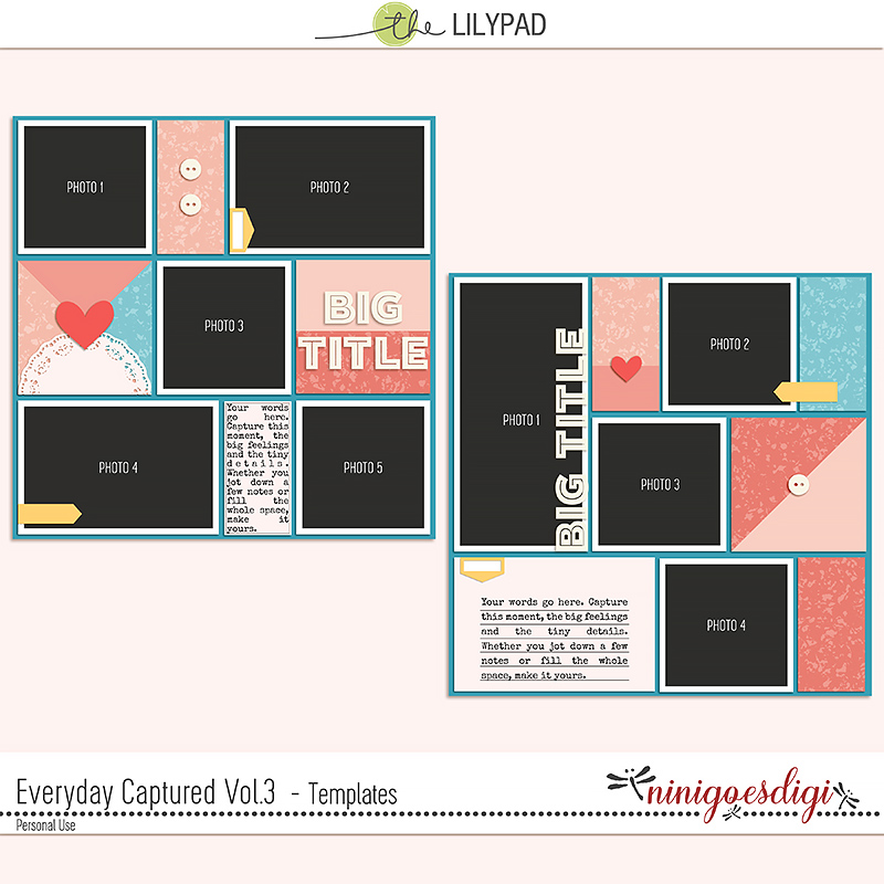
Both of these designers reinvent the pocket look. Lynn wraps the structured grid boundaries with realistic, hand-drawn machine stitching. Nini offers an exceptionally balanced, highly organized grid setup that helps you track full stories seamlessly.
4. Minimalist & White-Space Heavy Designs
Embracing the “less is more” philosophy, these templates feature vast expanses of completely untouched solid background paper and a small, purposefully placed off-center photo block. Embellishments are held back to allow silence on the page to do the heavy lifting, instantly making your pages feel sophisticated and modern.
This style is perfect for highlighting a profound story, a poignant poem, or a single powerful photo without any distracting clutter. The single focus is one reason I separated this style from the clean and simple style. There is ONE focus with few elements or other distracting items. This is the not the template to use if you have a lot of photos to display or if leaving larges areas of the page completely empty makes you feel uncomfortable.
I personally LOVE this style of template. It can incorporate so many different styles all in one. Let me show you what I mean:
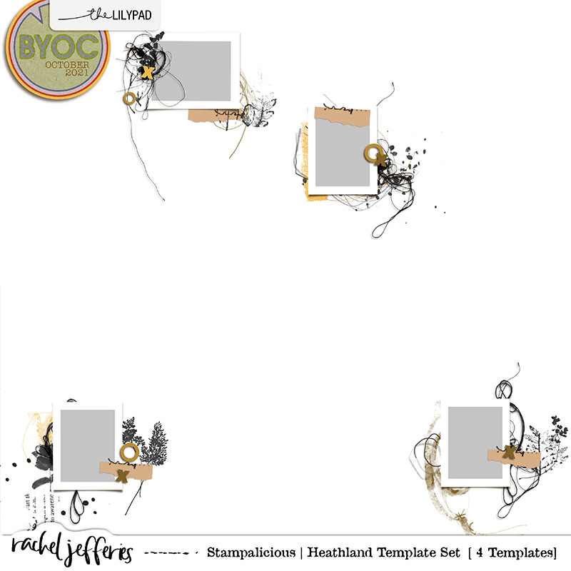
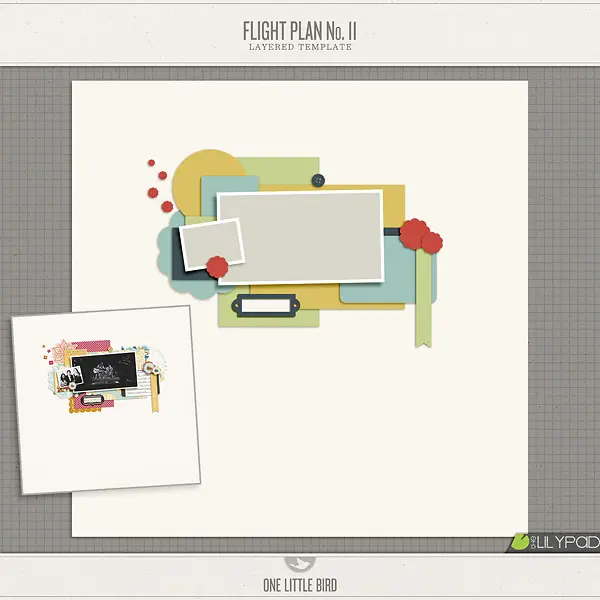
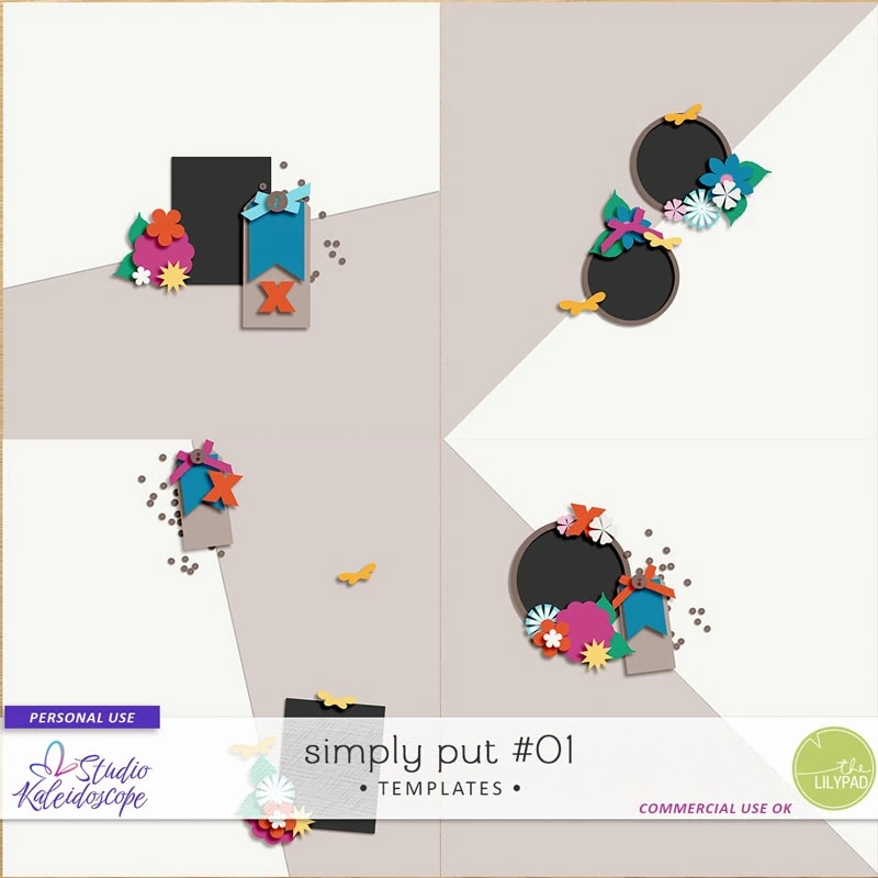
Each of these designers created a template leaving a LOT of white space and highlighting only one single photo, but oh my goodness, look at the difference! Rachel Jefferies’ Stampalicious | Heathland set pops little bits of messy threads and artsy stamps right around her photo placeholder, giving it that cozy, mixed-media art journal vibe. On the flip side, One Little Bird’s Flight Plan No. 11 uses crisp rectangular paper layers stacked neatly behind the photo frame to keep things feeling totally clean, simple, and beautifully organized. And then you have Studio Kaleidoscope’s Simply Put #01, which uses cool geometric lines and subtle shapes to draw your eye straight toward your picture. It just goes to show how each designer can take the exact same minimalist “less is more” blueprint and completely turn it into her own gorgeous personal style!
5. Geometric & Shape-Driven Templates
This layout style utilizes razor-sharp lines, triangles, angles, and perfect circles to split the canvas. The geometric shapes act as exact clipping masks, slicing your photographs and patterned papers into dynamic graphic elements with tons of visual movement rather than traditional rectangles. This is an incredible pick if your photos feature strong structural lines (like city skylines, architecture, or action shots) and you want a bold, high-contrast look. This is the not the template to use for soft, organic photos, or if your photos are highly detailed.
Let’s take a look at a couple of examples:
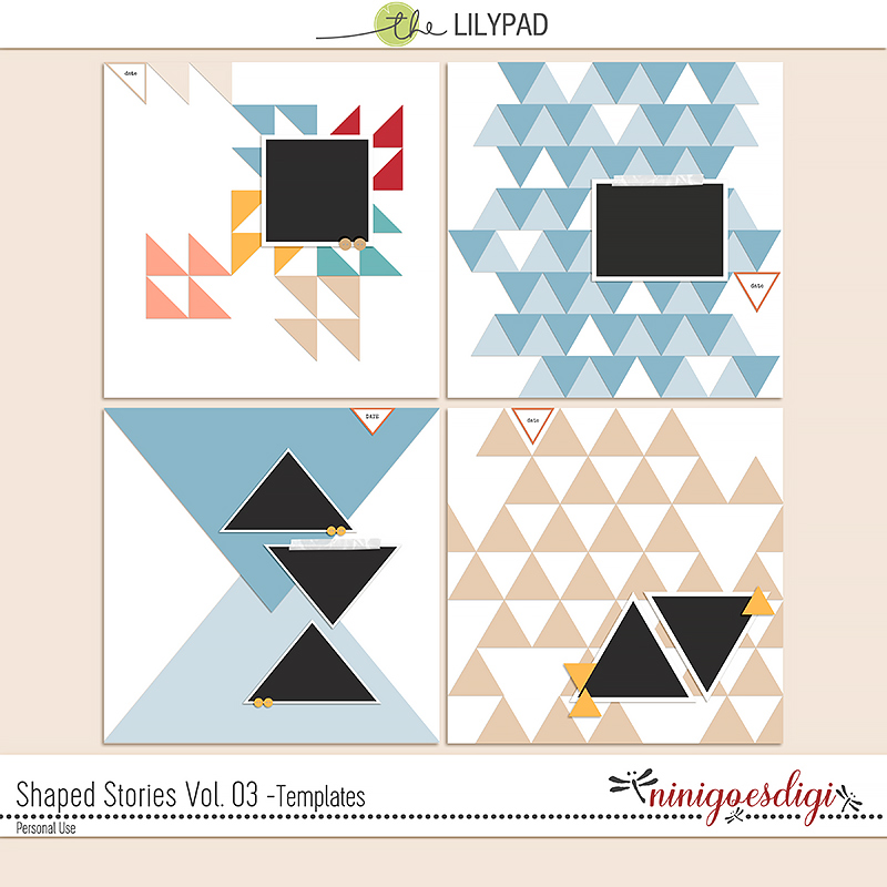

In both of these examples, you can easily see how shapes and circles make this fun style work so well! In Shaped Stories Vol. 3 by ninigoesdigi, she uses triangles to build bold backgrounds and repeating patterns that add instant energy to your photos. I could totally see using this template for action-packed sports shots or even a dramatic cityscape! (Bonus: she has a whole series of these templates using completely different shapes to play with).
Then you have the Orbital Focus #01 Templates by Studio Kaleidoscope, which use giant graphic circles to bring awesome motion and energy to the page layout. Almost all of her templates have this high-energy vibe, packed with interlocking circles, stars, and cool angled lines that are absolutely perfect for adding instant movement and playful style to your pages!
6. Typography-Focused & Text-Driven Templates
Our last style of template encompasses a wide range of designs since written words take center stage. These templates can feature pre-made text paths that curve dynamically along waves, shape into circles, or form massive journaling columns. It’s designed so that the focus is the writing itself and that writing acts as the primary decoration of the page layout.
This is the template to use if the story behind the photo is far more important than the visual details. If you love long-form journaling (like Traveler’s Notebook styles), or if you don’t have a photo to match the memory you want to preserve, this is the template style to use. I wouldn’t use this style if your photos need to be the center of attention.
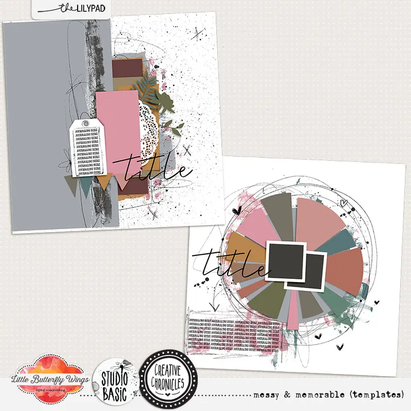
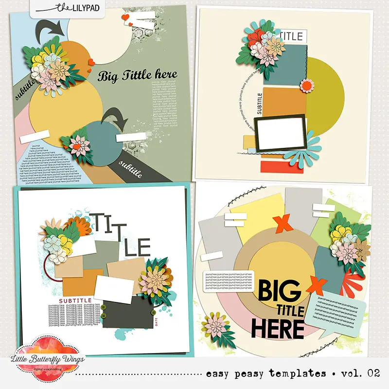
Little Butterfly Wings is a true community favorite for this style. Her Creative Chronicles series, created with Studio Basic, is deeply soulful and story-driven. Instead of treating text like an afterthought, she builds massive, gorgeous journaling blocks and poetic writing prompts right into the heart of the page blueprint, treating your written heart-filled words like central artwork. I’ve highlighted the Messy & Memorable Templates from this series above, as well as her Easy Peasy Templates. You can see the plentiful areas for journaling found in them.
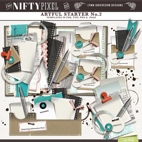
If you love long-form storytelling but still want a highly artistic flair, the Artful Starter series by Lynn Grieveson Designs is an absolute dream. Designed as a beautiful hybrid traveler’s notebook style, it functions like a text-heavy journal built with realistic stacked paper slots, hanging tags, and stitched pockets. It is the ultimate canvas for “tucking” in multi-paragraph vacation logs or deep diary entries right alongside your favorite photos and travel memorabilia.
Wrapping Up – Your Quick Template Cheat Sheet
Now, because I know you might be reading this while trying to squeeze in a quick scrapping session, I put together a handy little cheat sheet for you! This quick breakdown gives you an overall view of all six template personalities, what makes them unique, and exactly when to grab them (or pass on them!) depending on the photo stash you are working with today. Feel free to bookmark this page so you can use it as a fast matchmaker guide the next time you are shopping the store!
| Template Style | Core Characteristics | 📸 When to Use It | 🛑 When to Skip It |
|---|---|---|---|
| Simple & Lineal | Clean grids, neat borders, perfectly aligned photo rows, and tons of breathing room. | When you have a massive batch of event photos and want to document them fast and beautifully. | If you only have one special photo that you want to stand out as a heavily layered masterpiece. |
| Artsy & Mixed Media | Pre-blended paint splatters, watercolor stamps, messy stitching, and organic torn-paper edges. | Perfect for one or two incredibly meaningful photos where you want to build a deep, artistic mood. | When you have a lot photos or need to display a strict timeline of events. |
| Pocket-Style Grids | Tidy rows and columns of standard slots that alternate between photo spaces and journal cards. | An absolute lifesaver for big, ongoing chronological tracking or a giant mountain of everyday snapshots. | If you want to break design rules, use massive angled word-art titles, or scatter elements everywhere. |
| Minimalist & White Space | Large expanses of quiet, untouched background highlighting a single, tight photo cluster. | Brilliant for showcasing a profound journal story, a poem, or a solitary high-impact picture. | When you have a lot of photos from a party or vacation that you want to fit on one spread. |
| Geometric & Shape-Driven | Sharp lines, triangles, starbursts, or circles used as exact cutting and placeholder frames. | Incredible for pictures with strong lines, cityscapes, architecture, sports, or high-contrast action shots. | If your images are soft, heavily detailed, or close-ups where shapes might slice off important faces. |
| Typography & Text-Driven | Giant word-art titles and text paths that curve along paths or form massive writing blocks. | Perfect when the story behind the memory carries all the weight, or if you don’t even have a photo to match. | If you absolutely dislike writing long paragraphs and prefer to let your photos do 100% of the talking. |
At the end of the day, digital scrapbooking templates are just awesome tools built to serve your memories, not the other way around! Now that you can look at shop previews like a pro and spot the perfect canvas for your photo stash, you are ready for the next step.
In our next post, we are going to look at what happens after you drop your pictures into those placeholders. We will dive into some super fun, easy design tricks that top creators use to guide the eye across a page, make things pop, and tie a whole color story together. Trust me, you can use these exact same secrets to instantly breathe life into any template you open up!
See you there!
Deborrah Cannizzaro
Hey, everyone! I hail from Florida—yes, a true native (we DO exist!). After college, I moved to Chicago to pursue a career in opera, living in several different Midwestern states before finally returning home to the sunny West Coast of Florida in 2013. My two sons were born in the Midwest, but they are perfectly happy here because, let’s be real, this is where all the Midwesterners end up anyway! I met my husband here, and life truly couldn’t be better.
My scrapbooking journey started back in 2003 shortly after my second son was born. I completely fell in love with the tactile feel of papers, fabrics, and textures. Combining those layers with my favorite family photos instantly sparked a lifelong passion for photography. While I still adore paper crafting and making cards (there is truly nothing like die-cutting and inking!), the mountain of physical “stuff” everywhere eventually became too much.
In 2015, I discovered digital scrapbooking, and I have never looked back!
If you look at my layouts, I’m not sure I have one set style. I am a total phase scrapper—one month I am completely obsessed with messy, artsy layers, and the next it is all about quiet white space. I absolutely love color and texture, and I am deeply inspired by our community. Whenever a layout catches my eye in the galleries, I will pause to analyze, study, and figure out exactly why it works and why I love it.
I am a proud Photoshop girl through and through. I actually first learned the software to fix my photos, so transitioning to digital memory-keeping felt completely seamless.
I am always fiddling with my files, trying to alter elements, shift colors,
and change things up to perfectly highlight my photography.
If I could give just one piece of advice to new scrapbookers, it would be this:
never be afraid to ask questions! Every single one of us started at the exact same beginning. I absolutely love asking questions, and even when I don’t get the answer I expect, it always inspires me to look further. Just enjoy the process!
At the end of the day, that is truly all that matters.


Great article DivaMom! I appreciate your organizational skills. I know based on these examples that I lean definitely towards a mix of Simple Clean Lineal & Minimalist White Space templates. I have many of the others, but these two are the least stressful for me.
I am looking forward to more design tips and tricks in the next one.