Never Out of Style: Buttons
Greetings everyone! I’m Guest-Polly Deborrah (DivaMom96 in the Forums/Gallery), and I’m here today to talk about buttons. Back when I first started scrapbooking, buttons were on everyone’s pages. This was back in 2003, way before the idea of digital anything. I remember having a vase filled with different types and colors of buttons and I loved looking through them when creating my pages.
Over the years, I’ve seen buttons replaced by flairs, and then fade out and only used here and there. But you can still find buttons in almost every designer collection. They are an amazing way to add color, dimension and interest to your scrapbook pages and journals. So, let’s look at four fun ways you can use buttons in your layouts. Some of them are easy, others more complicated, but I know you’ll find one that will appeal to you.
Before we start, it’s important to learn how to recolor a button. There are many ways to accomplish this, but the easiest way I’ve found is to:
Add a button to your paper. Make a copy of the layer (CTL or CMD J). Rasterize the copied layer.
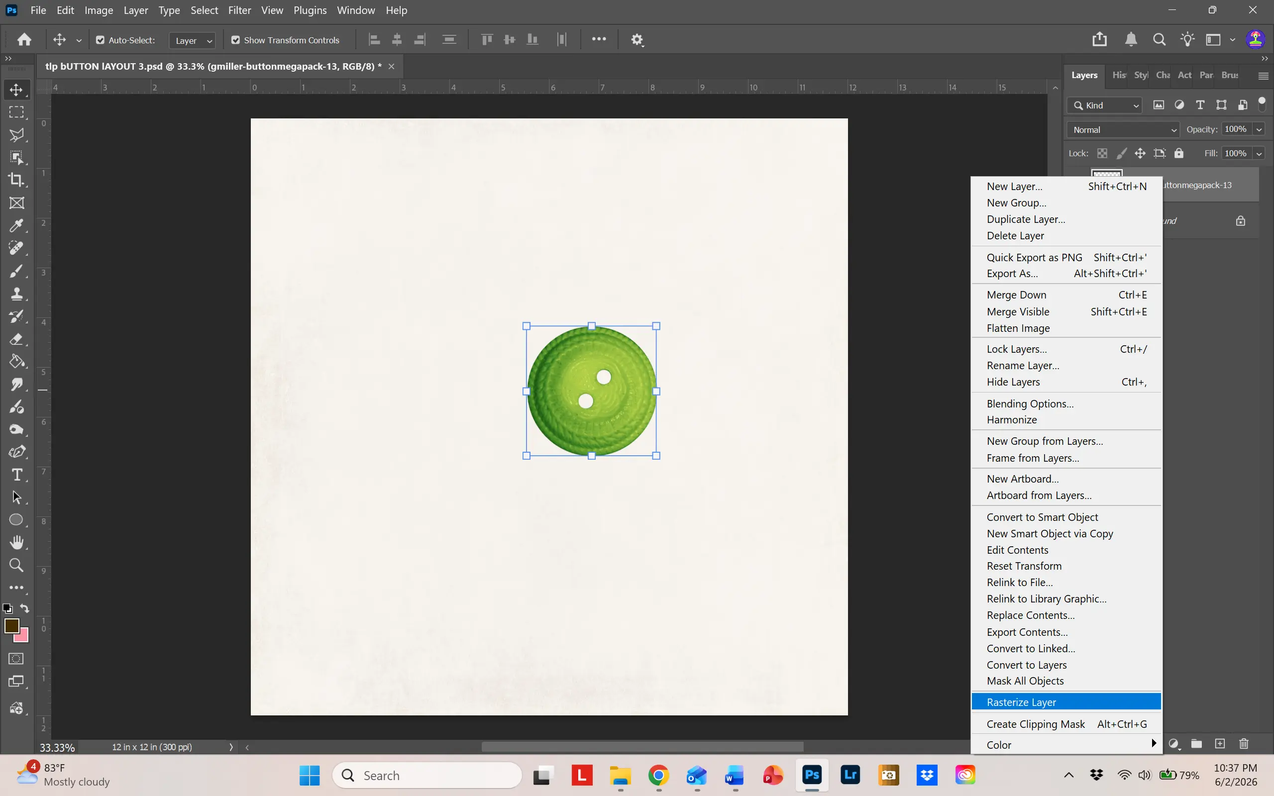
Then from the Image tab, use Adjustments/Hue-Saturation to change the color.
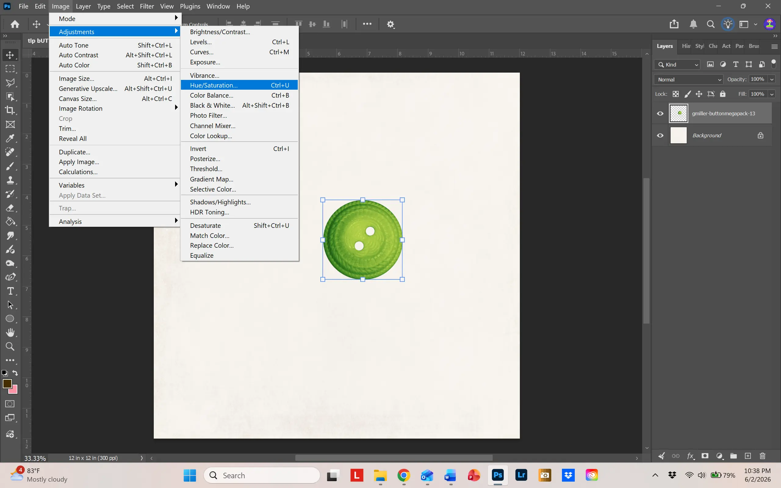
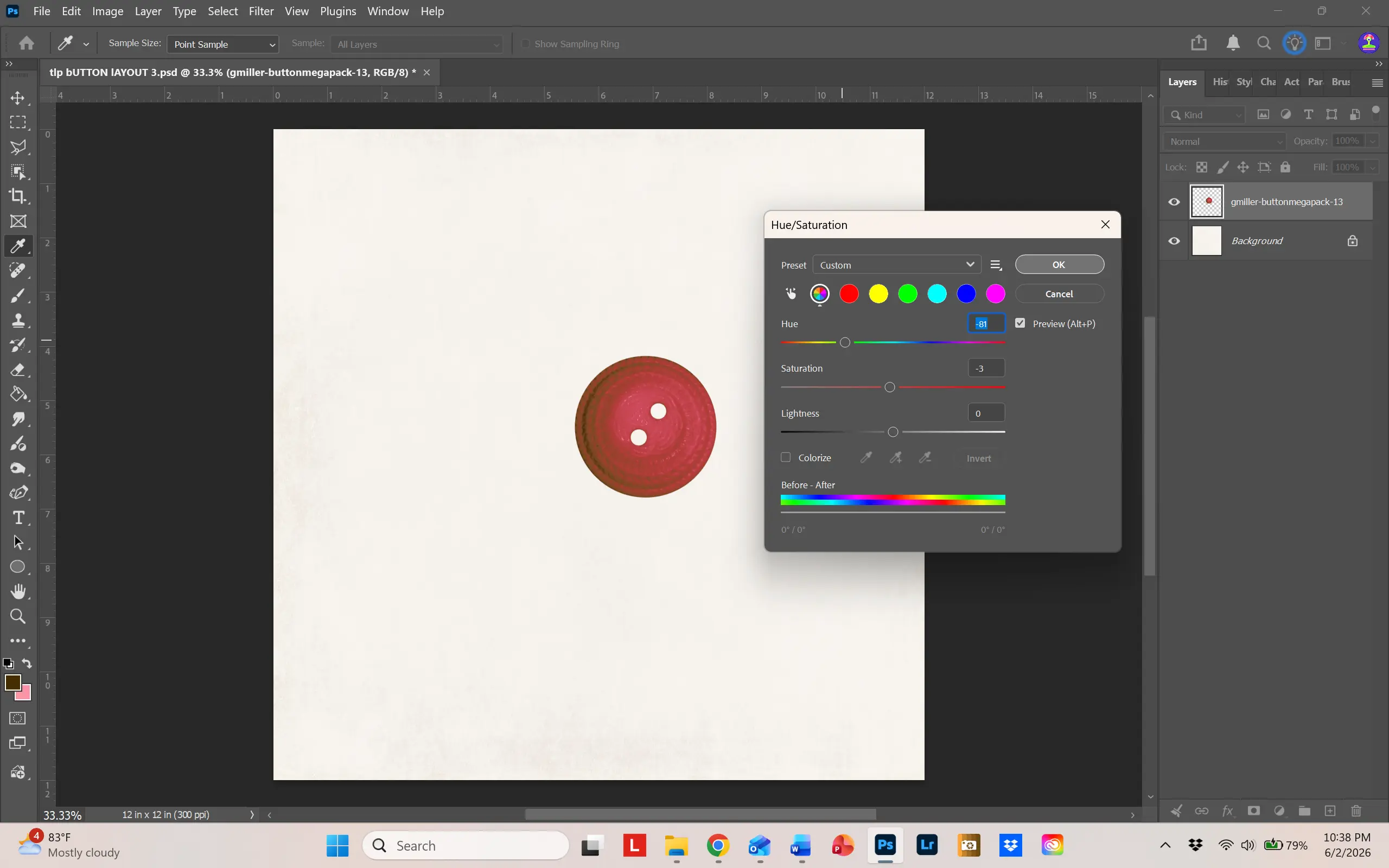
Simple and easy. Now – let’s get started!
Buttons as a background
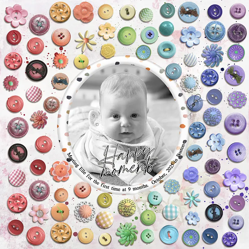
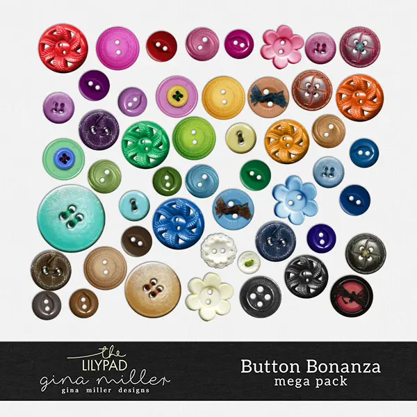
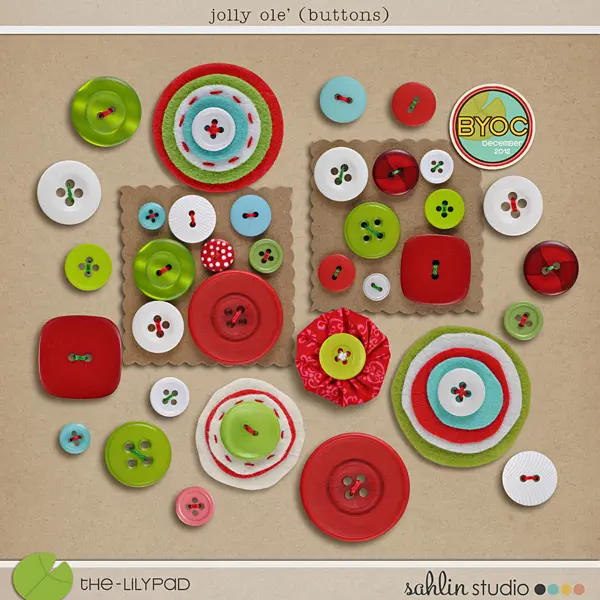
I thought I’d jump right in with a full-page button example. This layout was so much fun to make, and it’s relatively easy to do. The biggest challenge was choosing which buttons to use! So, I selected two products from the store: Button Bonanza by Gina Miller and Jolly Ole’ buttons by Sahlin Studio. These two products provide a fabulous selection of buttons and can easily be recolored and resized, as my sample layout shows.
To create the background layer of buttons, I used the Grid Layout Guide in Photoshop. This can be found under View.
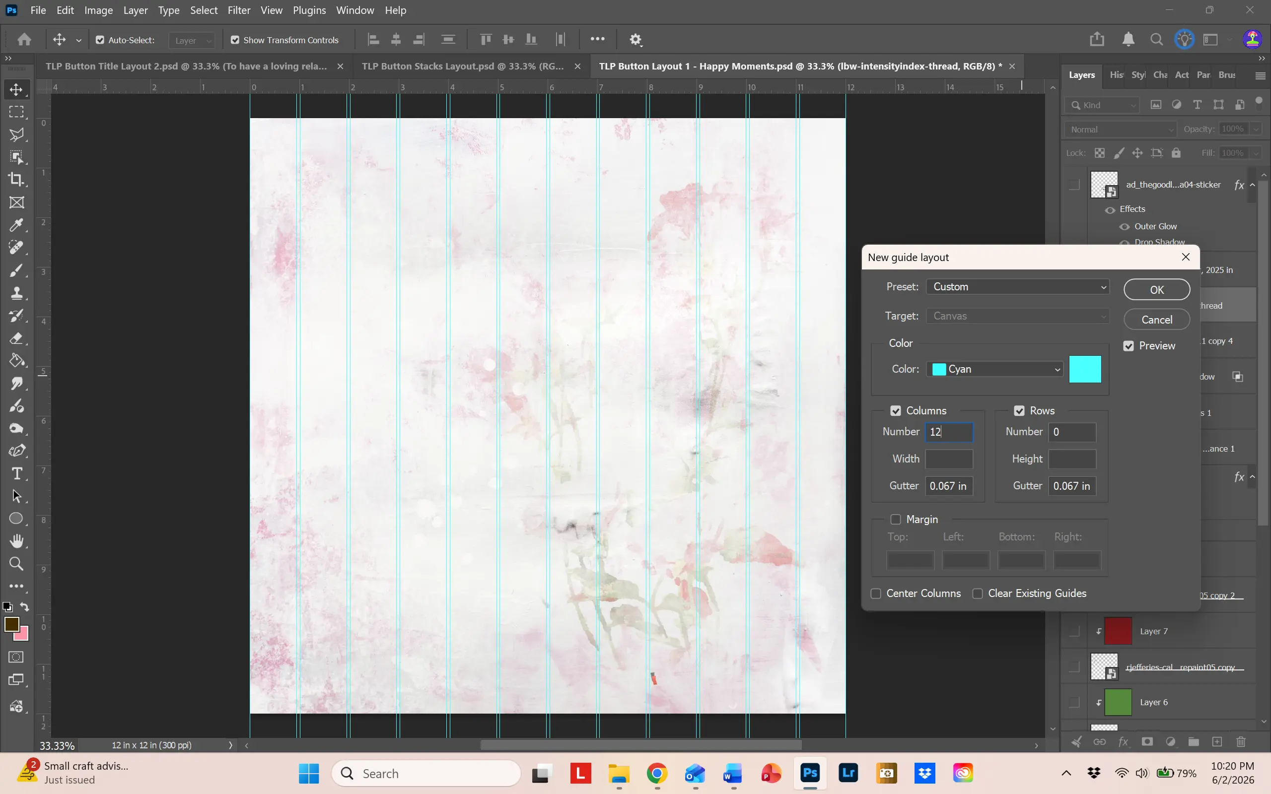
To help with button placement, I made a guide layout of 12 columns. That way, I could line up the buttons around the column lines. I knew I wanted a rainbow look, so I chose six colors (red, orange, yellow, green, blue and purple) and recolored buttons so that I had about 12 buttons of each color. Then I chose 3 specialty buttons that I only recolored for certain areas. To help with finding the buttons, I colored each layer the color of the button, placing all similar colored buttons in one group. Just right click next to the “eye” on the layer, and a dropdown of colors will appear.
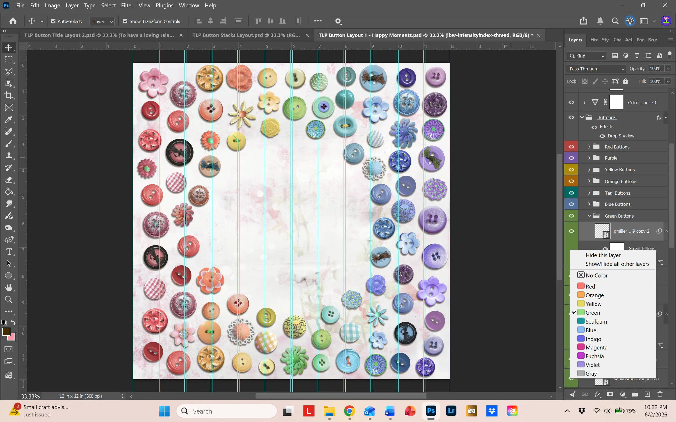
This was enormously helpful. As you can see, each color takes up two of the column lines with some of the buttons merging into the next color. To make room for the frame, I placed the frame and matte combo on top the button layer groups. By decreasing the opacity of the frame and matte, I could see underneath and remove the buttons I didn’t need. Then I just moved the frame/matte underneath all of the button layers. For additional interest, I placed some splatters on the paper, matching the color of the general area.
This was a lot of fun to make and you can find all the products I used in the gallery. Just click on the layout image.
Buttons as a Title
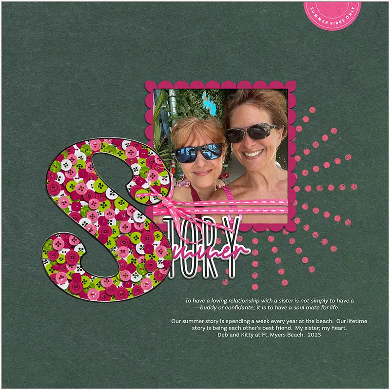
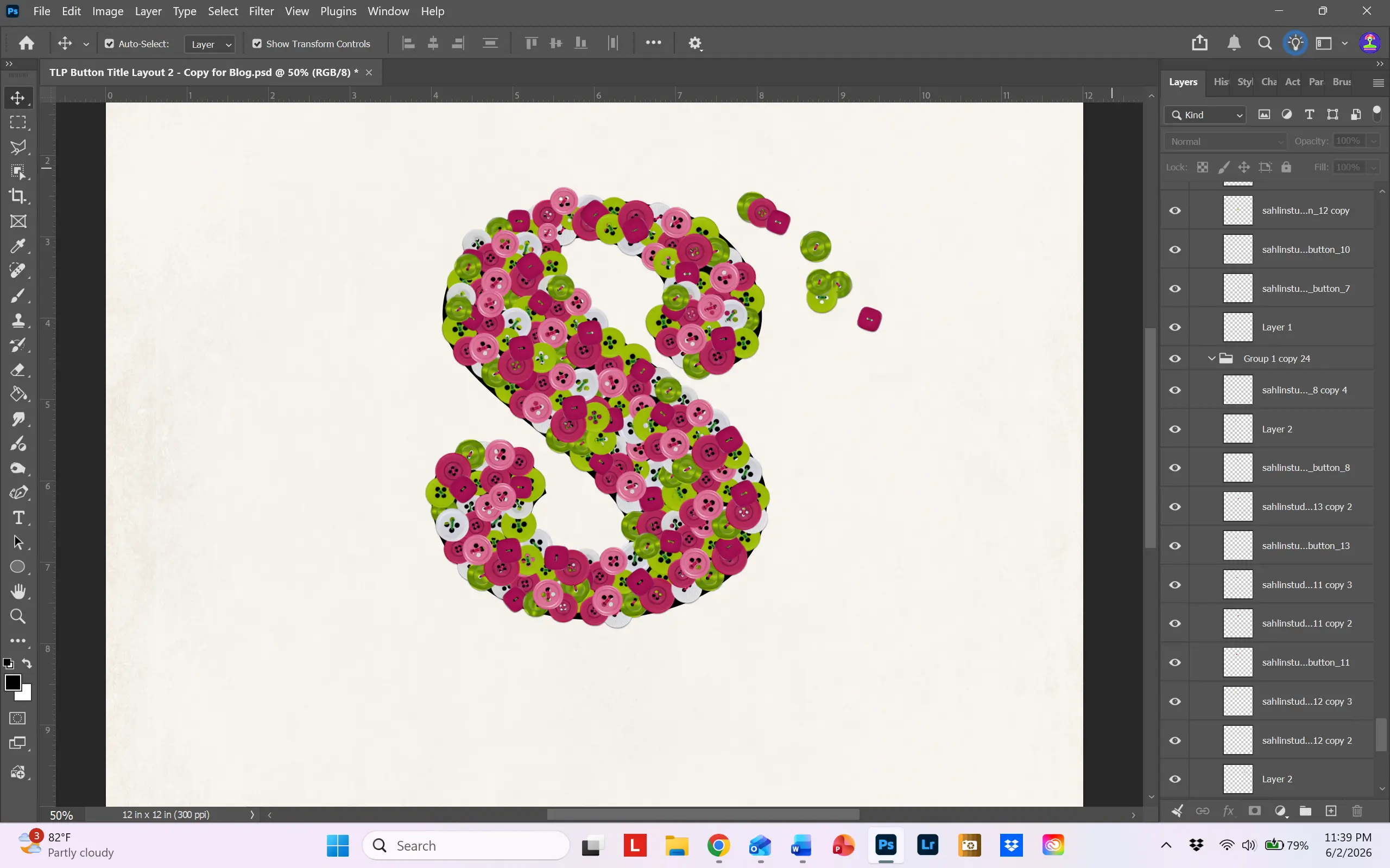
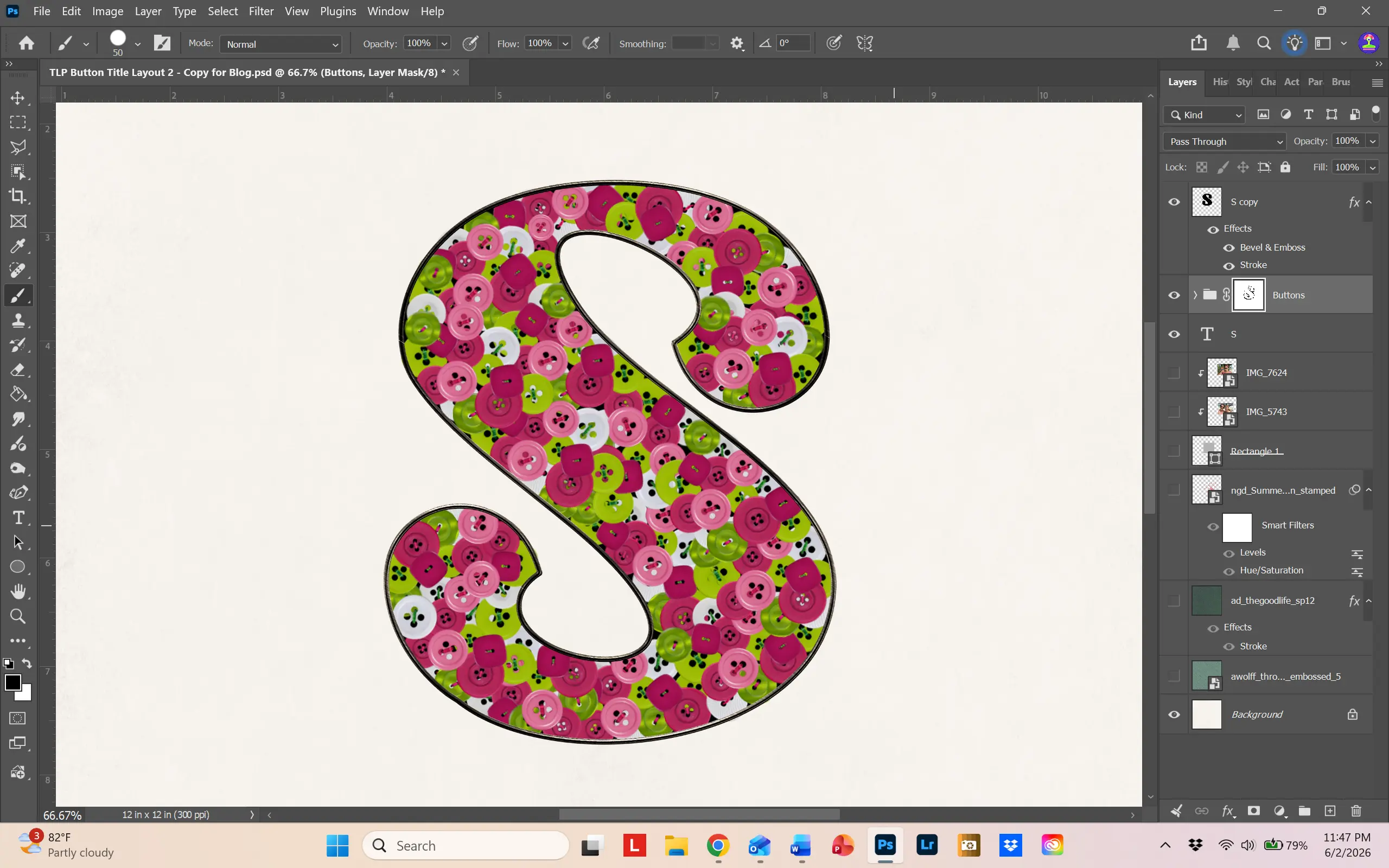
This is gorgeous way to use buttons! I always love challenges asking for a monogram or a drop cap (a drop cap is a large, decorative capital letter used at the start of a paragraph. It drops below the first line of regular text.) So the idea of creating a letter filled with buttons really got my heart pumping! The technique is a little complicated, so I’ve provided step-by-step instructions on how to create my button monogram letter.
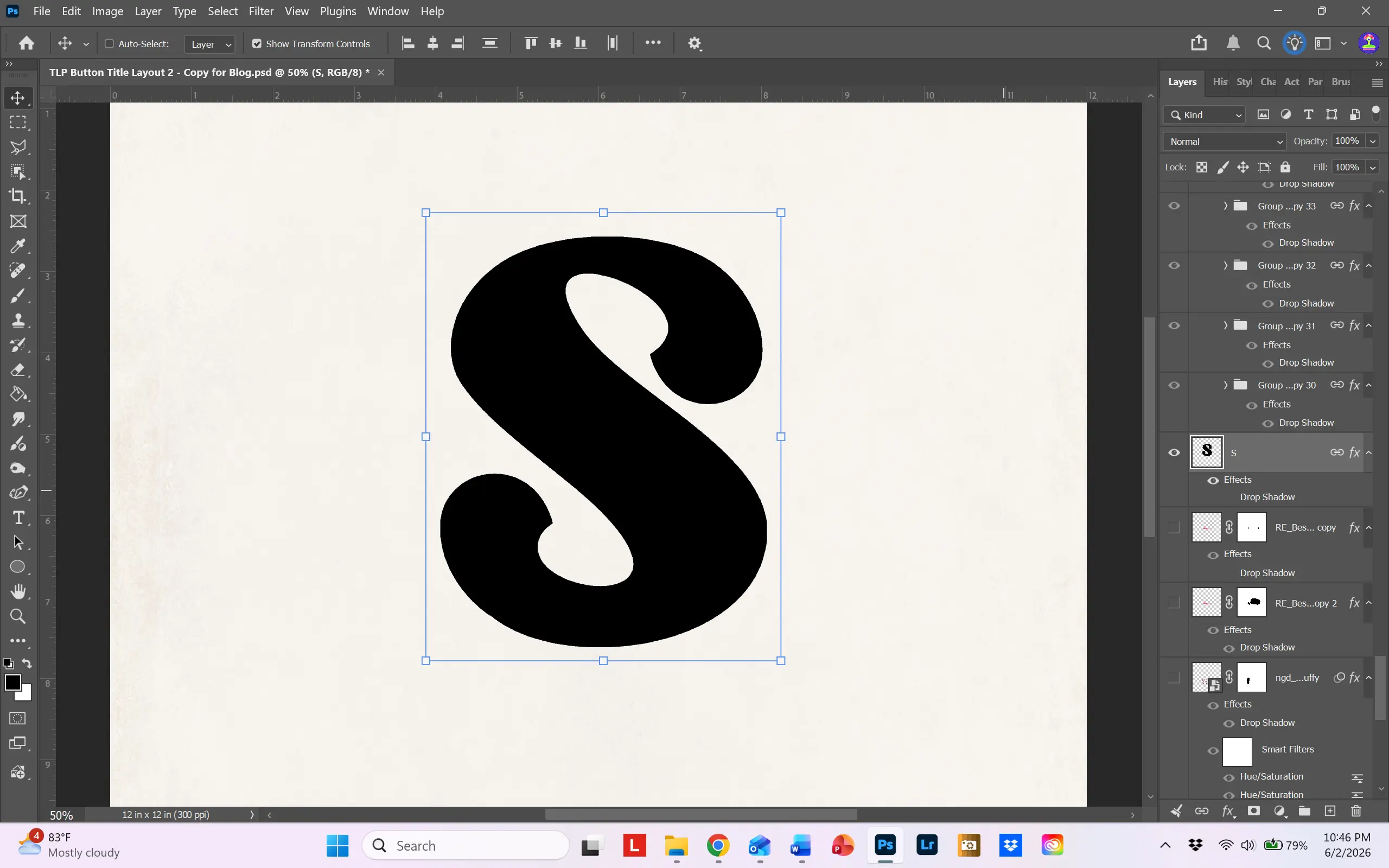
Step 1: Choose a font that is big and black. I chose the font Ragwort. It’s a free font and can be found at dafont.com. https://www.dafont.com/ragwort.font. Make it really big so you can work with it.
Step 2: Choose your buttons and recolor as desired. Again, I used Sahlin Studio’s Jolly Ole’ Buttons. This product is so versatile! Place them on your page and arrange them in a cluster. The buttons should be close enough to cover the black layer underneath. Don’t worry about the holes in the buttons.
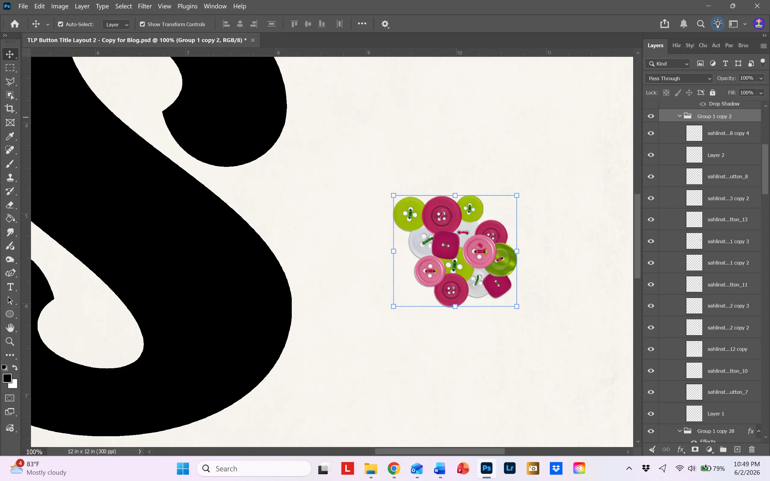
Step 3: Select all the buttons, right click on them and choose New Group from Layers. Once you have your group of buttons, select the group and make about 20 copies. Make sure that the “Auto Select” box at the top left of the screen is unchecked, and select a group. Move it around and start filling in your letter shape. Don’t worry about buttons hanging over the edge; we’ll fix that in the next step.
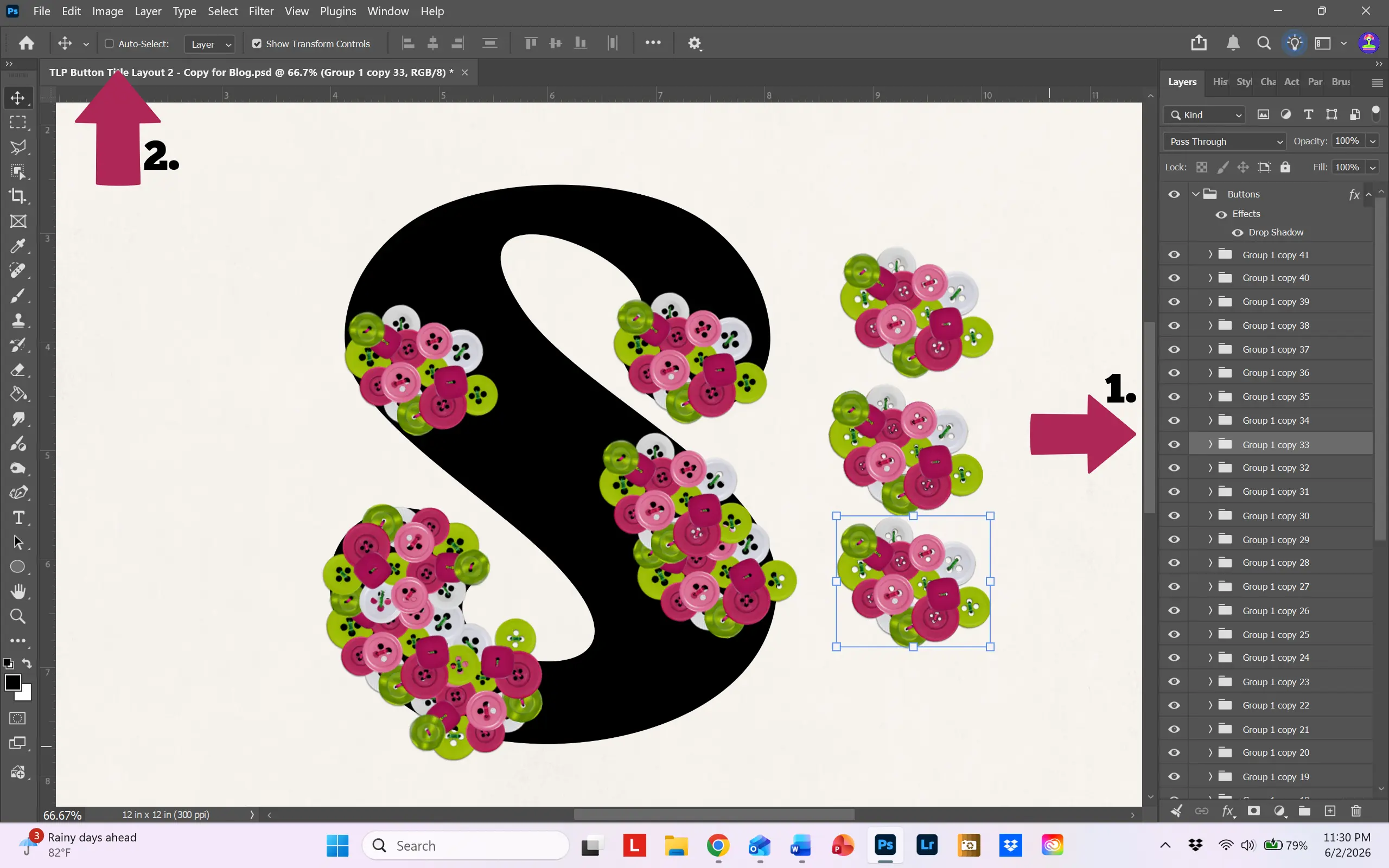
Step 4: Continue placing the groups until the entire letter is filled. Then, check the Auto Select box and move the individual buttons around, moving them close to the edge of the letter and deleting buttons you don’t need, until you are happy with the look. Delete any extra button groups.
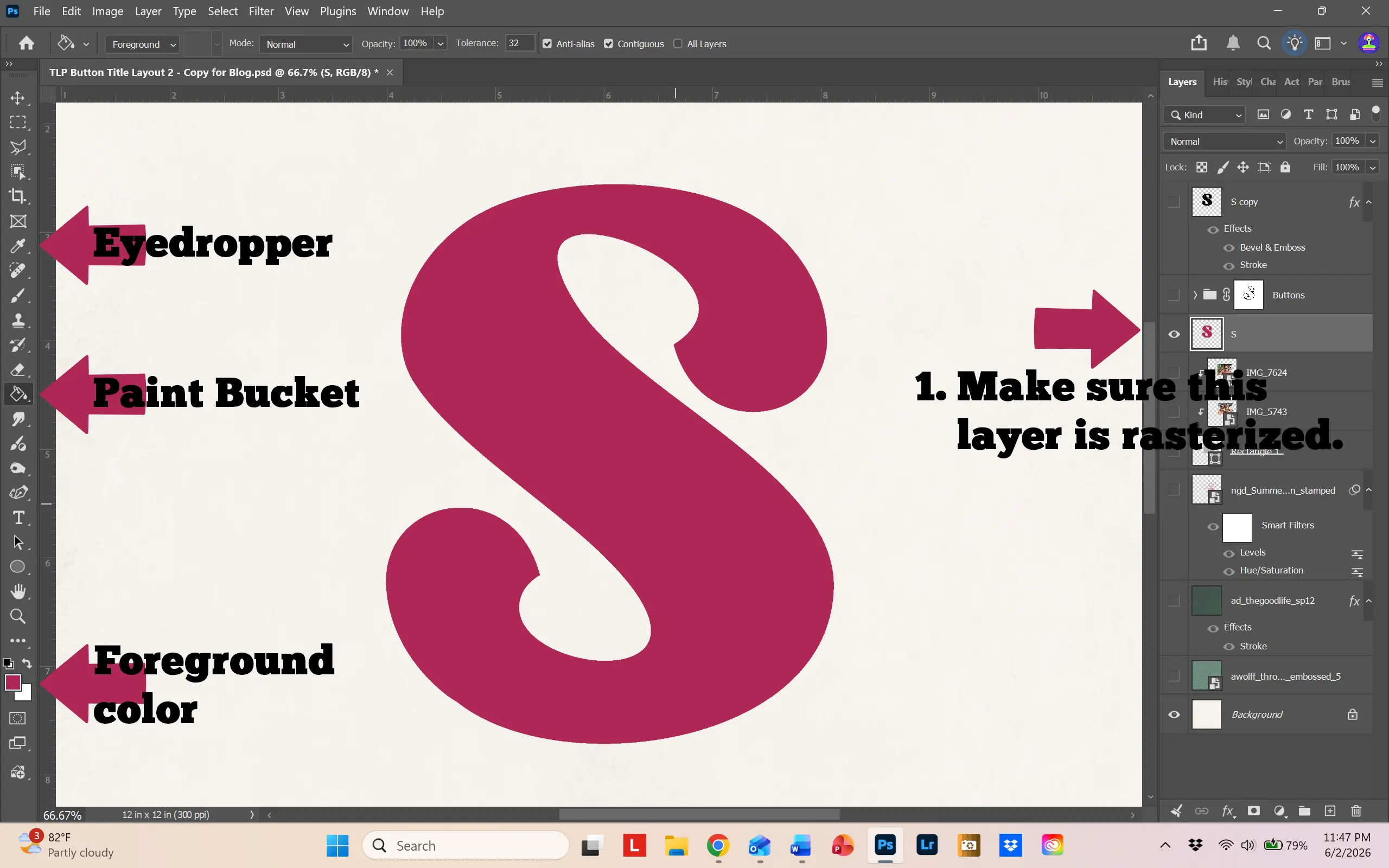
Step 5: Make a copy of your original letter layer. Move it to the top of your layers. Rasterize the layer by selecting “Rasterize Type.”
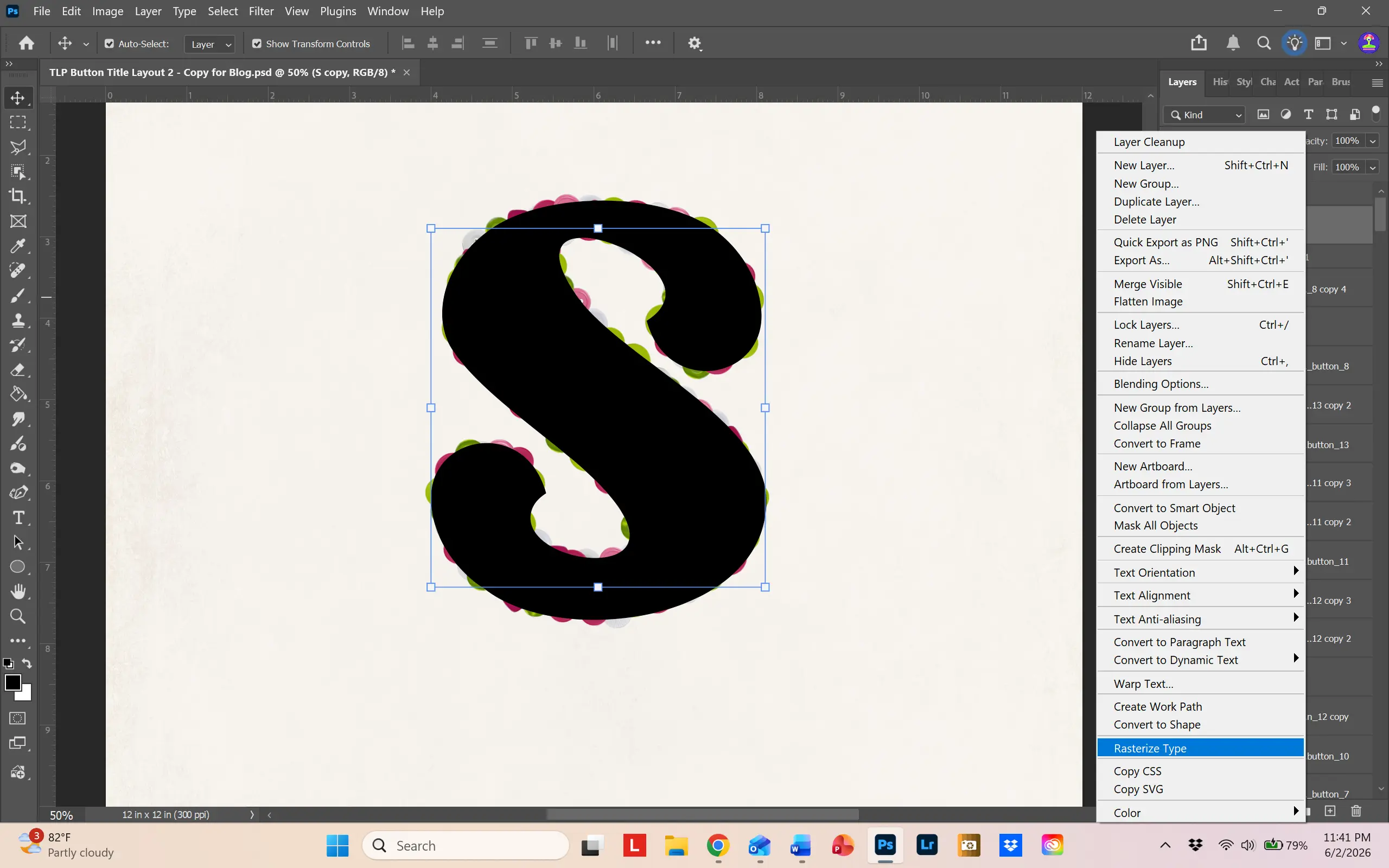
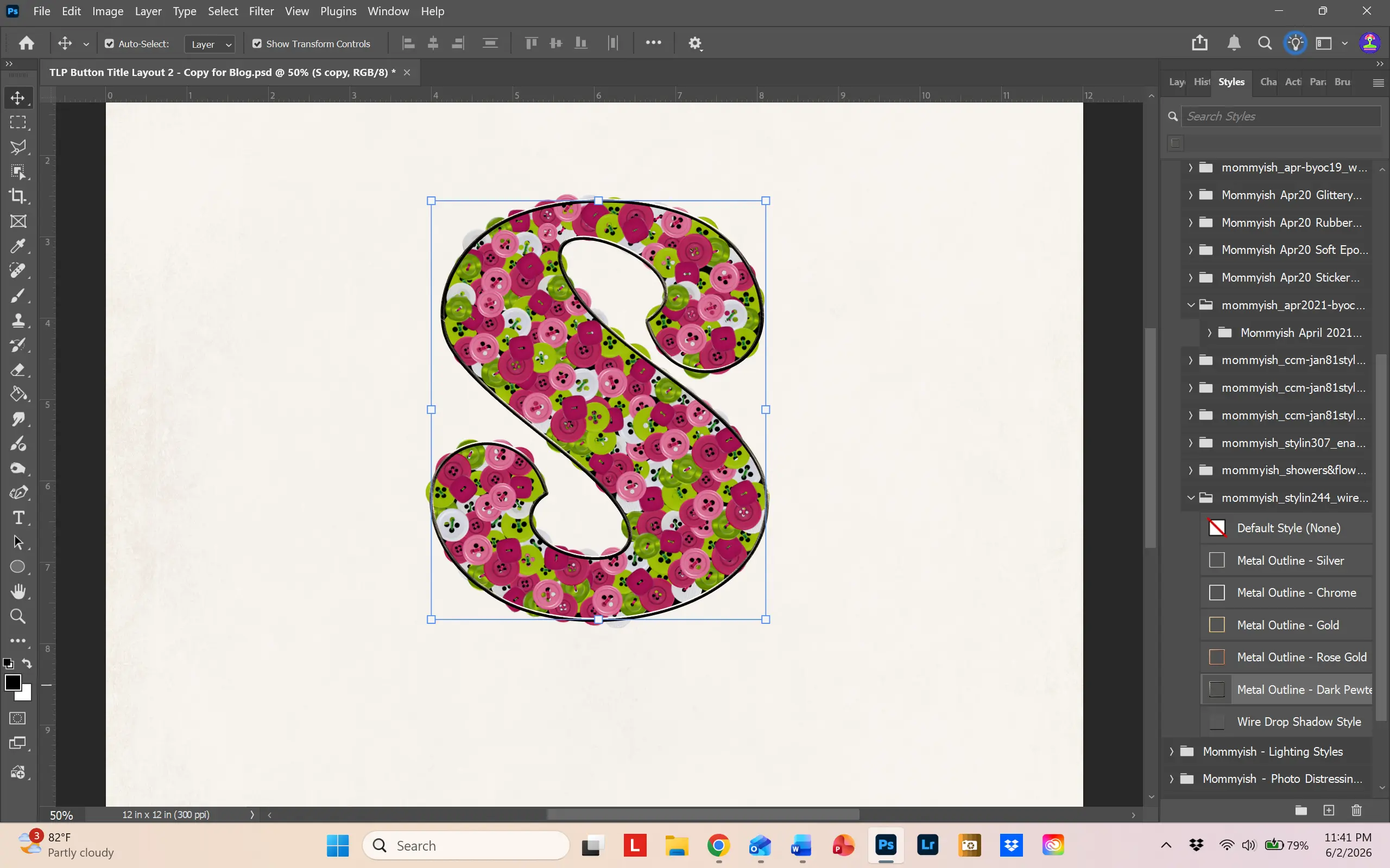
Step 6: I wanted a frame outline to hold all the buttons together, so to speak. So I used Mommyish Stylin’ #244 – Wire Outline to create a metal outline. Be creative – you can design any type of “frame,” whatever style you like, whatever color you like.
Step 7: Make a master group of your buttons. Select all the groups, right click on them and choose “New Group from Layers.” I named mine “Buttons.”
If you look at the image above, you’ll see that there are buttons sticking out from underneath the wire outline. We need get rid of those overhanging buttons. To do this, we will create a layer mask and brush them away. To do this,click on the master group (which should be just under the wire outline letter) and add a layer mask. You can do that by choosing the little camera icon at the bottom of the layers panel.
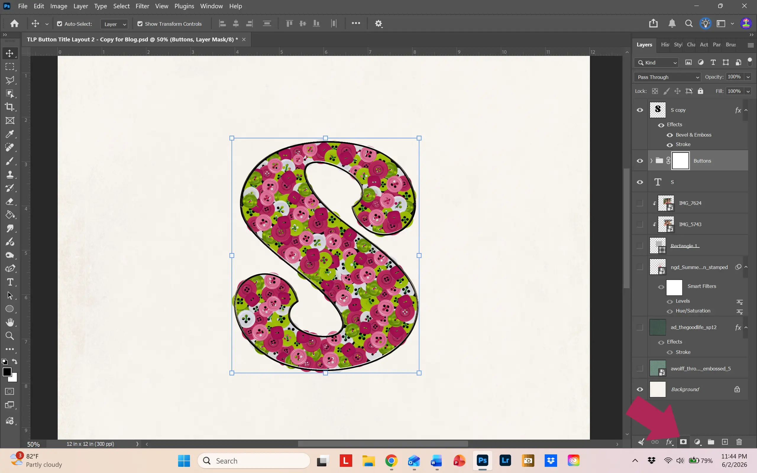
Select the mask. Making sure that your foreground color is black, choose a hard round brush and begin to brush over the overhanging buttons. If you make a mistake and delete too much, press CTL/CMD Z or change your foreground color to white and brush over the area to restore your error. You will end up with a clean-edged letter.
Only a couple more steps and we’ll be done.
Step 8: Remember those button holes? We need to change the black behind the buttons to a better color. To do this, select the letter at the bottom of your layers, the original letter layer. Using the dropper icon, select a dominant color from your buttons (I chose a dark pink). Choose the paint bucket icon and click on the letter. It will change to your chosen color. Then, move the colored letter layer back under your buttons. What a great change!

Step 9: Last step – add a drop shadow to all your buttons. Open one of your button groups, double click on the far right side, and the Layer style box will open. I made a drop shadow with the following numbers. After applying the drop shadow, right click on that layer and select “Copy Layer Style”
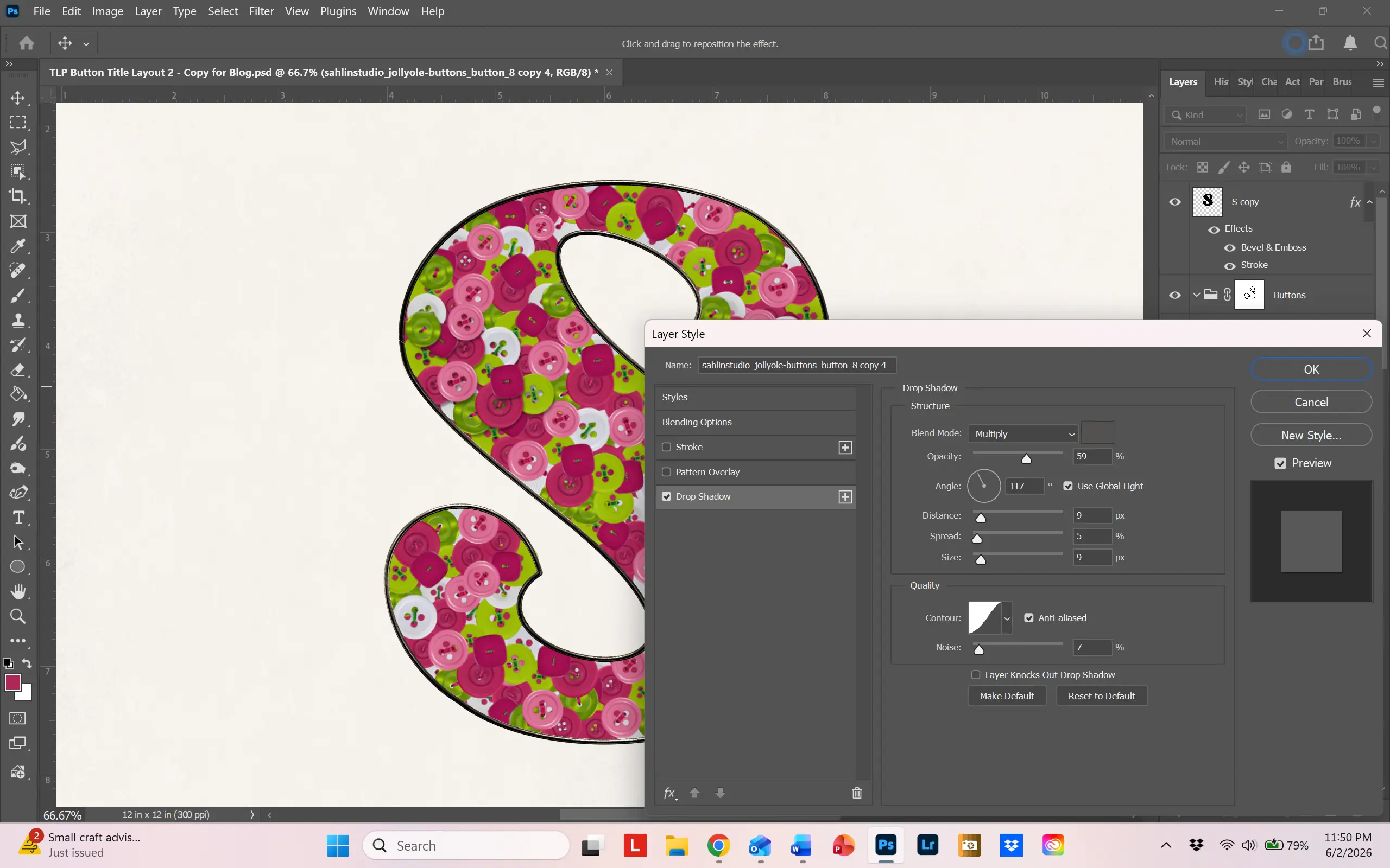
Open all your button groups, select all your buttons, right click on them and choose “Paste Layer Style.” Now your buttons have added dimension. If you notice any shadows spilling out of the outline, just go in and move the offending button further into the letter. Whew! We are done!
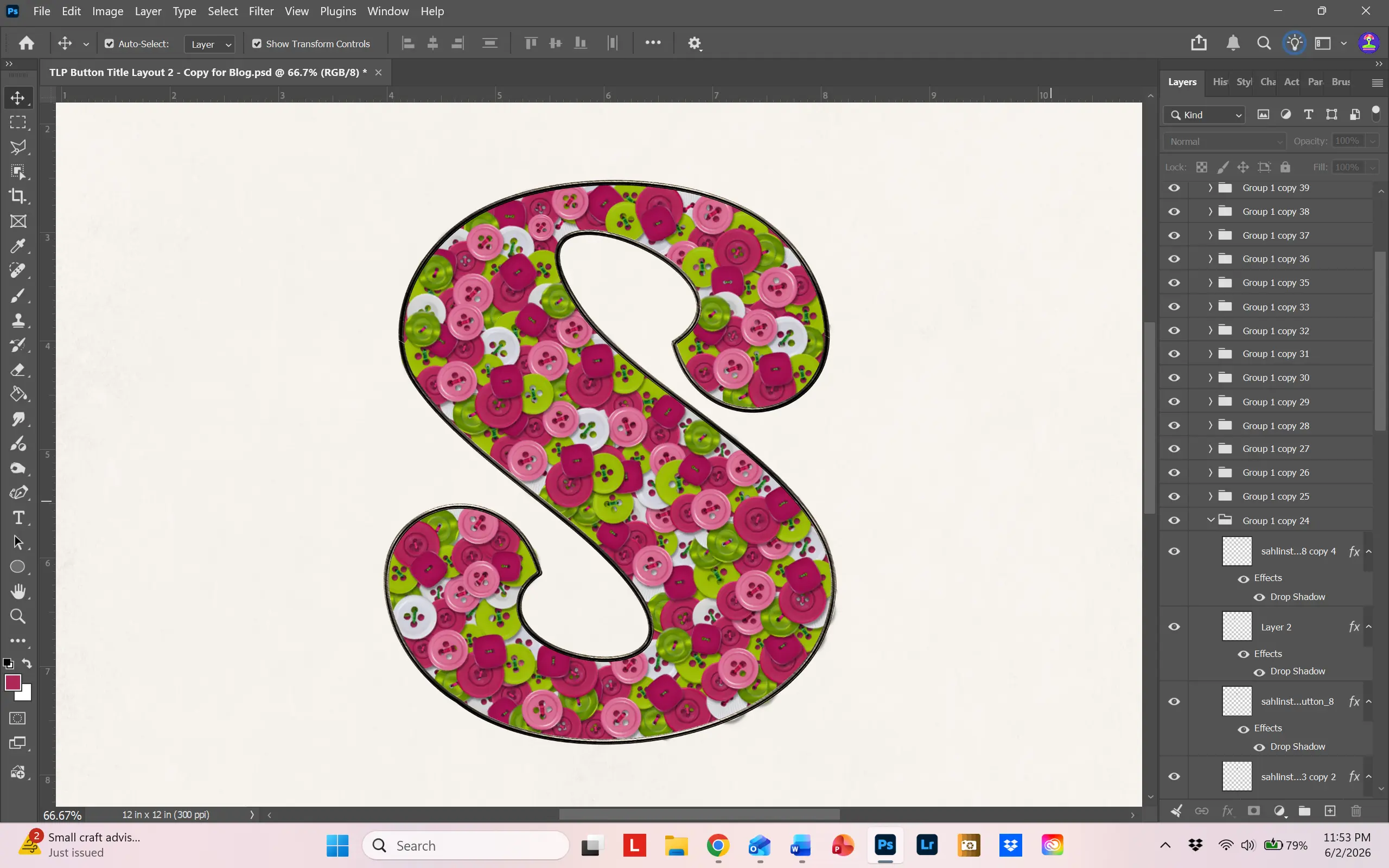
I ended up linking all the layers together so that I could move the letter around and place it where I wanted.
Buttons as a Frame
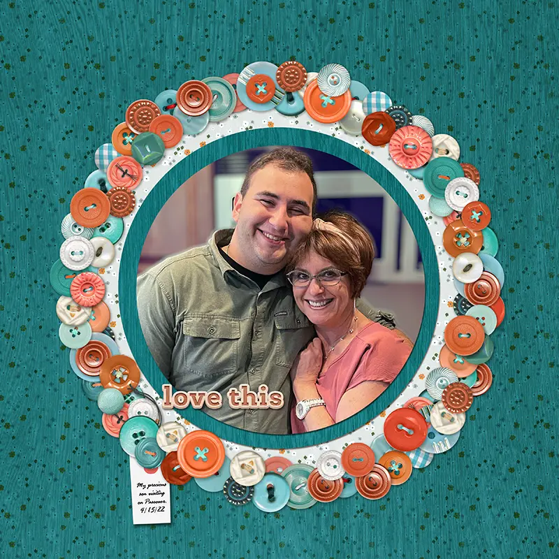
After all that work on the letter, let’s try an easier technique – use buttons as a frame! I remember back in the day when baby frames were often decorated with buttons. This inspired me to try it digitally and I love the result.
Like Polly Beth, I use a program to organize my scrapbook supplies. So, I did a search for all buttons from The LilyPad and came up with a list from which I selected about 10. Again, I recolored my chosen buttons to match my color theme.
To make the frame, I created a circle template. I simply cut out a piece of paper with the Elliptical Marquee Tool and then cut out the center of that circle to give me a circle frame placemat. After placing it in the middle of the page, I began arranging buttons around the circle. You can duplicate buttons and make them larger or smaller until you’re happy with the look. I added a drop shadow to all the buttons, giving a slightly larger drop shadow to those on top that hung over the edge of other buttons.
To finish the layout, I selected papers that would blend in with the button color theme – I wanted the photo and frame to shine on this layout. See? Fun and easy!
Buttons on stacked fabrics
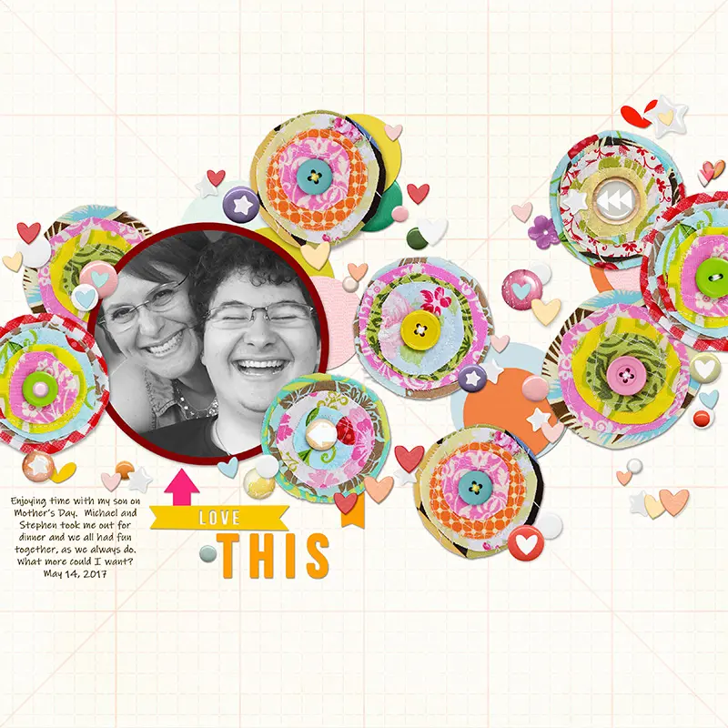
This last layout ended up being one of my favorites! I adore fabrics and when I did traditional scrapbooking, I would add fabrics to layouts, stitching away and having fun making the fabrics into elements. The texture was wonderful!
The LilyPad store has a wonderful assortment of buttons and items to create similar style elements. When I saw this collection by Sahlin Studios, I knew I wanted to use it!
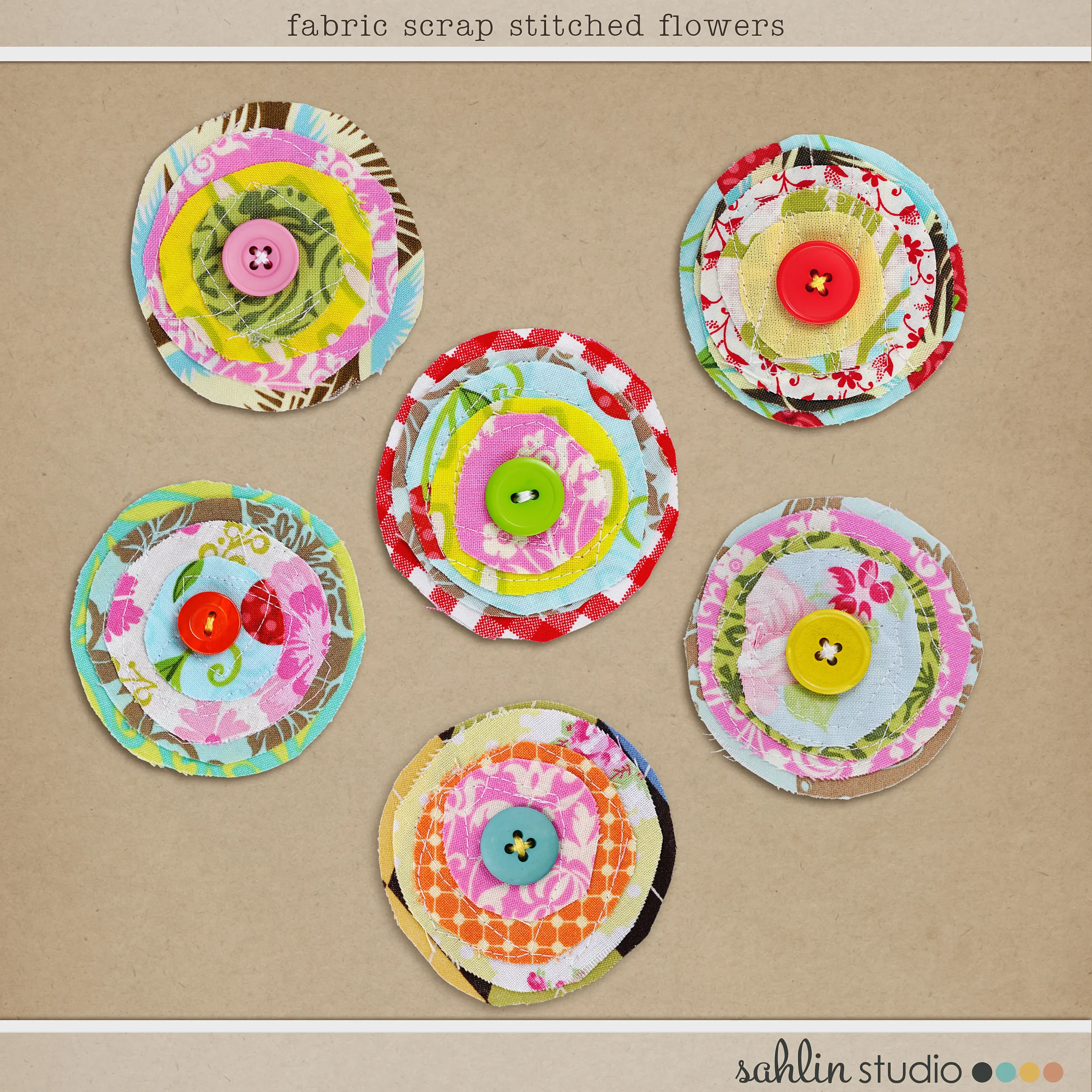
I love how she stacked different fabrics together and used stitching and buttons to fasten them together. These are perfect for small elements or for the whole page. The fabric stacks are wonderfully created, full of color and whimsy. The clusters made a fabulous background design for this layout of me and my son. To be honest, the most difficult task was choosing all the hearts and doodads to place around the fabric circles. I ended up using an assortment of sprinkles, brads and hearts from various designers. All products are listed on my page in the gallery.
And there you have it! Four fabulous ways to use buttons on your layouts. I encourage you to experiment with them and use them on layouts, journals and hybrid projects! Buttons – they aren’t just for your clothes anymore!
Deborrah / DivaMom96
I hail from Florida – yes, a true Florida native (we DO exist!). I moved to Chicago after college to pursue a career in opera, and lived in many different mid-western states before returning to Florida in 2013. Both of my sons were born in the Mid West, so they are perfectly happy here on the West Coast of Florida, since that’s where all the mid-westerners come. I met my second husband here and life just couldn’t be better.
I’ve been scrapbooking since 2003, soon after my second son was born. I loved the feel of paper, fabrics and all the different textures. I loved taking photos to put in my pages and thus was born a love of photography. I also make cards – there is nothing like die cutting and inking. I pretty much love all paper crafts. But there’s always so much STUFF everywhere! I discovered digital scrapbooking in 2015 and have never looked back.
I’m not sure I have a style. I go through different phases – one month I’m into artsy, layered pages and the next it’s all about white space. I love color and texture and strive to add it to my pages. I’m inspired by other scrapbookers. When a layout catches my eye, I try to figure out why it works and why I love it. I analyze and study. I’m also a Photoshop girl. I started using it to fix photos so when I discovered digital scrapbooking, it was a seamless transition. I’m always fiddling in it, trying to alter things, change colors, make things different. And it’s perfect for my love of photography.
If I had one piece of advice for new scrapbookers it would be don’t be afraid to ask questions! All of us were there at one time or another. I love asking questions and even if I don’t get the answer I want, it inspires me to look further. Enjoy the process; that’s what matters.

Oh man! I sure do love buttons! I still love my button jar and I also really love when designers still throw a couple of buttons into their elements! They are so versatile for the perfect finishing touches! Fabulous sample pages on here too!
They add so much to any layout. Thank you!
I LOVE this!!! Great tutorial. Thank you for sharing this!!!
Thank you so much!
Some great ideas here, and I really appreciate your tips on recoloring a button and on making a button title. I love buttons! I think they add charm and realism, and can make a digital layout feel warmer/more organic
What a great idea post! I love all of your suggestions and I’m going to try them!