Beginners Mixed Media: Torn Papers
For some of us, there is nothing more nerve-wracking than attempting a scrapping style out of your comfort zone or more daunting than a blank canvas with infinite possibilities.
(OK, yes, I’m talking about me personally but I’m sure this applies to others as well!)
So in this blog series, I’m attempting to make Mixed Media less daunting by giving you (and me) some jumping off points. Where to begin with digi – mixed media scrapping? Right here for Mixed Media Beginners!
Last month I used a ready-to-go premade collaged paper background and this month I started with the idea of layering a lot of torn newspaper and ephemera paper, adding some light paint to basically glue it and blend it, to essentially make my own digital mixed media background, inspired by some real life mixed media backgrounds I’ve seen in passing. But as you know, I usually need the kickstart a template provides me with so that’s where we start once again today.
Torn dictionary and book paper is a common addition to mixed media scrapbook layouts, with or without gesso and paint, as either a base or element layer in the real world.
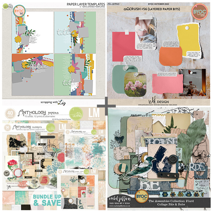
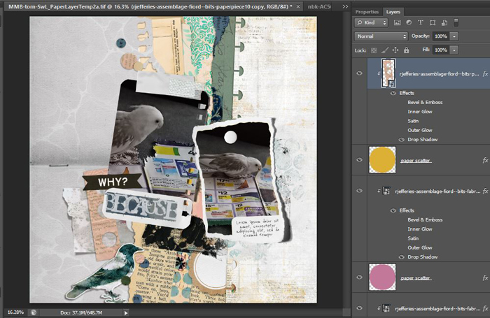
If I had bought ‘real’ scrapbook paper, I’d be too scared of ruining it to physically rip it (or even cover up an inch with another product sometimes) but digi tearing and clipping masks and non-destructive editing (and the ‘undo’ option) mean I can tear anything but doing that myself to make it look authentic with brushes is a process, so the products and template pack I picked today were with that in mind .I’m starting with Scrapping with Liz’s Paper Layer Templates, and also, because I wouldn’t dream of tearing a photo in real life but it is virtually risk-free in Photoshop, I’m using NBK Design’s artCrush 56 Layered Paper Bits from the new October BYOC to give my photos that instant torn look. Here’s my photos on the NBK templates added into the SWL template. (The NBK templates come as layered files with a color mask if you want to give your photos a tinted look and the shadows are already ‘tweaked’ on a separate layer but you can turn both of these off to customise it yourself).
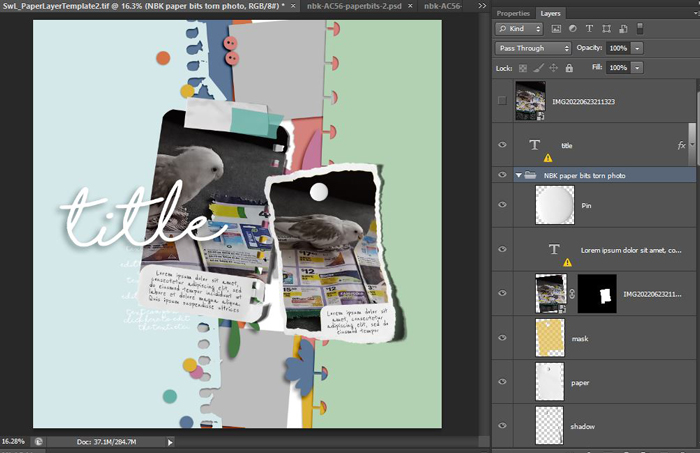
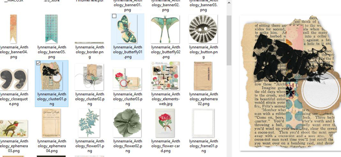
Now the paper tearing is mostly as easy as clipping papers to the paper layers in the SWL template with it’s torn and notebook edges and using a mix of pre-torn pieces from Rachel Jefferies’ The Assembles Fiorde Bits & Bobs pack. I’m mixing it with LynneMarie’s Anthology Collection which has some pre-made clusters in the element pack (as well as the individual pieces) that look so good I have to show you.
So this is everything I’m using together.
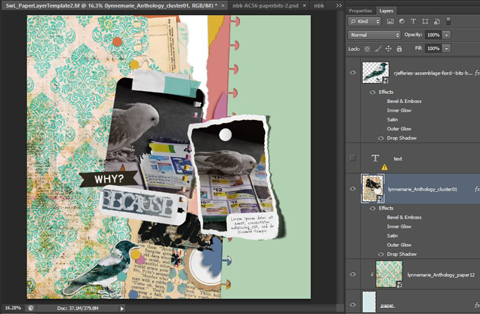
And here’s my work-in-progress now including LynneMarie’s cluster, the torn book paper gives me the newspaper style I was originally thinking about.
Keeping it real: At this point I really wasn’t feeling it and this happens to me every once in a while. When the creative process usually brings you peace or joy, this can be frustrating and annoying but switching paper positions often makes me feel better and I always try to understand why.
So here’s my ‘why’ for this page. The warmer tones of the papers (the aged creams) as well as the colour of some of the template layers themselves, compared to the colder tones of the white and greys in my photos was the reason. I love that teal flourish pattern but it was too heavy for the busy layout and because of the warm cream base it pulled the overall colour scheme of the page into the warm zone, clashing with my photos. This is something to keep in mind as a template or scraplift scrapper, sometimes the colours of the template or the inspiration piece can throw me off, but I never bin my page in frustration. It can always be improved. Warm and cool colours can mix but I wasn’t getting the balance right.
At this point, with the papers shuffled to keep the warm tones flowing down the centre of the layout, I remember part of the reason I picked this template was the confetti fits my ‘feathered paper shredder’ theme of the photos too and Rachel’s elements include some ‘punchinella’ (the leftover pieces from confetti making) so I tucked those in too and used some of those papers clipped to the individual confetti pieces of SWL’s template to keep it cohesive.
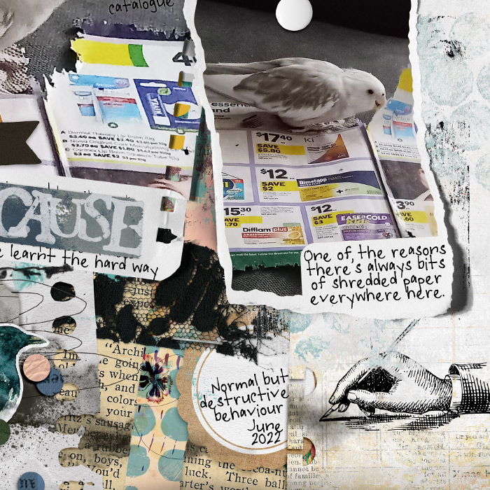
Now after some of the (in real life) wet kind of media, I’m all done! Some inky stamps, scribbles that extend the body of the bird into the page as well as guiding the eye down the page, journalling and paint. This is a close up of some paint blending the layers under the right torn photo with the lace and scalloped tag cluster like I had originally been inspired by, it’s white with subtle blue dots painted over the top and echoes the aqua paint behind the left photo.
If you have been following this Mixed Media Beginners series, you know this has been a process of experimentation and realisation for me. One thing I’ve realised has been that mixed media pages don’t have to be full of full-on colour, pattern and contrast. Mixed media pages were visually jarring to me initially but they can also be subdued and more delicate (which maybe everyone else already knew) and I started feeling making this page.
Anyway here’s the final mixed media page. See you next month for more Mixed Media Beginners.


