Ways to Use Artsy Kits for a Traditional Style Layout
POV: Sometimes I’m drawn to a kit just by a few elements in the preview and have to have it, but then feel bad for the rest of the kit that just sits, life purpose unfulfilled on my EHD.
If you can relate and want some ideas on how to work with more Art Journal style kits in a more traditional way, this post is for you (and me, if only to justify indulging in these kits more often when those must-have preview pieces catch my eye!) I’ve already blogged about working with AJ style templates as a more traditional scrapper here so this is kind of an extension of that thinking. While these sorts of kits are full of awesome texture and artsy goodness that I appreciate for their papery real authenticity, if you want to use them in a less artsy way, it’s still possible.

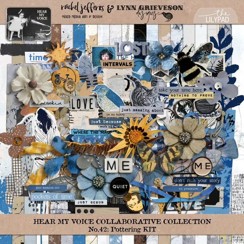
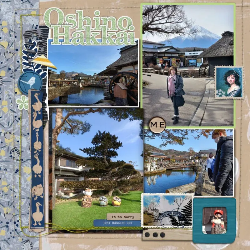
I played with Lynn Grieveson and Rachel Jefferies | Hear My Voice: Pottering kit this week and documented some of the ways I worked with it to create a ‘less messy’ page. The following is a bunch of ideas, in no particular order, so that you can use, re-use and repurpose parts of a kit or your stash that may have been to art journally for you to use.
- Consider your arrangement. Rather than angled and interesting crops for photos or paper pieces that are often design features of artsy pages, stick with tried and true grids and straight lines to anchor your page design in your photos and clusters. Use matting and frames to give your photos that traditional treatment.
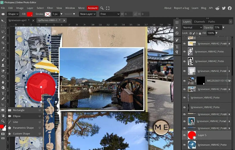
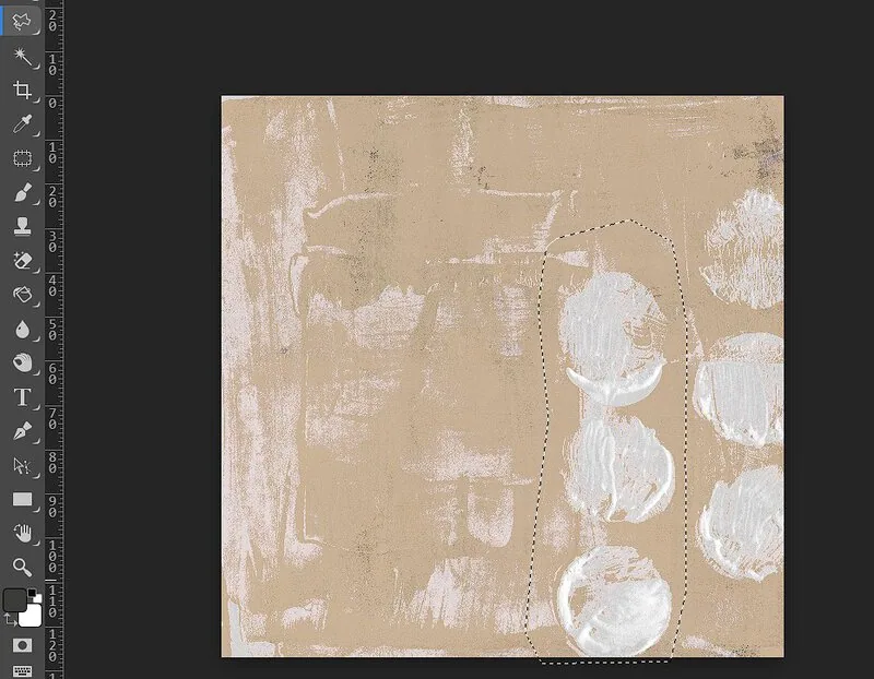
- I used a simple border piece of patterned paper from the HMV kit and made a cluster along that edge to keep it simple. I arranged my photos clustered together in a basic grid then added linear pieces from the kit like the postage stamps to accent and expand it. The rounded corner frame from the kit also softened the grid but wasn’t quite right so more ideas coming up!
- Crop it to clean up edges There’s often a lot of freestyle shapes that look hand-cut or have torn edges in artsy element packs. One way to see the elements as more traditional is to crop them into more traditional shapes – so instead of freestyle or torn edges, a cleaner circle crop for example.
- I just made a new layer and dragged a circle over the top of the bird element that covered the area I wanted and then used it as a clipping mask, effectively cutting off the ‘perfectly imperfect’ wonky edges. I used a similar method with the Polygonal Lasso to trim the torn yellow stripe piece into a triangle to still use it as an arrow and pop of colour
- Sticker-ify it! While some stamps will look perfectly traditional, for some mixed media including stamps or doodles, you can make it a more traditional item like a diecut or sticker or adding it to a ‘traditional’ label or tag then shadowing it or layering it among element clusters.
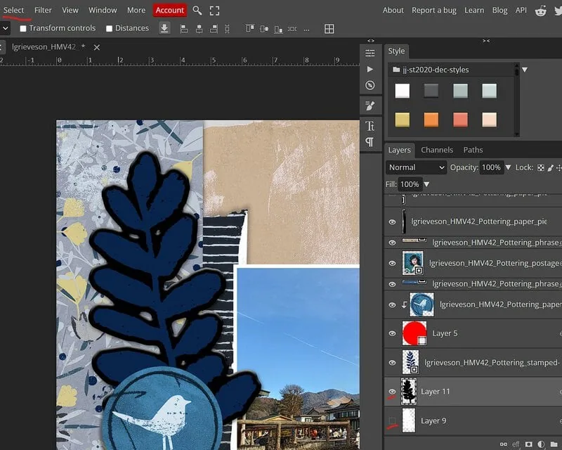
- There are styles and actions that can help you achieve the sticker look in a range of ways but I just tried to DIY this one and used a white-ish stroke on the leaf stamp… then when that looked a bit dodgy, because of gaps in the leaves as you’d expect with stampy texture, I created a new layer under the leaf and ctrl-clicked the leaf doodle to get marching ants around it’s outline, then went to the Select menu and Expanded the selection to give me the border area (you can see in black in the below screenshot) and then selected Smooth to make the edges less jagged, filled it with white and added a slight bevel and shadowing. (It’s shown here as Layer 11 in black so it’s a bit clearer but my end result uses Layer 9 in white).
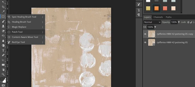
- Restore it! If there’s paint or stamping that isn’t exactly where you want it on a paper or element, we have the technology to can make things less messy! Even with AI there’s some trial and error involved but Spot Healing Brush or the Patch Tool can remove some of the imperfections or mixed media depending on what exactly and how large the issue is.
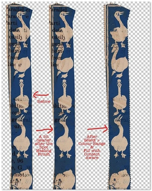
- I used a few methods including Content Aware fill to see if I could remove some of the text on this duck element (one of the pieces I really loved in this HMV kit) to make it more about the ducks, less about the text. (If there’s a transparent background, ctrl-click the element first to keep the ‘fixing’ to within the bounds of the element. Spot Healing works when you want to change smaller issues or sections. (I have a lot of screenshots on the steps for text removal with Colour Range if you want more info on it but there’s sliders and trial and error involved when the text is not a uniform consistency or opacity)
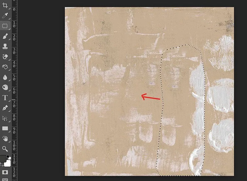
- For the background paper, I used Spot Healing Brush near the top before putting in my titlework near the end but you can use the Patch Tool like this. Just using the mouse to circle a random area you want to replace with the Lasoo to get marching ants and then activating the Patch Tool and dragging that to a section of the paper that is more suitable. It won’t be perfect but given this layer often is covered in photos and other goodies, it’s another trick to have up your sleeve. Think of it as real life cut and paste collage with paper.
- (If I had been paying better attention in the store, I might have seen there’s a coordinating solids pack for Pottering that’s sold separately as well as bundled with the kit that would mean I wouldn’t have even thought about this step, I would have just substituted a more solid background but using a Kraft or alternate from your stash is a quick option as well, depending on how organised your stash is…)
- Style it! Use a layer style to keep the shape or element but give it a more traditional look – make it a glossy epoxy or change the style of the wood from rustic to Scandi inspired pale wood – whatever works for your page!
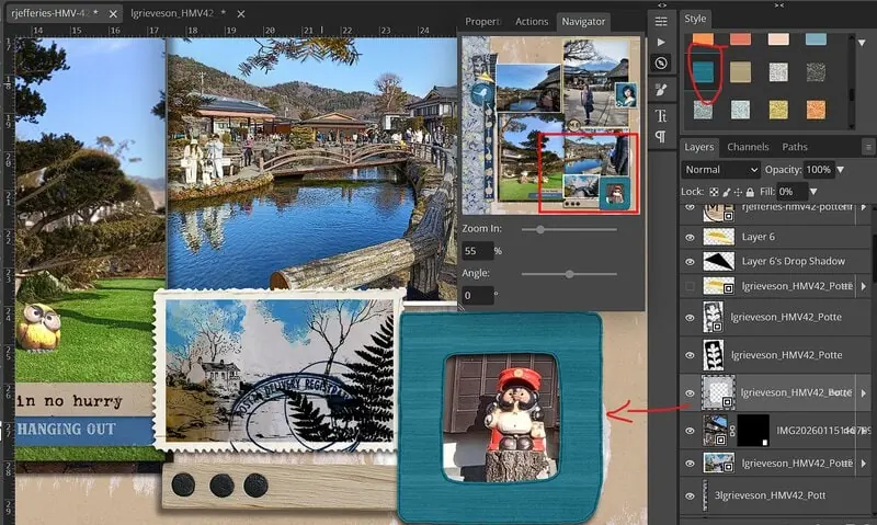
- Here I’ve used one of Just Jaimee’s styles from an old BYOC to give the frame at the bottom a new look in a textured stripe blue that goes with the HMV kit tones. Same bones, more traditional look! (This pack from Storyteller Dec 2020 might be in your stash but the Styles category is a treasure trove in the store)
- Shrink it! Scale down anything to make it less distracting and also to give you more negative space that can give your photos more space to breathe for a traditional page
- I shrunk my side cluster for example to about 80%
- Mix it! Use Artsy kit pieces selectively with traditional elements or solids to soften the overall artsy effect – add in a few traditional labels or alpha or switch messy stitching for cleaner stitches or staples.
- Using one of Kim Jensen’s Hello Spring alphas tied this together with it’s sticker effect edges, repeating the doodled leaf sticker idea for consistency; and I added ‘cleaner’ lower contrast stitching from Sahlin Studio’s Stitching No.1 pack , so it has a border that is a common design feature in traditional page but it is less distracting from the photos and harmonises more with the page as a whole instead of using high contrast, dark messy stitching.
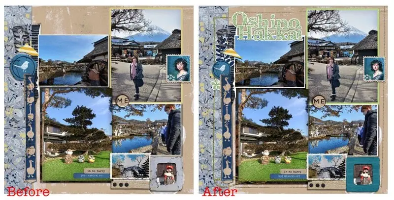
So here’s my Before with the pieces from HMV Pottering as-is and then my final page as the After. All the tweaks and ideas went to give it a bit more polished look. Hopefully I’ve shown the traditional potential that artsy kits can offer if you’re less of an artsy journaller and a more traditional scrapper!


Thanks, Justine!!! This is such a great article! I love fancy and mixed media kits for “regular” digital scrapbooking. This gave me a few more ideas of how to use them.
This is a wonderful idea for an article and I’m glad that you wrote it. We can be tempted to look at a style of kit or bundle and think we have to stick with that when using it for one of our layouts or art journaling projects. But we don’t have to bind ourselves to those types of rules. I love using kits in the opposite way.
Super Justine!!
I really appreciate your suggestions here. The “Sticker-ify” and “Restore” techniques are new to me, and I think I might actually give them a try! I love how you altered that duck element.
I love these ideas! taking bits out of some of Rachel and Lynn’s papers is pure awesome! I love to take an artsy doom and sadness kit and go another way! I recently took Pixel Giraffe’s World Upside Down ( a kit I specifically bought for a time in 2024 book)-but it has this way cool “broken” word art that is so much like graffitti, I used it on a page of my son’s broken scooter he was working on. It flowed!
[GALLERY=media, 607217][/GALLERY]