Scrapping Secrets: Using Photo Masks
Hi there! This series spills some of the secrets and highlights some theory, problems and solutions behind the amazing scrapbook pages you see in the gallery. Sometimes scrapbooking involves problem solving just as much as creativity and you may find these secrets help you with your own pages, especially if you feel like you are at a roadblock. Nobody’s perfect, some of us just know a few more tricks and soon you will too!
______________________________________________________________________________________________
This month in Mixed Media Beginners, I featured photo masks as a way of giving your photo an artsy look and today I’m back with some tips and tricks from myself and other team members and TLP designers for using them on your pages. If you missed it or just want an overview of how to use masks and the different kinds already available in the TLP store, make sure to check that the Mixed Media Beginners post.
- I asked the team 2 questions about masks and got so much information that this post will only give part of it! I’m going to limit the information in today’s Secrets to masking photos only.
Q1. What are masks great for?
Literally so many things!
- Blending photos onto papers
- Blending papers …
- An instant journal spot on a busy background paper …
Ok… just for photos…
- Making a photo feel special or magical!
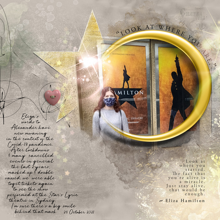
The way this photo ‘fades’ into the star with the sparkle brush on top – pretty magical to me!
- Making ‘less than perfect’ photos look like they are actually better and just meant to be that way!
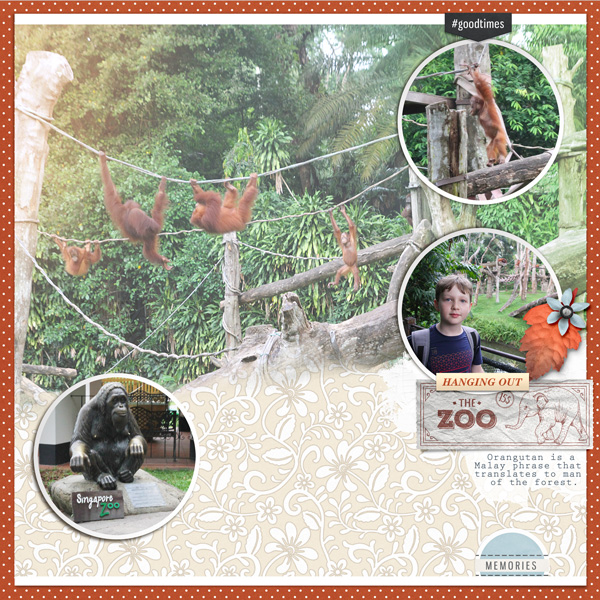
(Shh don’t tell anyone but the mixed lighting in this photo, the movement of the orangutans combined with the distance we were from them, made for a photo I didn’t love but if I had made it small to minimise the imperfections that way, the baby following his family wouldn’t have been so noticable; but now it just looks like an artsy part of the story! )
- A painted mat layer for behind a traditonal or framed photo. You don’t have to use it to clip a photo to a photo mask, it can still anchor it.
- Giving your photos an instant ‘painted’ look.
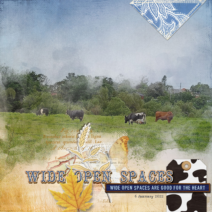
In this page, clipping my landscape photo to one of NBK Design’s Remembrance masks makes my photo look like it is a watercolour part of the background in just a few clicks.
- Using a photo mask to blend one large photo into the background can still mean a smaller photo used traditionally is the star.
Usually what is the largest would pull more focus on the page, but having it fade into the background means the more solid, smaller photo with the tag cluster has more visual weight and less competition for being the focal point here.
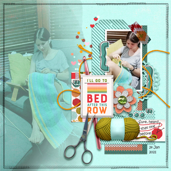
- Photo clipping masks are great for cropping or fading out parts of a photo because of odd or distracting elements in the background.
Courtney (bestcee) showed me this page of hers as an example. She said of the bottom right photo, ‘I think the lights behind me are very distracting and pull focus from us, especially me.
Instead of a full crop, I just used a blended mask from Lynn Grieveson (part of the Darcy template). Ta-da! The lights are minimized and pushed to the background.’
Now on to some secrets to success for using photo masks…
Q2. What do you wish you had known (about masks) when you were starting out to give your finished pages less of a ‘beginner’ look?
- Rae (Bcgal00) said she wished she knew earlier on that if a photo doesn’t extend over a mask as you would like, you can choose a brush to fill in or extend the mask. This is similar to what I did in the Mixed Media Beginners post here to make the area of the mask over my daughter’s nose less distressed. You can use the same technique around the edges of the mask if you need it to stretch a bit further.
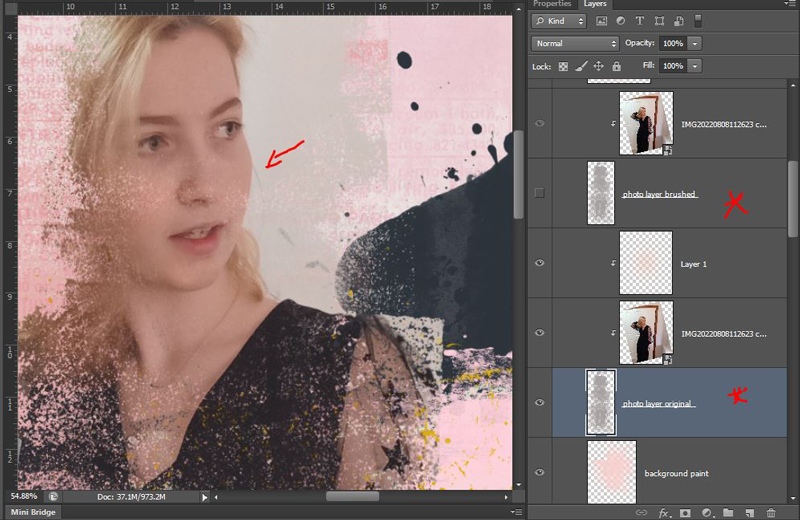
In this After, you can see her face more clearly but you also see the area over her neck is more solid after I filled in the mask layer more with the sponge brush too.

- Cindy (scribbler) also mentioned that you can use a soft eraser to lighten portions of a mask that are too dark. So the reverse to what I did above. If I wanted her dress to be less visually heavy because it is black on a light pink background, then I could have added more distressing or erased parts of the mask just using a brush or eraser on low opacity (and the Undo button if I did too much all at once!)
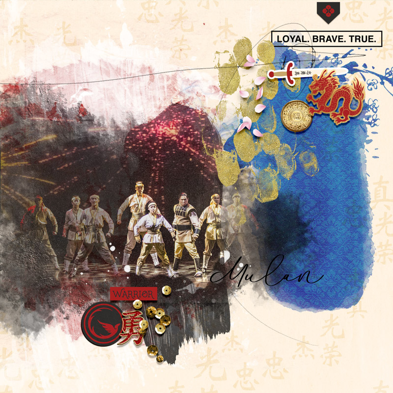
- You can clip your photo to multiple mask layers and vary the opacity of each one to give a more watercolour effect like Polly Jenn (jk703) inspired us to do on day 8 during the MOC. There are lots of cool examples of this in Jenn’s post. You can also use this technique to change the focus of your photo using blend modes.
To make Mulan the star here but still keep the other warriors from the stage photo for context, I clipped the same photo to several different paint masks and made sure she was over the highest opacity paint mask.
- You can change both the opacity of the mask layer itself and the photo layer seperately to give different effects.
Reducing the opacity of the photo layer will make some of the mask colour come through onto your photo. If you reduce the opacity of the mask, more of the background paper colour and pattern will show through. This means you can have, for example, some polka dots added through your photo like I did on the sides here
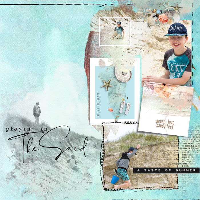
- For an instant nostalgic look, try changing a photo to black and white before clipping it to a mask. It can give that ‘dream sequence’ feel to a photo, like they use in the movies! Here under the title, it feels like the start of a dream sequence, recalling this day at the beach.
You can also use Burn or Multiply blend modes on the mask with a solid paper below it to give you a tone on tone look.
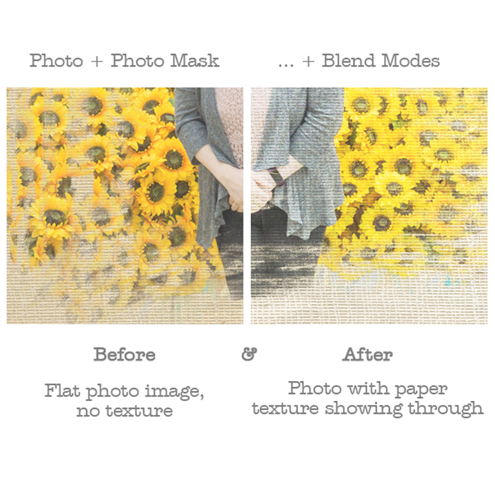
- I love this tip for adding realistic texture to your masked photo from designer, Rachel Jefferies –
- ‘ After you have clipped a photo to your mask, don’t forget to try and bring some texture through from underneath – if you had a solid paper underneath for example, you could apply a darken or multiply mode if you were scrapping on a white paper, or you could duplicate your paper from the back, bring it above the final masked layer, desaturate it and use it as an overlay with a soft light or overlay blend. This adds more realism and makes the photo feel like it’s really been transferred or painted into the original background’.
And you know I’m all about digi looking real, so here’s what that looks like.
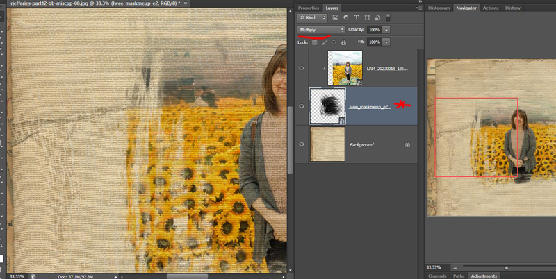
I’ve grabbed a Mask Me Up mask by LiLi Wee and pre-layered background paper from Pocket Art_Basics Backgrounds 12 by Rachel Jefferies – you can see the paper section I have the mask sitting over has a canvas texture and the mask has a messy painted, brush stroke look to it.

Just right clicking and selecting ‘Create Clipping Mask’ on the photo layer clips the photo to the shape of the mask layer below it. The photo does not have the canvas texture look to it – yet.
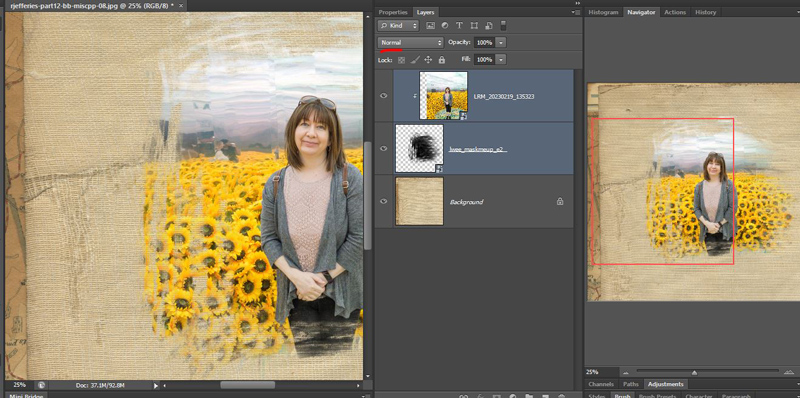
Now just by using a Mulitply blend mode on the Mask layer, like Rachel suggested, see the difference? That canvas texture wavy grid comes through the photo. (You can soften how much it comes through by reducing the 100% slider). It’s also changed the colour obviously because the background is not white. I don’t mind it but I also wanted to try Rachel’s next step so…
additionally, after duplicating and desaturating the paper (converting it to black and white) and dragging it to the layer above the mask….
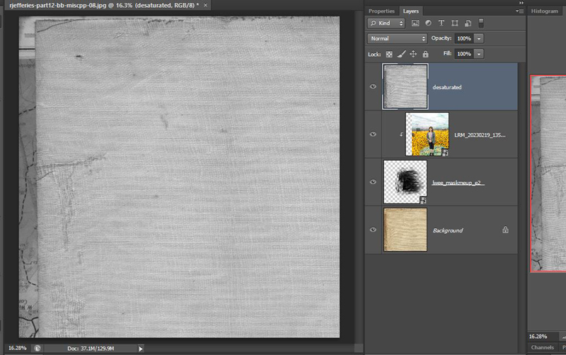
and changing the blend mode to Overlay, I got a lighter effect. This is a lot closer to the original photo colour and blends pretty seamlessly into the page, you can see the texture and creases coming though!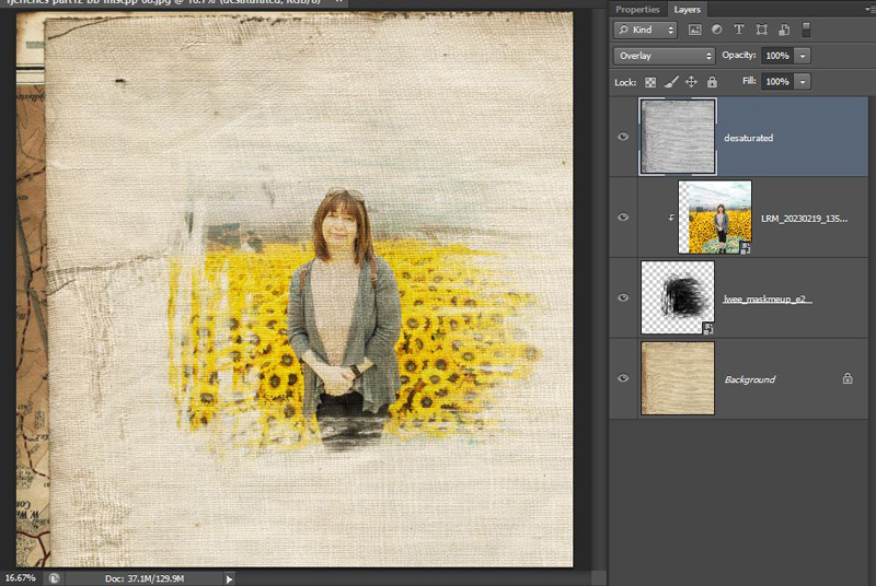
Because of how layers work, anything on a top layer will effect everything underneath, s0 then to make sure the paper stays the original colour, I clipped the desaturated paper to just the clipping mask as well which you can see with the 90 degree arrow.
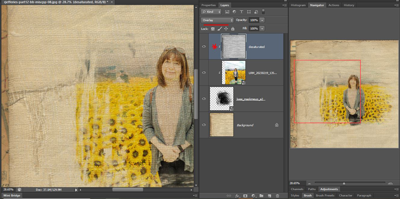
Here is the side by side, close up for comparison.
- (Another way to achieve the underlying paper texture coming through your photo mask is similar to the technique we have talked about in the forum and on the blog before, affectionately called ‘Friends don’t let Friend’s Fonts Float’. Using the ‘Underlying Layers’ sliders in the Layers Palette in Photoshop. Christa (cfile) has also made a style for this, available in this thread. (It is known to work in CS3+ and PSE11 if you want to check it out and have a go!)
Well if you stuck with me through all of that, you must be exhausted too but you might have a few more secret ways to level up your layouts!
Did I miss any things photo masks are great for or got a tip or trick of your own? Drop me a comment below.
See you next time when we’ll look at some secrets to using masks with papers.


