Zooming In: Layout Analysis with Close-Ups
“The whole is greater than the sum of it’s parts”. You might know this quote, attributed to philosopher Aristotle. It’s another way of saying all the little pieces of a system or larger entity are even more important when put together, because they play off each other and have a synergistic effect. The quote is a bit controversial in theory and attribution, but it justifies a closer look at any ‘whole’ to appreciate everything that it contains and benefits from. In scrapbooking we can see this in action in everything from kit previews, that show the synergy of so many pieces and elements against patterns and papers, to completed layouts, where the synergy can come not only from the combination of elements, photos, fonts and papers as pieces, but also in the way each piece is used and positioned to create the whole.
Today I’m getting out the virtual magnifying glass to zoom-in on parts of a whole and showing how the details and some tweaks to pieces can elevate the whole overall layout.
________________________________________________________________
It’s not often I start a post with the finished layout first but here we are. Have a quick look before we zoom in.
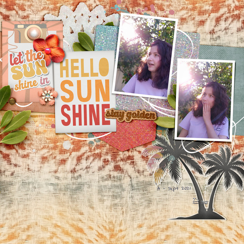
Now let’s look closer at some key parts and the reasons they’re important to the layout as a whole.
To get the illusion of dimension on a digital layout, how an element sits on the layer below it makes quite a difference.
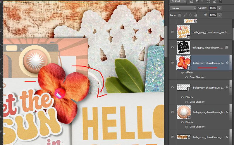
For the ‘Let the sun shine in’ sticker laying over the flower, I selected the flower layer (hold ctrl & click on the flower icon in the Layers Palette) to get ‘marching ants’ (moving dashed lines) around the flower shape, then copied and pasted the sticker portion inside those marching ants onto a new layer; using a multiply blend mode to give a subtle change that is really quite quick and makes the sticker look partially bent as it might be laying over something relatively bulky in real life.
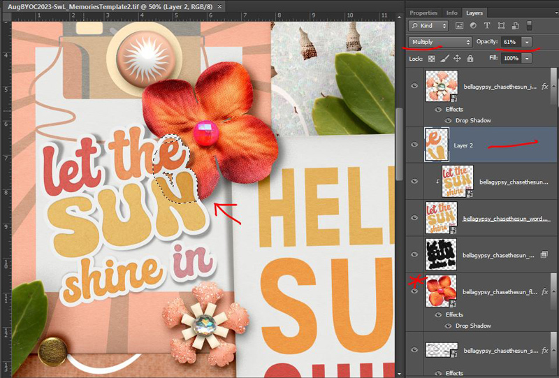
The alignment of that flower over the edge of the pink sun brad is no accident either. Rotating any element that already has some creasing or bent edges so that it looks like it is really laying over something else can go a long way to letting this particular part add realism to the whole. See how it doesn’t look quite right sitting in this orientation below? Just turning it a bit clockwise means I don’t have to do any of the marching ants sticker stuff and the attached shiny flower center also looks more in line with the light and shadowing on the rest of the page.
I’m not someone that uses curly string often on a page but the string line running behind and through everything on the Scrapping with Liz | Memories template works perfectly as a doodle and I’ve become a fan of those through Mixed Media Beginners. All I did in the end was turn off the shadow layer (it’s on still in this screenshot but you could also recolour it if you want) and it really becomes an important part of this whole page, connecting the cards, photos and elements and guides the eye through the layout because the eye is drawn to light and areas of high contrast. The subtle curved lines in the photos, where the branches arch and sunlight creates lens flare are enhanced by the doodle/string line. Without it, the page wouldn’t have the same flow and would be a lot more linear without the curves to soften it, changing the vibe of the page as well.

If you’ve seen any of my Mash-up or Stash Mash posts, you know I’m a fan of mixing and matching, not only kits and colours but different styles, textures and finishes. I knew I needed to use one of A Whimsical Adventure’s new tie-dye papers but I’m also a sucker for Bella Gypsy’s ombre shimmer papers like the new ones in their August BYOC, and hopefully I’ve shown that although it may seem an unlikely pairing, they can totally work together.
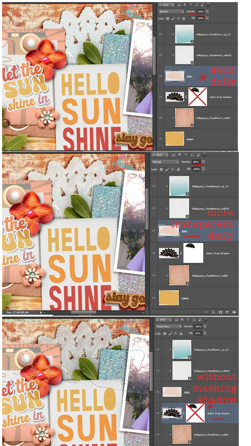
To add another texture, I modified the doily layer from the template to be more transparent, like tissue paper or a thicker patterned vellum which lets some of the underlying paper show through, just by reducing the opacity on the original template layer. Because the doily shape is now more transparent, to avoid just seeing the shadow layer show through and making it more grey than white-ish, I used a mask to limit the visible shadow to the outside edges; if I hadn’t you can see the result in the last screenshot in this set.
Staying with different textures and vellum, I made the palm tree silhouette element from Bella Gypsy’s Chase the Sun into a vellum die cut, by mostly just adding a white stroke but reducing the opacity of it – the outer stroke means the edge detail of the palm leaves isn’t lost or minimised as they would be with an inner stroke. Here are the various layers deconstructed so you can see how it is made up.
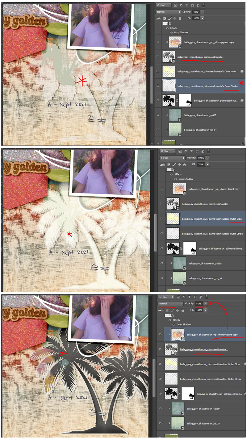
Again, by using the marching ants on the original palm tree layer and a mask over the shadow layer, the vellum edge stays more white-ish and transparent than grey from the underlying shadow. Throwing some paint on as a clipping mask to the palm tree and reducing the opacity and adding the staple as a fastener gives it the extra realistic touch and repeats the idea of the lighting in the photo, as well as the vellum and intricate edges from the doily. Repetition in design contributes to cohesiveness.
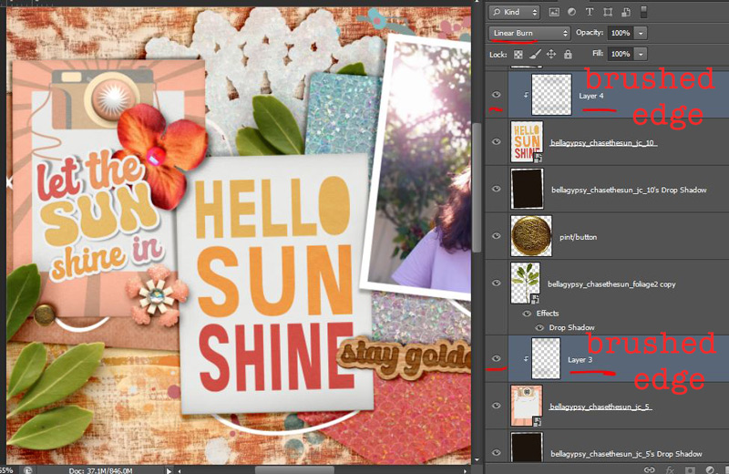
And finally, I’ve discussed my hand shadowing and creasing method with a basic soft brush before on the blog and it does take a bit of extra time but just separating the shadow layer and giving it a twist can improve the realism too. I ‘twisted’ the shadows on the photos themselves.
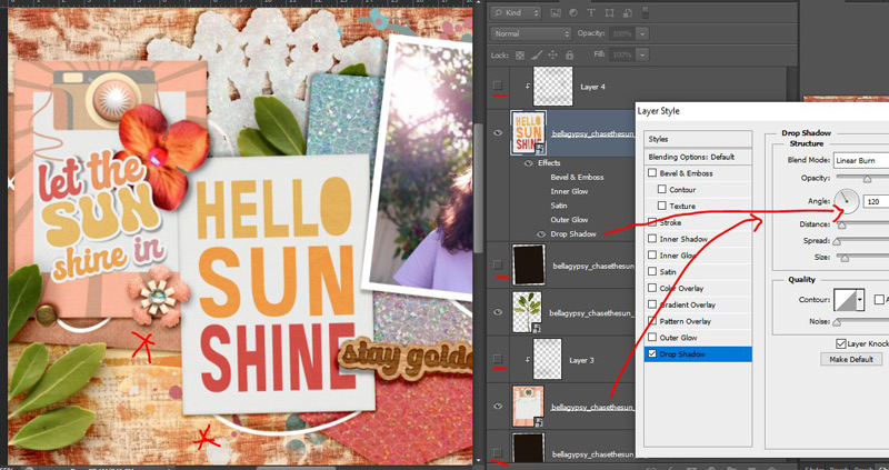
Without the shadowed edges and with a normal 120 degree drop shadow, the cards definitely look flatter and less ‘real’ to me.
Now here’s a ‘spot the difference’ side-by-side comparison of the layout with all these tweaks as I showed you at the start of all this (on the right) and just the standard, no extra changes version that I’ve called the ‘before’. Do you think amping up the parts was worth it?
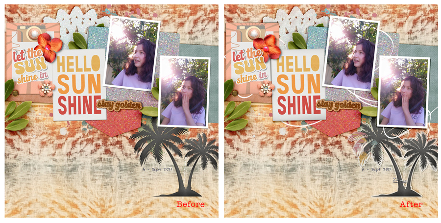
Because of the way synergy works, the time investment in making all these tweaks to the parts of a page feels worth it to me (which is not as much as the time spent in creating screenshots and blogging really) but that’s a personal choice for every scrapper. I think after having printed this page (whenever that ends up happening), I’d regret not having spent a little extra time improving it. After seeing a sharp decline in my scrappy productivity in the last few years based on the amount of layouts I created, I’ve only recently realised that at some point quality over quantity became not only acceptable but preferable to me and at the end of the day, I’m happier with the ‘wholes’ I create overall. Quality over quantity makes sense in other areas of my life and I am still amazed it took me so long to get to this stage in my scrapping.
Have you reached this conclusion too or are you happier with less tweaks and more output? Or have you found some other way to balance the amount of photos and stories you have with your scrapping time and the pages you create? And do you analyse your own layouts like this, during or after scrapping?
Let me know in the comments. Have a scrappy day!