Beginners Mixed Media: Realism with Distorted Shadows and Edges
Hi there. Today in Mixed Media Beginners, I’m going to literally be throwing shade. There’s no disrespect or ridicule here, just a comparison and explanation to why sometimes I add hand shadowing directly on to papers or elements, or tweak shadows below my layers and how my mixed media use influences that. It’s also kind of a Scrapping Secret post – this is one way to level up your pages, so it’s a two-for-one post really, which is to say it’s a long one so grab a cuppa and buckle up!
______________________________________________________________________________________
Here’s a bit of background or nostalgia that will make me sound really old but gives today’s post some context: I still remember my first digi pages (cough, cough, like 17 years ago) and the quick progression I made from not even knowing drop shadows existed and therefore not applying even a default shadow to any of my layers in Photoshop and having everything appear flat, to the opposite extreme of having enormous and gothic dark, over the top shadowing on pretty well every layer. Looking back now, they were both seriously unrealistic looking but for the opposite reasons, and like with everything else, you live and you learn.
Both the desired level of realism and shadowing you want and expect on your pages is definitely a personal preference, and how much of your digi-scrapping time you spend on it can, (fast forwarding to my current digi-scrapping), feel like it takes longer than the actual page design and placement of everything.
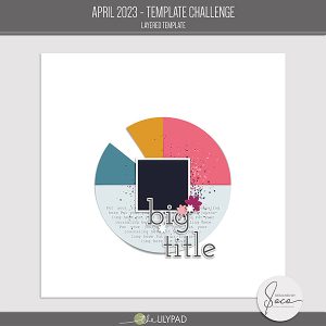
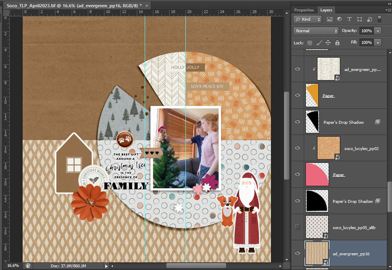
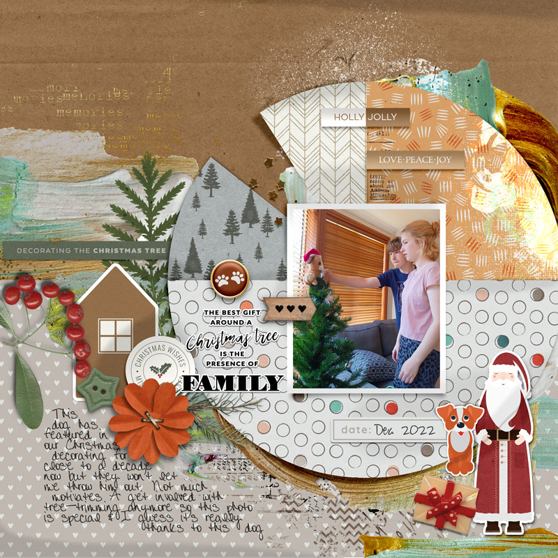
Now onto some of my process for this month, using the awesome April Template Challenge template freebie by Designed by Soco that I saw so many cool pages based on in the gallery that I had to play along – pick the template up for free in the Challenge Pad.
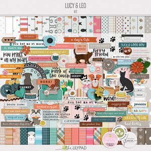
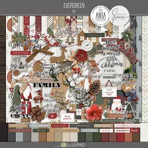
I’ve had a few other kits and collabs by Soco in my Wishlist for a while so I went there to browse and I thought these 2 collabs, Evergreen and Lucy & Leo, would mash well with a particular photo in my To Scrap folder. I wanted Christmas themeing but not necessarily the traditional colours, plus a dog element to fit the story behind the photo.
The decision process basically done I could already see this template working with extra paint and elements, and my initial plan was to go tone-on-tone and use a different colour paper for each segment of the circle and use the corresponding paint colour extending out into the background for a mixed media page. So that’s my mindset and where I’m starting in this first work in progress screenshot (and if you know me or just know the journey some scrapbooking involves, you know I used the phrase ‘initial plan’ for a reason). Here I’ve enlarged the template a bit to suit my photo and started the audition process of adding papers and my key elements.
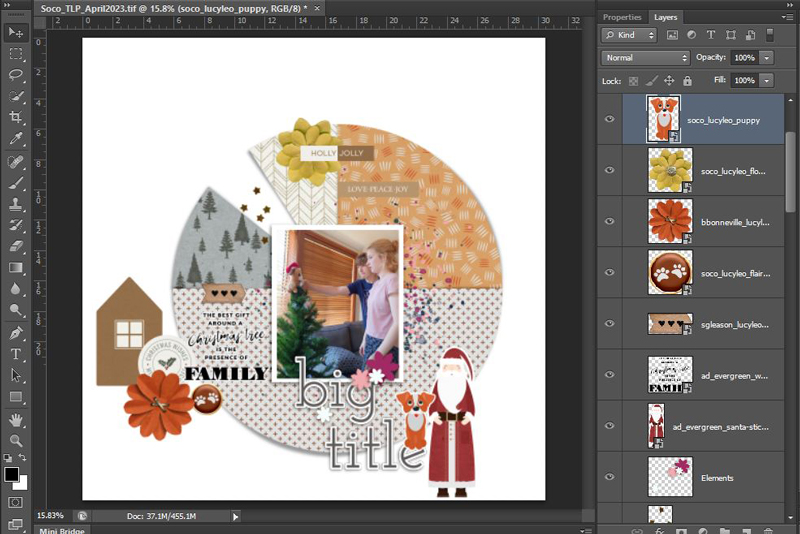
Looking back at this now, my tone-on tone plan was sunk from the start. I got distracted by the elements I wanted to use and where I thought they would work best on the template to create a visual triangle, and there are just too many cool patterned papers between the two collab kits for me to ever have stuck to just using single colour solids or tone-on-tone papers in each segment. I placed the wordstrips so they followed the tone-on-tone plan, but the red and brown section on the semi circle at the bottom just made the whole page too heavy. I then basically grouped everything except the background layer together while I was thinking about what to do colour-wise, and started moving the circle cluster around the page, deciding having it partially off the page helped, and I mixed the colours more by changing some of the papers, especially the semi circle piece. That open circle, multi-coloured paper at the bottom motivated me to abandon the tone-on-tone look (it works with the photo, it pulls in the pink of her top, the blue of his shirt, the grey of the sofa and the red of the dog’s Santa hat) so, hey, if I’m not going tone-on-tone with paint flowing out from behind each wedge, I can split the background and add more paper! So I did.
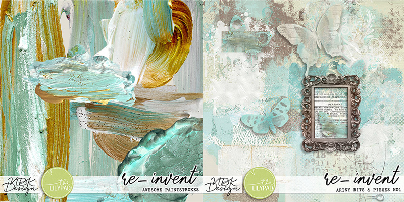
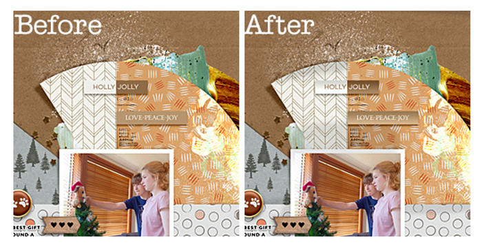
Now I’m just going with the flow and adding elements with abandon! And I figured if I don’t need basic paint brushes/PNGs that I can recolour to whatever the segment required, then I’ll use some glitzy gold to add more warmth and go with the star scatter. This is one my fave realistic paints from my stash- I pulled out NBK Design’s Re-Invent – I love the texture and movement in this paint, the way the tones change, like paint really does in the light, I 100% agree with the product name. It is full of ‘Awesome Paintstrokes’ and the Re-invent Artsy Bits and Pieces pack is full of cool background stamp stuff. It’s got a bluey teal in it that doesn’t suit my page but in the world of digi, that’s not a deal breaker.
Here’s where I go a bit mixed media crazy.
I tuck paint PNG files around the edges of the circle and across my new horizontal background split. I add some ‘stamps’ that give a newspaper transfer effect, some chevron stampy bits in a dark contrasty colour, a gold-ish ‘memories’ word stamp from the coordinating Artsy Bits pack. I manage to balance the blue-ish teal colour by adding it to all the 3 parts of my page that act as a visual triangle (top right, mid left and bottom right), aaaaand I use a ‘vivid light’ blend mode to change a blue-ish paint splotch over the top right paper wedge to a yellowy-white highlight, that I’m mentally quite pleased with, thinking it looks like a glimmery Shimmerz paint,…. but then the hyper-realism of that paint now makes me look at my page and see that even though the template has cool shadowing on the paper wedges, the whole thing kinda looks too flat, and well, a bit fake in parts to me, and so now I’m resigned to throwing some extra effort into making the flatter sections look more real. (I should add that I think most people would just call it ‘done’ at this point, but if you’ve read any of my blog posts, you know this isn’t just going to wrap up neatly right now).
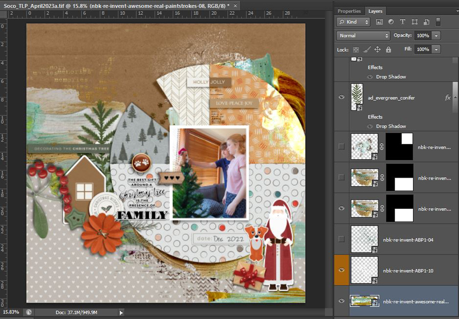
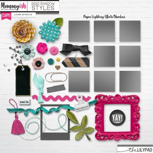
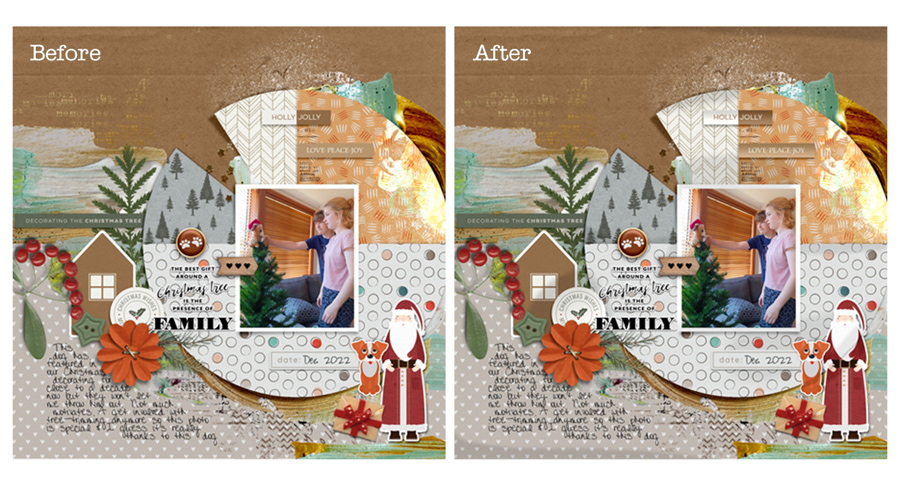
So now I’m thinking this is Phase 2: the digi mixed media’s done, the whole page is essentially done but now I need to add more realism. On some layers I add Mommyish’s 2020 Shadow style which has an extra gradient layer that gives shaded edges with one click (like the wordstrips)…
and on others I just paint shadows and creases on top of the papers and edges of ‘stickers’ or items I imagine are diecut pieces that are sitting on 3D foam to give them a bit of a lift off the page. (I may watch too many paper scrapping process videos on YouTube). This process can be used in any program that has brushes, layers and clipping masks. All I’ve done here is use a low opacity grey brush and my mouse to drag a rough line across the edge of this wedge on a new layer above the paper. The settings are visible up the top but what works varies with the paper you are using and it can be intensified or pulled back in the step after this.
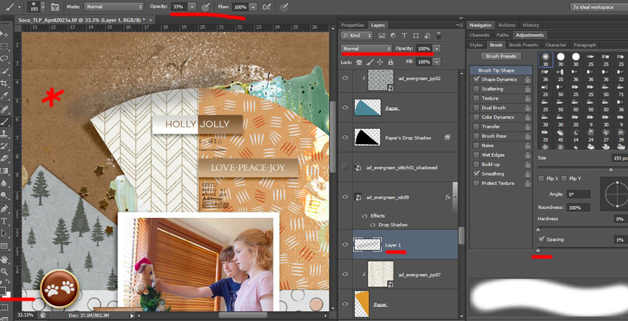
Now I’ve just clipped the new brushed layer to the paper and wedge beneath it (using ctrl + G or right clicking the Layer 1 layer in the Layers Palette and selecting Create Clipping Mask from the flyout menu) and changed the blend mode from ‘normal’ (Linear Burn or Multiple are my go-to’s) and fiddling with the slider to make it look like the edge was curling up a bit and that the light was therefore not hitting the paper the same.
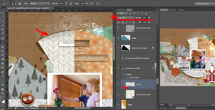
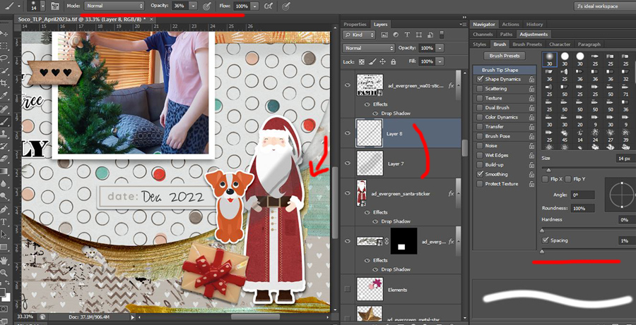
This works pretty easily with a solid colour paper, but here’s the tricky bit that my brain throws in while I’m playing with the slider. If a patterned paper was really quite curled up in the real world, the pattern itself would look different. If it were stripes, the stripes would not continue to be perfectly horizontal or vertical through that curled section so just adding some grey-ness to the same pattern in Photoshop wouldn’t make it look realistic, the pattern would have to be distorted but that’s more than I’m willing to think about at this time of night so I limit myself to making the edges look ‘slightly curled and not flat’ and the other way that I can make that look real is with the shadow below and lucky for me, Soco has already done that on her template. I’m going to do that on a few of the elements I added though. So here’s my brush work above the Santa sticker, I’m making it more creased along the circle by using a second brush layer, a darker, smaller brush over the same size low opacity brush from before.
Then I put the drop shadow for Santa on a separate layer and use (Ctrl+ T) Transform > Warp, pulling a few of the handles of the bounding box grid out and in to make the ‘sticker’ stick and lift in parts. I figure the dog sticker and the present element would make the sticker shadow less on that side, and it would be more likely to lift on the opposite sides or where it wouldn’t stick to the thicker paint at his feet.
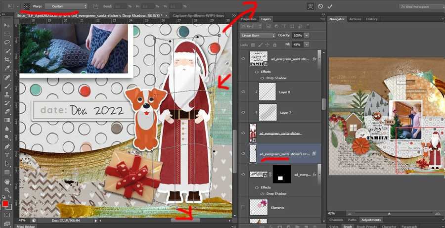
Where I have creased Santa following the curves would mean he’s got less of a shadow there, but see how the semi circle paper lifts under the dog sticker? The shadow would be different there under the dog so I follow this process over a few more parts of the page, knowing that the weight and liquid nature of paint will warp paper and rarely with liquid glue or double sided tape would any of my real paper layers ever be perfectly flat. And here is my finished page, with a side by side to see the overall effect of throwing and distorting shade across the whole page and just one portion.
So is throwing shade and distorting and tweaking things all worth the extra time?
- To me now, yes, but to be fair, NBK’s paint and the separated shadows already on Soco’s template give the page a pretty good realistic base.
- To me in another 17 years or so when I look back on this, or to the less than a handful of other people that may actually see this when it’s printed? They’d probably think that’s actually pretty good (especially considering my digi beginner ‘no shadows’ and ‘gothic shadows’ stages). All of this is of course subjective, but isn’t that just true of how all art, mixed media, digital or otherwise? That’s food for thought for another day.


