Scrapping Secrets: Visual Triangles in Practice
Hi there! This series spills some of the secrets and highlights some theory, problems and solutions behind the amazing scrapbook pages you see in the gallery. Sometimes scrapbooking involves problem solving just as much as creativity and you may find these secrets help you with your own pages, especially if you feel like you are at a roadblock. Nobody’s perfect, some of us just know a few more tricks and soon you will too!
______________________________________________________________________________________________
One of the methods scrapbookers use to make a page secretly engaging is the overt and subliminal use of visual triangles. What is that? Well remember trigonometry in Maths class that you thought had no practical uses? Don’t worry there is no calculation involved but it turns out triangles are a scrapbookers friend! In practice, it just means giving the eye three points to subconsciously triangulate and find a centre point of, and you want something of interest basically in the centre of the triangle. There’s nothing too conceptually difficult and you are probably already using them when you cluster or scrap. Let me show you some of the ways you can use visual triangles and highlight them so you can see them more clearly.
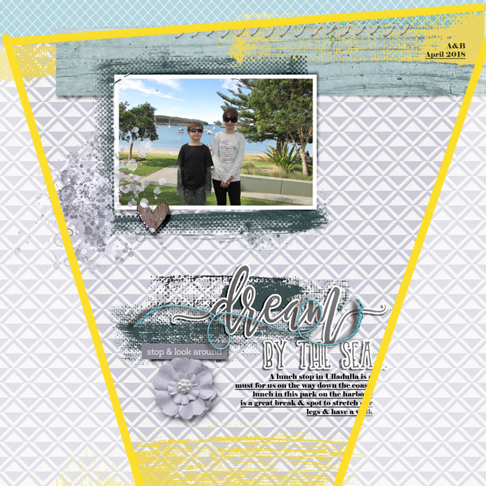
Going way back to my first Mixed Media Beginners blog page of the year, adding paint using linear strokes in place of paper strips on a clean and simple template, the yellow brushstrokes are the obvious limits of the visual triangle here. The triangle is huge and extends off the page but the effect on the eye of the person viewing the page is the same. The eye and brain are engaged by the contrast of the 3 yellow points and create that triangle, just like I have with some vellum and another brush in Photoshop to draw a big yellow triangle here right over my original layout. The centre point is around the bottom of the photo and above the ‘d’ starting the title and despite the overwhelming use of pattern that makes a rather clean and simple design a lot more busy, the centre point gives the eye both a chance to rest and take in the photo and title, two major features on any layout I personally make, so that to me, is a good central point for that triangle.
Now if I had moved the top strokes of paint to sweep behind the middle of the photo, like I have here just to show you the difference, well that effectively moves the central point of the triangle down and changes the focus of the page. Even taking out the part of that yellow triangle border that runs across the photo, the eye is not naturally drawn to the photo, even with the dark glasses, shirt and pants my kids are wearing. That contrast is not enough to keep the eye from drifting and settling between the large flower and ‘By the sea’ part of the title. So here is a secret you probably already know, template designers can take a lot of the guesswork out of scrapping and often have these visual triangle cues built in to their templates!
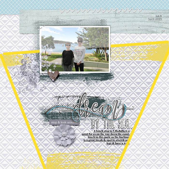
Because I use templates as a jumping off point, sometimes where something starts on the page following the template is not where they end up on my final version. I stuck pretty close to the template by Soco I used, which is now retired, on this occasion and that top yellow paint stayed where her paper strips were on the template, I have no idea of I thought about this back when I made this page but it’s pretty clear to me now that I’m thinking about it.
You can also use more than one visual triangle on the same page. In a colourful and eclectic page, like this one that I made this month, you can use colour in a considered manner to guide the eye to focal points on your layout. Here the eye reads the greens as one visual triangle, which basically frames the central photo and highlights her smile.
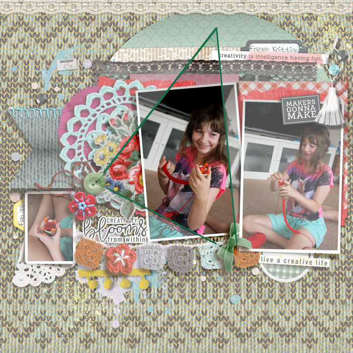
And on the same page, the pops of yellow are used to highlight the title wordart and supporting photo which may otherwise get lost in such a busy background and layered design.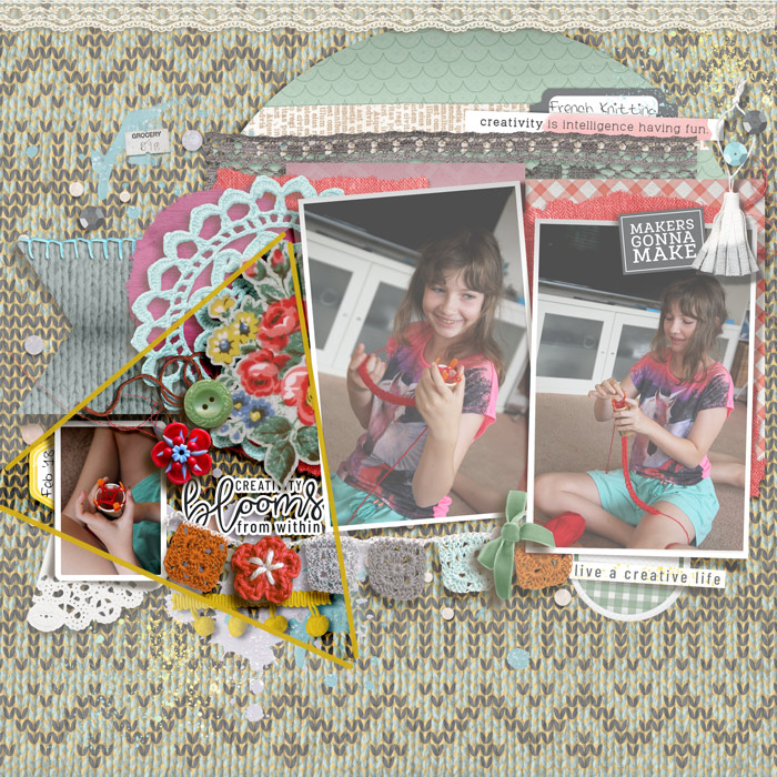
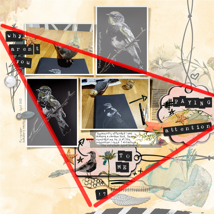
The positioning of the wordarts also has a similar larger visual triangle effect on the above page. Beyond colour, you can use single elements or clusters as your triangle anchor points. Going back to this Mash-up page, the way the long title is cut up and the positioning of the title alpha among clusters of doodles and elements in 3 distinct sections of the page, creates a strong visual triangle framing part of the photo cluster and journal tab. Thinking about how I scrap, photos tend to drive my stories and process so this is a fitting but again unintentional use of visual triangles in my past pages.
So next time you are scrapbooking, if you want a detail or part of your page to shine, think intentionally about your placement to create a visual triangle and guide the viewer’s focus. You could also use 3 photos and place the title or a journal card in the centre of them to make your title or story the feature of your page. Lots of possibilities with this scrapping secret method!


