SOSN Stash Mash – Sept 6, 2023
Hi there, if you are a regular visitor to the TLP Blog, you might remember the Monday Mash-up Series from last year, where we looked at strategies to step outside the ‘one kit only’ scrapping box to increase your confidence in mixing and matching and ability to stretch your stash. (And if you didn’t see any of them, you are forgiven LOL and the good news is you can still access them). Anyway, with all those lessons up our sleeves, this year I’m introducing the SOSN Stash Mash!
Every Wednesday when TLP Designers put a selection of goodies on sale at half price (here’s a link to this week’s specials category), I’m reminded of some specific treasures I have in my stash and feel inspired to pull them out from the depths of my harddrive again. And I know now that I can find a few kits among that day’s selection that will work perfectly together to tell my stories and support and enhance my pictures. So welcome to another SOSN Stash Mash!
_________________________________________________
So it’s been a few month’s since my last Stash Mash and the nature elements in the Explore Bundle by Lynne-Marie and Scrapping with Liz’s Gathering templates sparked my creating and photo choice this month. I also pulled out some other ‘oldies but goodies’ and ended up mashing with 4 designers by the time I called it done.
Here’s what I’m using that are all in today’s SOSN sale.
[Scrapping with Liz – Gathering templates; Lynne-Marie – Explore Bundle; Allison Pennington – Tomorrow’s Memories (paper pack & elements pack); Kim Jensen – Chipboard Alphabet Soup ; Stringbats 2 ]
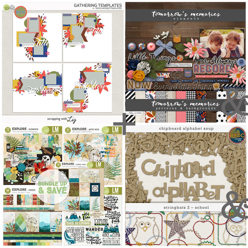
The journal card in the Explore Bundle that says ‘Hike, climb and move mountains’ was a ‘must use’ and at this stage, I was thinking that would be the title and fill the bottom photo spot of the template I picked. But if you have seen any of my process posts before, and having just seen Kim Jensen’s Chipboard alpha above, then you know that my plans at the start generally take a turn at some point and have probably figured out that card is not my title in the end.
So without further ado, here’s my starting point just with photos dropped in.
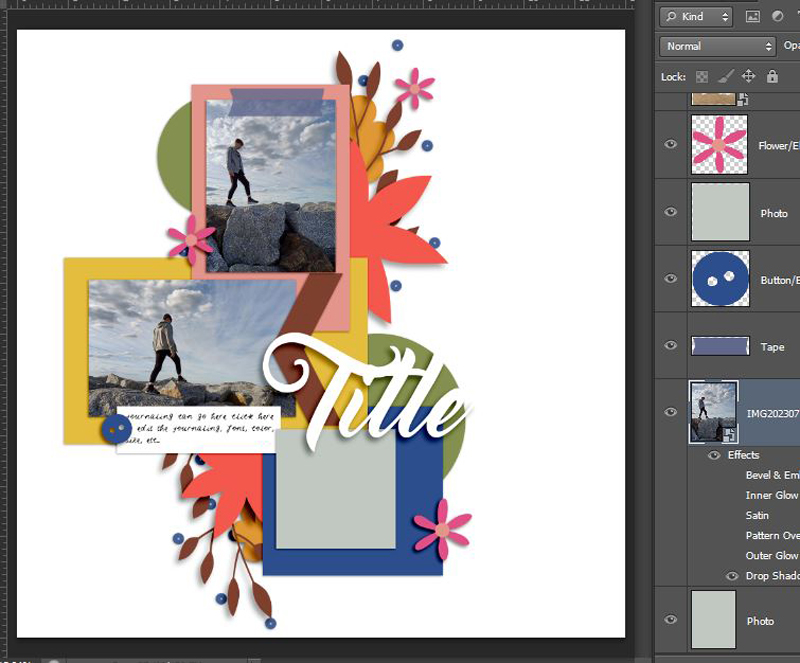 Now my must-have’s, that journal card and coordinating background from Explore that made me think of these photos and some extras from Allison Pennington’s Tomorrow’s Memories elements pack that had a dark blue that I was drawn to as well as the memories theme, plus if you know me, you know I don’t need a reason to add birds or bird related elements to a page. That bird punched out cardboard square of Allison’s is perfectly imperfect and the mixed media clouds and doodled birds by Lynne-Marie work well together in the ‘sky’ of the page.
 At first I was looking at the colour temperature of the blues in my photo and the blues in the background paper and thinking I would end up tweaking the colours in my photo to match more with the background tones (using a Hue/Saturation slider Adjustment Layer clipped to each photo). But by half way through scrapping, the contrast was growing on me. The photos had the same tones as each other and were placed close enough together that they actually standout well from the rest of the page as well as playing off each other and reinforce the theme. They have repetition in composition and colour which are important in the overall page design here. If the photos were vastly different (which can happen with Auto White Balance camera setting even with a series of photos like these, taken in quick succession if the sun is moving in and out of clouds, which it was on this day and these were just taken with the default camera on my phone) I would have still adjusted them to try to look the same as each other.
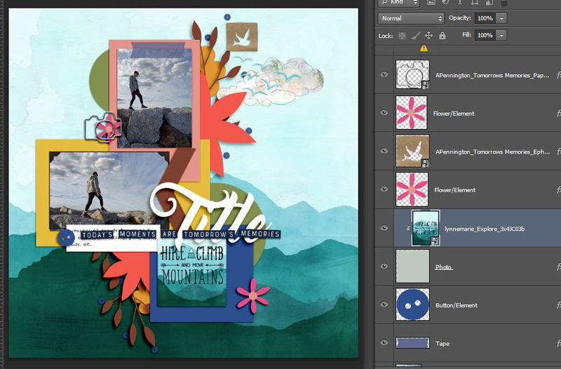
Now for extra papers. I liked the yellow mat of the middle photo spot on Liz’s template drawing attention to that photo, (the photo corner frame from Allison’s elements looked good as a detail against the contrasting colours too) and how the blue matting the journal card worked with the background tones so I chose similar toned papers from Explore. The denim paper had some stitching detail on it as a bonus so I positioned that paper to take full advantage of it! That justified to me using some messy thread and instead of flowers, I used some more Explore mixed media in the bottom cluster. To anchor the word strips from Tomorrow’s Memories, I put a pre-bent paper strip underneath it , now thinking that would be the title; but then also thinking it’s too small to be the title and at this point I had another look through the SOSN sale and thought the Kim Jensen goodies would allow me to add a bigger feature title like on the template so the cogs started turning while I finished up choosing papers and extending the yellow into the page with some of Allison’s splatters.
 So that the big chevron piece on the middle photo would stand out more, I went with the black and white houndstooth contrasting paper from Allison’s paper pack. I went with dark brown wood at first but it felt lost among the other wood papers. At this point, I could not get over how perfectly the sprays and wood grain features in the Explore patterned papers worked with the lines in my photos, extending out the shapes of the clouds and rocks into the page. It’s come to be part of how I use and position papers to make them feel like they were custom made for my photos and to integrate the photos into my layout. They never are custom but this shows they don’t need to be. I will line up creases in a paper to extend maybe the horizon line in my photo or a natural break between surfaces (much like I did with the line of string in this Zooming In post) and it didn’t take much moving at all with any of these papers and made this process super quick compared to my usual process. In fact, I figured out a title (pun-ny as ever) while I was thinking there’s so much wood on this page that’s basically about rocks, and here’s the finished page with a few tweaked shadows and extra elements.
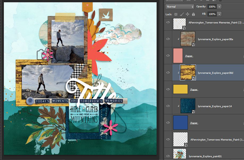
 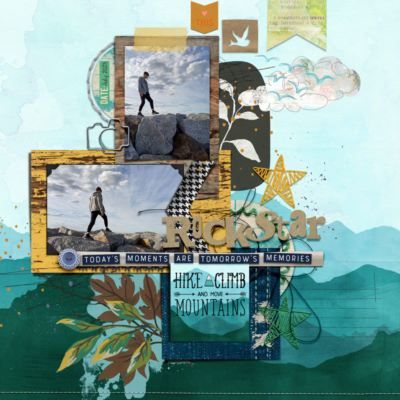 So the stars in the Stringbats 2 pack complemented the title pun and stitching I already had on the page, and then I added more stitching (because details and texture!) around the circle paper piece that became the date tab and the matching circle behind the title. The stars also meant I could replace some more of the flowers on the template and bring back some green to the page, seeing the green paper piece circles were clipped with a blue sprayed notebook paper.
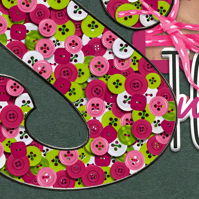
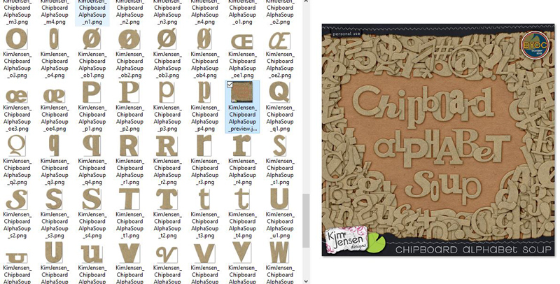
The natural colour and texture of the Chipboard alpha were great and sidenote: if you don’t have this pack, it is full of so many different fonts for each letter and character that means you can mix not only cases but also font styles within a word but still have it look cohesive, which is especially fun if you have double-letter word titles. Let me show you a quick peek in that pack so you can see what I mean. And, as always, Kim has you covered for international versions of letters!
 Thanks for reading – hope you’ve been inspired to pull some oldies but goodies from your stash or to get mashing!