So You want to Start Digital Scrapbooking: Getting Started Step-by-Step in GIMP with a Layered QuickPage
Today we’re starting to get to know the free graphics program GIMP by scrapping with a layered quickpage (QP). Fair warning – this is a long post with (hopefully) enough information and screen images to make using it easy for someone that is a beginner to digital scrapbooking or just new to GIMP.

What is a QP? As we talked about a few weeks back in the Beginners FAQ blog post, a QP is a pre-made scrapbook page. A traditional one would be a single flattened page with a cut-out for a photo that you would simply drag in, and maybe add some text on but no ability to move items on the quickpage around. If it has a flower on there and you don’t like the position of the flower, you would have to try to cover it up with something because the flower and everything else is flattened onto the background and can not be manipulated in isolation (well not especially easily or by someone starting out with a new graphics program at the very least). There is a whole category for QPs in the store with different themes and styles.
A Layered QP is a bit more flexible kind of QP and as the name suggests, it is a pre-made scrapbook page but it is not flattened in the same way. A flower would be on it’s own separate layer and could be moved or edited easily and independantly of the rest of the page and elements on the screen. This Aztec Summer – Layered Quickpage set by Sahlin Studio (available along with several of hers in the Retiring Product Sale until 31 March) will allow me to learn a bit more about GIMP and what it can and can’t do and share that with you.

To start with I’ve downloaded and run the exe file to install GIMP from their website, following the directions and prompts. (I saved it to my laptop desktop so I could find it easily – this file can be deleted after install).

I’m using the current version of 2.10.36 and now I’ve opened it by clicking the dog with the paintbrush (he’s apparently called Wilbur and is their mascot and honestly he looks like a wombat to me but I’m Aussie so maybe everyone else everywhere would see a dog first), anyhow this is the workspace I see. There are some important areas to get to know in GIMP and these will become more apparent in a minute when I actually open the quick page file.

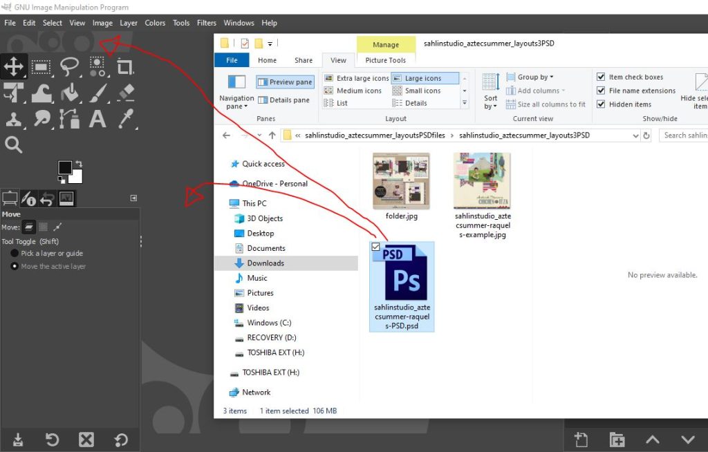
Now I’ve gone to the folder I downloaded and unzipped the Sahlin Studio Layered Quick Page set and now I can just drag the psd file I want to use into GIMP either into the middle of the workspace, which will basically be the desk if I were looking down on a real paper layout in front of me, or up to the top area in the left corner.
(If I already had something open, dragging into the middle of the workspace would stack my QP on top of whatever is already open and into that already open project so to keep it in a separate tab, I would have to drag it to the top left area. For now, it doesn’t matter so let me just drag this in.)
OK here we are. A few things to see below now.
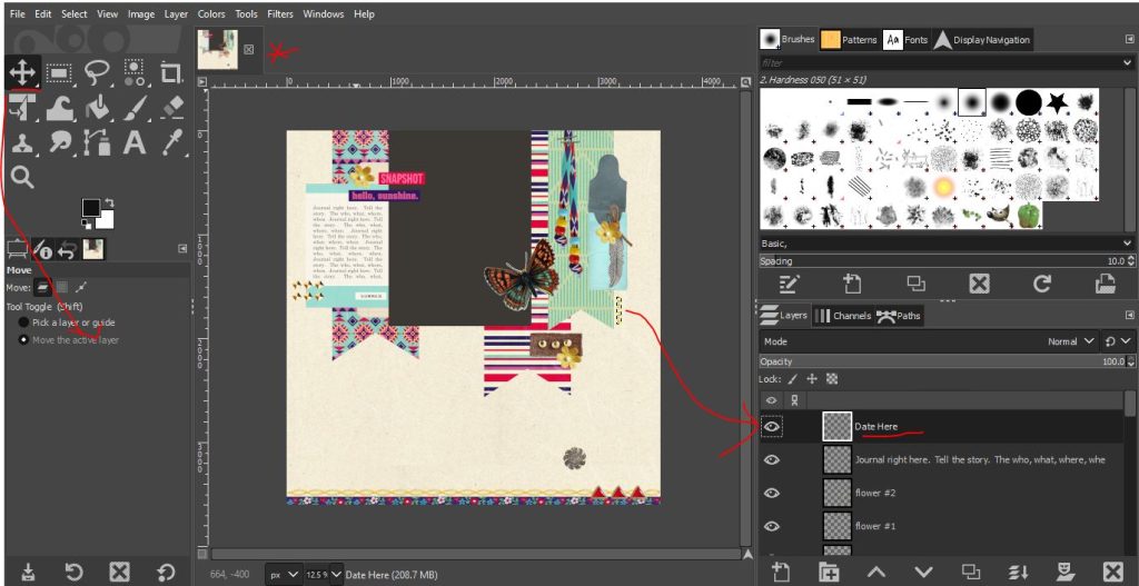
- The QP is situated in the large workspace area (but if you are like me, you’d prefer it to fill that whole space so we’ll learn how to zoom in in a minute.
- And this is what I mean about tabs at the top, where I’ve drawn an asterisk. The next time I drag something in, if I drag it to the top left corner, another tab will appear next to that asterisk and to navigate between items, I’d just click on the tab to see it fill the screen.
- And finally there are two important areas the Layers Palette and the Tools Palette – the ‘date here’ layer is the currently active layer in the Layers Palette bottom right, you can see it is darker than the other layers listed below it and each component of the QP is on it’s own layer. There are some dashed lines around the (small) date that is oriented sideways which shows you the boundary of the currently selected layer. The Move Tool is currently selected in the Tools Palette on the upper right of the screen – it has the 4 direction arrow icon, and the current option, shown in the bottom left section of the screen, is for it to move what ever layer is active so to start with I’m going to move the date and let’s make everything a bit bigger.
“How do I move or resize something?”
Leaving the Move tool selected, I’m just going to put my mouse cursor on the spot where the date is currently and then click and hold the left button mouse and then drag it to where I want the new date location to be on my page, just below where my photo will go.

Now we will change to the Transform Tool in the Tools Palette (it’s below the Move Tool but it might be already set as the Unified Transform tool, so click the little triangle in the corner of that box or hit Shift R on the keyboard to select it). I’m rotating the date so it’s horizontal instead of vertical. This is just personal preference and you could also just delete that text box that says ‘date here’ and put your own in somewhere else. (And now after finishing my page, spoiler alert: that ‘date here’ layer that can absolutely be clicked on and typed straight into in Photoshop, can not apparently in GIMP – I had to create a new textbox and delete it in the end anyway – lesson learnt! So if you are coming to GIMP from another program, something to consider )
With the Date Here layer active in the Layers Palette still, this Rotate box pops up (it can get in the way sometimes!) and you can rotate a layer a few ways. I typed -90 into the Angle box so it went anti-clockwise, but you can grab a corner handle on the outside of the dashed lines (it’s there, just super tiny!) and rotate it to your preferred orientation. (I need to interrupt myself here for a quick word about the pop-up boxes – read this if you don’t see them! Sometimes dialgoue/pop-up boxes open *behind* your workspace/interface so it might make you feel like after selecting something from the drop down menus, nothing happens but it’s waiting for you to give it a bunch of specifications about what to do and you just haven’t seen that, let alone clicked enter so it’s done nothing – So, try minimising your GIMP window to see if there’s a pop-up box sitting behind it.)

(You can also go to ‘Layer’ drop down menu at the top, then ‘Transform’ and select Flip options or Rotation of a standard amount like 180 degrees or 90 degrees clockwise or anticlockwise). It’s still hard to see so let’s zoom in to check the date is the right way up.

In the Display Navigator panel on the top right, there is a slider. I’ve zoomed in to 33% as that is what I was always told will give you a good feel for the actual size something will print at if you are a 12x12inch or standard size scrapbooker. So the date text, which you should be able to read now, will be roughly the size of newspaper paragraph text to me which we’ll leave for now.
You can see from that smaller version of my project in the Display Navigator what part of my project I’m zoomed in on. There are obviously parts outside what is visible on the screen right now and this helps you to still see the page as a whole while zooming in on a particular part. The underlined icon under that slider bar is worth noting as well, it will make your layout fill the whole workspace and make it easier to see. (Also – if you can’t see the Display Navigator panel – you can find it by going to the Windows menu at the top of the GIMP screen and then Dockable Dialogues and Select Navigation then it should pop itself up there next to the Fonts Palette)
“How do I add my photo/s?”
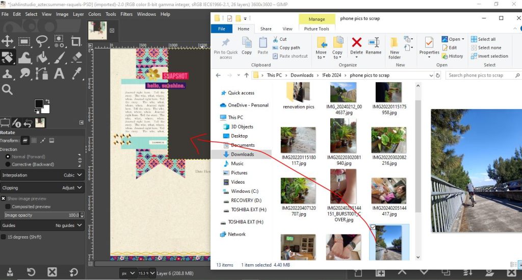
On to the photo, let me open it by dragging it into the open QP project (I’ve zoomed back out to full page visible). The photo spot on this template is the large grey rectangle and is called Layer 6 in the Layers Palette so I have found it in the Layers Palette and now if that layer is active, the next thing I drag in will sit right above that layer. If I stayed on the date layer, which is already at the top of the layers palette the photo would cover everything already on the project.
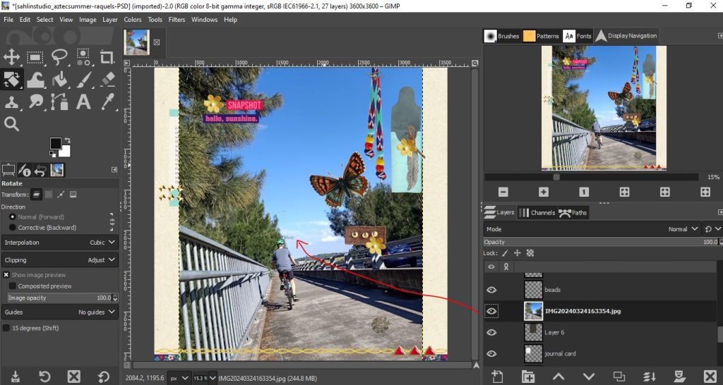
OK here’s the photo sitting right above the Layer 6 photo spot. The date here text is visible over the photo because of how layers work.
I think the most important thing to know about the Layers Palette for beginner scrapbookers is about the order of the layers. You can change the order of items in the Layers Palette but remember that the an item at the top of the palette means it will be at the front or above something listed at the bottom of the palette. A layer above will hide part of the layer below.
“But it’s the wrong size for the photo spot!”
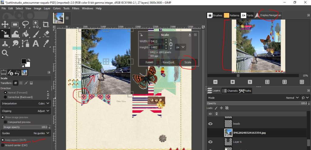
You can see below the photo’s a lot bigger than the photo spot on the QP so we are going to use the Transform tool again but the Scale tool this time to shrink it to fit in the grey rectangle photo spot.
Change from Rotate to Scale in the Tools Palette (use the little corner triangle again or Shift S) and then there’s this pop up. The current Ruler bar at the top of the workspace is in pixels (px) so the scale units are in pixels to match as well (they can be changed to inches or centimetres etc but it’s not necessary at the moment). The circled little forks (not sure how else to describe them) are actually a link that is not joined, which means you can make the layer wider and stretch it without making it taller as well. For a photo, we want to keep the same ‘aspect ratio’ (see the FAQ post for more on that) so I click the forks to make them a whole link again and keep the changes to numbers in the width and height boxes the same. I use the down arrow next to the 3000 on width to start reducing the size (and unclick when it seems small enough).

There is no real way to preview this change, so there’s some guessing involved. When you’re happy, click Scale in the box (next to Readjust) to accept the change and then a green timer says ‘scaling’ while it works.
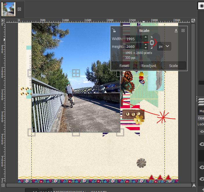
So now my photo is better but not small enough – you can at least start to see the edge of that Layer 6 photo grey spot though. So I repeat and shrink again, (shrinking will be okay for the image quality of your photo, but enlarging if you have started with a small photo, say something compressed from Facebook or the internet somewhere, that can end up with a blocky, pixely image if you enlarge too much), but this time I’m going to use the handles at the corners (see the yellow left bottom corner box) and drag that diagonally in to the middle of the photo so I’m not guessing so much as watching it change shape.
Now I have it the right size, I need to go back to the Move tool to push it into the right place. See how it’s now sitting with the butterfly and wordstrips overlapping the photo? In a traditional flattened QP, you would put your photo under the one QP layer and have it peek through the photo spot cut out window.

Now my photo’s right so at this point, I have no idea if GIMP auto-saves but given how long all this took me (albeit stopping to write this as I go and take screenshots etc), this project was well overdue for saving and making sure I don’t ‘overwrite’ the original psd file, in case I want to use it again.
You definitely want to save your work in progress!
“How do I save my work?”
GIMP saves layered projects like ours as xcf files. For over a decade I’ve saved my work as TIFF files but GIMP doesn’t love TIFF files. To keep editable layers, you can save it as a xcf or psd but give it a new name (I put the layout title I’m planning Blue Sky at the start of the QP filename) and store it in a location you can find again in the future. For now, mine is just in the same folder as the original QP, it can be moved to my Documents file after I’m done).

(Feel free to skip this part but I did test the TIFF file thing. Looking at my Windows Documents folder where I saved my work in progress TIFF, it just looked like a blank white square in the preview, rather than a thumbnail of my page so far as TIFFs have previously looked like when I’ve saved them in Photoshop CS6, but opening it again in GIMP it turned out fine eventually – saved as separate layers and all – but in Photoshop (CS6) when I opened it, it was just that blank white square, so my guess is it is not backwards compatible with my old version of PS but may work if you were to open it in new programs that can handle TIFFS should you not wish to use GIMP in the future but need to edit something created in it). Back to our current program…
While I’m moving things, there is a blue car in the photo I’d be happy to cover with that butterfly, so I’m going to move that with the Move Tool like we’ve already learnt to use. But on second thought I think the butterfly is too colourful and a bit distracting so I went back to find an alternative (I found a pack in the Retiring Sale also by Sahlin Studio) and so I’ve dragged in a wooden one.
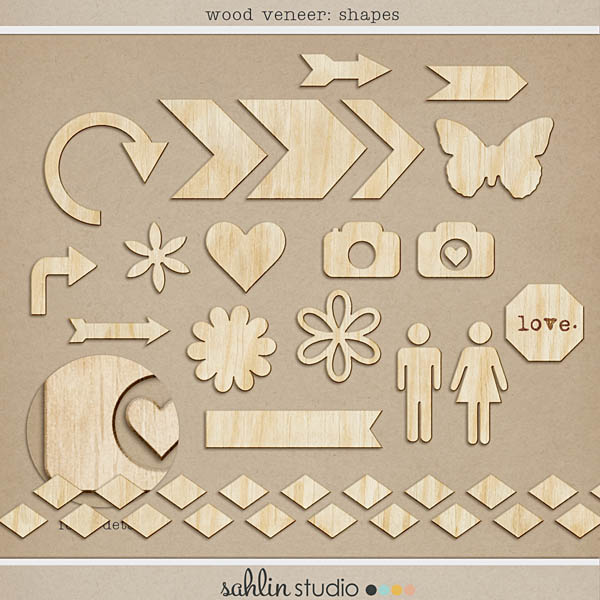
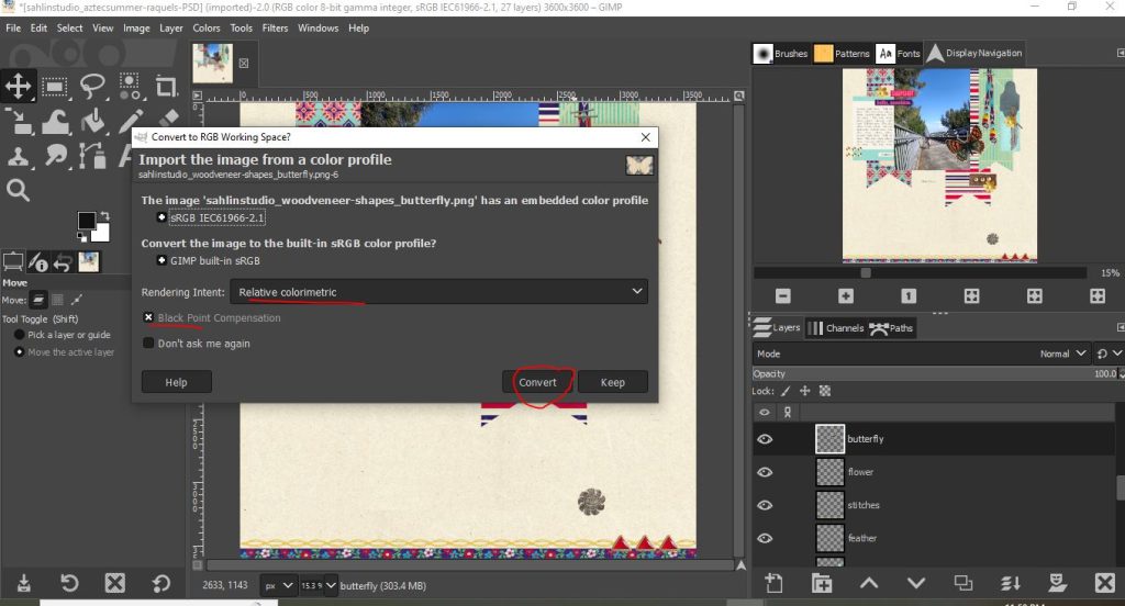
Dragging in new elements or papers can prompt this box to show up. From what I’ve read the preferred selections here are underlined.
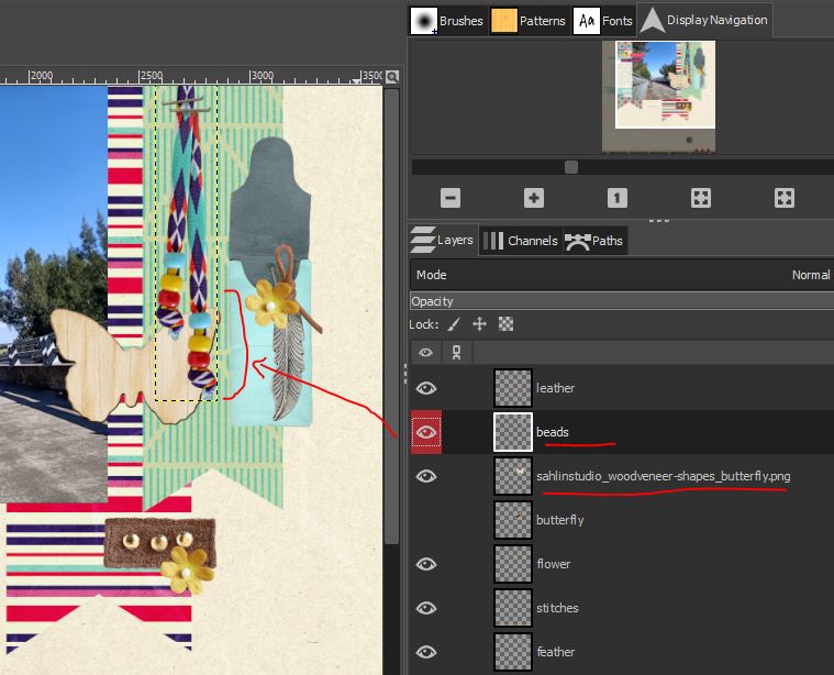
To get rid of the colourful butterfly, I can either click on that Layer that say’s Butterfly and right click the mouse to get a menu that has a Delete this Layer option; or if I’m not sure and maybe want to keep the butterfly in the document in case I want to use it in another way, I can just hide it. Clicking the eye will turn off the visibility of the Layer. The issue I now have here is that I think the beads being a bulky item would sit over the top of my butterfly, so I change the order of the layers by dragging the ‘beads’ layer up the Layers Palette.

Ok that’s better
“It all looks a bit flat” – Drop Shadows
Adding shadows will make the beads look more bulky and realistic. Just a note that the psd of this layered Quickpage actually has shadow effects already on it but these will not translate in GIMP – this is how this template shows up in my old version of PS – the fx on the flower layer denotes a drop shadow effect and you can see it on the underlined yellow flower. (That ‘date here’ layer is also editable in PS because it has the T in the thumbnail for that layer). See the beads in this Photoshop version? With GIMP we have to do a bit more work.

In GIMP there are 3 ways to add shadows as far as I can tell – Drop Shadow, Long Shadow and Drop Shadow (Legacy). For now I’m using the first one on the active Beads layer.

Here is the pop up box. It took a bit for me to get used to and you might have to really think back to number lines and graphs with x & y axes from Maths class, but +/- x and y sliders are used to move the location of your shadow left or right or up and down. Again you can have them linked or unlock them so they look like forks and move independently. The opacity slider will make your shadow lighter or darker and clicking ‘preview’ will let you see the effect moving the sliders around has before you click ‘ok’ and commit to shadow values. You should note that with this drop shadow method, the shadows will be added to and modify the actual Layer because it is a filter. It is not an add-on effect that you can toggle on or off, like with the visibility ‘eye’ so be happy with your shadow settings before you hit ‘ok’.
(You can always undo a step by hitting Ctrl Z and then try again – it is one of the best things about digital editing programs- but once you have shadowed 20 items, to go back and change the shadows on just the first one, you would have to undo all 20 and start the process all over, which to me is an issue. To work around this, you could duplicate the beads layer first and shadow just the duplicate layer and turn the visibility off on the first beads layer, so it is there as a back-up but it seems like a lot of extra work if you are creating an entire page from scratch without a quickpage)

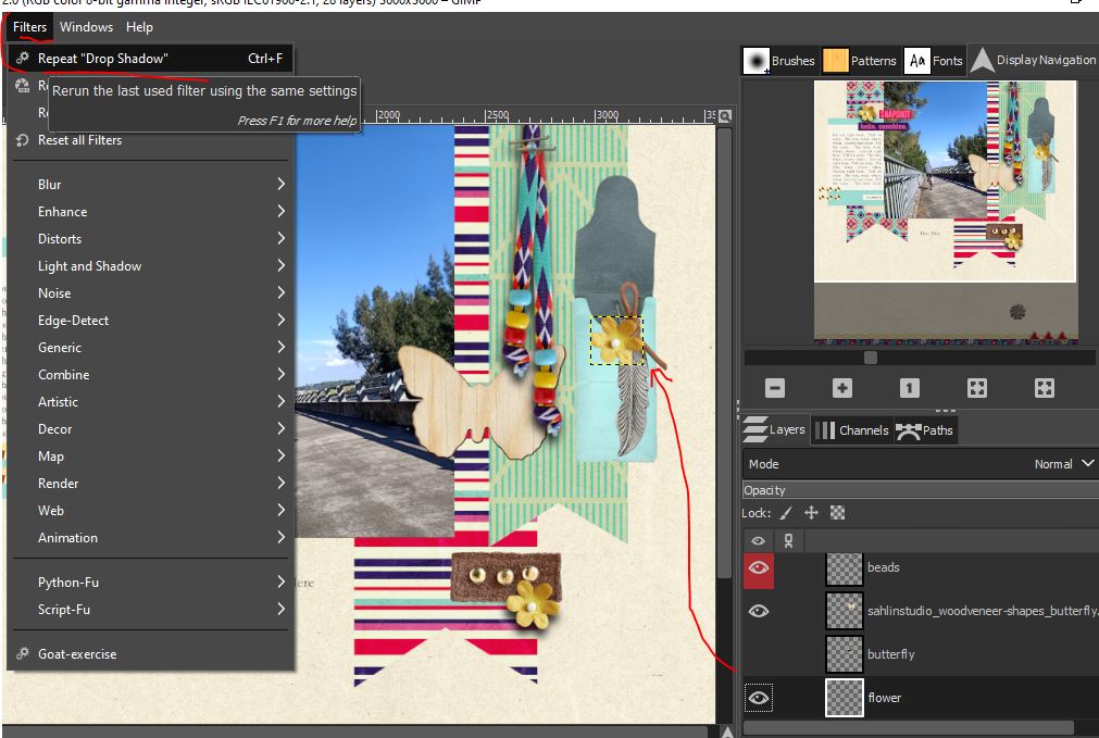
You can start light on the shadows and after accepting a shadow level, you can go back in and add to it basically like adding more paint to something to make it darker, but you can’t really subtract without hitting undo. You can also just select ‘Repeat Shadow’ if you are happy to add the same shadow settings to various layers but you have to select each layer one at a time. There does not seem to be a way to select multiple layers at once and apply the same filter to them all.

“How do I add text? Either a fancy title or some journalling about the photo/s?”
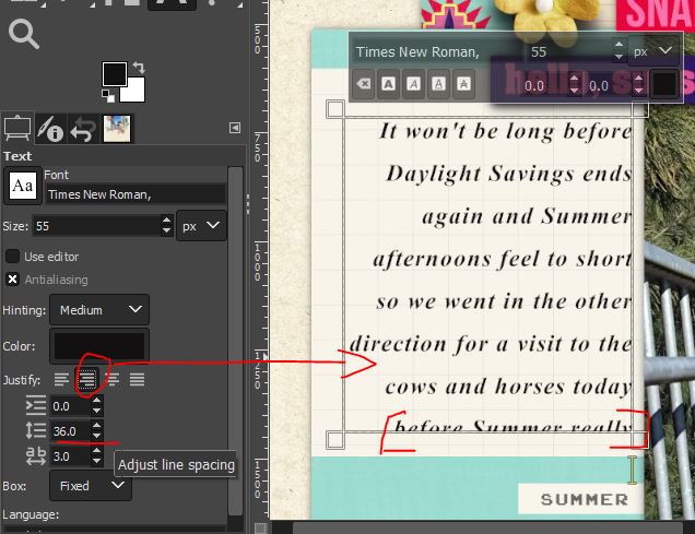
So this QP has a journal card on the left of the photo already that has a textbox on top of it in the psd file, but we can’t use it in GIMP. So I selected the Font Tool in the upper left and chose a font from my computers list of available fonts. (They also appear next to the Display Navigator panel on the top right) and used my mouse to drag a box the same size as the journalling already on the journal card. The I just typed in my details.
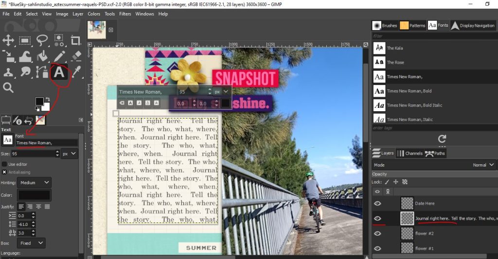
It then looked like this with each character in it’s own yellow box. To make the text a bit easier to read, I selected bold and italic options (underlined in the little pop-up) – as well as turning off the eye for the original textbox.
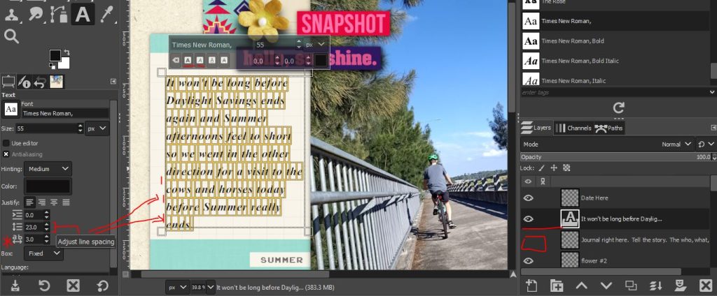
Pay attention to the spacing number (the line spacing) so your lines of text don’t overlap and become illegible) but also so you don’t cut off your journalling. If what you typed extends beyond the text box you drew, it won’t be visible. I changed my paragraph alignment at this point too and then repeated the process to put my date in where we moved around that Date Here layer way back at the start.
Now I wanted a title and this is optional, there is already wordart on the page but I also wanted to see how GIMP handles alphas (which are like letter stickers and described more in the FAQ)
I grabbed this pack of alphas, Springaling by Allison Pennington (from the Retiring Product sale and I’m going to use the blue set but it has a complete set of letters and numbers and punctuation symbols in multiple colours)
 I’ve dragged in the letters from the Windows file folder for this product after I downloaded and unzipped it to spell ‘Blue’ and will make a text box above and below it to give this a title of ‘Nothing but Blue Skies’.
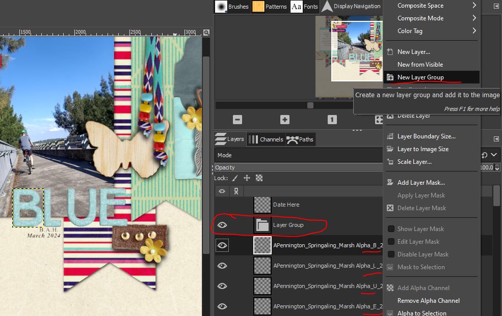
But now that I’ve lined them up, I think they would look better over the sky part of the photo. S0 that I can move all the alpha layers at once and keep the spacing, I right clicked on the B alpha layer and made a New Layer Group, then dragged each layer up the Layers Palette and into that group. Now I can just make the Layer Group layer active and when I use the Move tool, all the letters will move at once, I can also scale the group as a whole, rather than each letter individually – this would be especially handy for super long titles where you have placed a whole lot of letters! (If you click and hold the centre window icon in the Scale box around the letters you can Move while the Scale tool is active, without going back to the Move tool!) Here I shrunk my Springaling title a bit to fit within the photo.

You could also use a Layer Group if you have made a ‘cluster’ of extra elements that you like together but want to move them somewhere else on the page. Layer Groups seem to make life easier in GIMP!
“Wow this feels long”
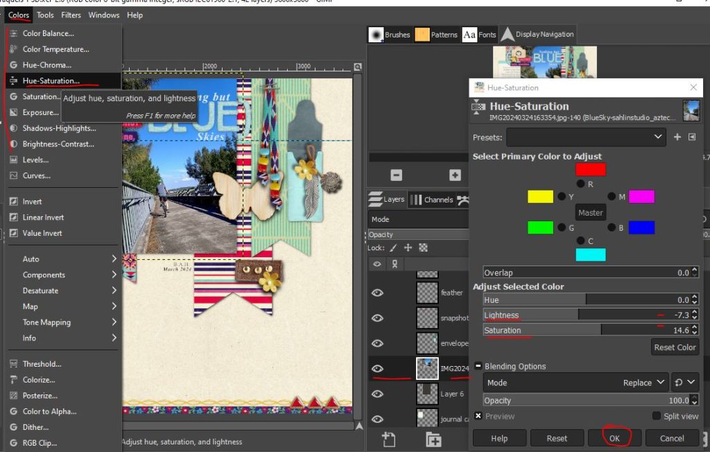
It’s ok. The learning process and reading how to do something always takes longer than actually doing it! We’re nearly done. I’m just finishing my title with the Font Tool, making sure all the paper piece layers and elements are shadowed and throwing on a few extra wooden pieces from the pack I grabbed the butterfly from earlier. I turned the visibility off on a few layers from the QP too which you can see in the finished side by side image. Also I forgot to tweak my photo with the filters and edit options on my phone before I added my photo to the page so I gave the colours and contrast a quick bump with some of the Colors Menu tools so it didn’t look so washed out against the vivid colours of the QP. This is totally optional but handy (but not in the place I would have necessarily looked for them coming from Photoshop myself and the pop up screen looks different to what I would have expected but it did the job). Again, this changes the layer (in this case the photo) itself so be sure before you hit ‘ok’ or you’ll have to Undo or delete the photo and drag it in again.
“OK Let’s Save For Web so we can share it in the gallery already!”
OK save your file again. Now we duplicate the whole project by typing Ctrl D – and it shows a second tab at the top which look identical. Now because the gallery limits on size are 800px x 800px, if you look at the rulers we can see this is full-size (print quality size) at 3600px

To resize for a screen, in the Image menu, choose Scale Image and in the pop-up we want a resolution of 72 and size of 800x800px:

Yes it will look tiny, and you can see from the rulers it is 800 x 800px, but this is your Duplicate copy as you can see the two tabs at the top- don’t worry, the rulers on the original page you scrapped will not have changed. (Plus you can always use the Undo Ctrl Z function)

You can now save this resized image using the Export As option to save it as a jpg ( xcf files will not be recognised by the gallery or people you send it to). Name it something that will be able to differentiate it for when you upload it to share with us in the gallery. I usually add the size at the end of mine (so this will be BlueSky800px but you need the jpg file ending. If png comes up as default, backspace the png and type jpg after the ‘.’)

Then there’s a second pop-up (minimise GIMP if you don’t see it, it may hide behind the program) and choose the quality level. The gallery size limit is 250kb so 100% quality may be too big.

80% gave me a 180kb jpeg file. Hover the mouse over your saved jpeg to check it’s size before trying to add it to your page to the TLP gallery. (You can see the saved xcf file here too in the folder with Sahlin Studios original templates. The xcf file has Wilbur the dog mascot instead of a thumbnail which is why the way you name your files is something to consider)

You can also now go back to your first tab and ‘Export As’ your original project to print. This time you are saving at 3600x3600px and 300pixel/in and still as a jpg format. This one I would name BlueSky3600px but name it how you will remember – maybe add ‘print’ to the end.
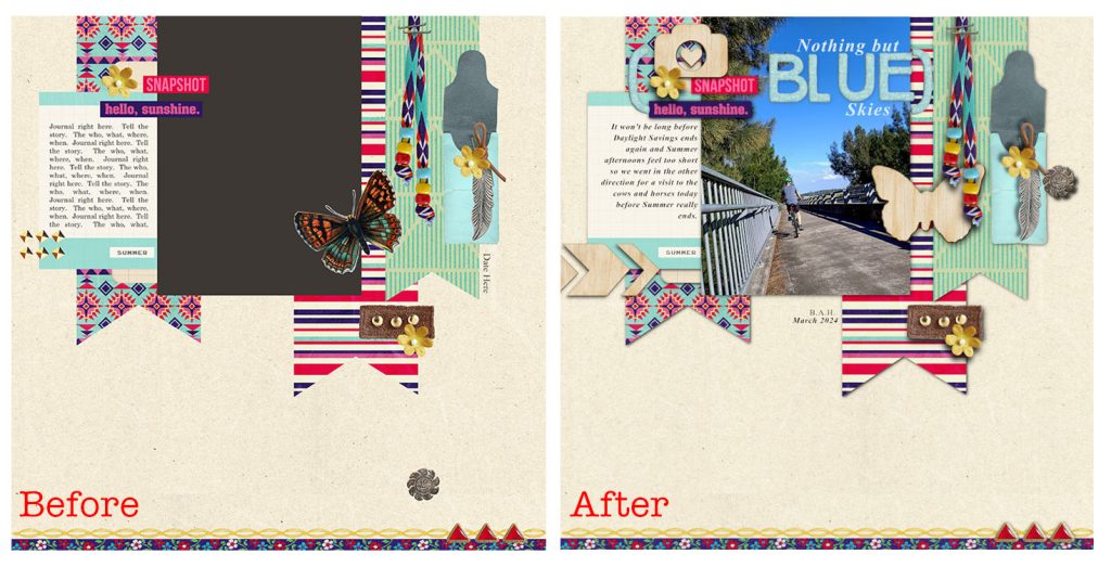
Here’s the QP as it started in GIMP and my finished page side by side. Thanks for sticking around & I hope this helped you learn a bit about GIMP and starting as a Beginner.
There are also some traditional QP’s available as Freebies in the store. There are a few here by LynneMarie if you want to try for yourself. If you can follow the process of a Layered QP a traditional one will be a breeze!
(Also we are having some issues with blog comments at the moment. If you have questions or comments for now please contact me by typing @bellbird then your comment through the status bar in the TLP forum).


