Blending Papers
Hi everyone, it’s Polly Rae here, and today I’m going to share with you my process of blending papers with blend modes. Often a paper has a pattern, color or texture I like but it doesn’t quite mesh with my page design. I could use an adjustment layer to manipulate the colors but I prefer to try changing the color blend modes on my paper layer and often duplicate the layers, changing blend modes and opacity on each layer.
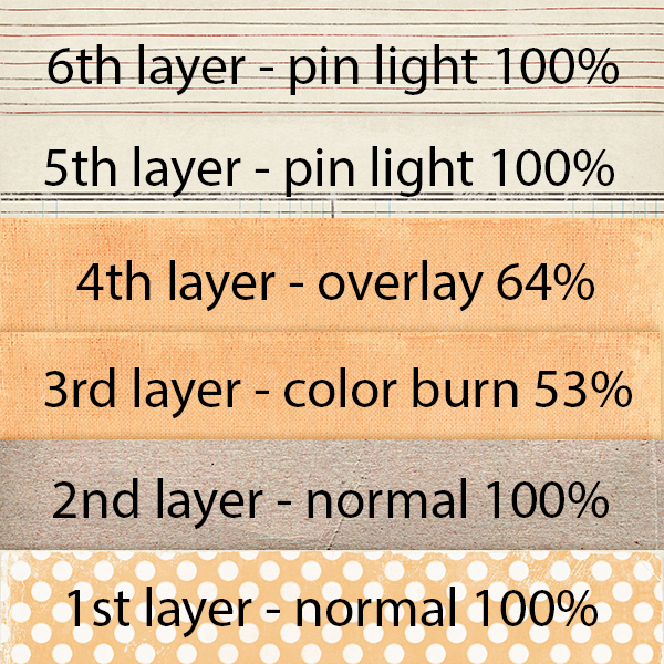
For my sample page, here are the paper layers I will be using, along with the blend mode and opacity of each layer.
I know how the blend modes affect my papers in a general sense and I’m happy with that. I don’t need to know all the scientific and mathematical calculations, in the same sense as I know generally how my car works and what happens when I turn the key in the ignition and drive. I just need to know how to adjust and manipulate the modes to my advantage, I don’t really feel I need to know exactly why it happens. If you wish to know more, there is a lot of info available and have fun reading more about them. For today’s post, I’m going to keep it pretty basis, so as to not overwhelm you. I want you to find the joy in playing with blend modes, as I do. I get excited about using them and always am amazed at how many varied looks you can achieve. By the way, this is not only suited to blending papers, it is also amazing with photos. I think a future blog post about blending images might be good to share; I’ll get started on that at some point soon.
By changing the blend mode and opacity, you can change how that layer blends with the layers below it. There are six sections of blend mode groups (normal, darken, lighten, contrast, comparative and composite). There is a shortcut for scrolling through the blend modes to see how each one looks with your layer; use SHIFT + or SHIFT – to scroll up and down through the blend mode menu. (Don’t have a painting or editing tool selected before using the shortcut because these tools have their own blend modes; these are the tools in the 2nd group, in the left sided toolbox.) I use overlay, multiply and linear light a lot and often duplicate layers, changing modes and opacity. Trust me, once you start playing with these you are going to become as addicted as I am and can spend copious amounts of time just blending, duplicating and changing opacity to see what can happen!
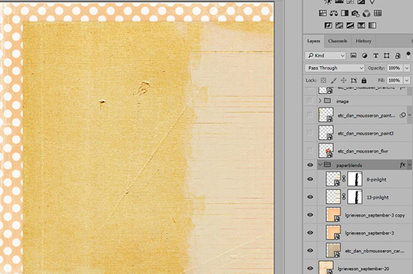
In my sample page, I used six layers of papers (as shown above), you’ll see that the 1st layer is set to normal blend mode at 100% opacity. There is no layer below this so there are no light/dark pixels to blend with so this first layer remains in “normal” mode at 100%. The second layer was left at normal blend mode but the 3rd layer above it was a new paper that I wanted to blend into the paper below, so I changed the blend layer to color burn but reduced the opacity as it was a bit intense to my liking, then chose 53% opacity. I duplicated that 3rd layer and changed the blend mode to overlay blend mode at 64%. This increased color and contrast, lightening it up a bit. The 5th and 6th layers were lined patterned papers that I wanted to journal on, but wanted to diminish the lines so as to not draw too much attention to the lines, so the blend modes I chose blended the darker pixels (the lines on the paper) into the layers below, reducing their visibility. I used a mask to erase some of the paper, leaving the strip along the right to journal on.
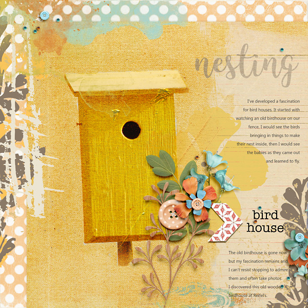
To finish my page, I duplicated my photo and changed blend modes, opacity and erased some of the background. If this interests you, I hope you’ll be excited to read a future blog post about this technique. For today, we’ll stick with blending papers. I then added my embellishments, paint and journaling. So, here is my finished page.
I hope that this inspires you to experiment in blending papers. Have fun and don’t forget to share your pages made with The Lilypad products in The Lilypad gallery HERE. If you have any questions about blending, please visit us in the forum and we’ll be happy to help.