Zooming In: Hybrid & Cut-file Shadow Study
In the last Zooming In blog post, I talked about how the parts and details can really make or elevate the whole. As someone that thinks about realism often while digiscrapping, I’ve been enjoying seeing all the Hybrid Gallery projects lately, and especially the different perspectives and angled photos that show how real paper and element layers sit and interact with lighting. If you aren’t sure what I mean, it’s posts like these linked below from annsofie, dawnmarch and mocamom among others – all the hybrid people are inspiring! They take digital products from the store and print them to use in a more traditional way. The Hybrid Gallery has everything from flat and pop-up cards and bookmarks through to travellers notebooks and traditional scrapping and pocket pages.
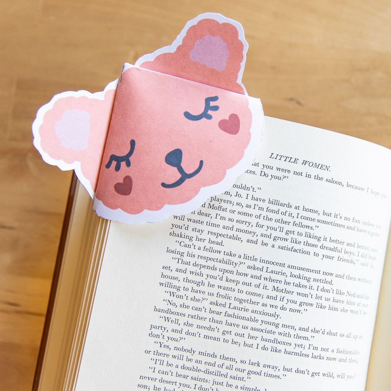
The bear bookmark corner really shows the difference lighting can have. See the difference in the two ear pieces? One is definitely darker and the other means the same colour pink paper looks lighter in real life and used creatively, maybe because of the sheen or just the reflective surface. (There’s also a video kindly included in the description in the gallery if you want to see how Dawn made hers and make your own too!)
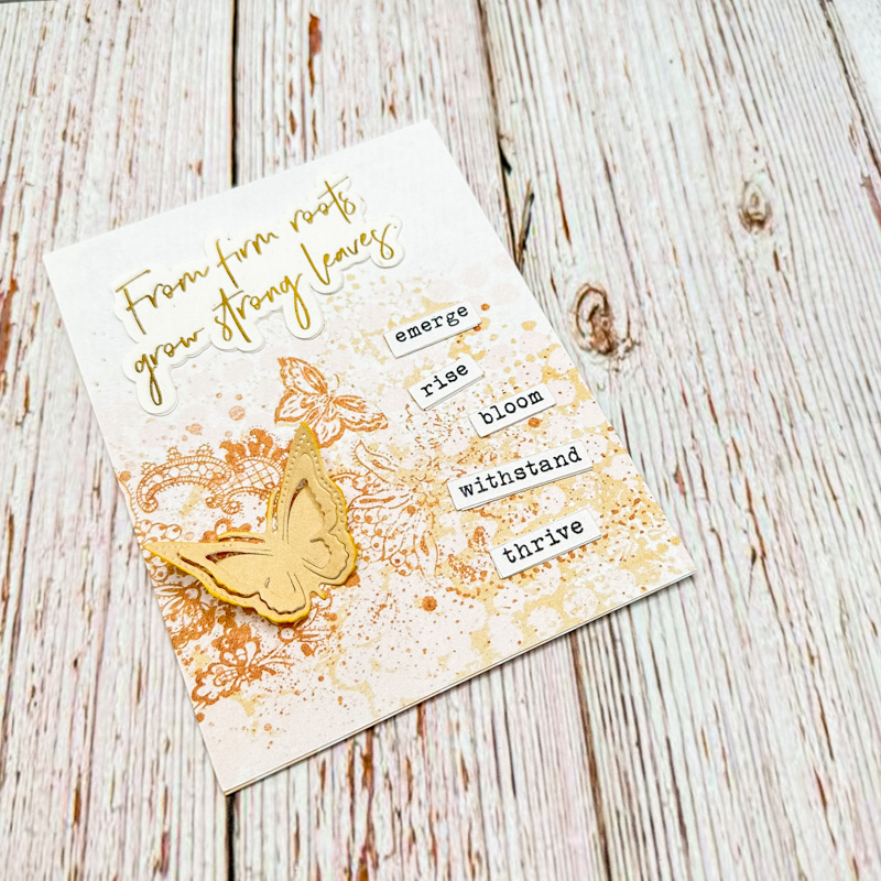
I also love seeing how cutfiles are used in real life and how creases and curling paper edges contribute to dimension on ‘flat’ pages. The butterfly on the card has detail with cuts through the wings for shape and whether intentional or not, the way mocamom has adhered it allows the wings to pop off the page a bit. ‘Bent’ butterfly wings are always something that draw me in from thumbnails in the gallery!
I found a bargain Cameo 4 in a second hand store not so long ago and couldn’t pass up the opportunity, but for a bunch of reasons, starting with it didn’t have a power cable so I wasn’t sure it would even work after buying it ‘as is’, I haven’t really played with it until this week and it gave me a chance to experiment and compare my shadows to real shadows and so that’s what I’m sharing today.
This is the page I made showing my success with the Cameo after some googling and watching several intro, ‘how to’ and trouble shooting videos. I used the same cutfile, from Scrapping with Liz’s Classy Cut-outs template, as a PNG on my page in Photoshop, as well as the SVG version with the digital cutting machine. The kit used is Bella Gypsy’s Contagious Creativity collection.
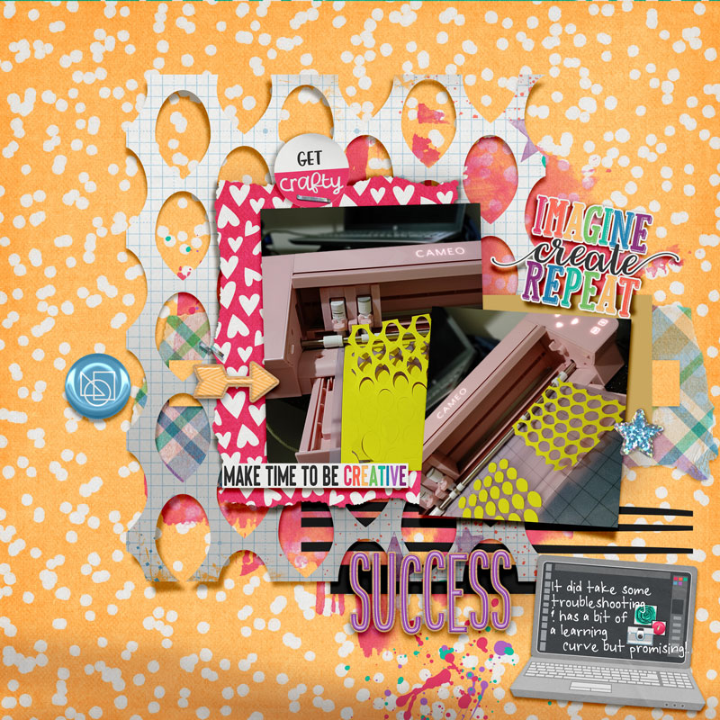
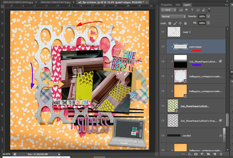
To give the illusion of the cutfile lifting, I separated the shadow onto it’s own layer and then used the Transform> Warp option, dragging the handles in a few places. Because I didn’t want to have to distort the linear grid of the paper to make it look really curled and buckled and warped, I kept it fairly flat.
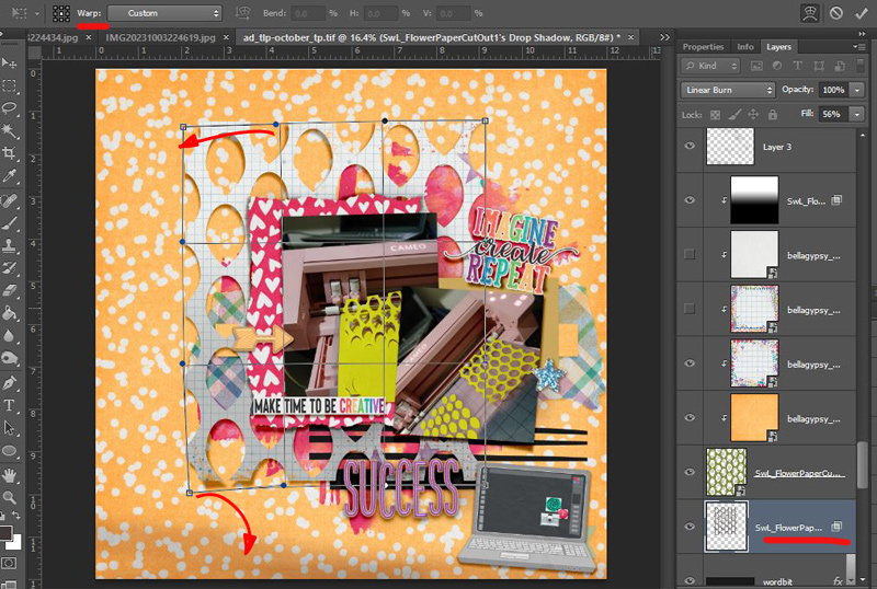
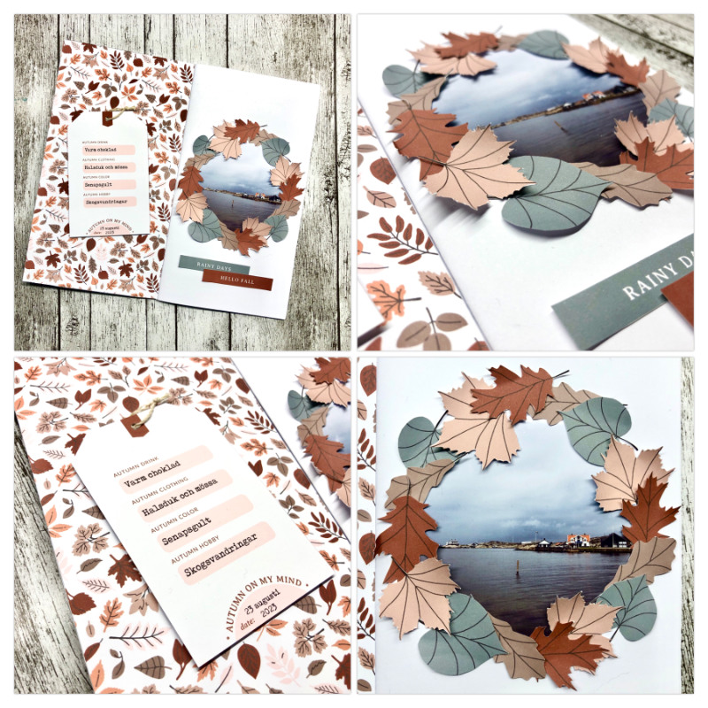
I also added a gradient overlay to make the bottom edge darker and brushed over some of the edges using clipping masks. You can see in annsofie’s traveller’s notebook page especially in the close-ups on the right, how the leaves in the wreath, especially the light pink and brown ones at the top, have darker edges so I think this step helps with the realism when using a cutfile as a digital layer on a digital page, beyond just warping the shadow layer and stopping there.
And this is me playing with and looking at the ‘real’ cardstock cut out and studying and zooming in on this one part of the whole page. I was just using not-precious, thin card while experimenting with the cutting machine. This is just cut from a yellow manilla folder basically, so heavier cardstock may not naturally roll up so much after peeling it off the sticky (new) mat or an older, less sticky mat; but I tried to hold it against some white paper to see where and how much the shadows fall when the cutout is tacked down just on the mid-left side, corresponding to where I have an arrow element and a backwards staple on my layout. I held it down with a highlighter and then with my fingers to see the difference. The light source was a lamp above to the left and a window was directly in front of the desk, so light was coming in from the top of the photo, and left top diagonal. The direction and intensity of the light will obviously be a main factor in determining the angle and intensity of the shadow but also gluing it down would give a smaller but darker shadow with less of a gradient effect on the yellow cardstock surface but glue and I aren’t always friends so that’s an experiment for another day.
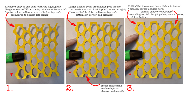
Looking at the real cutfile against my digital version, I think I used too dark a gradient at the bottom and will be more subtle in the future.
I’d be interested to know: Has digiscrapping made you look at things in real life differently and has it influenced how you scrap at all?
See you next time.