The Monday Mash-Up! – Common Color
Are you primarily a one kit only scrapper, on a budget or looking for ways to extend your stash?
Mashing 2 (or 3!) kits together (and making your own customised collab!) gives you so many opportunities but means you won’t have to spend all your time tagging or searching your stash. If mixing and matching is not your normal style and feels daunting, this series will look at several ways to make mixing different design styles easier than you think!
______________________________________________________________________________________________
Hi there and welcome to a fun new way to start Mondays in the middle of the month – The Monday Mash-up!
So far in this Monday Mash-up blog series, we have mashed kits of different styles from different designers that have a common theme, and then last month we mashed 2 kits with different themes by the same designer.
This month, we are going to mash 2 kits from different designers that have different themes but have a particular colour in common.
If you think about it there are only a limited number of colour families a designer can use to create a kit. Think ROY G BIV basically. Within each colour family there are too many shades for me to wrap my brain around but the use of single colour palettes and particularly tone-on-tone scrapping have been popular trends in both the paper and digital scrapbooking worlds, where, for example mostly green elements would only be used over green papers. Mashing kits based on colour really opens up so many possibilities for using and reusing kits in your stash!
Your photos are a great starting point in choosing a colour to form the basis of your page and in selecting products to mash!
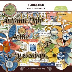
For today’s page I’m using a photo I’ve had for a while that I processed to add more light and lens flare and to tone down the saturated colours. I’m also playing along with Fiddle-Dee-Dee’s current Designer Challenge and you can see from the template below, there is the potential for lots of fun with paper pieces.
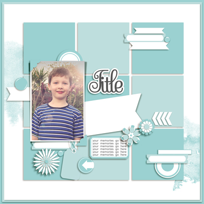
To avoid my photo being overwhelmed by a lot of competing colours and patterns, I’m going to mash 2 kits that feature blues, inspired by my son’s shirt. Often with these sorts of basic portraits, I have no title or wordart in mind and they are really ‘just because’ photos that I’m sure any mamarazzi & scrapbooker completely understands, you can never have too many photos of your kids, right?!
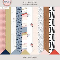
So in a case of what I believe to be ‘scrap serendipity’, Elif Sahin has a collection called ‘Just Because’ and it has a medium and darker shade of blue in it’s colour scheme.
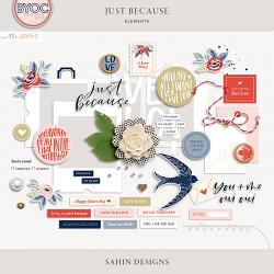
 Not everything in the preview suits my scrapping style, or very loose vision for where I want this page to go, but in the history of ever, I have never used every single piece of a kit and I let go of the guilt associated with that a long time ago, but that highlights one of the benefits of kit mashing – you can use the pieces that speak to you and complement them with parts of another kit so you can create a page that is more you!
OK so I know you are dying to know what I picked to mash with Just Because. Ta-da, this is Lynn Grieveson’s Forestier (available also as a kit with a bonus alpha) and it’s not my first time using either of these kits.
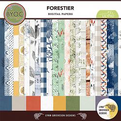
Looking at both kits, like in the first Monday Mashup using Birthday kits, I’ve got one product that has more clean lines and patterns and basic sentiments that work for my photo, and one that is more artsy with patterns I love but in no way could create myself but the key factor here is they both feature blue. Remembering they don’t have to be identical shades of blues for this kind of mashing to work as a starting point.
So here’s my initial placement trying papers from Forestier. (Spoiler alert: the yellow corner splotch on one of my fave papers from the Forrestier paper pack that is kind of distracting now, ends up helping me widen the colour scheme for this page and pick up on more of the warmth & sunlight in the photo).
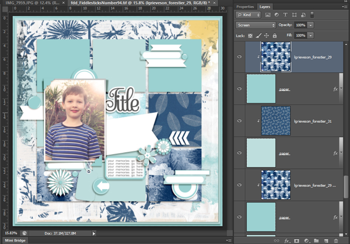
Adding in some pieces from Just Because…
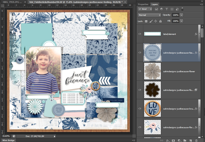
..and more from Forestier, and this is where the other colours start to creep in but they are in smaller pops and the larger scale of the photo means those extra colours aren’t dominating the page.
And finally here’s my finished page – full credits in the gallery here. In a surprise twist that even I didn’t see coming, I removed the top left paper square from the template to let more of the background print show through above the photo. (Covering up even an inch of some patterned papers is hard sometimes! #scrapbookerproblems!)
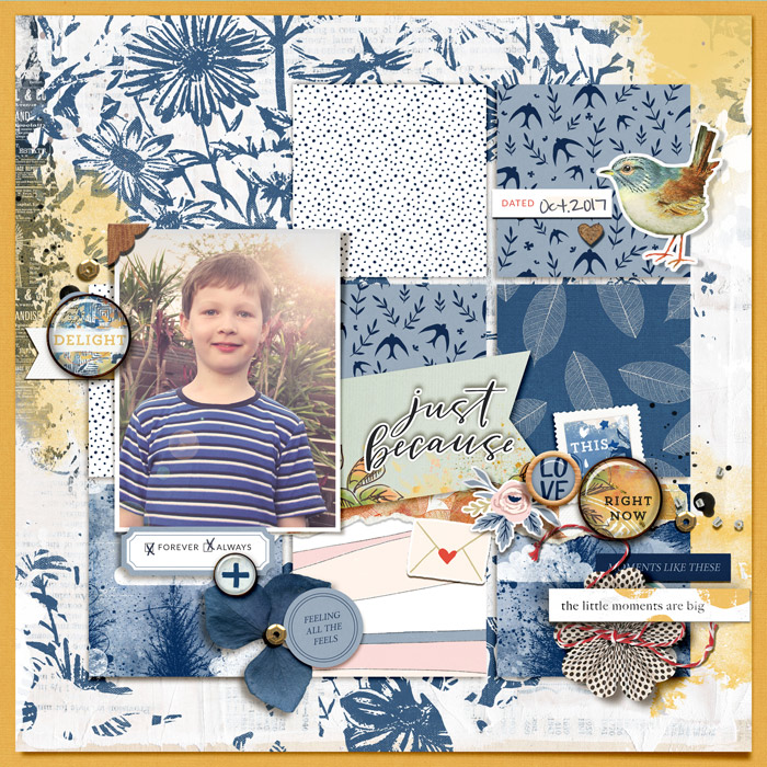
This page will be too crazy busy for some scrapbookers but I hope you can look past all the patterns to see today’s colour mash-up concept in practice. The overall page is still very blue but the white alone in the patterns helps balance it and the golden yellow of the page border and the paint creeping in from 3 points around the page just sets up a visual triangle that is a well known technique to draw the eye in towards focal points in all forms of art. The tiny amounts of pink and red are contained within that triangle and their small scale in the overall colour scheme keeps them from being distracting. Using wood tones and gold sequins is really just an extension of the yellow colour family and they all add warmth to the page, plus no one ever complained about the colours of blue sky and sunshine, they’re a ‘can’t fail’ combination.
And to think, I started this page with just a photo and no ideas other than the colour blue!
See you next month for another Monday Mash-up journey!


