Page Fixes: Let’s talk about Balance
I don’t think it matters how long you’ve scrapped or who you are, there are times when you just aren’t loving the page as it’s coming together in front of you. It happens to everyone, right?! Here’s an example of mine from this past weekend and let me talk you through my process of getting it to a place I am much happier with and share some things you can try if (or next time) you find yourself in the same spot, so you won’t be tempted to bin your layout! Try these instead to fix and save your page!
______________________________
So we begin with me scrapping from a loose recipe, just 4 steps for a page for the Halloween Bash Costume Challenge. Now let me stress there is nothing wrong with the recipe (I love a recipe challenge and the other costume/recipe choices in that challenge were great too!). This post is more about identifying and fixing issues within a layout, while working within any kind of challenge guidelines and this is just a real life, possibly relatable example, which is why I’m sharing it. So the Little Mermaid costume page requires a blue background, 3 animals on the page, include something you are passionate about, and use 20 thingamabobs (elements). In the spirit of honesty as always, the 20 thingamabobs made me a bit anxious but no big deal really as I’m not exactly a minimalist.
Picking photos for this wasn’t hard; the animals plus something I’m passionate about mentally lead me to pet photos and in thinking about the number 3, my 3 birds in one photo came to mind… and then the whole reality of actually getting a photo of them together gave me some story. Here’s where it gets hard for me and my first way of addressing that problem.
Without a template, I can feel lost. Multi-photo or single photo, it doesn’t matter, so my method of tackling that when I’m not using a template (or scraplift inspo) is to find a fancy frame or group of frames that instantly make the photo/s more important and putting that in the middle of the page (it doesn’t always stay there but it gives it a central focus and starting point). A multi-photo frame is even more useful to me on these sorts of ‘free reign’ pages because it already clusters my photos which is especially useful when they are all part of the same series or story; and then I just start adding embellishments around it. So that’s my general process and on this day, I liked the off-centre, delicate balance stacking in this NBK Designs wooden frame and it felt fitting with my birds being together but all over the place so it felt like a good place to start. I went with a diagonal flow to give me space for ’20 thingamabobs’ and I pulled pieces from various kits as well as trialled various blue papers after searching my stash that just went with my ‘taking a group photo of birds is like herding cats’ theme.
So here’s my in-progress ‘I’m not loving it’ page.

And here’s the page after I made several changes and submitted it. (Full credits in the gallery here)
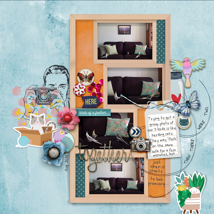
So here’s what I changed and more importantly why it made a difference and I feel like it all came down to balance and often does when I’m working without a template. Beyond balancing proportions and changing relative positions of clusters and items to give a balanced page overall, it is also about balancing light and dark tones within the page.
With layouts like this where the focal point is central, it can help to imagine a seesaw style of scale and look at how the page composition affects the way the seesaw is influenced. So let me show you how each of the changes I made effect my imaginary seesaw.
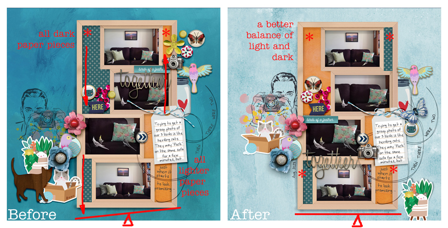
In the below Before and After, I’m looking at the distribution of the darker tones in the page.
- In the Before page, the heavier visual weight of the darker tones in the plus sign paper pieces are all in the left side of the frame (in the negative spaces), combined with the more zoomed in shot of the sofa, which is very dark and dominates the frame of that third photo, it tips the scales to the left.
- The paper pieces on the right of the Before page are all a lighter colour in comparison (an orangey solid) with the tag also being light and is a complete contrast to the dark third photo next to it. To me, the ‘lights’ don’t offset the weight on the other side of the scale much.
- In the After page, I have switched the positions of the plus sign and orange papers in the top of the frame, so there is a piece of plus sign and a piece of orange paper on both sides of the scale, so they effectively cancel out or balance the scale. The plus sign pieces also make up a smaller area than the orange, which offsets some of that dominant sofa through the middle 2 photos.
Now let’s look at the clusters of elements and how they tip the scale.
- If you think back to the park when you or your kids have used a seesaw, you would know that generally speaking, any load placed closer to the central pivot point of a seesaw style of scale will have less of an impact. The closer to either end a load is placed, the more it’s weight will effectively pull that end of the scale down. So a larger load on one side of the seesaw but closer into the pivot point could definitely balance with a lighter load that is at the very end of the other side. This is more important to consider looking at the element clusters on the page than the paper pieces because the paper pieces in this particular frame were the same distance from the pivot point, and switching what paper went where did not change their distance from the middle.
- In the Before page, the elements grouped together on the left form a larger area, with it’s vague mid point (the red asterisk) further out from the middle pivot point of the scale than the area of the elements on the right end. The doodle loop is light and barely part of the group compared to the woodgrain cat silhouette on the left.
- Removing that cat and repositioning some of the elements in the After page brought more consistency to the opposing clusters, and as you can see from my red seesaw line below, I don’t think it’s quite a perfect balance by moving the cat in the plant sticker, but it has changed the dynamic of that right cluster to include the tag and moved the midpoint of that cluster group closer to the pivot point and is an improvement to me.
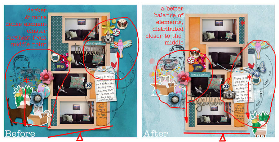
Modifying the element placement also transformed the diagonal flow to more of a visual triangle centred on the photos, title wordart and story, which i think also improved the cohesiveness and flow of the layout to me.
Additionally changing out the background for a lighter overall blue paper (still from the same paper pack by Lynn Grieveson) made the whole page feel lighter and offset the dark tones of the sofa that weigh down the centre and especially the lower left of the layout where that third zoomed in photo. Given how colour and tone can impact the mood of a page, the lighter blue paper was definitely a better choice also in this instance with a theme and story that is not overly dramatic or intense.
So to sum up, if you are not loving a layout you are scrapping, before you bin it, step back for a minute and think about whether it feels balanced around your focal point.
- Are there tones or colours that are competing or weighing part of the page down?
- Are your photo or element clusters distributed disproportionately or evenly around the focal point of your page?
- Would a different tone of background help fit the mood better?
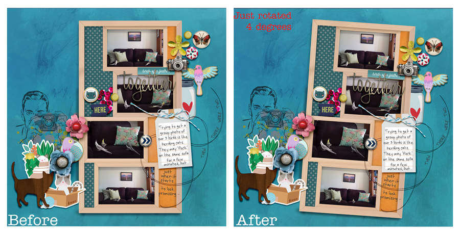
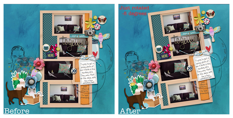
- And finally, picture a seesaw and if you are really finding achieving a balanced page difficult, you can always use the tilt trick to correct it or lean in to the imbalance!
- Group everything you want to keep together and just rotate it by a few degrees until you are happier with your see saw! This time the After images are just the Before page rotated by 4 degrees, or by -8 degrees and just that step seems to instantly improve it – maybe that is actually better than fighting for balance in some instances and it’s not something you really have to think about, it just seems to work! What do you think?