Hi Pad Scrappers!
Polly Liana here with some great tips to make your titles come alive with originality and fun! Yesterday, clever Polly Judie showed you a cool way to use paper and a Photoshop trick to create beveled alphas. Today, I’m going to piggyback on that great idea to show you another way to use some other Photoshop tools to create great titles for your layouts.
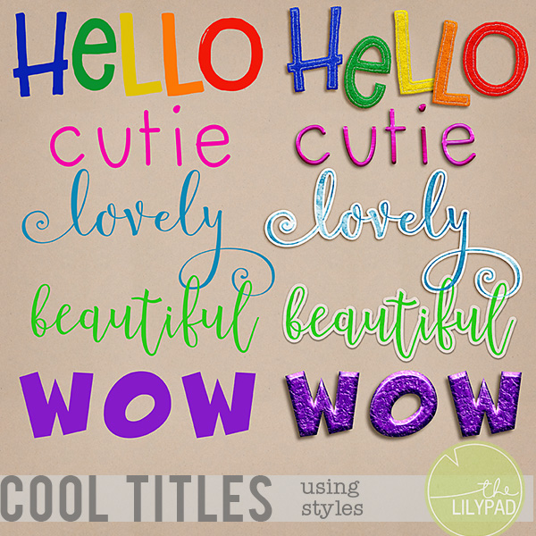
I don’t know about you but sometimes I have to skip the title on my layouts because I just can’t find anything that coordinates with the rest of my elements and papers. Fonts don’t always POP the way I want them to and word art doesn’t always say what I need it to say. Enter: Photoshop styles by Mommyish. Yes, our very own Leah of Mommyish has designed over 100 different styles for your all your scrapping and designing needs. She’s got styles that can make your fonts and elements look like gel rubber, puffy stickers or chipboard. She’s even got one that can make them look like plastic building blocks!
Have you ever wondered how it is that designers can come up with so many different and clever objects to include in their kits? Many times, they create them using styles. I’m going to show you a few different ways that you can use Mommyish styles to create your very own personalized titles that will coordinate with any layout.
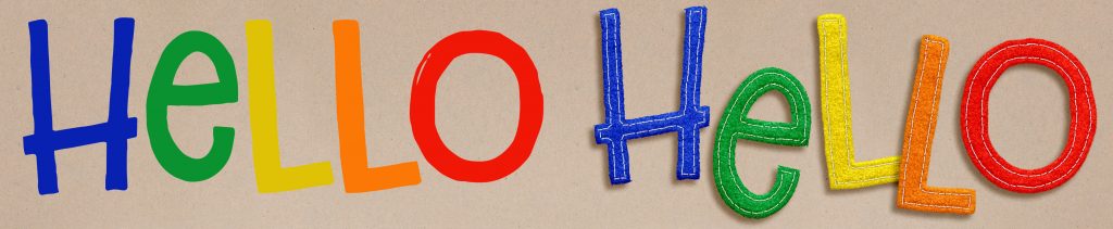
First up, one of my very favorites… the stitched felt style. This one takes any font or colored object and adds stitching to it to make it look like you cut it out of felt and stitched around each piece. She even recorded a terrific video with clear instructions so you will know exactly how to use the style, actions and buttons that are included. The font I used was Taco Tuesday.

Second is a very clever style that’s a cinch to use and makes your thin fonts look like they’re made out of wire. You can make them in silver or gold OR you can use the original color. The font used here is designed by our own Heather Joyce and it’s called The Future Freaks Me Out.
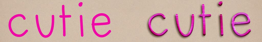

Next up is a combination of styles. First, I used a watercolor style to convert the text to a watercolored look. Then I used a sticker style to add a white border around it. Finally, I used a watercolor paper style to make it look like it had been painted on textured paper. The font here is Velvetberries.


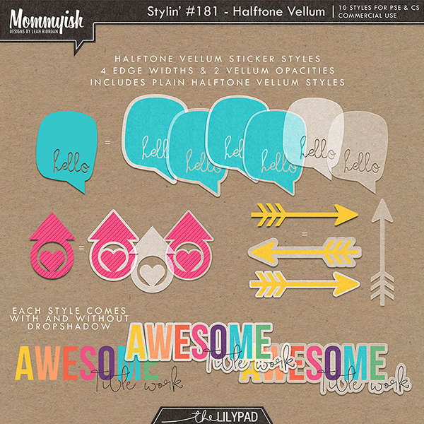
Here is another simple style to use that will give your fonts a vellum look, with or without a border. You can choose the opacity of the vellum for different looks. The font is Introblues.

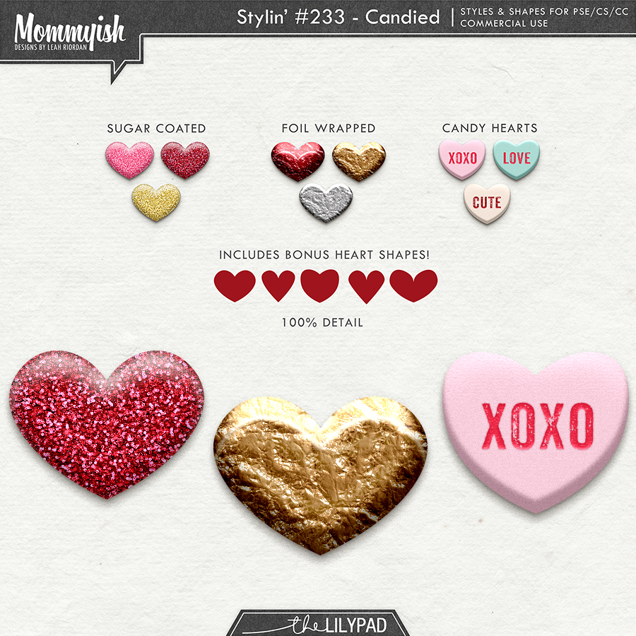
Finally, a title using Mommyish’s newest styles just in time for Valentine’s Day. It makes things appear as if they’ve been wrapped in foil. Again, you can use the colors of the original item. The font is Thwack.

Here are some wonderful reasons to take the plunge into using styles:
- The main reason I love using styles is because they are a little-known gem that’s underutilized in personal digiscrapping. They really expand the flexibility of items in a stash because you can recreate elements in new media. Have you ever seen an object and thought, “That would perfect if only it were a sticker/flair/metal/foam/enamel object…” Now you can create exactly what you want. The opportunities are truly endless.
- When using the styles and in particular when watching Leah’s awesome tutorial videos, you can learn a ton about how Photoshop works. For example, I didn’t know much about paths until I had to create one when using the felt style. Now, I’m a pro!
- These are quality styles and when used correctly, the results look really polished and realistic. It looks like you did some real magic when it was actually just a few clicks!
The other good news is that Leah is just as passionate about styles as you’ll be when you start using them. So passionate in fact that she hosted a great styles contest a few months ago. For the contest, she offered up a few styles for people to try for free. Give them a try and come back to her store to peruse more than 100 other styles. There will undoubtedly be some in there to suit your scrapping needs.
Thanks for checking this out and have a great weekend!
Leave a Reply