Mixed Media Beginners: Artsy Pockets & Photos
Hi again! For this month’s Mixed Media Beginners I was inspired by a recent blog post by Gaelle on pocket scrapping. (If you haven’t seen her blogpost about getting started with Pocket Scrapbooking on the Project Life app, you can check it out here). Pocket scrapping can be clean and simple, messy and mask-y, or somewhere in the middle, which I call ‘Clean and Artsy’.
Personally, I started making digital pocket pages through Project Mouse and my style definitely evolved over the years from ‘clean and simple’, with a lot of plain pocket cards and rectangular photos and white borders (and also rounded corners – I remember those days, Gaelle!), to ‘clean and artsy’, where my borders were obscured with painted or blended edges, elements overlapped everything and there were less clean lines and more doodles and scribbles, but still featuring a white background and border. That was my real intro into the world of digi mixed media actually.
Since then artsy pockets really took off! There’s a huge range of templates that cover every style of pocket scrapbooking in the store. Rachel Jefferies, Lynn Grieveson and NBK especially have heaps of these if you search for ‘artsy’ or ‘messy pockets’ (or scroll through the ‘templates’ section of the Pocket Scrapping category ) and they are chock-full of extras you would associate with mixed media. They are characterised by the inclusion of items like messy stitching and thread, grungy or artsy masked photo or journal card spots, paint and ink splatters, decorative or eroded frames and borders as well as using a wide variety of shapes positioned at slightly to hugely misaligned angles that are perfectly imperfect and far beyond the traditional rectangles in Gaelle’s example. Some are more structured and some look more freestyle and some go well beyond the typical 3×4 and 4×6 pocket sizes to include big feature spots as well. The beauty of all that is that there is something to fit everybody’s preferred pocket documenting and scrapping style.
I’ve discussed Pocket Scrapping before from a mash-up perspective and today’s page is also a mash-up of packs but I’m not actually using any journal cards. I’m going to start with a traditional sort of pocket template from NBK’s Easy Peasy Simple Grid 1 pack. Here it is, it’s 12×12 drop down option 4 for PSD files (but also available as PNG’s and PAGE files) and so my first steps give a similar result to Gaelle’s clean app-created results and then the mixed media and artsy-ness begins. 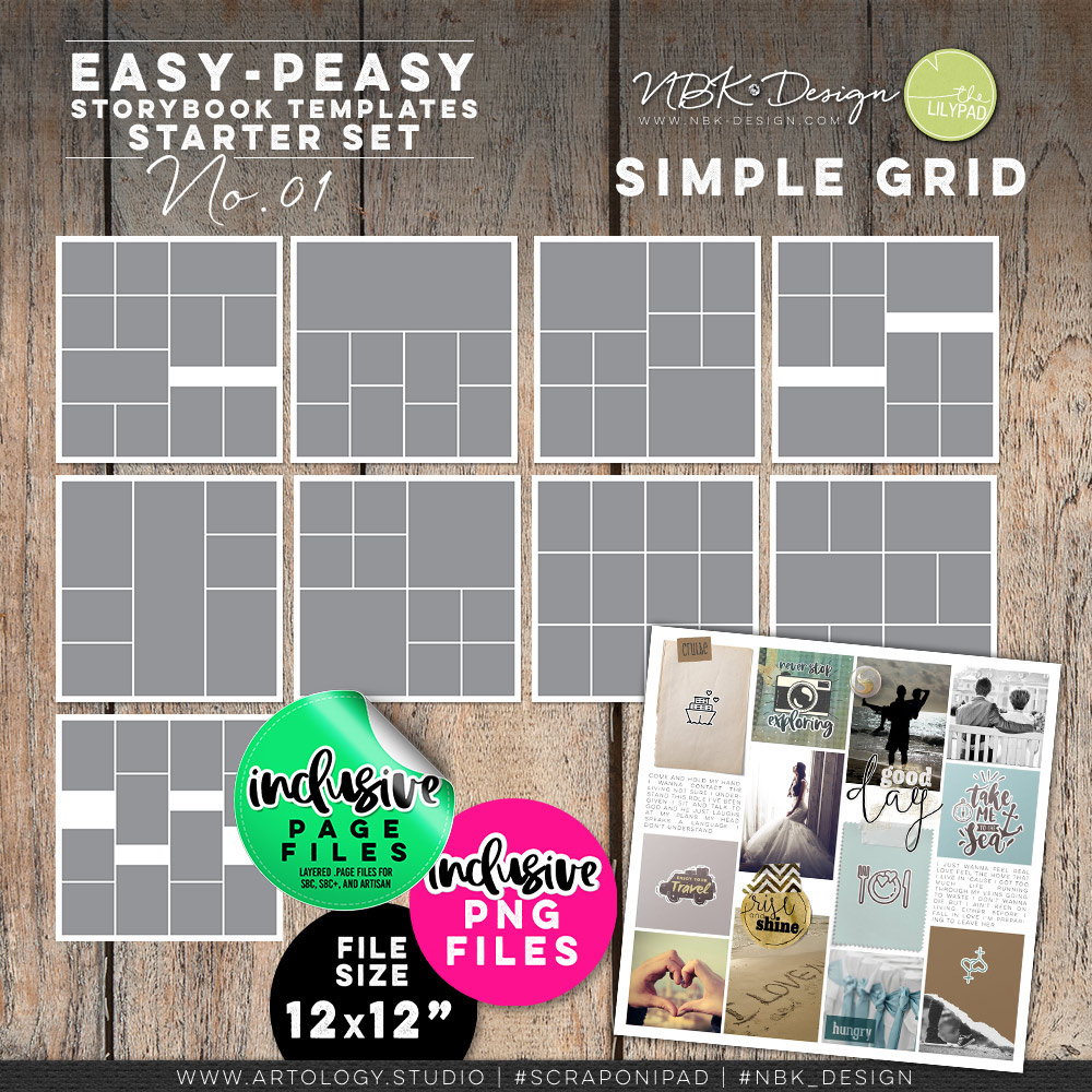
Setting up my basic pocket page:
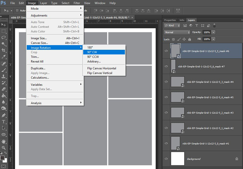
I grabbed one with a long photo spot in the middle and rotated the template ready for dropping in my photos;
then use clipping masks to get each unedited photo to fit the rectangles and tried to arrange them to tell a story of a trip visually. This is where I’m at.
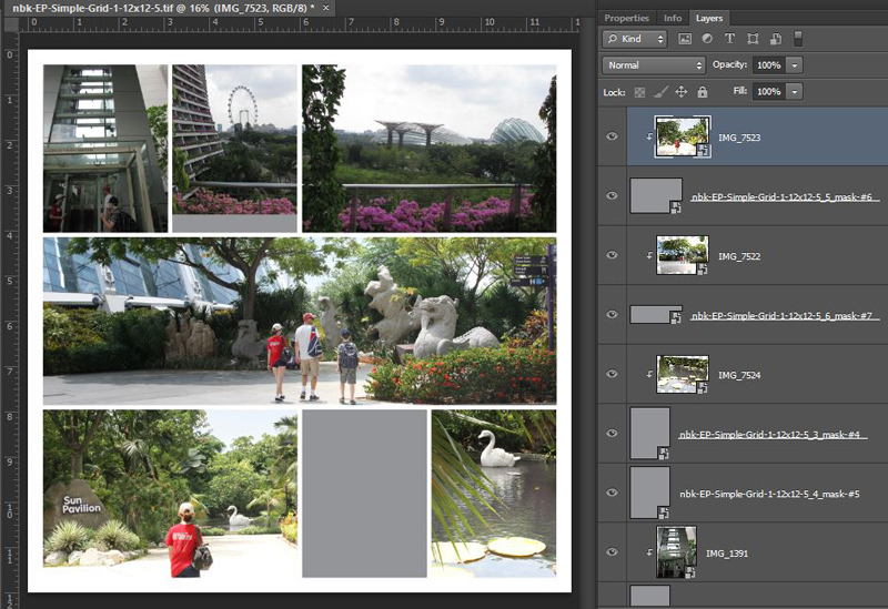
The artsy plan: Looking at the above, I have some spaces to put artsy bits and have started thinking about title placement and element use. The middle photo on the top row and the 6×4 to the right are not a long panorama but were taken along the same path with the same handrail, and at this stage I’m thinking to use that hand rail as a leading line from that middle photo to the next. Because lining up that railing means not fully covering one photo spot (you can still see the grey gap below it), I see covering the gap as an artsy opportunity. It can be covered with a wordstrip or paint/mask or really anything. It might say ‘the ascent’ or something to tie the elevator/lift trip to the rooftop walkway with the handrail view photos. Still thinking…
My title or some journalling will go on the path on the left of the middle panorama photo and it will probably overlap into the tree line of the bottom left sun pavilion photo. A journal card could tie the sun pavilion entry photo to the disappointment of finding a floating statue rather than a real ‘giant’ swan in the last photo. I’m also thinking to use some of NBK’s Magic Lights to enhance the statues on the left of the panorama photo as they are hidden more in the shade.
Giving some photos an artsy treatment:
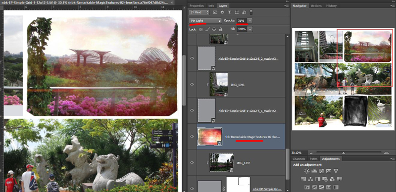
To me, ‘artsy’ can mean having the page look less boxy but also making the photos more artsy too. So I started with one of NBK’s Magic Textures; these are rectangular jpegs designed to be used as overlays with blend modes in a photo editing program. Photographers will sometimes use these sorts of products to enhance or totally transform an image and they can be addictive to play with; they are reusable and stackable and give different effects depending on the photo and blend mode you use.
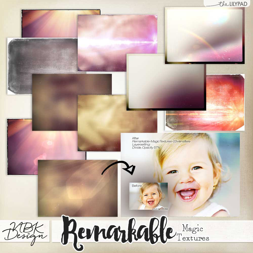
Through trial and error playing with different blend modes and sliders, I gave my less-than- inspiring sky and landscape that did not do the view justice, a bit of a makeover. Instantly less boxy because of the angled edges of the magic texture I chose and definitely more artsy photography.
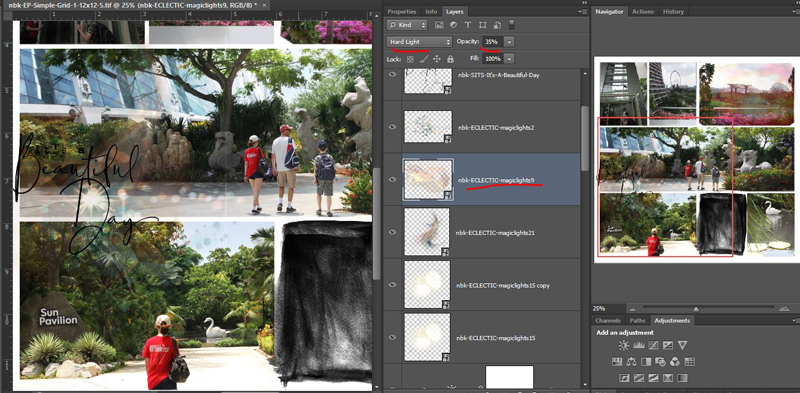
Next I pulled in a few of the Magic Lights from my stash. If you haven’t played with these before, they come in a huge range of shapes and colours, and again, the blend modes and opacity tweaking is the key (I can honestly lose a few hours playing with these and the different effects they can give a page or photo). Stacking them in a different order also changes the way they show up on the screen because the colours and blend modes play off whatever is below it layer-wise, but they definitely bring some magic to the page.
I grabbed a wordart at this stage as a working title too while looking through my stash, and also swapped out the plain 3×4 journal card spot for a less linear mask from NBK’s Your Day (7. Layered Masks). This particular mask is close enough to 3×4 size that you could use it as a clipping layer for a traditional journal card and I’ve done that before to give cards a more painted or messy rub-on transferred on to the page look.
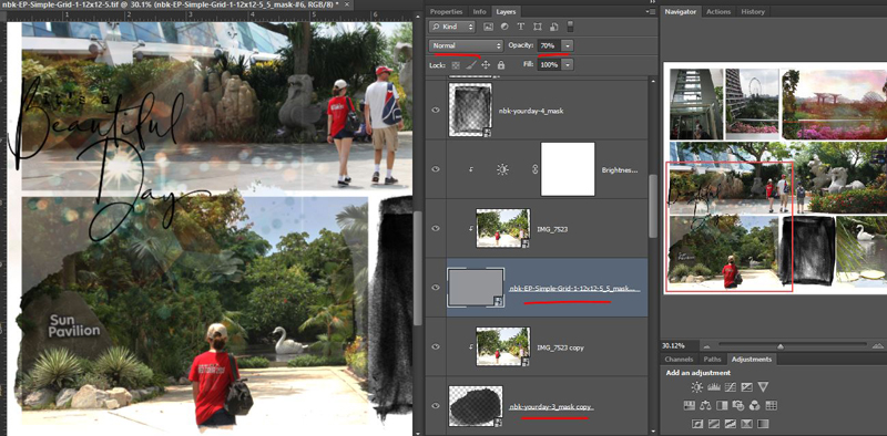
Now looking at the Navigator pane on the right, it’s still boxy overall so I decided to use another Your Day mask to make one of the photos that I cropped break the rectangle slightly but still retain all it’s detail. This is the ‘Out of the Box’ technique and NBK Designs and A Whimsical Adventure also have ready-to-go layered frames and layered masks that feature this technique for easy blending. If you like this technique or want more product details, revisit this previous post. All I need to do to here is drag the blob shape mask under the original pocket layer, letting it poke out and break the sides of the rectangle slightly. Then I duplicate the photo layer and (without moving or nudging it), clip the copy to the blob. I then reduced the opacity of the grey rectangle layer (leaving the blend mode on Normal but dropping the slider to 70%) so it was still visible but the more organic blob shape was dominant and at full opacity, quickly giving a bit of a faded or water coloured transfer effect.
Adding elements, journalling and finishing touches:
Because I was thinking about the story of the swan, and Project Mouse, I grabbed a swan element from my stash. (It’s from Project Mouse: Vibes – don’t be too impressed, I don’t have that good of a memory, I just knew they had a swan in one of their kits and a Windows folder search did the rest). I then threw some more various Project Mouse stuff on the page (complete credits in the gallery), including some of their Artsy splatters, wordart, stickers, washi tape and in stitching down a wordstrip, I decided I needed more stitching.
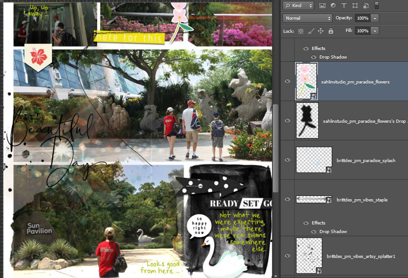
I grabbed another NBK pack, Easy Peasy Messy Stitched Overlays 3 which has both inky edges, and stitched inky edges in the one pack and they’re all sized with pockets in mind so they drag and drop and fit perfectly. This is just an inky, grungy frame around the swan close-up. You could recolour these to white and use them to essentially ‘erase’ the hard edges of your photo as well in keeping with the artsy style. I used a stitched overlay around the ‘gap’ and wordstrip photo in the middle at the top, you’ll see that in a minute.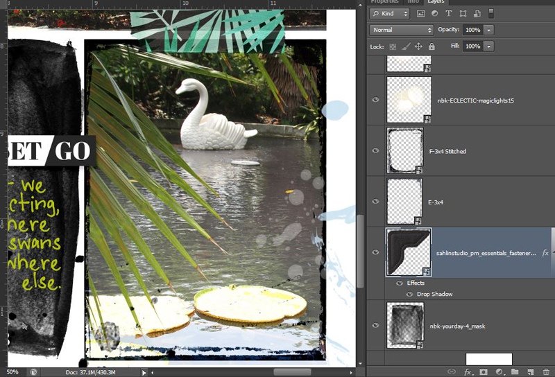
And here’s the finished product. It can feel like a long process sometimes but it really isn’t that different to any multi-photo freestyle layout process to me.
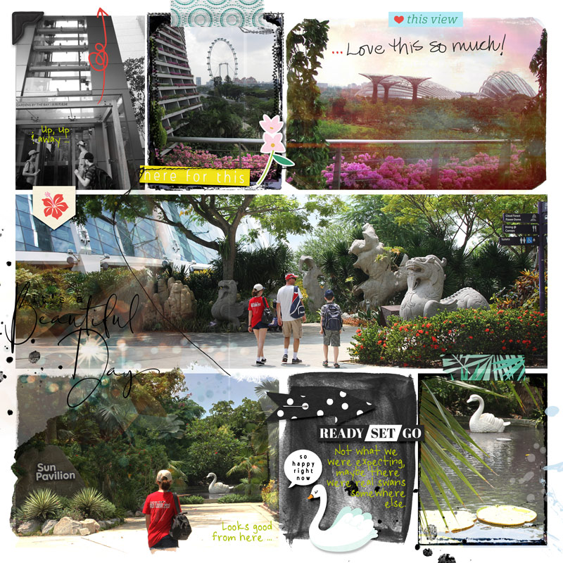
On reflection, this page is more photo heavy than my norm but it’s been quite a while since I scrapped pockets like this. Usually I would leave a bit more white space on the page for the eyes to rest on and this is where the all important balance of journal cards, filler cards and photos requires consideration. So because the colour and intensity of everything was feeling a bit overwhelming, I reduced the opacity a bit on the mask under the swan sticker, making it more grey than black, and made an artistic choice to convert the first photo to black and white. I also decided while writing this too, to go back in and use a scratchy brush as an eraser to remove a few spots around the edges of the ‘ blob’ rectangle to add a tiny bit more white space and mimic the cut off edges on the diagonally opposite, top right photo for balance. I didn’t want to lose or mess around too much with the Magic Light spots though so what I erased was minimal. I’m also thinking of maybe putting a small journal label under part of the title too so the ‘It’s a’ part is more legible as well. But for now, this is the end.
So would you call this mixed media style of pocket scrapping ‘Clean Artsy’ or something else? Are you generally a pocket scrapper and if so, do you prefer clean or artsy pocket pages? And do you ‘artsy’ your photos with textures or photo treatments? See you next time.


