Scrapping Secrets: Creative Cover Ups!
Hi there! I’m starting a new series today that will spill some of the secrets and highlight some problems and solutions behind the amazing scrapbook pages you see in the gallery. Sometimes scrapbooking involves problem solving just as much as creativity and you may find these secrets help you with your own pages, especially if you feel like you are at a roadblock. Nobody’s perfect, some of us just know a few more tricks and soon you will too!
______________________________________________________________________________________________
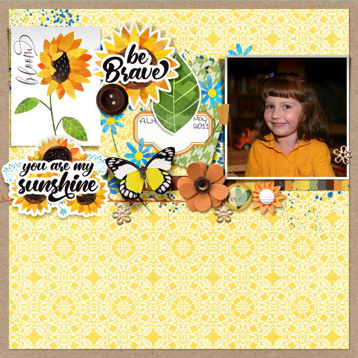
Today I’m going to address dealing with photos that have less desirable details in the background, like this one, where I didn’t love the distraction of one of my son’s many little trucks on the table behind my daughter. It’s orange so it really sticks out and pulls the focus away from her.
So here’s a secret you should already know but might forget when you see pages in the gallery: Not every photo is a work of art straight out of the camera.
Just like on Instagram or in advertising, you only see in the gallery what the artist wants you to see and the final version maybe nothing like the original. I’m all for realism in my photos and kid’s life stories but I can do without a washing basket in the background now and then, or at least have it be less of a distraction when I have an otherwise cute portrait I want to scrap. In fact I’ve had this photo in my ‘to scrap’ folder for years but every time I look at it, I would just see that truck and scroll on past it. I’m sure everyone has photos that are great or special but less than perfect like this and while some of us will just embrace them and scrap them anyway, some of us will just feel too frustrated with them but I’m here to show you a way that you can use them!
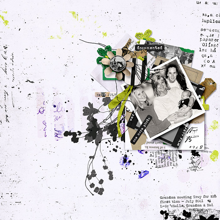
So that was my nearly finished Before page, and here is my After, with some rub-on flowers and wordart covering up the truck, and I’d bet you never guessed my secret if you saw it just like this in the gallery!
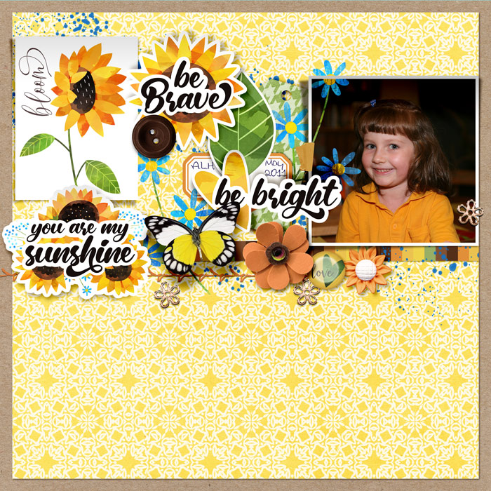
I’m calling it a Creative Cover Up. You don’t need to have, or know how to use, any fancy Photoshop tools to fix the photo to make use of this solution. It’s quicker for me to just put a sticker or an alpha or paint or something right over a photo with a background issue like this, like I would have in paper scrapbooking, especially when it’s not a photo I would have printed and framed as is but just want to add to a scrapbook. (If you look closely next to the ‘t’ of the word sticker, the orange of the truck is still visible, I didn’t my waste any of my scrapping time or brain power trying to alter the photo itself). And the most important thing to me is I got to use the less-than-perfect photo and am happy with the resulting layout.
I also asked some of the TLP team for examples of pages where they have used a creative cover up on what they felt was a less than perfect photo.
This page is from Polly Courtney / bestcee – it is another example of a creative cover up using elements. She says of her Before page: “I wanted the focus to be only on my kid, and your eye kinda drifts to the half cut off kid on the left [of the main photo]. Especially since it looks like the two kids might be interacting.”
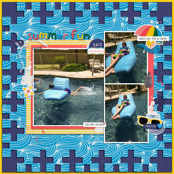
So here’s the After! I think she definitely achieved the focus now being on her kid and stopping the eye from drifting with the swimwear sticker and heart brad! Perfect solution to a problem you would never have known existed.

Remember how I mentioned washing baskets in the background of photos? Well how about a whole clothes line too?! This is Polly Ona / wombat146 ‘s photo and I can relate!
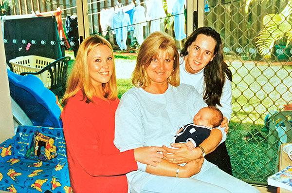
She says of her solution: “I blurred out the background on this photo and then changed it to black and white and of course cropped it a bit.” Turning the photo black and white definitely makes distracting colours less obvious and just like a paper scrapper would trim parts of the photo they don’t like in the real world, that helps in the digital world to physically reduce the distractions as well. The placement of that striped circle and lime green foliage also creatively covers up some of the area that was once a distracting clothes line!
And last but in no way least, Designer Lynn Grieveson has shared a page with another creative cover up using her Hear My Voice Hurting collection. She says ” [This is] a photo of me holding up a photobooth photo strip and I just wanted the attention on a couple of our faces on the photobooth strip. I dragged the partially transparent overlay (with moths on it) over the top of the photo, then simply used a hard round brush as an eraser to reveal the parts of the photo I wanted. You could probably do a similar thing with (white or cream based) papers by reducing their opacity.”

And actually the Random Challenge that is a vellum challenge this month and has some extra inspirational pages using vellum over parts of photos. Used as a partial frame or a journal spot, it could obscure any less than perfect background detail.
So just to round it all up: When you have a problem like something distracting from the main focus in your photo, some ways you can cover it up are with:
- any element like paint, stickers and flowers that overlap the photo,
- a black & white or monotone colour filter right over the photo
- vellum and patterned overlays or cutouts
Got a favourite creative cover up trick or page in the TLP gallery to share? Link me up in the comments!
See you next month and if there’s any secrets or problems you are dying to know about or ways to work around, let me know in the comments too!