Mobile Highlights – November 2015
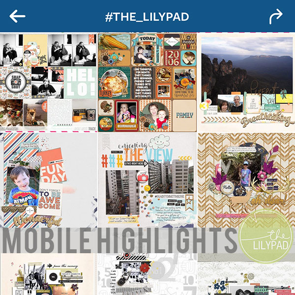
Hi everyone! I am back this month with some more AWESOME highlights from Instagram this month. I’ve been sifting through pictures tagged with some of the most popular TLP hashtags and picking out the ones that really jump out to me the most.
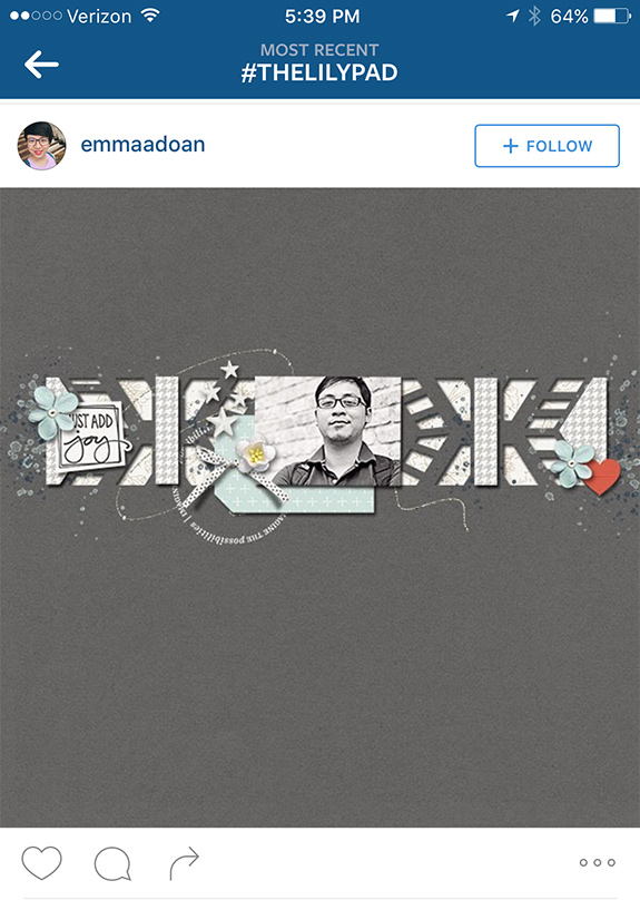
This first layout by emmaadoan jumped out at me because of it’s monochromatic look. Keeping the entire layout within this color scheme really makes it stand out among the rest of the layouts. I love how it’s simple, but intricate at the same time.
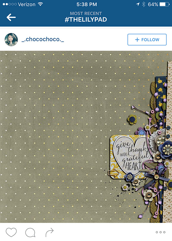
This layout by _.chocochoco._ makes great use of the edge of the layout. The layering done here along the edge looks very realistic, and the use of a pattern paper as the background keeps the rest of the layout from looking bland.
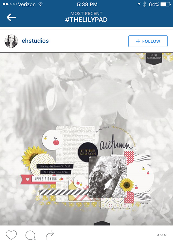
This layout by ehstudios didn’t jump out at me right away. It wasn’t until I scrolled back past it and realized that the background is a really large blended photo that I stopped to look. What I find most expert about this layout is the ability to use the large photo in the background, but still able to keep it subtle enough to not distract from the rest of the layout.
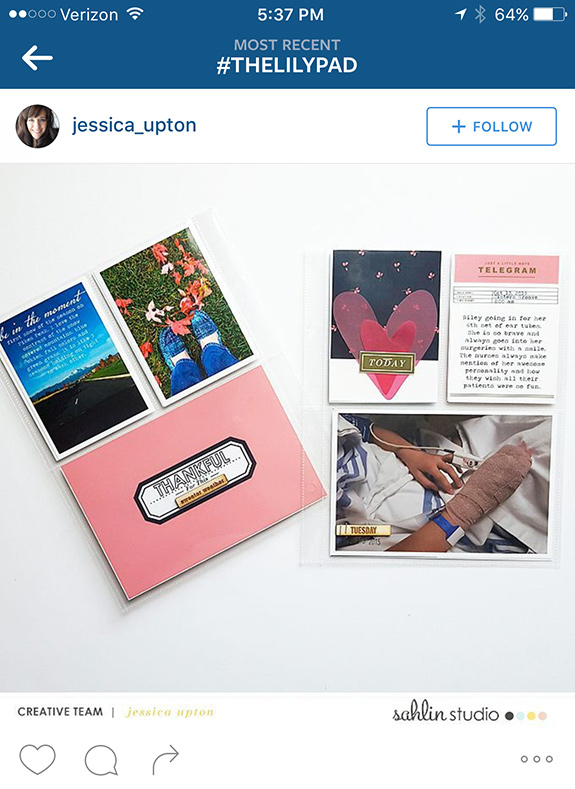
I love seeing TLP products used for hybrid layouts. These PL inserts by jessica_upton combine great photos with the striking and simple cards from Shalin Studio effortlessly.
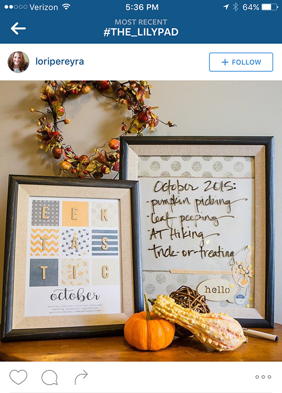
More hybrid! These wall art projects by loripereyra use TLP products and create some awesome October art. I love the use of unconventional October colors, and the idea of using a frame to create a custom dry erase board.
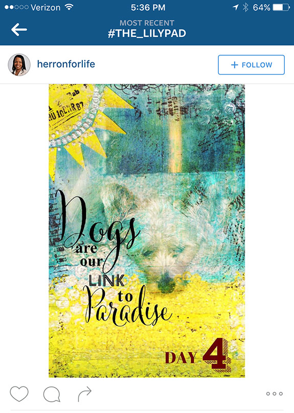
This Art Journal page by herronforlife also uses some very creative blending. I love how the picture of the dog is blended to become part of the background of the page, but still stands out. The quote also pulls at my heartstrings.
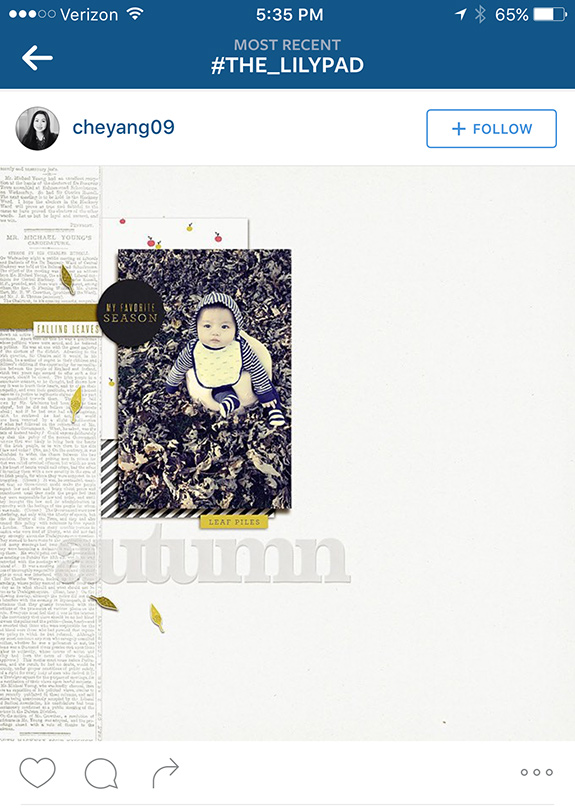
The linear look of this page by cheyang09 struck me right away. Sometimes, I crave the linear look on a layout and this one executes that linear look with ease. I also love the pops of color around the photo.
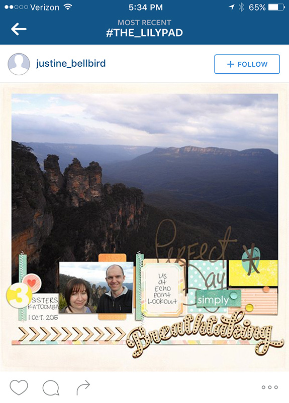
When you have a gorgeous photo like the one on this layout by justine_bellbird, there really is nothing else to do but make it huge and put all the focus on it. I also loved the creative layering of some of the title work. I like how the “Perfect Day” word art is tucked behind other elements.
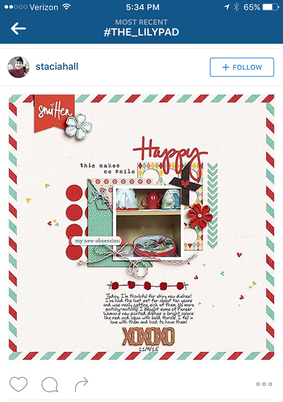
I have to be fully transparent here. This first thing that jumped out at me on this layout by staciahall was the dishes. I knew immediately that they were part of the Pioneer Woman line of dishes, because I’ve really wanted them for a while. I really like how the colors of the layout work with the colors in the photo here, not to mention the expert shadowing on that string!
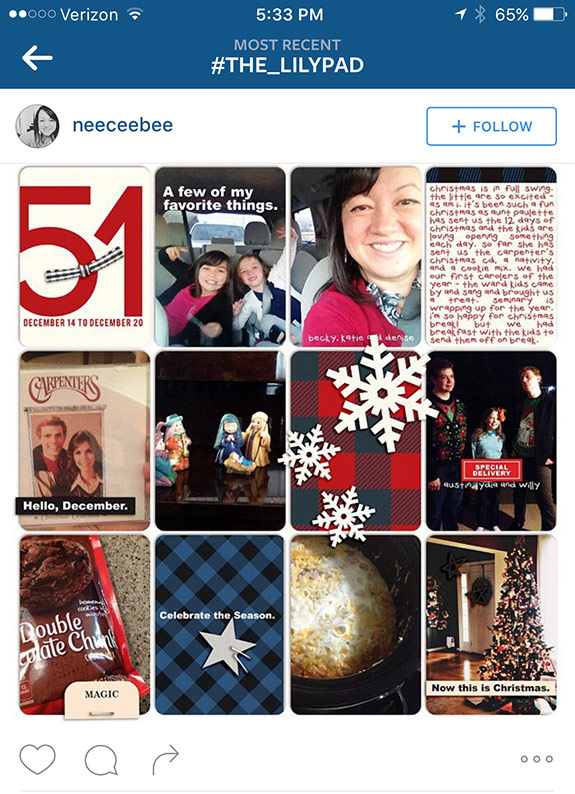
Finally this layout by neeceebee jumps out at me for a reason different than any other – I absolutely LOVE the graphic look of this layout. The bold plaids, straightforward word art, and awesome graphic snowflakes really give a bold, different look to a Christmas layout.
So that’s it for this month! Keep posting your layouts using the TLP hashtags, and maybe I’ll feature yours next month!