The Monday Mash-up! – Rainbow plus Neutrals
Are you primarily a one kit only scrapper, on a budget or looking for ways to extend your stash?
Mashing 2 (or 3!) kits together (and making your own customised collab!) gives you so many opportunities but means you won’t have to spend all your time tagging or searching your stash. If mixing and matching is not your normal style and feels daunting, this series will look at several ways to make mixing different design styles easier than you think!
______________________________________________________________________________________________
Hi there and welcome to a fun new way to start Mondays in the middle of the month – The Monday Mash-up!
* a combination or mixing of dissimilar elements, especially content from different sources.
- Some background:
I’m back with another Mash-up. I’m mashing based on colours again but dissimilar colours. This month I’m mashing rainbow coloured papers with neutral elements. Mashing a neutral pack with any kit that has absolutely any colour scheme will always work and extend your scrapping possibilities. Neutral packs of elements are stash essentials to me and are a ‘go-to’ especially in speed scraps or anytime you need a ‘little something’ to finish off a page. Neutrals include classic black and white (which I have focused on in a previous Monday Mash-up , as well as their warmer counterparts, creams and greys, as well as versatile browns and navy, plus gold and silver to me. My main neutrals for todays layout come from the Memory Pockets Monthly: Foundation series – I’m using the 2021 versionbut there are several packs in this category that all use the same colour palette even if you aren’t a pocket scrapper, these packs are full of neutral goodies and worth a look at if you are building your stash as they are so versatile and were in fact designed to complement *all* past and future MPM collections – so if you saw me Pocket Mashing last month and have been thinking of giving it a go, MPM Foundation plus any other MPM would be an easy combo to mash-up.
")
As an unintended bonus today, I’m giving you a peek behind the curtain of ‘instant layout magic’.
What do I mean by that? Well, if you are somewhat new to scrapbooking, digitally or in any form, you may think that all the pretty pages in the gallery and on social media are created quickly, with total ease, or that you’re the only one that sometimes struggles to bring a page together. I’m here to tell you that’s definitely not always the case and you are not alone! In fact, I have days like this, usually when I’ve had some breaks from scrapbooking and I’m not sure on what story I’m telling and really can’t find the word art to say what I can’t figure out how to say, if that makes any sense. (And if you are still in disbelief, the forum often has threads on how to get in the zone or to get your mojo back – the struggle is real for many of us). So in the interest of ‘keeping it real’, today you’ll see one of my struggle sessions, so buckle up this layout is a journey.
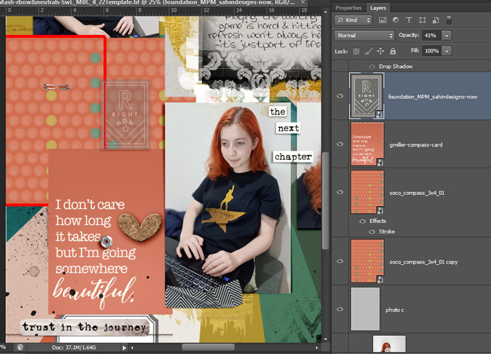
The journey starts with me and 3 photos, and only a loose idea that I wanted a rainbow background and something about ‘looking for silver linings’ to do with what she was searching for on the computer. And because of the colours in the photos, I knew I wanted a red-ish, orangey colour in the rainbow (more than pink because of her hair), and that the gold and black of her shirt with the grey-ish wall behind her pointed me in the direction of gold, black and other neutral elements.
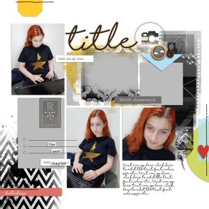
So when I don’t know where to start, I look for a template and get my photos placed. If you know me by now, you know that I see potential in templates beyond what they may initially seem like. The Scrapping with Liz August Designer Challenge template may not seem like a 3 photo template but it is full of possibilities for journal cards, wordart spots and paper pieces and it was the easiest decision in the process of this whole page!
Here’s my first work-in-progress shot, placing the photos so that the face in the images is turned either towards the midline of the page or towards a focal point and adding some elements.
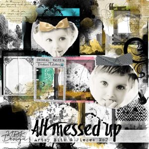
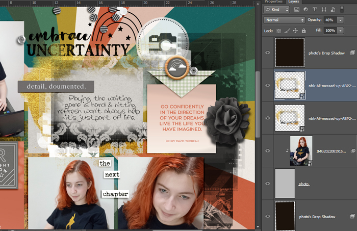
So apart from the MPM Foundations, after a few months of Mixed Media Beginners here in the blog, I have started to like the versatility of stamps and masks and often they come in black by default and mean they are an easy mash-up ingredient! These NBK packs from All Messed Up caught my eye and I knew I had to work them in with the boxy parts of the template. I used Artsy Bits & Pieces 2 as well as Photomasks – they are no.3 and no.5 in the Choose Options store menu.

Now here is a peek at some of the papers I ‘auditioned’ for the role of main background. I scrolled through my stash looking for the designers I know use lots of colours in their paper design. I tried papers from my stash of Allison Pennington, Just Jaimee’s Storytellers, Kim Jensen, some of the Project Mouse kits and basically any Bella Gypsy kit as well as a few others and then decided to try some of the big TLP site collabs. I tried 25 different papers, including some literal rainbows on a Lynne Marie paper and here is a handful of them. I did come across some great wordart by Becca Bonneville in the Braver collab that I thought would work for a title during this lengthy paper search so that was a silver lining in itself.
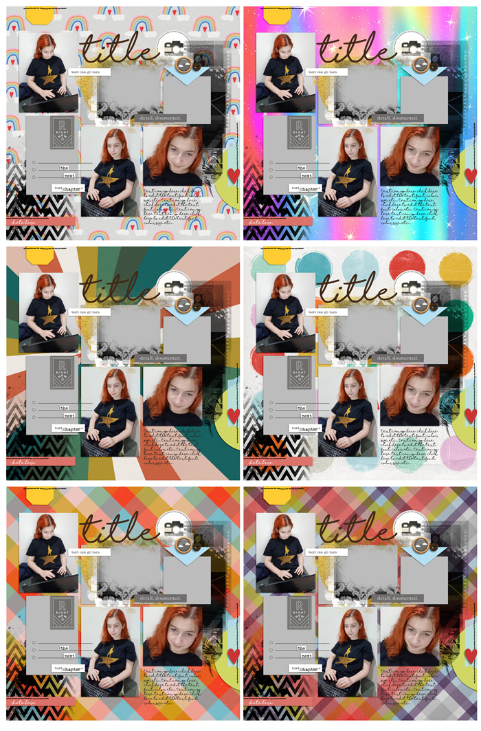
Ultimately the radial paper I used by Allison Pennington, as well as a few other papers and the quote cards came from the TLP Compass collab.

If you’ve stayed to see how this all ends, thank you. Let’s jump to the finish line now.
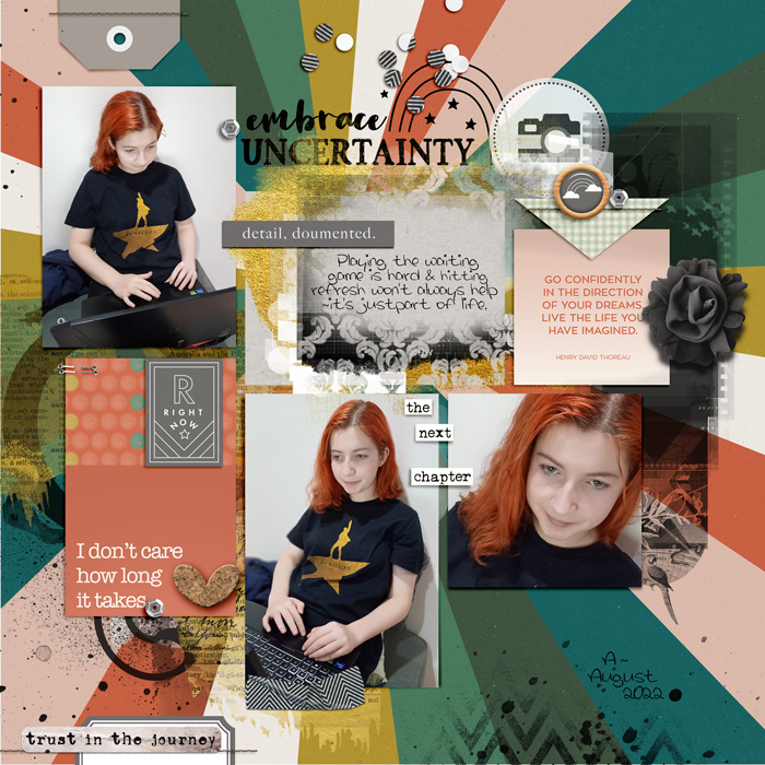
Here’s a few things I did that I’m sharing again in the spirit of honesty and what you see is not always what you get.
- I turned off some of the template layers like the taped semi circle down the right side because the background I chose was pretty busy and to give the negative strip mask more room
- The take home message here is that templates don’t have to be used exactly the way they initially look. Turn off and on or move layers to make a page design work for you.
- That “It doesn’t matter how long’ journal card I actually pieced together with 3 journal cards I was being a bit fussy as to where I wanted those yellow spots on the edge and then I ran out of card to cover the grey rectangle and the whole phrase wasn’t what I needed. You can see my Frankenstein card below. I also hid the comma at the end of ‘takes’ with a sequin that’s duplicated and used elsewhere on the page as a subtle visual triangle. (It was probably not quicker than clone stamp or colour filling the comma out of existence but I don’t always think digitally like that. I will cover things up the old fashioned, paper scrapping way usually).
- The take home message here is that if you can’t find the perfect card or piece, you can probably ‘Frankenstein’ one!
- All the stamping and paint is duplicated (or used at a lower opacity) to get it to the level of colour density I wanted. I can waste a lot of time sliding the sliders on layers like that chevron stamp in the bottom corner, and in real life, if I hadn’t stamped it dark enough, I might ‘double stamp’ it!
- The take home message here is that you are in control of how black your stamp ink is (or any colour really), and how much your ‘stamped on’ layer shows through. Double, triple stamp your stamp layer if you want it to really be bold and contrast, or try ‘linear burn’ blend mode.
- There’s not much dimension to this layout. There’s really only 1 layer of paper bits/photos and paint so it’s pretty flat, but purposely layering the NBK stamps to overlap other layers like the gold over the ‘ce’ part of the title, as well as the camera rub-on, that is also overlapped by the negative strip mask creates a built-up effect and gives depth to a relatively flat page.
- The take home message here is overlapping stampy layers that are different can give you depth and create a cool and cohesive effect, especially when you stamp over multiple paper or photo layers. It can be just the thing to bring it all together!
See you next month – I’ll try to be less wordy then!


