PSA from TLP: Effects for Realistic Layouts
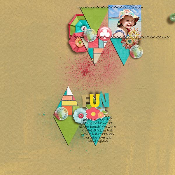
Are you a “Shadow Snob?” Meaning, do you spend hours getting your shadowing to be juuust right? Or, maybe it drives you crazy when you see something in a layout that couldn’t possibly exist in real life. Recently, there was a forum thread here at the Lilypad in which people talked about the things in layouts that make them a bit cuckoo. Most people mentioned that they were super meticulous about their own layouts and didn’t pass judgement on layouts that others create. It got me thinking about the things that make all digital layouts appear as realistic as possible. Granted, there are many fantasy “newborn baby in a bottle” layouts out there but in the end, many of us strive to make our layouts look like they were created with real materials. To do this, there needs to be a sense of believable depth and layering. For the layout below, I used materials from our wonderful August BYOC to deliberately create areas of the layout that just don’t seem very realistic. See how many you can spot…
Now, here’s the same layout with the areas numbered (using Amy Martin’s Boxed Up Dates) and a corresponding list of some of the decisions I made that might have kept this layout from looking as believable as it could.
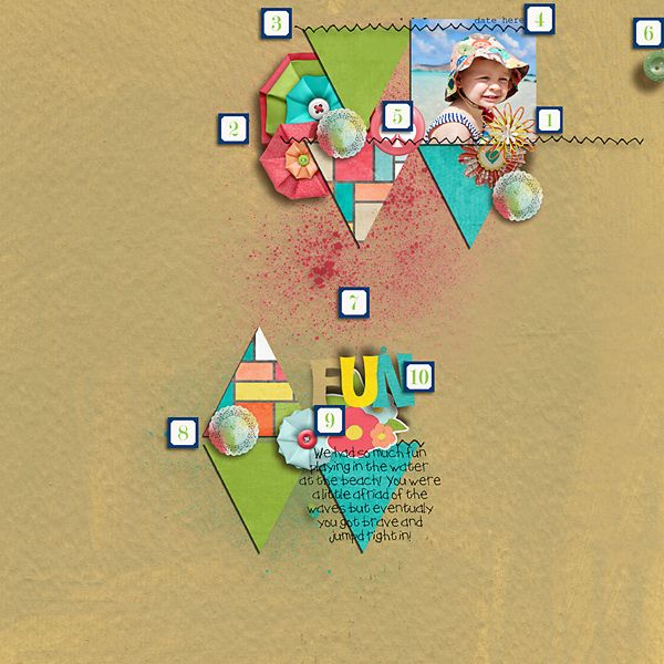
1. This flower from Kaye Winiecki’s Loom Bloom has no shadow at all. It’s just laying there, flat. Under it, there is what appears to be a very thick flower, tucked under a flat paper photo and the shadow is on the right when most other shadows appear on the left.
2. More large, fluffy flowers (Kim Larsen’s Bloomin’ Octagonal) tucked under what appear to be flat papers. Would it look the same if I had created this with real materials? Also, the stitches seem to be floating over the flowers.
3. More “floating stitches”. This of course can be resolved with thoughtful shadowing. (If you’re looking for help with shadowing, check out this great kit from Sahlin Studio (Realistic Drop Shadows).
4. Ooops! I used a template (Amy Martin’s Shaped Up Triangles) and forgot to date it, or remove the date reminder layer. When you use templates, be sure you turn off any reminder layers so they’re not peeking though your clusters!
5. Is it realistic to think that I would be able to stitch right through an acrylic piece of flair? I’d probably have to have a pretty powerful sewing machine!
6. The shadow for this button is in the right area but it’s much too far away from the button. It makes the button appear as if it’s floating a few centimeters off the page. Also, the button appears to have been cut in half. (from Little Butterfly Wings’ Forever Young)
7. When was the last time you saw real paint with a shadow? Splatter paint doesn’t have a shadow. (Paint: Karah Fredricks’ Hey MISTer paint)
8. This beautiful doily (from Rachel Young’s It’s Time) has been repeated through the layout for balance. However, I didn’t change anything about each of the duplicates so they look repetitive and not too interesting. Maybe I could change the size and/or rotate them so they look more unique and different.
9. If you had a real sticker and a puffy flower, which would you choose to put on the bottom? I try to keep the flat things in the lower levels of my layouts. (sticker from One Little Bird’s Sweetness Elements)
10. These alphas (From Jacque Larsen’s Joy Junction ) have varying shadow directions so they seem a bit disjointed. Also, the distance of the shadow makes them see like they’re floating a bit too far off the layout.
Bonus: Did you notice the spelling errors in the journaling? (font: The Outside the Box from Heather Hess) Keep an eye out for errors. You don’t want to notice them when they’ve already been published in your beautiful hardcover scrapbook!
Lastly, I find it hard to use red splattered paint without it looking like someone had been hacked to death for my layout. (Anyone else have that problem?)
Now you tell us: what are some “must have” effects on your layouts? Are there any things that push your “Slightly OCD Scrapper” buttons? We’d love to hear about it in our comments section.