Digi 101: Clusters
Just a quick tip about clustering. If you look through the gallery at TLP you will see some beautifully clustery (yes, that is a word) pages. The best advice I can give you when creating your own clusters is to think about the elements. In particular, the “depth” of the element in relationship to the other things on your page. Some people start at the bottom of a cluster and work their way up… for example, starting with the leaves, then flair or flat elements then dimensional flowers. Some add shadows as they go. I do neither of these things. I tend to start at the top, so to speak, and then stick stuff underneath. And I don’t add my shadows until the very end. Let me explain. Let’s look at this cluster for example.
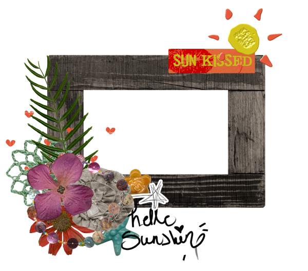
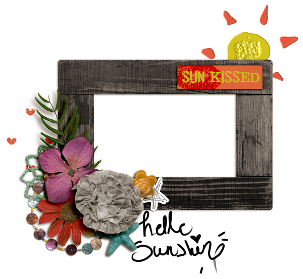
Something is just not quite right about it, right? Well, honestly, it’s a red hot mess, LOL, but bear with me as I point out a couple of issues. It just simply doesn’t please the eye because it is not exactly how it would look if it was “real”.
1. The most 3 dimensional flower (the brown one) should be on the top of the cluster, with flatter flowers beneath it.
2. Notice that the button is actually sitting under the paper star. That is not cool.
3. The stamped hearts are on top of the frame (which is possible, I suppose, but one is half on/half off).
4. The “hello sunshine” wordart is on a layer above the star button and the frame. EEK.
6. The “Sun Kissed” wordart tab is sort of hanging off the top of the frame. This is not a problem with paper frames, but this frame looks like it would be dimensional if it were real and this is an odd look.
7. Then the stamped sun. It’s just funky.
8. The doily is also on top of the frame. Unless it is starched, this wouldn’t probably look like this in real life.
So, try # 2 correcting these issues.
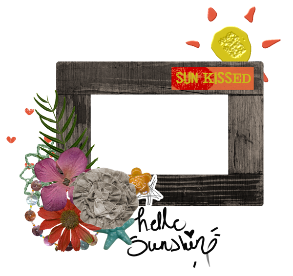
A little better? Maybe? But it is still missing something critical. What you may ask? Shadows! And not just any shadows. Again, in keeping with our theme, we really want our shadows to be realistic. To start with, they all need to be at the same angle.
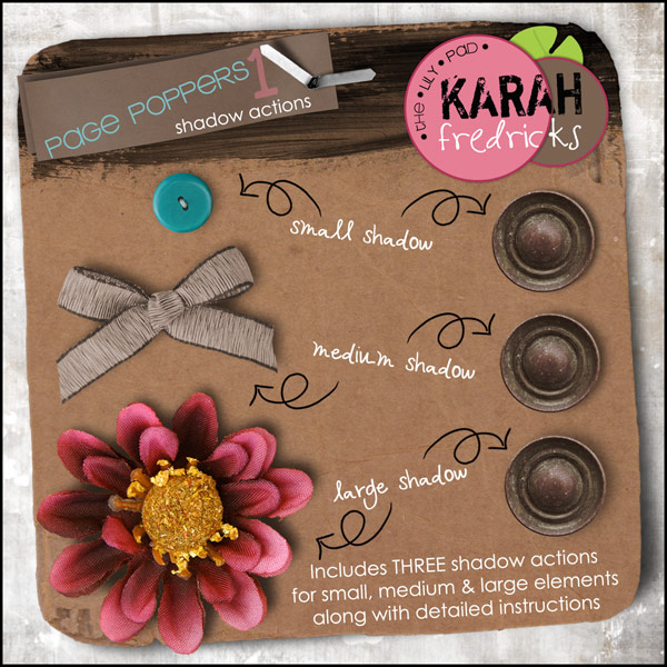
Bonus tip: if you are using a template with shadows, be sure that they are the same angle as the shadows on the elements you add… or just clear all layer styles and do them all at the same time (that’s usually what I do).
Besides going in the same direction, your shadows should vary based on the element. A piece of paper will not cast the same shadow as a big fat flower, right? And strings or stitching… don’t even get me started. There are several shortcuts to this process, however. In fact, there are at least 3 shadow style sets in the store you can use. Easy Peasy.
So, let’s see what our little cluster looks like now…
I’m certainly not an expert clusterer (yes, this is a word also), but even I can tell it looks better!
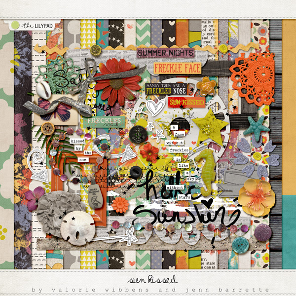
Here’s the kit I used for this.
Now, chose your favorite kit at the moment and go forth and Cluster!
Jen (JenEvang)


