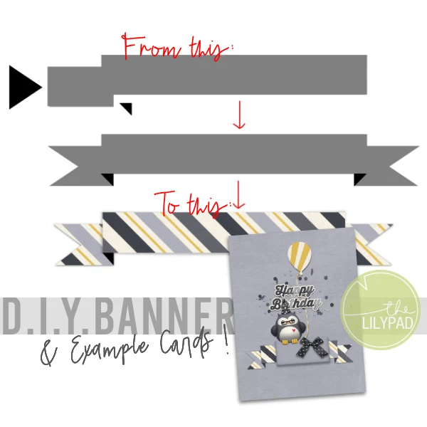
Build a Digital Banner & 5 Cards from 1 kit
Hey there! The other day I blogged a paper card I made with a banner shape and here’s the digi ‘behind the scenes’ look at how I made the compound banner shape from a few other simple shapes in Photopea. The process would be similar in any graphic design program.
Stick around, or jump to the end, to see several examples of this banner template in use, all using the one kit by Kristin Aagard in the name of stretching your stash and getting more cards out of one card making session.
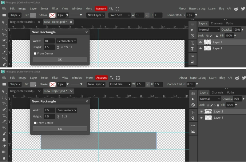
I started with a blank New Project / Canvas with a transparent background. It’s 6×4 inch size (in centimetres) so the banner would be long enough to fit the whole ‘Happy Birthday’ sentiment along the main ribbon and fit my card bases if i were to make a landscape orientation card where it opens up, as opposed to portrait, opening across like a book. If I were to turn it sideways for a portrait orientation/tall card, I’d be more shrinking it than stretching, it if that makes sense, but the template is also fairly flexible and the process is the same for shorter, thicker ribbon banners.
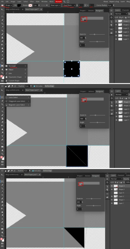
So the first shape is a long rectangle and then a shorter rectangle that I will clip a triangle from to give that cut ribbon look. Because of the symmetry of the shape, I work on the left second rectangle end, then just duplicate and flip it to create the right end.
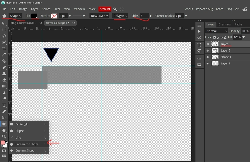
I used the Shape tool and typed in dimensions for both rectangles
and overlapped the edges of the rectangles to set up the folded look. I used the next settings with the Shape tool to create a triangle to cut the ribbon end. It’s black so I can see it against the grey when I use it as a cutting template or eraser. (You could also use the Polygonal Lasoo to snip into the shorter rectangle but I didn’t because i find I can never get it to look even but in real life, my cuts are rarely even so using that would add to the perfectly imperfect realism)
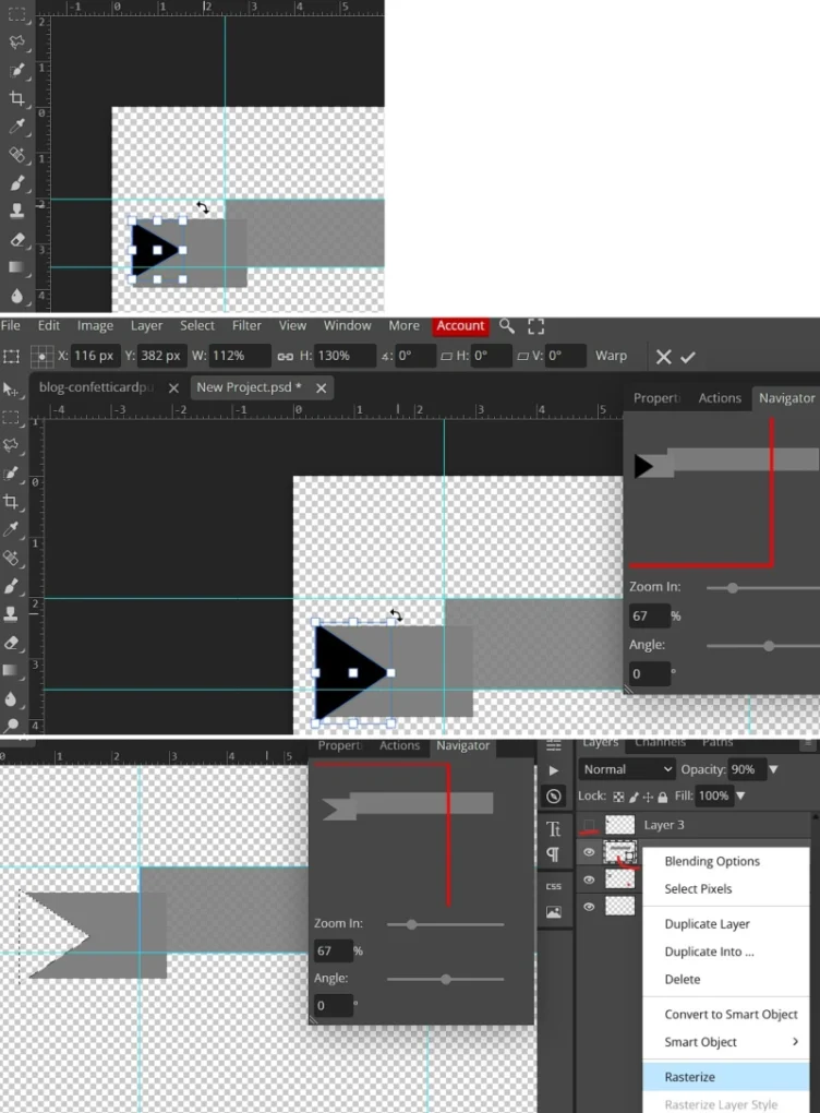
So i rotated and resized the triangle on the layer over the short rectangle, lining it up so it cut through the top and bottom outer corners; then I ctrl-clicked the triangle to get marching ants around it, selected the short rectangle layer in the Layers Palette so that it was the lighter gray, showing it’s active and then hit delete to cut that part out (if it doesn’t work, you may need to ‘rasterise’ the layer first using the right-click menu – it will get ride of that tiny ‘join the dots’ square icon in the corner of the layer thumbnail). Turning off the visibility (eye) next to the black triangle layer shows the snipped ribbon edge like the bottom screenshot here
To make the two rectangles look like they are part of one long folded ribbon or banner, we add an extra right angled triangle under the intersection of the rectangles, where they make a square at the bottom. Make a square with the Shape tool and then cut it in half diagonally with the Polygonal Lasoo.
:
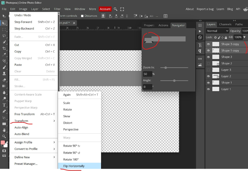
Now we just duplicate (so I have Shape 3 and Shape 1 copied in the Layers palette), and flip that black triangle and short, snipped rectangle. Flipping it gives a weird result as you can see in the Navigator fly-out panel but don’t worry, we just need to and position it on the other end of the long rectangle
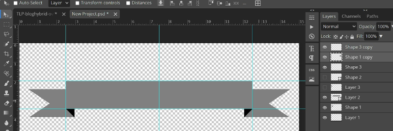
So there’s our finished banner template. Keeping it layered let’s you add papers in different spots or recolour parts separately. Save it and reuse it.
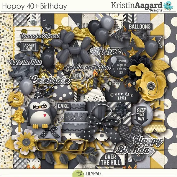
Now let’s see it in action. Using that banner template and the Happy 40+ Birthday kit by Kristin Aagard, let me show you how you can make several different cards using the same basic card sketch and recipe I used the other day as a guide.
Here’s the recipe and sketch again:
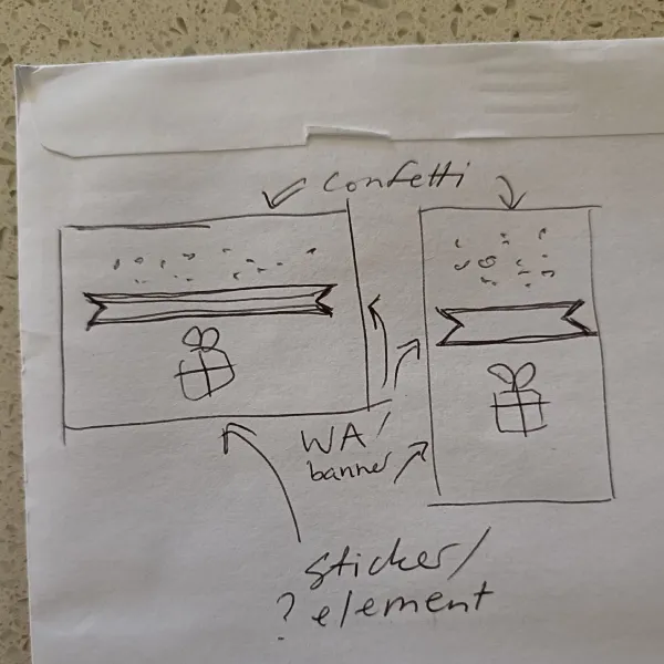
- Scatter (confetti, glitter, beads, sequins etc)
- Horizontal piece (Word art / banner / ribbon, paper strip)
- Extra element depending on your theme or occasion (eg. giftbox, balloons, cake, other themed sticker, maybe alternate wordart or journal card)
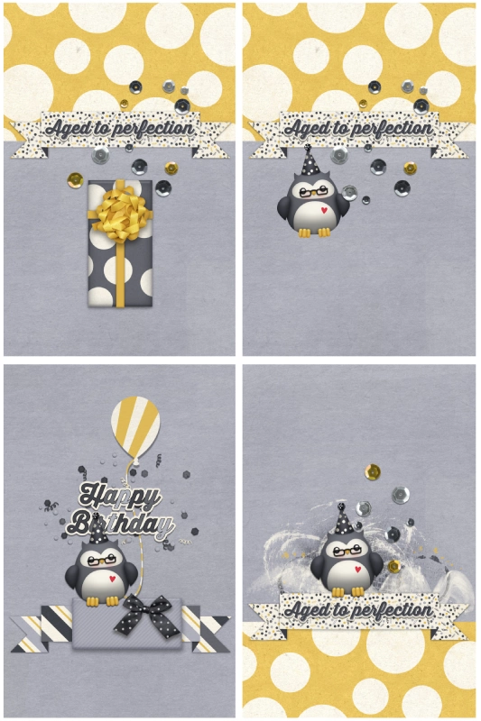
- The first card uses the sketch pretty literally with the split paper design basically acting as big scatter and then the sequins add some dimension but also spill over the banner. I started with a grey background to mimic my real paper silver card bases and reused this for all the cards.
- The second card moving across to the right, is the same except I switched the gift box for the owl sticker and placed it off-center. That owl with the red heart changes the feel of the card a bit, it adds some warmth to me. The gift sticker in card one is suitable for anyone (y’know when a card is required more for formality) but this card feels more for someone you know better.
- I switched out the banner papers and sequins for different options from the kit and simplified the background so there wasn’t multiple patterned papers. I moved the wordart off the banner and put it among the confetti and placed the owl sticker above the banner instead of below it. The top seemed a bit empty then so I added the balloon element (it was a puffy sticker, I clipped a burst paper to it to bring some of the yellow back while keeping the card fairly flat). The way this card is clustered, it is essentially juggling the recipe to have the sticker at the top, the confetti in the middle and the horizontal piece on the bottom making a pyramid or more filled triangle shape rather than distinct layers like my hybrid card
- The last one in this grid, I went back to the 2nd card and tried to make it more mixed media-y. I felt like the owl was better with the anchored to the banner like in card 3 so I used that idea, then just flipped the placement of the dot paper to the bottom of the card, and made it a bit messier with mixed media from the kit. Because it was now ‘bottom heavy’, the empty space at the top didn’t feel like a problem here, but more purposeful in providing balance
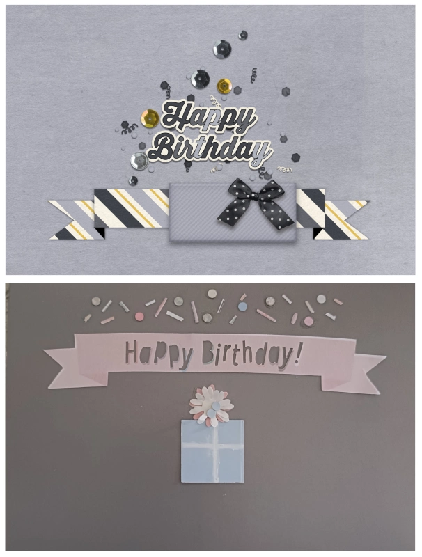
5. For the last one I went back to original landscape format and went back to the gift only, no owl idea and adapted card 3.
6. And this is where it started. The pink banner is a bit warped and bent and the confetti is more linear and a mix of shapes. It uses the sketch for a more linear look with each section more defined rather than clustered but the use of extra confetti over the flower creates cohesion.
There you go! 5 different cards just using a simple sketch featuring a digi banner template and reusing the same kit, and more variations are possible of course using the rest of the patterned papers, wordart and sticker style elements in the kit. The 5 digi cards didn’t take much time at all. Once I’d made the first card or 2, it was just a matter of moving things around and trying them in different spots on the page like I would scrapping (They were also quick because I had already made the banner template and honestly really quick compared to the hybrid card when you factor in that I didn’t have to go searching my craft room for the hole punch and paper scraps, and then put everything away at the end!)
You could print these cards and use them ‘as is’, or you could use the sequin placement, for example, as guides for gluing real sequins, confetti or other elements on to your printed card for a more dimensional hybrid card with real sparkle. Either way, I hope this demonstrates one way to stretch your stash and the possibilities a basic sketch or template can provide for both digi and hybrid cards.


What a fun way to make a banner Justine! Thanks for the tutorial. Your card is amazing and I can see many uses for this technique! Thank you for sharing!
How fun to build your own banner and then decorate them with whatever papers you want later! LOVE this post!
Those are so cute! Thank you so much for the inspiration!
I love the DIY banner! Need to make one asap!