Fearsome Filters Are Not Fearsome! Today: Dry Brush + some more
Hey there, fearsome filter explorers!
All the new updates to the forum and gallery are beyond cool, aren’t they? I spent some time getting acquainted with all the new buttons and so forth and I’m liking it!
It’s the same thing with Photoshop in all its variations. Giving yourself permission to mess around with your photos and the program is a lot of fun, and you can learn a lot about the cool effects you can get with Photoshop and Elements.
Today, I thought I’d explore Dry Brush and then take it a little further with three other filters-and seeing what I’d get. Take a read and see what you can do.
As always, here’s my original image:
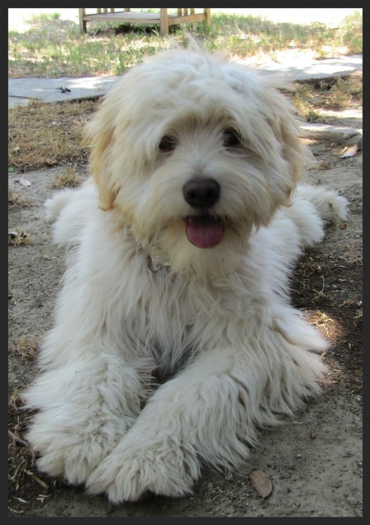
Here’s my cute boy Baxter! Such a lovely model. 😀 Hi Baxter! Ready to play tug-of-war?
Depending on your version of PS/PSE, your filters are going to be in slightly different places. I work from PSE8, which is a relatively ancient version (now) of PSE, and PS2, also pretty old in terms of program lifetimes. Even if you work off of earlier versions than those, though, I think you’ll be able to find your filter section.
Today I’m working with Dry Brush. Digital photography is terrific in catching details, but sometimes it’s too good at it, and you want to play with the photo’s reality and make it look more like a painting. I’ve seen some lovely and truly amazing layouts where you’d never have guessed the images started as photographs. Wow. This post isn’t going to go that far, however.
So, I took my fuzzy puppy Baxter, turned the Dry Brush filter on him, and this is what I got:
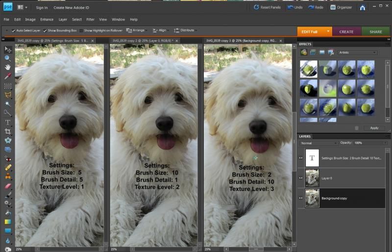
Okay, it’s difficult to see exactly what’s going on in this screen-grab, so let me show you the details.
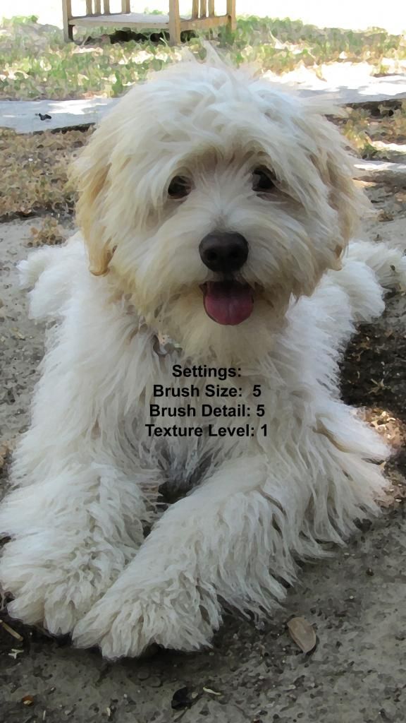
Now you can see what the Dry Brush is doing at this particular setting, with Size and Detail in the middle of all the setting choices. Not too bad. His fur is looking a little more painterly, but let’s see up close what happens when I go extreme with the settings.

And here with a larger brush size and less detail coming through (and increasing the detail level up to 2, which appears to give the smaller bits more contrast compared to Baxter’s white fur). It’s looking a bit more painterly, which is good. It’s similar to Cut Out which I covered last week BUT instead of broad swatches being averaged out in color, it has shorter “strokes” and doesn’t posterize my image as much.
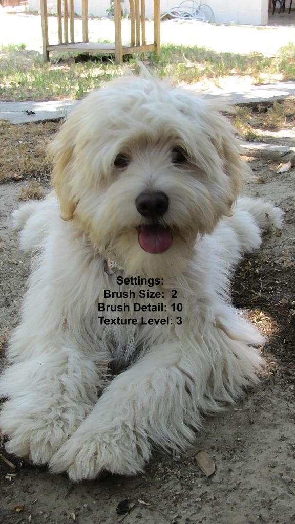
And here we are with the other (near) extreme in the settings. Baxter is still looking as cute, but now with the brush size smaller and the details kept at the highest number, AND the texture number also at a 3 and as high as it could go, it doesn’t look too different from the original. A little. Definitely subtle. You can see the differences especially up at the top of the image where there’s more contrast between the table and grass and sunlight.
What happens if I use another filter using the Dry Brush images as the bases, instead of the original photograph? Hmm. That might be interesting. Let’s see what happens.
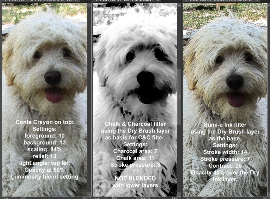
There! The photos shown here are the same ones I showed up above, in the same order. Personally, I prefer the effect of the Sumi-e Ink filter, but I also like the texture effect of the Conte Crayon. Chalk & Charcoal mainly appears to be a way to manipulate the shadows and highlights, with a little bit of texture thrown in.
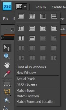
When you try out your filter settings you can be more or less systematic about the process as I am, or fly by the seat of your pants. In PSE8, at least, you can set up windows in various configurations to make comparisons easier, like I have here.
 See? Very cool!
Show me your Fearless Filter experiments on the Forum Thread, and have fun with them!
Fearlessly Yours,
Julie


