How to break the rules right!: Using outward facing photos
We all know that there aren’t exactly hard and fast rules with scrapbook page design, (it is your page, you can create it however you wish because it is ultimately yours and as long as you are happy with it, that is the main thing), but there are some general principles that over the years I’ve learnt influence how a page reads and comes across to the viewer, so if there’s something that feels slightly off about one of your pages, that you can’t quite put your finger on, maybe it’s got something to do with these principles, and whether you are following them or breaking them.
But we also all know breaking rules isn’t always a bad thing especially the creative rules! And as someone that has been a frequent visitor to the TLP gallery for well over a decade now, I’m always drawn to pages that I feel break the unspoken rules and try to understand why they work when really, to me, they shouldn’t. So I’m about to indulge in another wordy cerebral scrapbook art analysis and this is my internal monologue going back through some of the pages I’ve faved/watchlisted. Grab a cuppa and join me!
_______________________
Humans take subconscious cues from other people and animals all the time. Have you stopped and turned to look for something that has other people’s attention in a public place, maybe you notice them pointing or photographing something; or you may have paused to figure out what has stopped your dog in it’s tracks on a walk? Even in galleries, viewers will stop to consider what Mona Lisa may have been smiling at or daydreaming about, so the expression, placement and direction a portrait photo has on the page feels important to me, which brings me to…
The general principle I’m considering today: A portrait photo should be positioned to look in towards the center or across the page to keep the viewer’s eye from wandering out and off the layout.
As a scrapbooker that often has a photo-driven design process, I have resolutely followed this rule, and the direction a person is facing in the photo will be a key determinant in my page design. If I’m using a template where the photo spot means my photo subject would face outward, I would ‘horizontal flip’ the photo (if there is no text on their clothing or behind them that would be mirror-reversed and make the ‘flip’ obvious) or I’d flip the template itself to make things work with this rule in mind. On multiphoto pages with more than one portrait, I will position the photos so they are looking towards each other, and the same goes as the photographer, either positioning subjects before a shot or framing subjects as much as possible candidly in-camera. They need ‘looking space’. Cropping a side facing portrait off just beyond their nose feels claustrophobic and limiting to me so giving them ‘looking room’ across the layout is an extension of the same line of thinking to me.
These are some of the layouts that have made me think of other ways to work with portrait photos and position them such that they can face out of the page. They’re all clickable too.
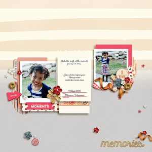
This page by Tronesia made me realise that the way the body is facing, either out of the page or in towards the midline of the page, is less important than the direction the photo subject is looking in. The cute photo on the left is still engaging and the star because of the direct eye contact with the lens and the viewer, with her head relatively central, even though her shoulders and body are angled to the left, or outward based on the photo’s placement. Realising this opens up a lot more possibilities for placement of photos where a child or pet may have been stopped and asked to turn for a photo mid-activity.
If the two photos of Tronesia’s were switched on the page however, I don’t know if that would be as engaging to me. Relative to her body, her daughter’s face is a small proportion of the other photo (as you would expect in a full body portrait) so overall, the direction of her body has more impact here. Positioned where it is, this means she is ‘looking at’ the journal cards and that works. Do you think the page would feel or read different as a viewer if that photo was in the left photo spot, facing out of the page? (Maybe I think too much but now you understand how I find my work arounds for ‘rules’).
This next page by Ferdy reinforces the position of the face versus the body as in Tronesia’s example but there are also a few other tricks that I learnt. Even with the spring directly underneath the child, and recognising this style of park play equipment creates vertical movement, the bouncy animal (I think it’s a duck but I’ve been known to be wrong) is clearly facing out of the page, and with the circles of paper effectively behind the duck, the page design creates a sense of movement across the page from left to right, such that the duck has walked this child across the page and this is the end point that they have come to; or at least that’s what my eyes, reading left to right, and brain can lead me to believe.
The circle paper pieces also create a strong central design for the page, anchoring the photo as part of a large cluster essentially, preventing my eye from wandering off the edge of the page. There is still ‘looking room’ for the duck (maybe it’s looking at the lemon slice or the enamel dots?) even with the skinny crop as it is not positioned right on the very edge of the page, but that’s again less important to me when the child, the star of the photo, is looking directly at the camera.
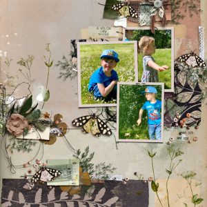
This next page is by designer Rachel Jefferies – total sidenote but I always love seeing how designers scrap! Anyway, there are several portraits here but the position of her daughter really caught my attention and showed me the power of placing an element or something significant right in the eyeline of an outward facing subject, moreso than with the duck above. (And, another sidenote, I’ve been collecting these pages in my ‘faves’ for a while so it’s not like I saw them altogether and had all these groundbreaking realisations all at once).
That top-right photo is all about her, and even with her cute brother next to her, she holds her own on the page despite both her body and face being in profile and the photo placement definitely makes her face out of the page. I would never in a million years have thought to place her there on the page like that but it works for me and I’m so glad Rachel did so I could figure out why it works.
If this were my happy child, I would no doubt want to scrap this photo but if it didn’t have the large butterfly right next to her, the page might leave the viewer wondering ‘what’s she running towards? why is she so happy?’ or other questions, and there is nothing wrong with that. Actually, thinking about it more, using a photo like this without the obvious (butterfly in this case) element placement can absolutely invite the viewer to consider questions for an engaging, thought-provoking page; where they can use their imagination to explore the possibilities for the photo subject, or for a layout themed like ‘Chase your Dreams’, ‘Off on an Adventure’ or ‘Look Out World! Here I Come’, anything that would justify the side-on position and placement; but for a more cut-and-dried ‘I don’t need to question it’ mentally page, which is how I usually scrap, giving an outward facing subject justifies me breaking this rule. That butterfly in her line of sight (and repeated in her son’s line of sight below her) says to me that they’re out playing and chasing butterflies, which may or may not be the case but as far as I’m concerned, case closed, no mystery or ambiguousness or huge title or journalling required (another sidenote: Rachel’s title in the gallery if you click through says ‘Lockdown 2020’ and really that adds to the context but doesn’t diminish the value of lesson and that butterfly element to me).
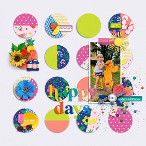
The below page by Jaye is an example to me of the thought-provoking positioning I mentioned above. If the photo positions were switched so they both faced in to that middle circle, it would invite more introspection and could feel restrictive, but the growth theme and having the photos facing outwards, especially with that smile evident, to me at least, makes this feel optimistic and symbolically they are headed out of the confines of the page and into the world. Or maybe he has already left and this page is part of processing the empty nest feeling? See the questions I’m already thinking given they aren’t looking at anything specific (no ‘butterflies’, know what I mean?)?
Finally I want to add this page by angels. This again uses multiple portrait shots but that top photo in profile is used as part of the series of shots and feels totally appropriate as part of the vertical flow down the page. It’s part of the visual story and even though it is outward facing, it doesn’t stop the eye from travelling down the page to land on that angelic front-on face. Using the patterned paper piece definitely helps but I think if that top photo were put in the bottom photo circle spot, this page wouldn’t be as wonderful. What do you think?
I know I also have photos that I zoomed in too much for, or have had to rotate a bit and crop in post that changes how much looking space the subject has and have thought that using one duplicated multiple times and stacked and fanned out a bit, or by ‘cheating’ and extending the background a bit with the clone tool might help the crops look more deliberate or less harsh. The top photo of angels has a line of elements down the right hand side in her field of view that serves as both something for her to be looking at, and possibly to hide the edge of the photo, so that the girl can be more central in the circle photo spot. Creative framing can hide a lot and is a great scrapbooking secret tip, (as well as it’s benefits discussed in a previous Break the Rules Right post.)
So in summary, positioning a photo to look out or off the page can work better when you consider:
- placing elements or a title in the photo subjects line of sight– giving them something immediate to ‘look at’ and also direct the viewers attention towards.
- the body of a subject positioned outwards is less important than the direction of their face or their line of sight – photos where the subject has turned their gaze in a different direction give more flexibility to layout placement options.
- using the photo as part of a scene where the photo is part of a natural endpoint – create a sense of movement with the photo subject effectively as the finish line or as part of a wider scene where close cropping or their line of sight seems logical.
- use the outward facing photo to provoke thought and emphasise the unseen or limitless possibilities beyond the page – not everything can be captured. Allude to what is imagined or possible and allow the viewer to imagine what exists off the page, beyond the visible or tangible. This could be a good way to invoke feelings of empowerment and encouragement.
- using the outward facing photo as part of a photo series on a multiphoto page. The out-takes and lesser shots you might not want to scrap as a stand-alone photo can always contribute to a story and have value.
- also consider duplicating the photo and using it as part of a photo stack or series to give the illusion of extra ‘looking space’ – this alters the relative space around the subject and suggests the framed crop is more to highlight the subject than truncate them. (I’m going to try this on a future page).
Have you got any other ways to work with this principle? Let me know in the comments or link me to one of your pages with your work around solution 🙂


