How to break the rules right!: Using same-sized photos on multi-photo pages
We all know that there aren’t exactly hard and fast rules with scrapbook page design, (it is your page, you can create it however you wish because it is ultimately yours and as long as you are happy with it, that is the main thing), but there are some general principles that over the years I’ve learnt influence how a page reads and comes across to the viewer, so if there’s something that feels slightly off about one of your pages, that you can’t quite put your finger on, maybe it’s got something to do with these principles, and whether you are following them or breaking them.
But we also all know breaking rules isn’t always a bad thing especially the creative rules! And as someone that has been a frequent visitor to the gallery for well over a decade now, I’m always drawn to pages that I feel break the unspoken rules and try to understand why they work when really, to me, they shouldn’t. So I’m about to indulge in some cerebral scrapbook art analysis and this is my internal monologue going back through some of the pages I’ve faved/watchlisted.
The general principle I’m considering today: Two photos of the same size on a page will compete for attention.
As a scrapbooker that often has a photo-driven design process, my usual method of working around this rule is to simply make one photo larger than the other/s on multiphoto pages and have that larger one be the ‘star’ and the smaller one/s then act as the support to tell the story or add an additional perspective but eliminate that competition for dominance.
These are some of the pages that have made me think of other ways of minimising that competition, while still using photos that are the same size.
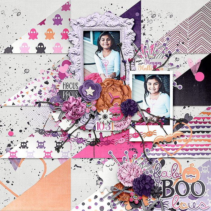
Like in this page by marnel, you can use a different frame around each photo to change the emphasis. The more formal frame makes the overall photo size read as larger and more important (my opinion of course), especially with that high contrast dark purple solid triangle placement behind it. This makes that light-ish formal frame more eye-ctaching as well amid all this fun patterned paper.
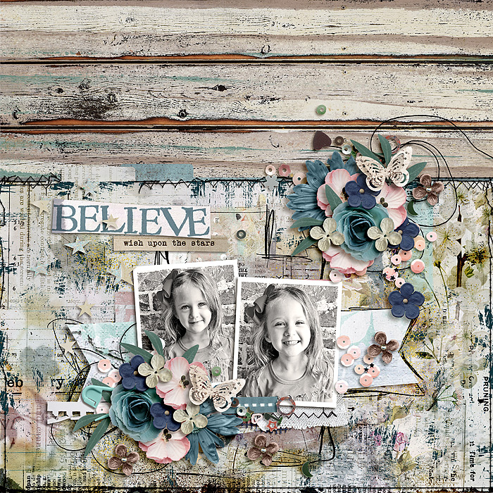
bcgal00 has used different framing here as well but just the high contrast and visual weight of the black frame gives extra significance and weight to the left hand photo.
On this page by ninigoesdigi, the colour photo stands out even though it is possibly smaller than the one on the left. Even though it is in the moiddle of a horizontal page design, it’s position in the middle of the page with the addition of that large flower means that after the eye has read the page from left to right, the eye naturally comes back to it and the black and white images fade somewhat into the background.
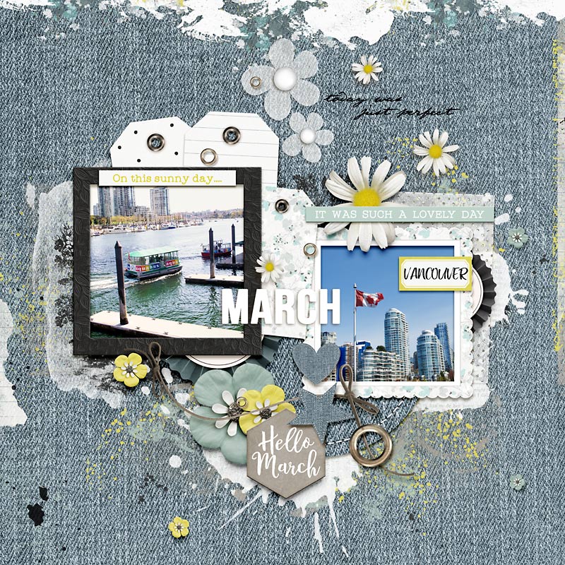
On this page by mrsashbaugh, covering the bottom third essentially of the left photo with elements changes the relative size of it. It is also layered slightly behind the overlapping right photo so that it is again seen in a supporting role, and additionally the right photo while still having the same monochrome filter treatment has more white or bright area that the eye is naturally drawn to, as well as this cute face being slightly bigger within the frame, so again a difference in scale helps but it doesn’t have to be the size of the photo spot, but the way the content of the image is cropped. The photo composition of one photo spot can determine the star when next to a photo spot of the same size.
So in summary, even when using 2 or more photos of the same size on a page, you can avoid them competing for attention by considering:
- alternate framing – relative size and colour of the frame can add weight to one image over the other.
- the content of the photo – both the crop and how you fill the space within the photo and brightness of the image.
- the photo treatment – using different colour and monochrome filters for contrast.
- element use or layering over one photo – to alter the relative size of one image.
Have you got any other ways to work with this principle? Let me know in the comments or link me to one of your pages with your work around solution 🙂