The Art of Mixing and Matching Patterned Papers
Hello everyone! It’s Deborrah (DivaMom96) here today with a blog post about papers!
When I did traditional scrapbooking, the first thing I would look at in the store was papers. Color, texture, patterns, solids … it was all the same. I loved the look and feel of papers. I remember spending most of my time trying to find the perfect paper for my layouts.
Digital scrapping is pretty much the same. I spend a lot of time trying to find the perfect paper for my layouts. For a long time, I would shy away from patterned papers. I could never figure out how to put them together.
That is, until I came across this layout by SeattleSherri in the gallery.
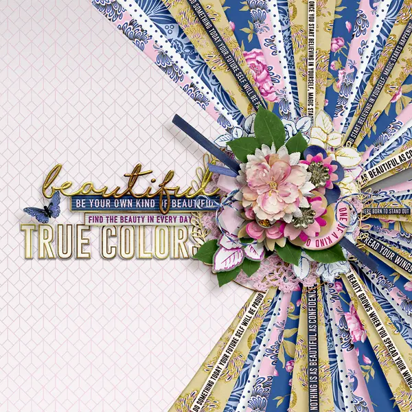
I was literally stunned. Just look at all those papers, side by side, perfectly put together. How on earth did she do that? It inspired me to do some studying and research and I’m here today to share with you the fruits of my labor. Today, I will share with you how to combine patterned papers that work!
There are five basic qualities to consider when mixing and matching papers:
- Contrast
- Pattern Scale (size)
- Neutral Paper
- Separation
- Color
Contrast
One thing I’ve learned is that papers need to contrast each other. Each paper should contrast with the paper next to it. Let me show you what I mean.
Take a look at this folder by Just Jaimee (I apologize, but I didn’t realize this particular kit was no longer in the store):
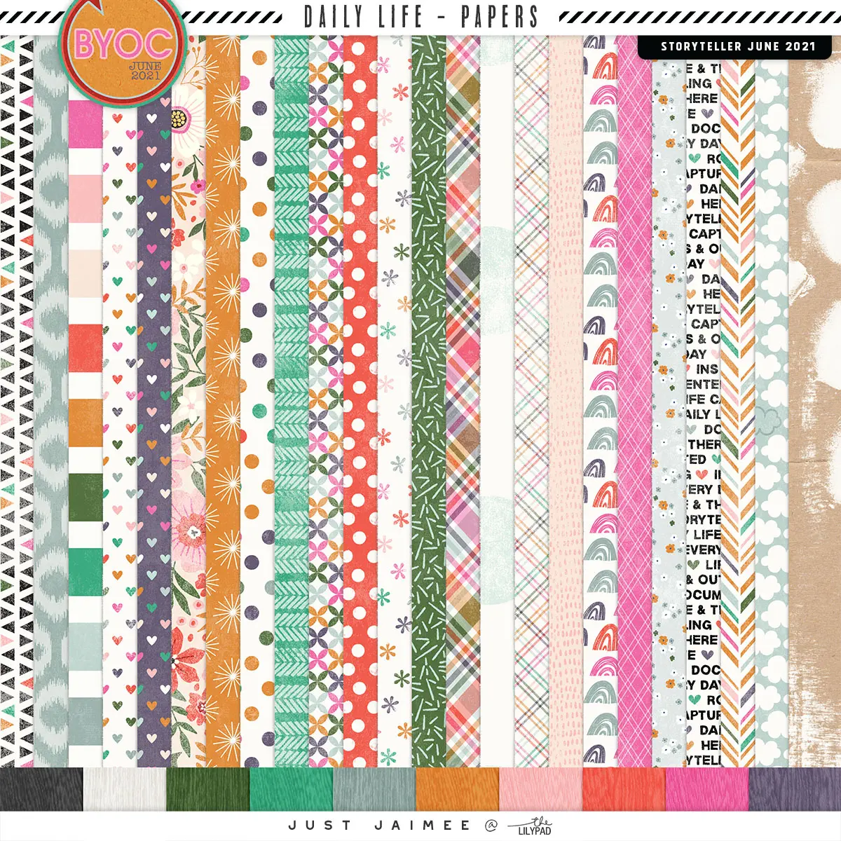
Look at the photo carefully. Notice that the background of many of the papers is white. Then notice that Jaimee does not place papers with the same background together. Placing papers with the same background color next to each other tends to make them blend into each other and look muddy and undefined. There is no contrast. So, my first lesson is, try not to place papers with the same background color next to each other.
But Deborrah, she does place some papers with the same background color together. Yes, you are correct and good catch! But those particular papers have an important difference, which brings me to my next rule:
Differentiate between Size and Scale
Take a look at these two papers, side by side.
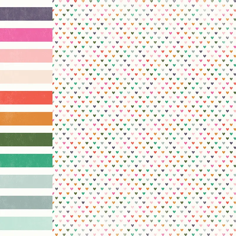
Notice that both have the same background color, white. But the patterns are drastically different. One is a big and bold stripe, the other full of little hearts. They have patterns of different sizes and types. So they work! When you place papers side by side, you need to place large patterns next to smaller, different patterns. That causes the eye to differentiate between the two papers. Think large florals next to polka dots; large stripes next to tiny patterns.
Here is a layout I made to demonstrate this:

In this layout, I placed large floral patterns next to small polka dot patterns, a cross hatch pattern next to florals – I even repeated the floral paper several times in each quadrant to pull it all together. But, I had trouble with it when I tried to place lots of different patterns together, even if I followed the contrast and scale rules. I was missing something – the neutral paper.
Neutral Papers
Neutral papers are those that act as a buffer between patterns. They help to ground the papers and act as a separator that allows them to work together. In my layout, I used solid colors found in the original large floral paper to bind the other papers together.
Look at SeattleSheri’s layout again.
You will see that she used two neutral papers – the white polka-dotted paper and the gold floral paper. By placing them strategically between two busy layers, they acted as a separator, binding the whole thing together.
When I asked Sheri about this, she told me that she’s a big fan of using kits. When she matches papers, she stays within a particular designer’s kit since the papers are made to go together.
But, what if we have a paper pack that really doesn’t have a neutral paper (that we like) to act as a buffer? Then we need to find a way to add separation.
Separation
In this layout, I used a stroke on the background mat of each chevron to add a small separation between the layers. This gave me the definition between the layers that I needed, allowing several busy patterns to be placed side by side. Now, don’t be fooled. It can take some trial and error to figure out which papers to place next to each other. But by using the rules laid out in this article, you can intelligently experiment with papers and end up creating a layout you love.
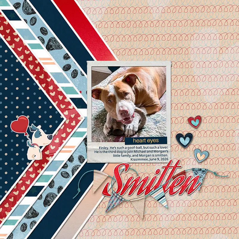
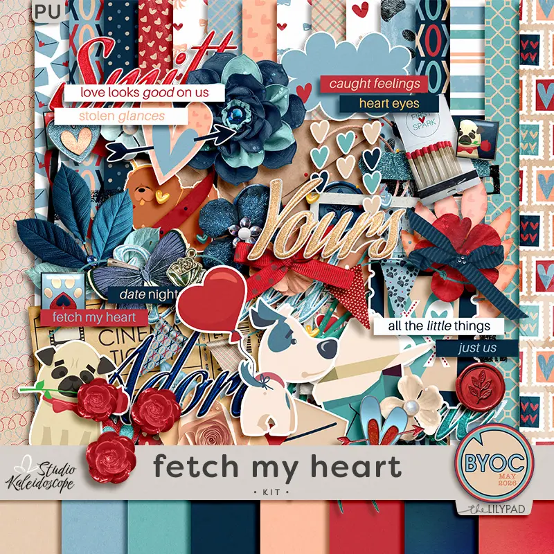
Doesn’t the kit work perfectly for this? It’s Studio Kaleidoscope’s Fetch My Heart.
OK – only one more rule to go!
Color
The last thing to consider when matching up papers is color. I’m not going to get into color theory here – you can easily find lots of information on the web. What I want to talk about is choosing color to compliment your photo.
Let’s look at this layout.
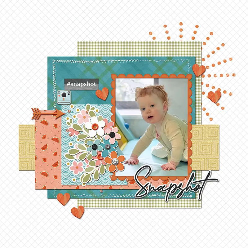
Notice that Elle (my granddaughter) is in a greenish/yellow outfit, surrounded by yellow and turquoise. I wanted to find a kit that had these colors, or even some contrasting colors. After some searching, I settled on NiniGoesDigi’s Snapshot Collection – it was just on sale during this past week’s SOSN sale!
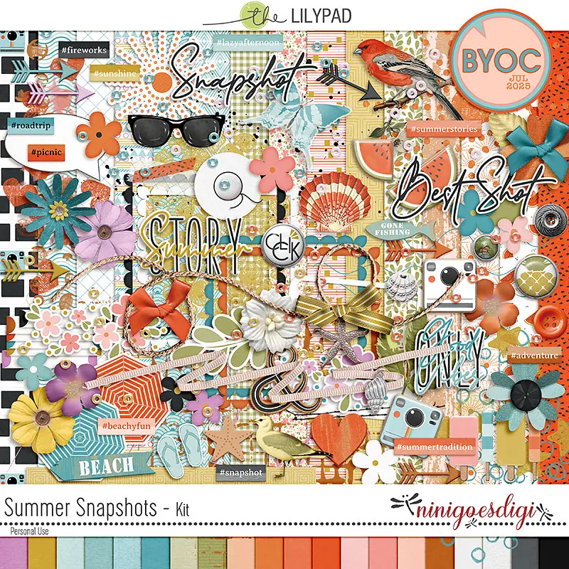
I pulled out lots of the papers and layered them together in Photoshop. I even put the photo on top of them at one point to make sure they worked together. After some experimenting, I decided on the following papers: one large pattern (teal cross hatch), one small pattern (green gingham), two medium patterns (orange melons and teal and white), and one neutral (tone on tone green).
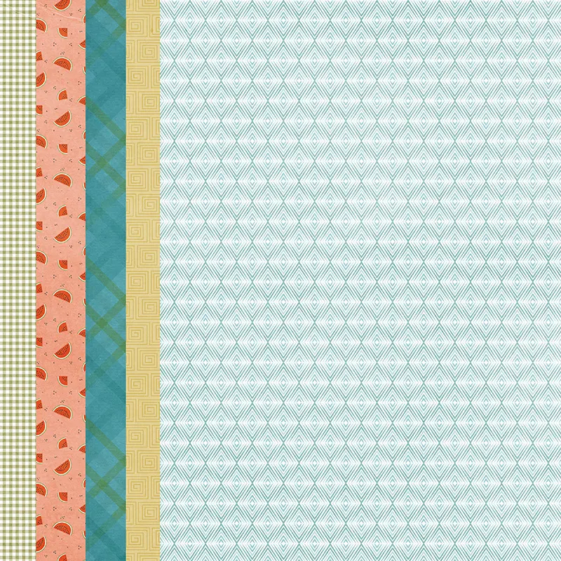
From these, I played around putting them under and over each other until I liked the placement. The colors all work together – orange is opposite blue on the color wheel, and green is between yellow and blue. And best of all, I liked the look of them together – the most important thing.
If this is new to you, I encourage you to play around with the papers of any designer kit you have. Put them all together and see which ones work best next to each other, using the rules mentioned here. Place neutrals in between busy patterns. Find large patterns and pair them with smaller ones. Contrast stripes against swirls – the combinations are endless.
Summary
To summarize, here are the five rules to consider when mixing and matching patterned papers:
- Choose papers that are contrasting and don’t have the same background color.
- Choose different sizes and types of patterns. Don’t use large and small hearts together; pair large hearts with stripes, big florals with small geometrics, gingham with polka dots.
- Choose a neutral paper or two to act as a buffer between patterns.
- Choose ribbons, strokes or other dividers to help differentiate between patterns.
- Choose colors that are complimentary or contrasting, or colors that coordinate with your photos.
And most of all, have fun!!

I hail from Florida – yes, a true Florida native (we DO exist!). I moved to Chicago after college to pursue a career in opera, and lived in many different mid-western states before returning to Florida in 2013. Both of my sons were born in the Mid West, so they are perfectly happy here on the West Coast of Florida, since that’s where all the mid-westerners come. I met my second husband here and life just couldn’t be better.
I’ve been scrapbooking since 2003, soon after my second son was born. I loved the feel of paper, fabrics and all the different textures. I loved taking photos to put in my pages and thus was born a love of photography. I also make cards – there is nothing like die cutting and inking. I pretty much love all paper crafts. But there’s always so much STUFF everywhere! I discovered digital scrapbooking in 2015 and have never looked back.
I’m not sure I have a style. I go through different phases – one month I’m into artsy, layered pages and the next it’s all about white space. I love color and texture and strive to add it to my pages. I’m inspired by other scrapbookers. When a layout catches my eye, I try to figure out why it works and why I love it. I analyze and study.
I’m also a Photoshop girl. I started using it to fix photos so when I discovered digital scrapbooking, it was a seamless transition. I’m always fiddling in it, trying to alter things, change colors, make things different. And it’s perfect for my love of photography.
If I had one piece of advice for new scrapbookers it would be don’t be afraid to ask questions! All of us were there at one time or another. I love asking questions and even if I don’t get the answer I want, it inspires me to look further. Enjoy the process; that’s what matters.