5 Tricks I Use on Every Layout
Having scrapped for over 6 years now, I have found that there are certain things that I do all the time to help create my layouts. You learn some tricks along the way, and some just seem to become regulars that help define your style as a scrapbooker. I believe that these five tricks that I want to share with you today are what take my layouts to the next level.
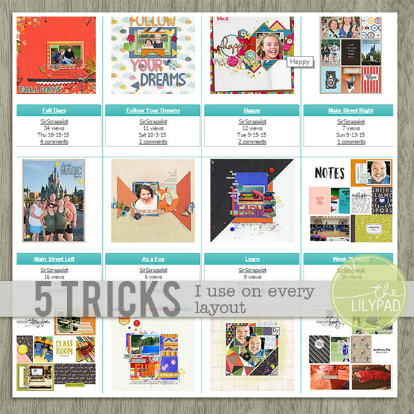
- Repetition – I am a huge fan of using repetition in all of my layouts. Sometimes I repeat the photo, or I repeat some elements. Other times, I create repetition with my use of papers, or with paints and other finishing touches. In this layout, Happy, I have used papers on the template to create repetition among the four triangular paper cutouts. Having the same papers be used on the bottom and the top add a touch of symmetry to the layouts, which I find is pleasing to the eye.
- Patterned Backgrounds – If you scroll through my gallery, it is rare that I use a completely solid paper as my background. For some reason, it never looks right to me. So when I am scrapping, I always gravitate towards the patterned papers. Sure, sometimes it’s hard to use a boldly patterned paper as a background, but here’s a bonus trick I use when that’s the issue. I take the patterned paper and a solid in matching color, and I layer them together adjusting the blending modes to tone down the pattern. That’s what I did on the layout Fall Days. The woodgrain background was a little bolder than I wanted, so I used the solid of the same color and played with the opacity of that layer to create a more subtle pattern.
- Realistic Paper Shadows – Shadowing is the one thing that if you pay enough attention to it, it will really make your layouts stand out in the gallery. One shadowing trick I rely on is to use THIS tutorial from TLP on creating a wave in my paper shadows. I find it easy to do, and have incorporated it into an action that I can run on my layout when I have everything in place. On the layout First Time, you can really see how the wave makes the page look a bit more realistic because of the shadowing on the stack of papers.
- Askew Title Placement – I don’t know about you, but I always struggled in paper scrapping to have my letter stickers line up in a perfect line. Some were always off center or a little crooked, and once they were on there wasn’t much you could do. A few months ago I really started paying attention to that idea on my digital layouts. When I am placing letters for a title, I always make sure I nudge them a bit to make them appear askew. Nothing crazy, maybe one click down, or one to the right just enough to give my layout that “real” look. This works especially good with Heather’s Foam Alphas, as you can see on my layout That Was Awesome.
- Paint – Paint has quickly become a tool that I use on literally every layout. The thing is, you might not always notice it. I often use paint to help create dimension behind my photo or the main part of my layout. It’ soften subtle colors, but layered behind everything, it really helps make the layout pop. I had never really used paint before, dismissing it as a look that I wasn’t into. It wasn’t until the last year or so that I started to see how just a little paint or mist can really improve the dimension I am always striving for. On my layout Empty, you can see that I used paint behind the photo – not a lot, just enough to give a slight touch. And while the layout still looks characteristically like one of mine, the paint helps to bring the picture off the page.
Do you have any tricks that you use on every layout?