Tricks to Make Your Photo the Star of the Page!

If, like me, you area photocentric scrapper and think the photo/s should be the star/s of your scrapbook layout, but sometimes you feel like they aren’t for some reason, or that they are struggling to compete for attention with everything else on the page, you aren’t alone.
Here’s some of the tricks the Pollys & I use to pull a bit more focus when we want it to elevate our photos!
- 1. Edit your photo. Some people don’t go out without make up so they look their best, editing is make-up for photos. Bring out your photo’s best with common sliders or filters on your phone or blend modes in your program. The quick edits I use often are:
- bumping contrast – especially where it feels like all the tones are the same to bring more light and shade
- bumping sharpness or definition – sometimes photos can look a bit soft or foggy, boosting these without overdoing it can help (although counterintuitively you want to use the ‘unsharp’ mask filter in most graphics programs to make it sharper!)
- bumping colour – bright sun can wash out colours in an image, and even at the technically best times of the day, it can be hard for a photo to compete with super saturated tones in kit pieces. I once read that the difference between the Vibrance and Saturation sliders is intensity and that while pushing up Saturation is like using a hammer and rather blunt and non-specific boosting all the colours simulatenously, Vibrance has more finesse and selectively boosts the less in-your-face colours which can improve the photo overall by bringing balance which might be all you need. Thinking about it now, I tend to use Vibrance more often to finetune colour personally but you can stack Vibrance and Saturation and use both on the same image.
- modifying the colour temperature – overall warm photo colours with a cool toned background and kit can instantly feel off to me; using a cooling filter can make the photo feel a better (or you can use it to warm up the kit colours like I’ve done here in a previous Page Fixes post .
- use an action, filter or a preset – adding some special touches like flare can lift a flat sky or enhance movement for a more dynamic photo but also for black and whites, as I’m not a fan of just making an image grayscale. To me, it just makes the colours look muddy, or like it came out of a printer in the ’90’s, with no true black and no true white areas. Sabrina Dupre has a set of Not So B&W presets for Lightroom but several other packs as well that, I have it on very good authority from some of the other Pollys , are still compatible with the current version of Lightroom (as of March 2026) and that newer versions tend to still be backwards compatible with earlier presets. Val Wibbens also has some fun actions that will make any photo interesting if you are editing in Photoshop or another program that can support atn files! [Please note that Lightroom specific presets and Photoshop specific actions are not always able to be used in every graphics or editing program but if you have the free version of the Lightroom app on yoour phpne, you can use Sabrina’s presets in the phone version of Lightroom too).


Polly cfile has used Sabrina’s Not So B&W presets to rescue a super dark photo she inherited for the page on the left and Polly marijke’s page below shows the difference presets can have on overall image appearance and how cool that can look when several different edits are all used together on the one page. She used various presets within the Halloween Treats presets pack.
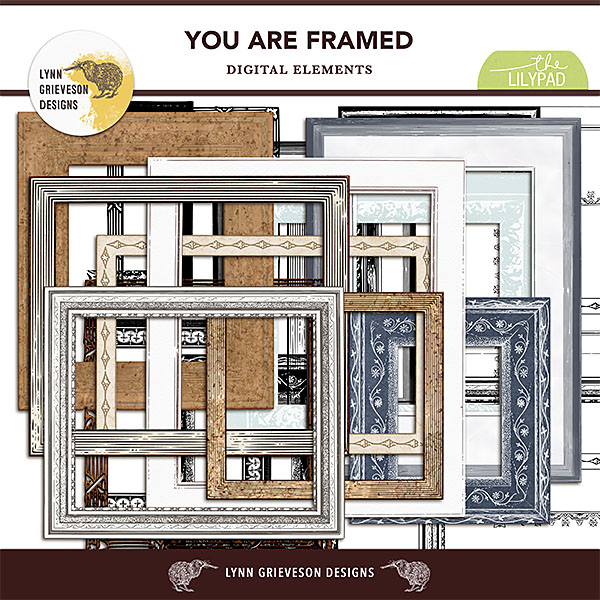
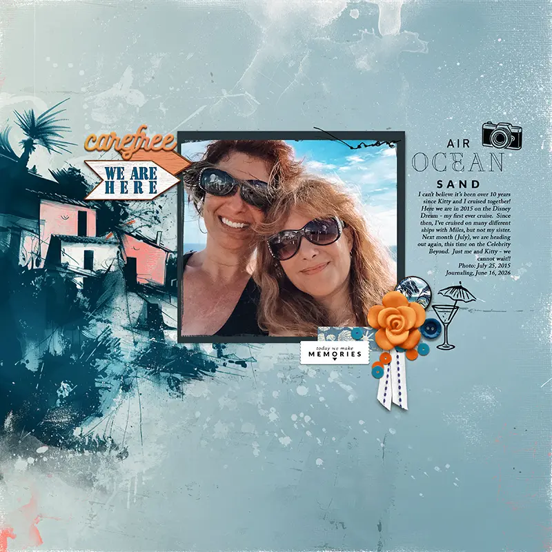
- 2. Add a frame.
Even a basic white stroke can be enough to add contrast and separation between your photo and the colourful papers and elements; and of course the fancier the frame, the more important that makes the photo, right?! Want one photo out of a bunch to stand out? Add a frame just to that one. Have a few photos that all tell a story in a sequence? Use a multi-frame or storyboard design arranging them from left to right in order the action takes place so they stay together and the eye will read them as the story you intended. There’s go-to frame packs as well as tools to make frames yourself! Thanks to EllenT, bcgal and LynnG for these example pages.

- 3. Blend the photo or layer something over it
I use this when I feel more artsy but also if the photo feels like it has some imperfections I want to hide. Masking out areas can help or adding a textured overlay straight over the photo. I’ve talked about that previously in a post here about Scrapbooking Secrets and in more step by step example post for Mixed Media Beginners. - 4. Add text right on the photo
Our eyes and brain will subconsciously pick up messages and seek text. The title or wordart straight on your photo will guide the eye right in to it and elevate it’s importance on the page
- 5. Give the photo dimension with shadowing
Popping the photo off the page or giving it and out-of-the-frame treatment can make your photo command attention. Tweaking shadows yourself with warp or using an action or style can totally be worth a few extra clicks and there’s several products in the store that can help you out (just again make sure you check what file type your program uses). These example pages are by Pollys cfile & SeattleSheri


- 6. All else fails, less is more. Eliminate competing elements or papers. Is your bright purple flower on the other side of the page drawing the attention of your eye? If you can’t bear not to have it on the page, move it closer to your star photo or overlap your photo, but maybe it should be saved for another page entirely. Try making it invisible (turning the layer off) and back on again and see how your photo looks in both situations. Goodbyes can be hard, but sometimes they are for the best. Sucali and scrapchyck make the case for minimalism to let your photography be the star below.
See you next time and I’d love to hear any extra tricks you use if you’d be so kind as to share them in the comments 🙂


Thanks Justine for these amazing tips! I love the Deckled Edge Framing action by Mommyish and use it all the time, especially for my heritage page. Every now and again I need to remove the framing on the scanned photo for whatever reason, and then I use the Deckled edge Framing action on the photo to bring back that heritage look. The presets for LR are fun to use too. I am not proficient in LR so playing with the presets is a great fast processing for me! Shadows and manipulating them by bends etc. can really bring a page to life. I hope all who see this post, give your tips and tricks a try to bring a new look to their pages. Amazing post!
What a wealth of fabulous ideas in this post!