Thoughtful Thursday : Eye catching titles
Hello again, Polly StefanieS here with some awesome layouts I found in the Pollywog gallery that feature some great looking titles. I have to say that not all layouts I create get titles, but I can fully appreciate a layout that has a title that grabs your attention and makes you click through to see what it’s all about.
As you drive on the roads, you might see a sign advertising a local newspaper, and it’s the headline/title that gets you interested. I can’t be the only one that judges a book by it’s title?
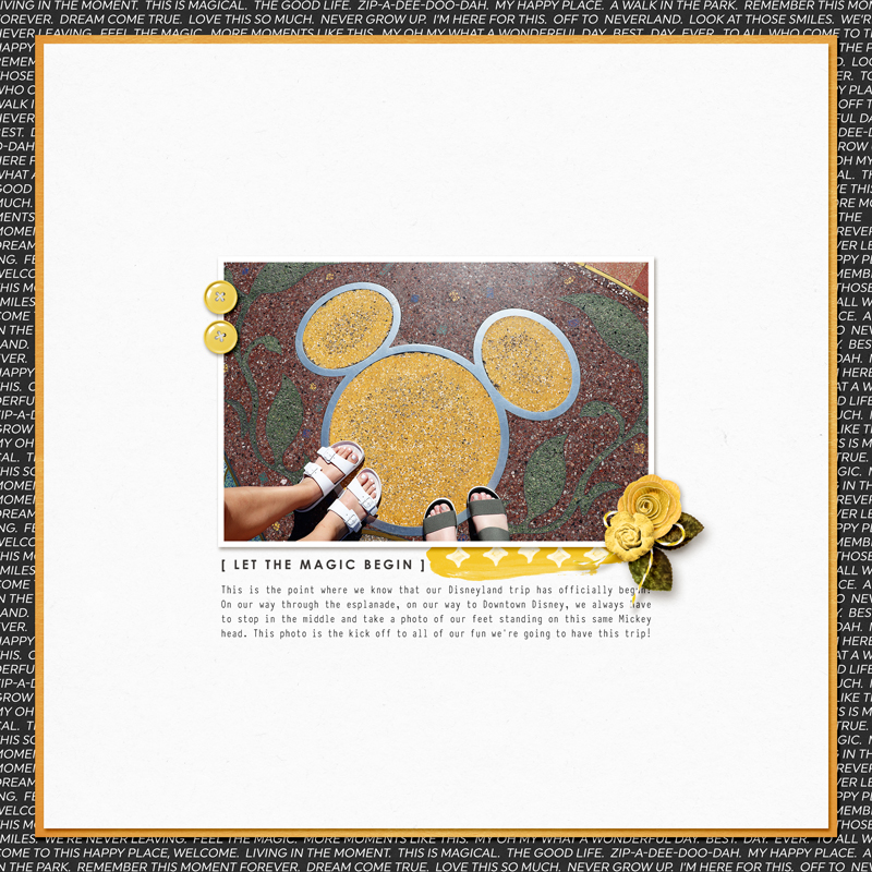
This one by tkradtke is a clean and simple one. She uses a wordart [Let the magic begin] which really sets the scene with the photo to tell you it’s a Disney story that’s unveiling.
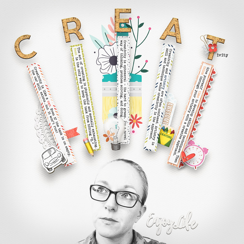
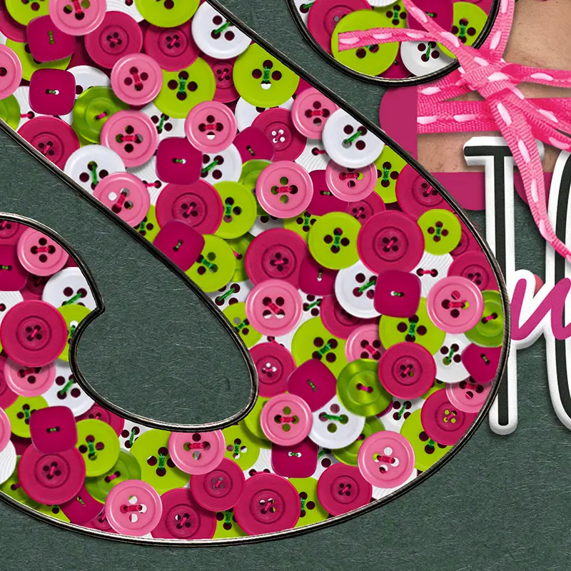
These wooden letters with shadowing that lifts them high off of the page, really packs a punch and you want to read the details on the paper strips.
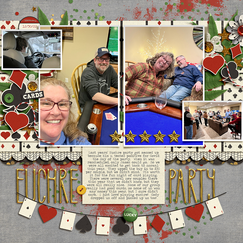
Euchre Party by Karen features a golden skinny alpha, it plays a foundational role below the photo layers and adds to the balanced symmetry of the layout’s design.
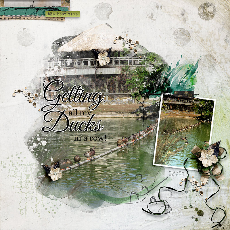
Getting my ducks in a row by cfile, is a beautiful tongue in cheek title. We all know how difficult it can be getting our ducks in a row, but her image of ducks standing on a float, lends truth to the idiom in a fun lighthearted way.
No matter what you use; word art, fonts, alphas, a title acts as a hook ,draws the viewer in and create a first impression for your design.