Recoloring Tips in Photoshop
Hello all my artsy friends! I am dropping in today with a couple of quick tips for easily recoloring elements in Photoshop. It is time for another fabulous Something Old, Something New sale in the shop and Kim Jensen has a fabulous crumpled flowers set that is 50% off today (along with everything else in the SOSN section). Have you ever seen one of those element sets and wondered how you would use it with other kits? Sometimes the colors work just fine on your page, and others not so much. Well, there is a simple solution when you want to change the color of an element to match a particular color scheme. I used a couple of different recoloring techniques on this page:
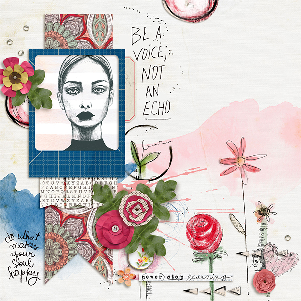
You wouldn’t know it from looking at the page, but I changed the color of the crumpled paper flowers, one of the paint elements and that gorgeous patterned flower paper under the photo frame. (Click on layout for full credits.)
Let me show you how simple these techniques are to use.
Hue/Saturation Adjustment
I used a quick hue/saturation adjustment for the flowers and patterned paper. It only takes a couple of steps to complete, but can have a really big impact on the look of the element.
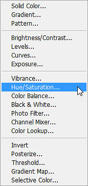
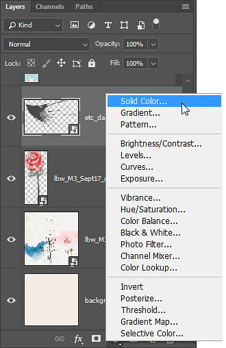
First, activate the element layer in the layers panel and add a Hue/Saturation adjustment layer. Click on the create new adjustment layer icon (half-filled circle) and choose Hue/Saturation from the pop up menu.
You should now see a hue/saturation adjustment layer just above the element. Clip this layer to the element (Ctrl > Alt > G) or the adjustments you make will affect everything below it. Once it is clipped to the element layer, it will only affect that layer. Now make adjustments to the hue/saturation sliders in the pop up box. These are the settings I used for the flower elements on my page:
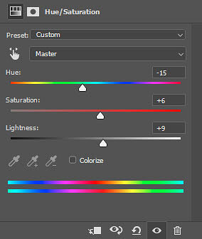
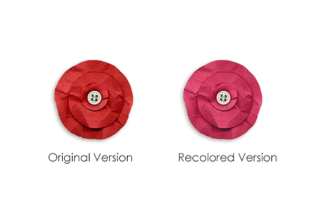
Hue changes the overall tone, Saturation makes the color more or less vibrant and Lightness makes the color lighter or darker. There is no one formula for these settings, so just play with them until you achieve the color you want. Here is a comparison of the crumpled flower element before and after the hue/saturation adjustment:
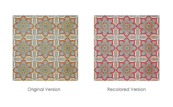
And here is a comparison of the patterned paper (from Etc. by Danyale’s Yesterdays kit) before and after the hue/saturation adjustment:
And that is all there is to it! Just this one little tweak makes those element packs (like the crumpled flowers) so much more versatile. It also gives you the ability to use any element from any kit and know that you can match it to the color palette on your page. How awesome is that?!
Solid Color Adjustment
The other recoloring technique I used is even easier, but only works on flat painted elements. I used it to recolor some paint from Etc. by Danyale’s Yesterdays Paint to match the other elements on the page (which are primarily from Little Butterfly Wings’ September 2017 M3 Add-on).
First, activate the element layer in the layers panel and add a Solid Color adjustment layer. Click on the create new adjustment layer icon (half-filled circle) and choose Solid Color from the pop up menu.
When the color picker box appears, the cursor will turn into an eyedropper that you use to select your color of choice.
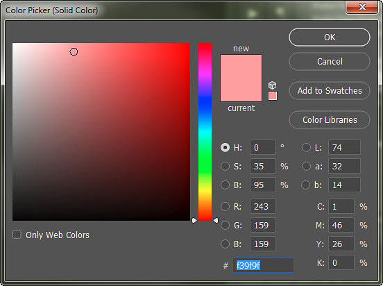
I selected a color from another element on my page. Once your color is selected, click OK and the color picker box will close. Make sure that you clip this layer to your element, or it will apply to everything underneath it. (Shortcut Ctrl>Alt>G) If you don’t like the color you chose, you can easily change it by clicking on the color box in the layers palette and choosing a new color when the color picker box appears. I ended up changing my mind a couple of times before settling on the one you see above.
And that is all there is to it! The solid color adjustment is a quick, easy and nondestructive way to change the color of flat elements like paint and word art. I also used this technique to tweak the color of the sketched woman in the photo frame.
Here is a comparison of the layout with the original elements, and the final version with the color coordinated palette:
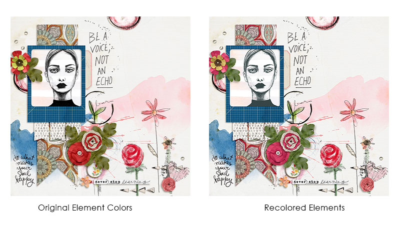
Although it may seem subtle, the recolored version is definitely more coordinated and pleasing to the eye!
I hope you have fun with these techniques and are able to use them to extend your digi-stash and give new life to your favorite elements. 🙂
Until next time ~
Judie (HeyJude)