Realistic Clustering with Flat & Dimensional Embellishments
Hello everyone! I’m just popping in today with a quick tip on how to make your clusters look more realistic and interesting. Many times we think we can only achieve dimension by adding “fluffy” embellishments to our pages, but the key to achieving a balanced clustering effect is combining both flat and dimensional elements. This technique helps the eye to see different levels of dimension instead of throwing a big fluffy cluster at it that may look unbalanced against a flat background. Here are some examples of this technique:
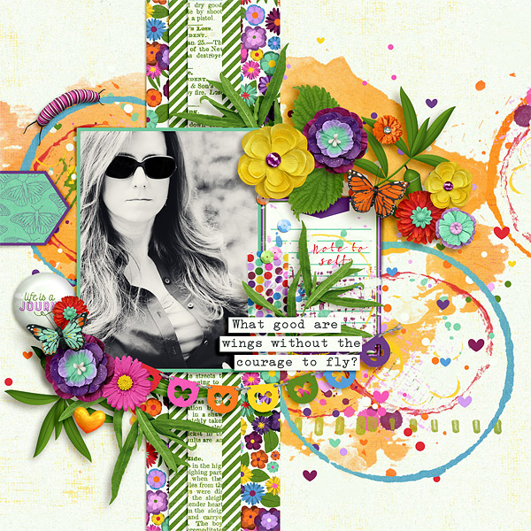
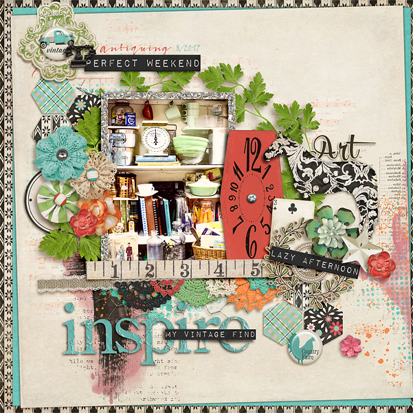
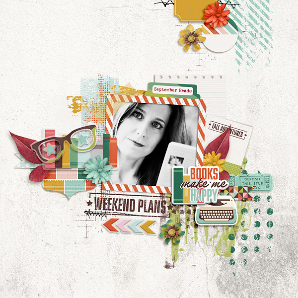
Notice that not only are flat and dimensional elements combined on both of these pages, but the flat elements aren’t all at the bottom of the page. On the first layout, I layered word strip title on top of more dimensional foliage elements and embedded the banner element between foliage and flowers. On the second layout, the word strips, playing card, metal clock and ribbon elements are all layered in between more dimensional embellishments. This combination of flat and 3D elements really makes these pages pop with dimension.
Here is another layout where I used flat paint elements on the bottom of the design to help push the other elements off of the page:
The most important lesson to learn when combining dimensional and flat elements is not to feel like you have to put all the flat elements on the bottom of the page. Embedding the flat elements in with other more dimensional embellishments creates a more interesting design overall. Another important tip when combining flat and dimensional elements is to warp your shadows (especially on the flat elements) to make them look more realistic – as if they are actually sitting on top of the 3D elements.
Ready to push your clustering skills to the next level? Be sure to share your creations with us in the TLP Gallery. 🙂
Until next time ~
Judie (HeyJude)