Minimal & Maximal Monday: Understated vs. Themed to the Max!
Hi there! Back in February, I challenged myself to use the same photos and products (same kit and template) to produce two different styled layouts and began with a minimal layout that I then maxed out to show the potential of any template and kit combo. It was an interesting experiment so last month I tried to reverse it and went from Maximal to Minimal, decluttering my layout and today I’m back for another Minimal and Maximal Monday with my focus being the theme of the page!
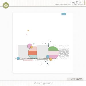
The plan: This time I’m planning to use the May Template Challenge template and it’s a freebie from Sara Gleason and is perfect as is for a minimalistic page, but also has plenty of scope for dressing up and maxing out. But my experiment this month is with minimal and maximal Themed pages – I’m going to try a more understated look as well as using plenty of the same kit and going heavier on the same theme with the same photo, story and template base, so here we go.
Here’s my products for today.
Template: Sara Gleason | TLP May Monthly Challenge Template – available free from the forum – this is classic Sara style – minimal in nature with lots of tiny detail element guides but with potential for both minimal and maximal scrappers alike.
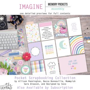
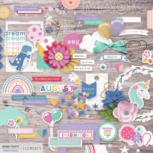
Kit: Memory Pockets Monthly: Imagine – this is a pocket scrapping kit from the monthly series that can be purchases separately or as part of a subscription, but it is so much more than just pocket cards, it has a cool glittery and stampy alpha, a fantastic element pack and patterned and solid papers to suit any scrappy or hybrid project, and clicking to see the full collection of previews in the store is really worth it to see how big these packs are.
Here’s my starting point for my minimal page.
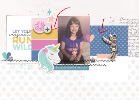
This photo is a throw-back of my daughter with one of her beloved unicorn toys, she loved her fantasy animals like narwhals and was also all about dinosaurs so the imagination and believing theme went with the backstory and the second photo spot looked like a good journal card spot so that helped me choose the MPM Imagine kit.
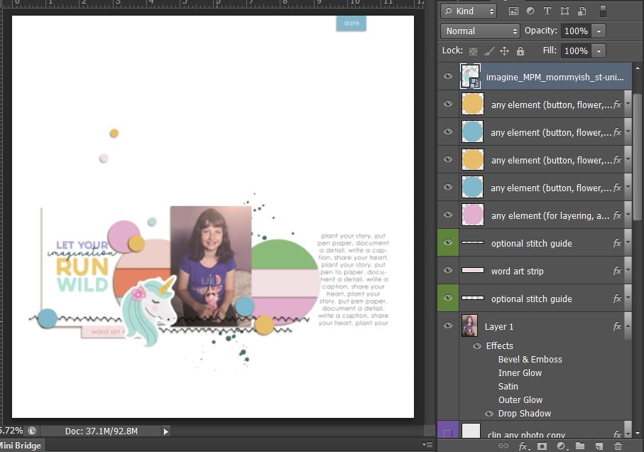
Bringing in some more elements, because this is the minimal page and based on the scale of the element placeholders in the template, I went with mostly smaller details – some stars and hearts and buttons and bling
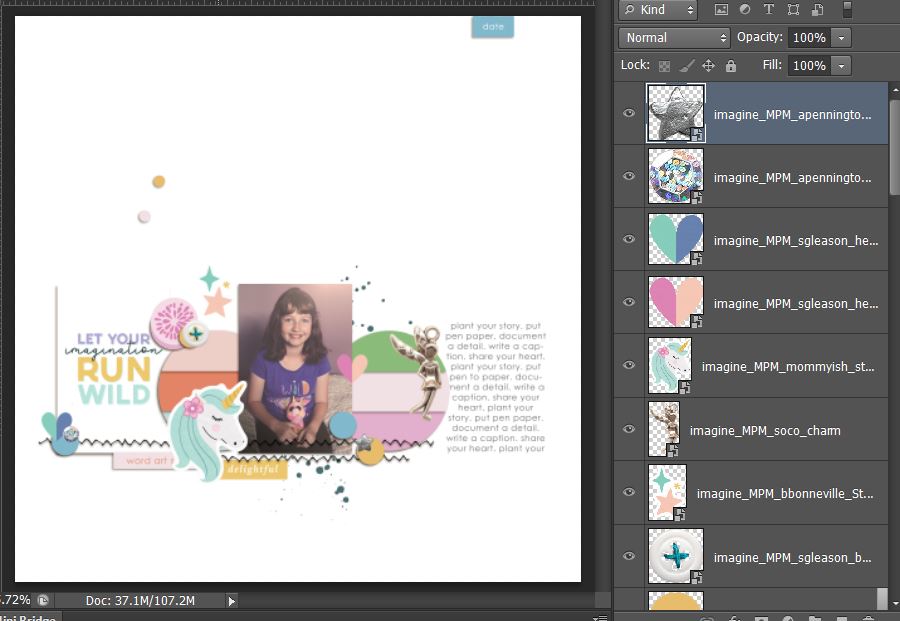 …then hiding the placeholder template layers and fixing my shadows to se what I’ve got…
so the fantasy and imagination theme is represented with the unicorn sticker and fairy charm at this stage. Because the circle parts of the template have a striped look, I thought a solid that complimented the photo background would be the best main background but it seemed to pull attention to the journal card/title too much, because of the contrast with it’s white background…
so I switched it for a more subtle pattern but that seemed too busy. So like Goldilocks, I had to keep trying combinations until I found one that felt just right. Because the predominantly white background I went with now creates contrast with the purpley background of the photo, the eye and attention is directed more to it rahter than the journal card which works for me. The contrast and scale of the text still gives it weight on the page but doesn’t distract as much from the photo. Adding a small strip of a that subtle polka paper adds some interest and anchors the photo cluster as a whole along with that contrasting stitching from the template.
So here’s my finished Minimal imagination themed page
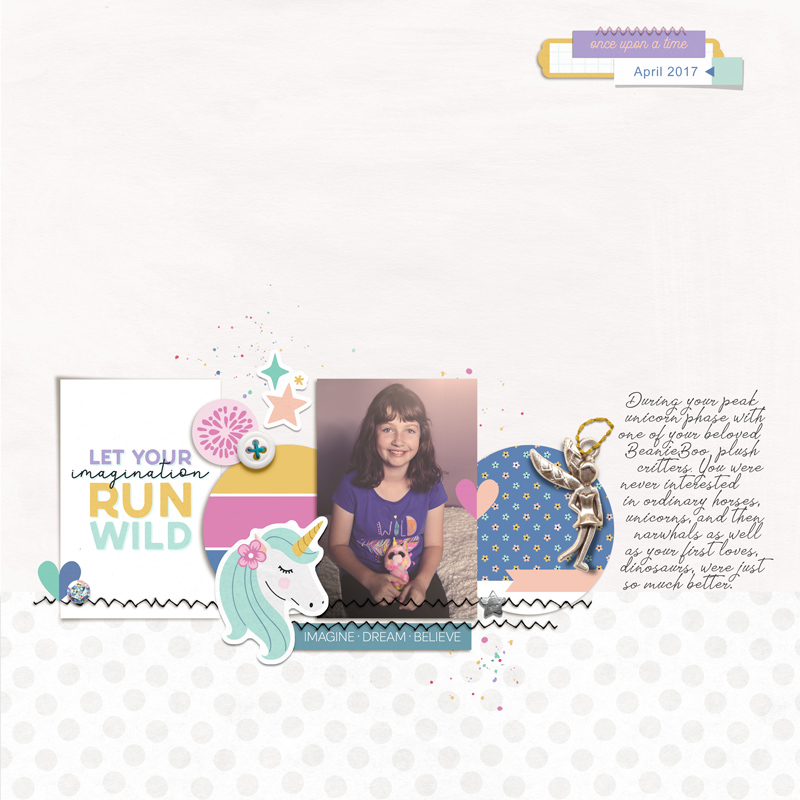 I kept the mixed media minimal and used the tiny splatters from the element pack but made the date strip section a bit more substantial. Layering tags with other tags is a good way to achieve this look and it is still on the minimal side.
Tip from this process: Paper scrappers will sometimes use pocket cards to save them cutting up whole 12 x 12 papers, which as digiscrappers we don’t have to worry about really but using pocket cards in place of papers can have advantages. Because the circle paper pieces in this template are relatively small and small patterns work well on minimalist layouts, I actually clipped journal cards to the circle pieces as the scale of the blue tiny floral was smaller than the paper included in the collection. Journal cards also sometimes have added extras on them like the pink banner on the blue tiny floral print card under the fairy charm which gives them some added value and dressed up the circle in one click with little work on my end! Same story with the striped circle on the left – that’s just one journal card that was pre-striped like a paint swatch card as you can see below before I clipped them to the circles in the template.
Now to amp up and maximise the imagination theme.
I first went looking for a paper full of unicorns to basically cover the expansive background because at this stage, if my daughter could have had a room full of unicorns (real or stuffed) she would have loved it. Alas there was no such paper but I did find some fun rainbows and the large curves guides the eye to the photo, and the astronaut dinosaur was too cute not to use. Dinosaurs in space would have been a mind-blowing fun combo for her back then. I also grabbed some more mixed media paint.
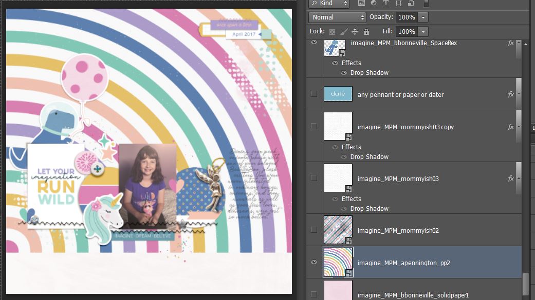
The only problem here so far was how those rainbow stripes broke through my journalling and I didn’t feel like re-typing in and moved it initially but same problem really so i thought about bringing in another journal card to put behind it so it was easily legible or adding a block of white paint but still thinking like a paper scrapper, I decided if this was a real paper page I would just ‘fussy cut’ the offending stripes of the rainbow out so that’s what I did.
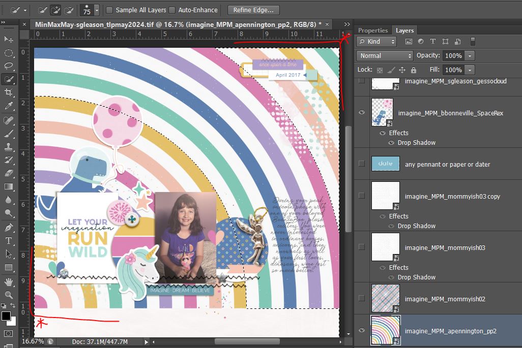
There’s probably several ways to select the area you want cut on a paper like this but I used the ‘Quick Selection’ tool in Photoshop (that lives with the Magic Wand in my version of CS6 so you may need to toggle that to find it). Using the ‘+’ brush up the top, I painted down the first strip I wanted to get rid of (the white between the mustard and teal)from the top left all the way to the bottom, then across the bottom to the last row I wanted to cut (the dark pink) and painted all the way up that. The brush was fairly wide but it didn’t need to be perfect but you can see the ‘marching ants’ or dashed lines of where I painted. I then just painted all the area in between them and the ‘+’ wand will add that new painted section to your original selection.
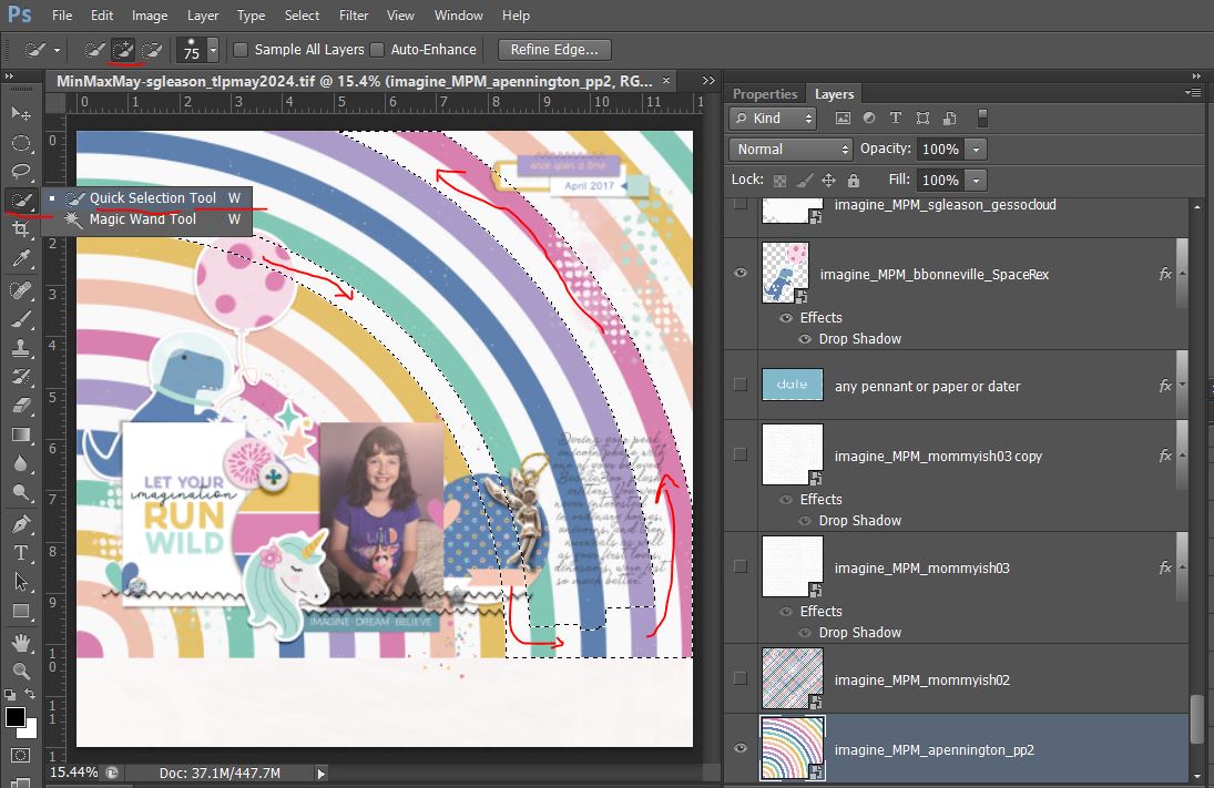 I could have just hit delete or cut at this point but I always prefer non-destructive editing and using masks (so that if I regret something later on, I don’t have to backtrack several steps I can just delete the mask). So before masking, because I want to keep the corner areas of the rainbow paper, I inverted the selection (Shift + ctrl + i ), so now the dashed lines look like this and the mask will hide the correct part of the paper. (I know it’s a few steps but it’s still easier than fussy cutting to me).
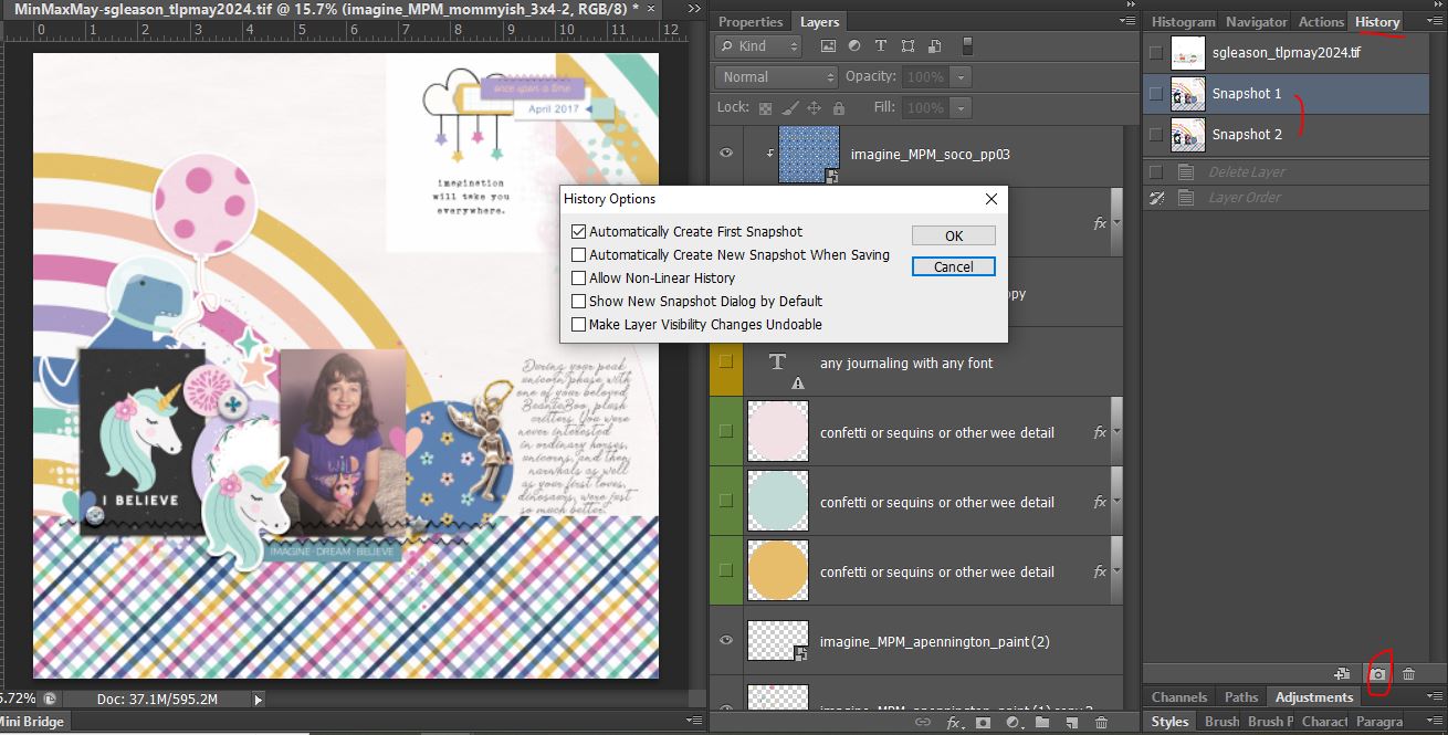
 So because I was thinking about fussy cutting, I went back to the journal cards to see if there was anything else theme-y in there I’d like to bring in. I saw the hanging star cloud card, perfect for fussy cutting into a sticker and I decided to swithc the title card to the black unicorn ‘i believe card’ and then I thought I’m going to have to move the unicorn sticker from the Minimal page and maybe a few other things… so before I went too crazy, again, I don’t love having to Undo a whole lot of steps so I created a Snapshot which is like an easy to revert to moment in history (it’s in the History panel) just by clicking the camera icon at the bottom. There are different options so this maybe your first or second snapshot but sometimes I do this before a major direction change in my scrapping process.
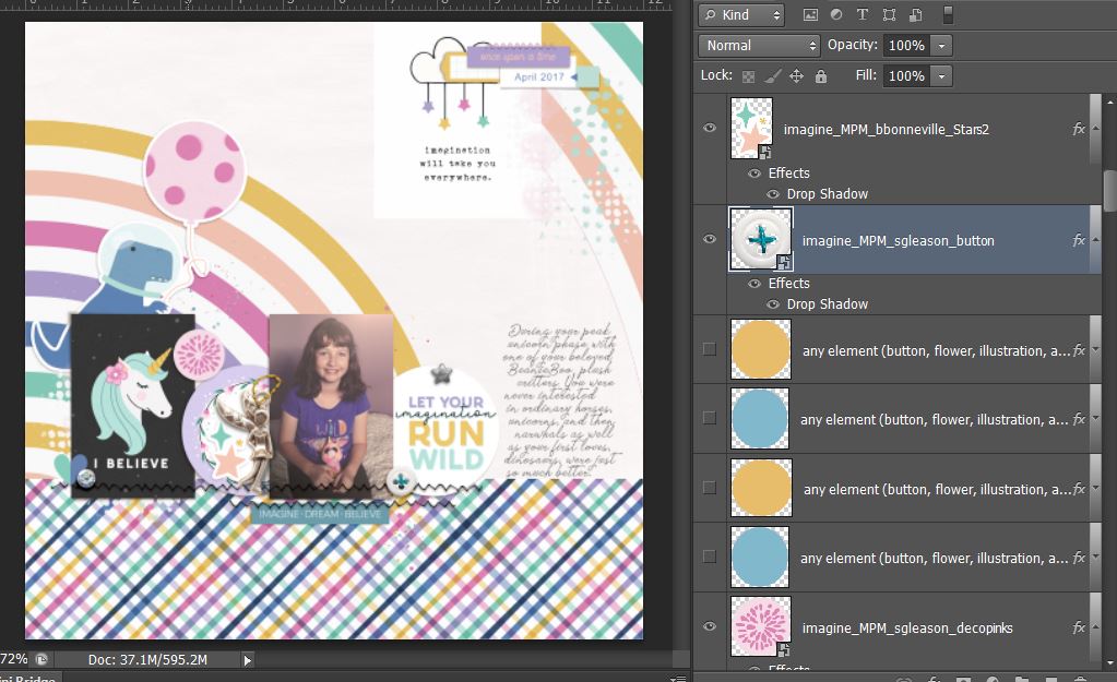
 So now I’ve moved the original title card over to the right circle spot and moved the fairy charm and a few other details
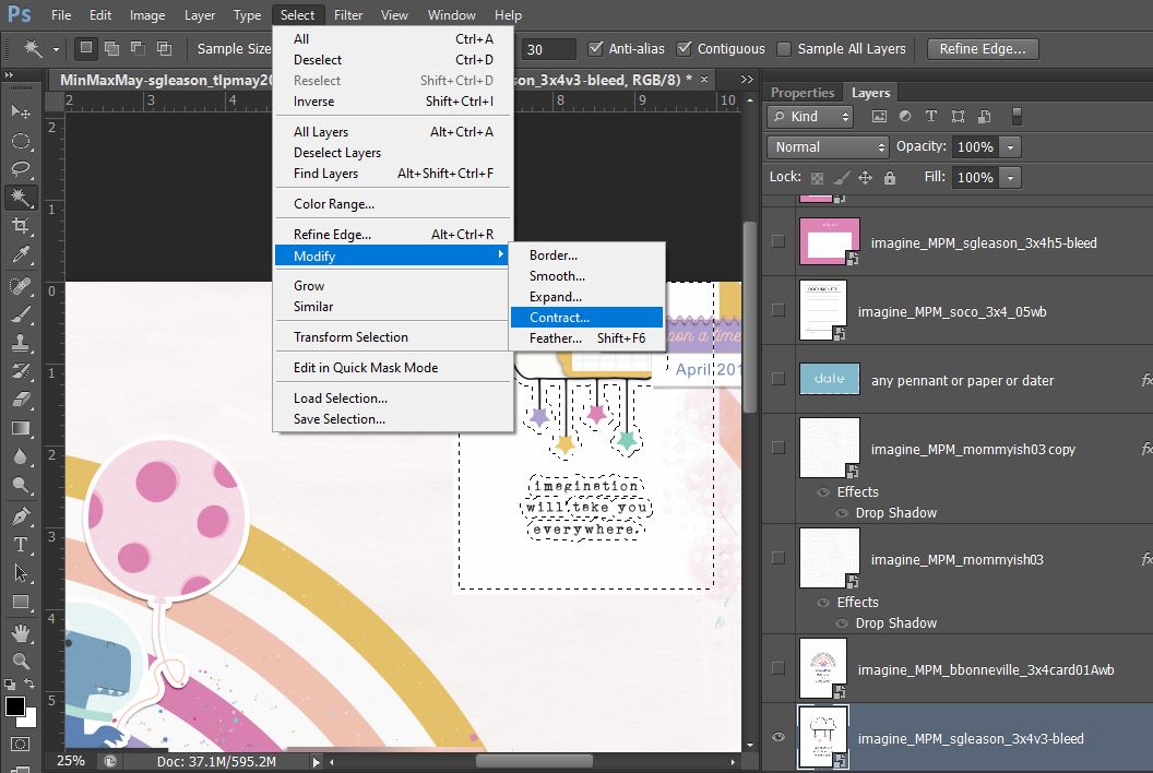
And so now I use the Magic Wand to select the white part of the journal card that I want to cut away, I just click on the white part outside the cloud with Contiguous clicked (you might have to mess around the the tolerance number -mine was set to 30 and was fine), then I make sure to contract the selection so I have basically a sticker or die-cut border/stroke around the cut.
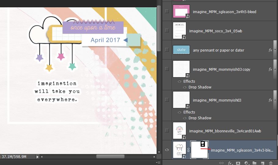
 … that gives me this (with the white rectangle around the edge of the card that I just paint over by clicking where I underlined in red to activate the Layer Mask and then just paint over the rectangle on the layout itself to mask it out before adding a shadow to round out the sticker effect).
And here’s the whole Maximal page finished up
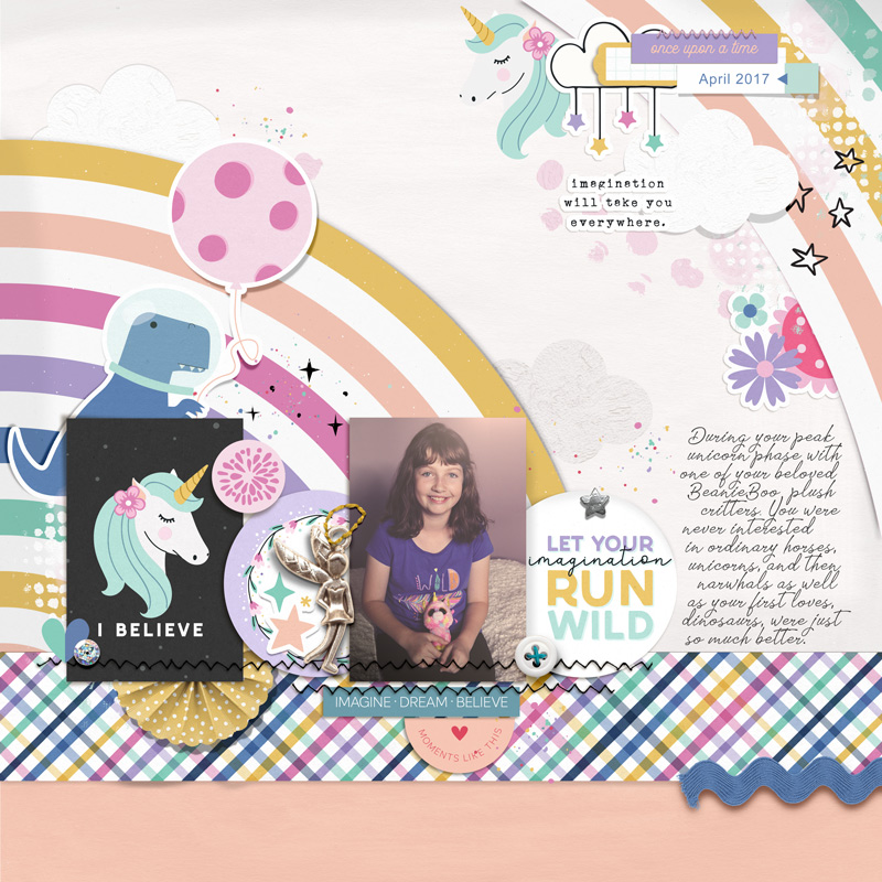 I brought back the unicorn sticker and added it up in the date label area and basically expanded the cluster in keeping with maximal style. The bolder patterns fit with maximal styling as well. I added a few more pieces of mixed media. some of the gesso clouds I used as ‘cut outs’ with shadowing and some I blended to add texture right on the background. More dimension came from the yo-yo folded mustard polka circle and blue rick rack. The blue of the rickrack and T-rex and solid-ish purple word strip in the date cluster give a visual triangle that centres on the photo, plus the checked paper strip gives the whole page a ‘shelf’ to sit on and anchors it all visually. I also brought in the black doodled stars to balance the black unicorn journal card.
So comparing the two pages below, I have at least doubled the amount of imaginative creatures on the maximal page and kept the theme going with additional themed wordart, the dreamy clouds, rainbow and stars to amplify it.

So my take-aways from this process post are:
- You can scrap an effective themed page in either minimal or maximal style.
- Journal cards are a great alternative to papers on small template areas, especially where you want a smaller scale pattern or a ‘value added’ look without the work
- ‘Fussy cutting’ with the Quick Selection or Magic Wand tools can be easier and quicker than real scissors! It’s a great way to make papers and journal card images work for your pages
See you next time.