Minimal & Maximal Monday: Same photos, 2 different layouts with Template Tips
Hello! Following on from discussing design styles for Beginners in my last post, I gave myself an informal challenge to produce 2 different style layouts using the same photos and same products, and seeing it’s Monday and I like alliteration, well, here we are.
Starting with a template my mindset was to make a minimal style page and then switch things up to make it more maximal, and because I mentioned that Artsy and Mixed media can work with either of those styles in that previous post, I purposely picked a kit with some artsy pieces and papers in it and a template that is simple enough that I could art-ify.
Scrappers often gravitate to one particular style but there ‘s also a lot of scrappers that jump between styles as they feel and I’m one of those people. Maybe it’s the kit, maybe it’s the photos, maybe it’s a challenge but something will pull me in one style direction and I just go with it. I’m not usually a minimal scrapper but I can be and I see the aesthetic benefits of it but I also find joy in throwing all the elements and now mixed media elements on the page but then also end up removing some before I feel like I’m done, and I know other scrappers will relate to that. I’ve been talking to the Pollys about templates this week and I’m going to throw in some tips and bits we discussed as we go.
Anyway, as we are in the middle of Love Our Designers and celebrating Joyce Paul today, I’ve grabbed one of her kits from my wishlist to use as well as a template by FiddleDeeDee Designs. If you are a beginner and even if you aren’t, some people struggle with thinking using a template is cheating. Before I start scrapping, let me emphatically tell you it isn’t cheating and you shouldn’t feel bad if someone compliments your page that began with a template. What you do with a template and where you take it is entirely up to you and so the finished product and praise are yours as well. Sometime we follow the template closely, sometimes we honour the template but make our own tweaks to it and other times the finished page is wildly different from the original template design, and you have permission to give yourself grace to do all of those things to create a page that makes you happy.
Ok, here’s my products and let’s go:


Here’s my start point dragging photos into the DecemBRR template. This is how I add photos to a template (or papers for that matter) when a photo spot or paper spot is on an angle, I usually drag them in behind and try to line up an edge or corner and this way I can also see what I would be cropping and lose before I clip the image to the photo spot. I also don’t love having a pattern that looks askew so I try to rotate the paper to the same degree as it’s clipping mask.
Looking at the top bar, I also usually lock the aspect ratio (keep the width and height the same size so the photo keeps the right proportions and isn’t distorted – 9.69% and 9.68% won’t make much difference to the overall look of the photo but the further the numbers are apart, the more stretched the image is so clicking the chain link icon between the W & H numbers is a good habit to get into, or in some programs holding Shift down while dragging the corners will do the same thing.

Ok throwing in a few key elements. I’m sure from the photos you can see these aren’t snowy photos, but templates are guides and those snowflakes in the template can be anything you want. Stars, flowers, whatever, endless possibilities and this is where you take ownership of the template and direction of the page. You can also place a photo in a journal card spot if your template has one, or add an extra photo, or use a journal card where it says photo. Don’t be afraid to make it yours.

So now I start auditioning papers keeping with the Minimal thinking… I love this paper but it’s too busy

better because of the tone on tone and smaller print but hmmm…

ok now we’re talking – for me, minimal design means the photos will be in a more staring role, the few select elements are best supporting actors and the background paper or scenery should not distract from them; it also means not filling the page and having plenty of negative space that acts like the spaces in between framed works hung in an art gallery.

Now with very few extras and a few paper switches (because I did love that tone on tone blue print and it is used very sparingly clipped to the circles and is not distracting compared to using it as the whole background), I have a finished minimal page.

So it got a sprinkle of paint & stamped leaves for a minimal artsy touch and I removed some of the larger snowflakes and kept extra elements like the silver star and geotag small. I ended up taking the title banner tag off but to keep the yellow visual triangle I had made, I placed the wordart closer to the yellow centred floral branch. I feel like I’ve honoured the template but tweaked it some, moving the title and clustering it off to the bottom right rather than further down and centred and taking out the middle snowflake pieces has changed the flow but the bones of the template with the photo spots clustered with snowflakes/flowers and circle paper pieces are still there.
This feels quite serene but I know there’s a heap of stuff in Joyce’s kit I have yet to try and use so back to paper switching. Now I’m not so concerned with negative space, bringing back the tone on tone blue first seems like a good idea but now I’m not feeling it (and I tell myself that that is ok!) even though a busy pattern is a good means of filling a page Maximal style. 
The Messy papers that coordinate with the Outdoors kit looked fun so I tried a few of them next.

The mood of the minimal page I made was quite serene, like a ride in the park can be, but it can also be quite fast and energetic so that works with the energy this paper brings to the page but I think the pinky red is throwing it off for me.

Ok I think I’m going with this one and bringing back that yellow floral in a supporting role

And on to throwing more of everything on the page – more wordart, more flowers, more mixed media (paint and scribble doodless and stamped images) – more is more with Maximal style. To make the title and wordart more visually heavy, I brought back the banner pieces I discarded from the Minimal page and added a tag. The big aqua flower next to it is also another relatively large snowflake alternative piece. To get more contrast and depth in the tones and more of the middle pattern to be highlighted, I used a paint mask, the one shown as an active layer in the Layers Palette, from the Outdoors kit with a blend mode going with Artsy maximal style.

I feel like I should have pointed out by now, if you don’t already know, that FiddleDeeDee Designs releases each template pack in two styles – a Dressed Down and Dressed Up version and they are geared towards both extremes of scrapping styles, but any template by any designer can be dressed down or dressed up with your product choices and creativity, and this is partly why you should not feel like using templates is cheating. The template I used is from the Dressed Down pack but here it is with it’s Dressed Up counterpart, and if you prefer more minimal pages sometimes like me, you can always use the Dressed Up template but turn off layers to suit you.

Cheryl of FiddleDeeDee Designs also has some good videos on her YouTube channel for newbies starting out with templates as well as for getting the most out of templates. Polly Angela has shared this tutorial and this one for Affinity template users too.
And now here’s my finished dressed down template, all dressed up and maxed out – ta da!
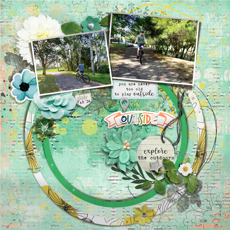
So if you’ve seen my process blog posts before you’re not surprised by my one tiny paper change at the last minute (okay, it’s a pretty obviously large paper change but it’s just one paper switched for another from the Messy paper pack, it just covers a lot of area so it looks like I changed a lot but only switched one layer in the Layers Palette) and I have my finished maximal page.
Here they are together.

Well, informal challenge done but I’m not sure which I prefer because the mood is so different in each version. Which do you prefer and does that align with your normal design style preference. Or like me, are you sometimes a minimalist and sometimes a maximalist? Let me know in the comments but first…
Just to recap, these are a few things to know about using templates that might make life easier from the Pollys.
- Using a template is not cheating, see throughout post for reasons why!
- Aligning your paper or photo with the aspect ratio locked (keep width and height percentage the same as you resize) and on a layer below (behind) the paper or photo spot can avoid stretched or skewed images or patterns
- You can delete, modify, move or substitute any layer in a template and use it as a guide or jumping off point to make your page your own. That goes for shadows as well, you can use the provided shadows or shadow as you want.
- You can also shrink the whole more maximal template (shrink every layer except the background) to get a more minimal overall design and vice versa to enlarge; or if your photos don’t work with the photo spot orientation, try rotating the template (or flipping it to create a slightly different design)
- And if you see parts of different templates you think would work combined, don’t be afraid to combine templates (you can often grab individual parts of templates from the PNG folder that is available with the template download to make combining easier)
- If you have a journal heavy page, switch out the fonts that come with a template to suit yourself or see if you can install a font that the template designer has used to save error messages or issues if you are modifying the template.
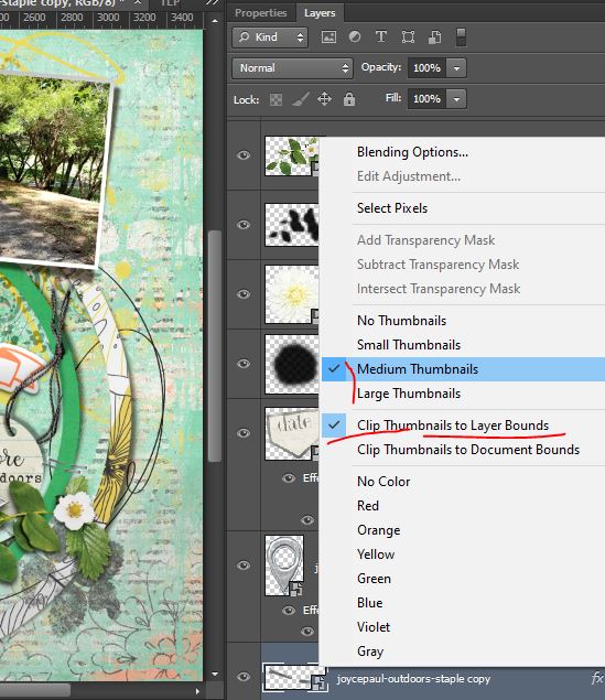
- And personally, having thumbnails I can actually see is important to me scrapping with templates (sometimes the artsy splatter layers look empty in the Layers Palette thumbnail icons) so right clicking the thumbnail image in the Layers Palette and then setting the size to at least medium and changing the layer bounds makes Photoshop life easier for me
And finally the number one piece of advice the Pollys suggested to anyone using templates is to get in to the habit of always saving and renaming the template as a new document first (or keeping the original zip file it came in) to avoid overwriting the TIFF or PSD template file, so you can use the template again and again. And then don’t forget to save regularly as you scrap your page in case your program doesn’t auto-save your progress – I’ve been guilty of and paid the price for forgetting both of these and they are lessons both learnt the hard way by digiscrappers everywhere!
See you next time!