Gradient Overlays in Photoshop
I hope everyone is safe, healthy and getting ready for the fabulous iNSD festivities coming up this weekend! I’m dropping in with a quick tip for adding a pop of color to a sketch in Photoshop – using a Gradient Overlay Style.
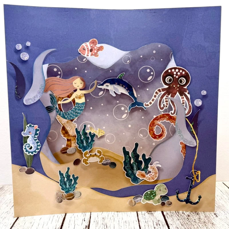
You can see the effect in action on this layout (created with goodies in today’s SOSN sale):

I added some subtle variegated color to the sketch to blend it with the background elements and colors. This technique is super easy in Photoshop with the Gradient Overlay layer style.
Here is how I added the effect to my page:
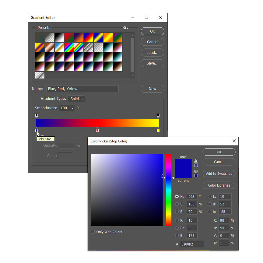
Step 1. Activate the sketch layer and select Gradient Overlay from the layer styles menu (fx button at the bottom of the layers palette).

Step 2. When the Gradient Editor Box pops up, click on the Gradient box to bring up the Gradient Editor. Once the editor is open, select the gradient you want to use. You don’t need to choose by color, because we will be adjusting the colors to match the layout. Look for the number of colors you would like to use. I wanted three colors, spaced evenly so I chose the Blue, Red, Yellow gradient.

Step 3. Once you choose your gradient, you can adjust the colors by clicking on the small boxes (called “color stops”) below the gradient at the bottom of the gradient editor menu. When you click on one of the color stops, the Color Picker menu will pop up and you can choose a color from the menu, or use the eyedropper tool to select a color from your layout. I chose the second option.
This is what the Gradient bar looked like after I selected colors from my layout:

Click OK in the top right corner and the Color Picker box will close.
Step 4. The last thing you need to do is select the style of gradient and its scale. I used a linear gradient on my page with a scale of 71%. I also lowered the opacity of the gradient to 41% to give it a more subtle effect. My blend mode is set to Normal, but you can definitely play with this setting if you want a different effect.

QUICK TIP: Make sure you have the Preview box checked (right side of Overlay box) so that you can see how the appearance changes if you want to play with any of the settings (Style, Blend Mode, Scale, etc.).
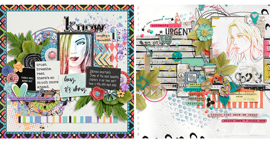
I used subtle colors in my gradient overlay because that is the look I wanted on my page, but you could certainly use brighter colors if that fits with your page. Here are a couple of examples with brighter gradient overlay colors:
I hope you have fun playing with gradient overlays! As always, be sure to share your pages with us in the Lilypad Gallery. 🙂
Until next time ~
Judie (HeyJude)