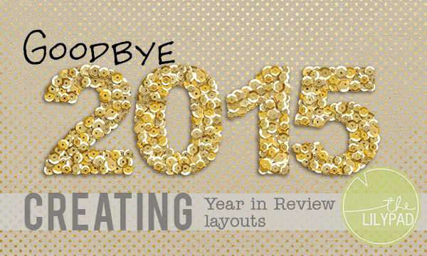
Creating Year in Review Layouts
I can hardly believe that it’s already 2016! I feel like 2015 just started! When I look back though, I see all of the great things we did, and the fun memories we have, and I can’t help but smile. Doing layouts about each of these moments is great, but I really like the idea of doing a “Year in Review” layout. I would love to have all of the best photos and best memories from 2015 on one page. I started to look into the store, and I found a bunch of great templates for creating a Year in Review layout.
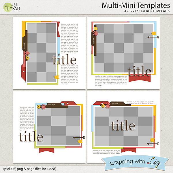
These ones by new designer scrapping with Liz are perfect for creating that photo grid and then doing a little journaling about the photos. That template in the bottom left has 12 spaces in it! Perfect for a photo a month!
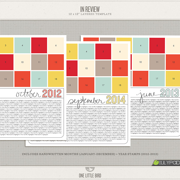
These templates by One Little Bird are a bit older, but I have always loved them. These are great if you really want to include a lot of journaling. Bonus: the years go up to 2015!
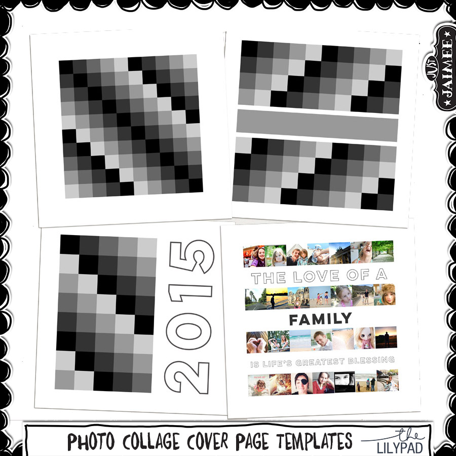
These templates by Just Jaimee are perfect for photo lovers! While there is no specific space for lengthy journaling, each template combines enough photos to make a strong, bold statement.
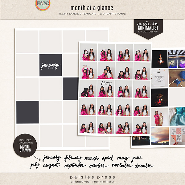
These templates by Paislee Press are not specifically for a Year In Review layout, but I could see using the templates for a YIR layout, and using the month stamps to delineate which photos are from which months.
After I had explored the template possibilities, I wanted to see if there were some examples of YIR layouts in the gallery. Oh boy, was there! As always, I was floored at the talent that is represented in the TLP Gallery, so I decided to pick some of my favorite YIR layouts to share.
This layout by Natascha jumped out at me right away for it’s use of color. After I started to really enjoy the color, I notice the quip at the bottom about it not being “all sunshine and rainbows” which made me laugh. I love how she has labeled the pictures with the months.
This layout by Tiff was one created for my MOC List Challenge. I loved how it was a recap of 2015, but it didn’t use any photos. I also loved how she used the pockets on the page. It was very eye catching in the gallery.
This layout by mswhittaker23 uses a YIR template by Just Jaimee and Mommyish from 2014. I really love the heart collage of the photos, and the fact that she included both the good and the bad in her photos.
This layout by jenn mccabe jumped out at me because of the black and white color scheme, and how expertly she used the pops of red. This is another example of creating a YIR layout that works without a lot of photos. Sometimes it’s easy to get bogged down by including enough photos on a YIR layout, so I like how this one uses one photo and still gets the memories on the page.
So I don’t know about you, but I am super inspired to create a 2015 Year in Review layout. If you go ahead and do one, post it on social media using the tag #TLP2015YIR. I would love to see what everyone comes up with!