Color Toning Photos
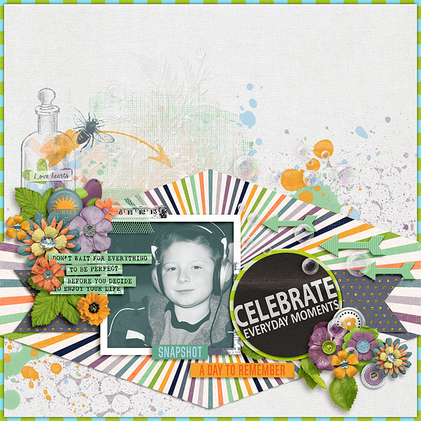
Have you ever had a photo that you really loved, but the colors clashed with the rest of the page? One tried and true trick in this situation is to convert the photo from color to black and white. You can take this technique one step further and really coordinate your photo with the rest of the page by adding a color tone layer. I used this technique with the photo on this page:
Want to know how I did it? It only involves a couple of steps and can be accomplished in most digital scrapping programs.
Step 1: Convert Photo to Black & White
There are any number of methods for converting photos to black & white. An easy way to do it in a digital scrapping program is to add a Hue/Saturation adjustment layer (clipped to the photo) and move the saturation slider all the way to the left to take the color out of the photo. If you have a favorite black & white action, that will do the trick too. I use RadLab to convert my photos to black & white (milk & cookies BW is my favorite). It really doesn’t matter which method you use, just make sure that there is some contrast and bright areas in the photo. If it is too dark overall, the color toning layer will be difficult to see.
Step 2: Add Color Toning Layer
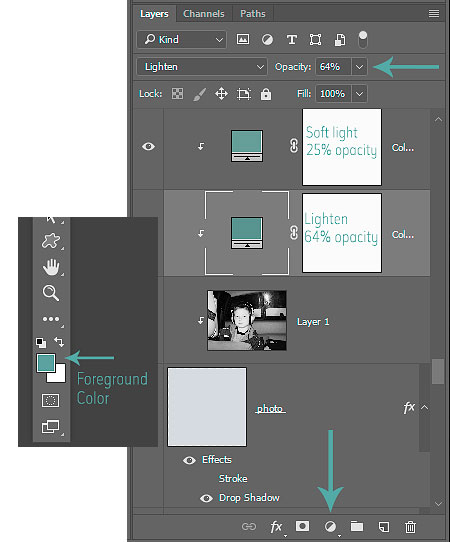
Once the photo is converted to black & white, add a solid color fill layer just above the photo. Before adding the fill layer, set your foreground color to toning color you want to use by clicking on the foreground color icon in the toolbar and then using the eyedropper tool to click on your color of choice in the layout. Once you have the foreground color set, click on the Create New Fill Layer icon at the bottom of the layers palette (it looks like a circle that is half white and half black) and choose the Solid Color option. The layer will fill with the foreground color that you just selected. (If you do not have a Solid Color Fill Layer option in your program, just add a new blank layer above the photo and fill it with your color of choice from the layout.) Clip the color fill layer to the photo (Ctrl+Alt+G). The photo will not be visible at this point. However, you make the color fill blend in with the photo by changing the blending mode to “lighten” or “screen.” As always, feel free to try out the other blending modes to see what effect they have on the photo. You will want to reduce the opacity of the solid color till layer until you are happy with the photo effect. (The opacity slider is located at the top of the layers palette). You can also add a second color fill layer above the first one and set the blending mode to “soft light” or “overlay” to add a little extra pump of color to the photo.
You can easily change the color of the fill layer by clicking on the color fill icon on the layers palette and using the eye dropper tool to choose different colors from the layout until you find the one that you like best. I added two solid color fill layers on my photo. The first one is set to Lighten at 64% opacity, and the second one is set to “soft light” at 25% opacity. Here is a look at my layers palette and the foreground color icon in the toolbox:
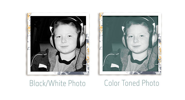
And here is a look at the before and after photos:
I love how quick and easy this technique is and what a great impact it has on the page as a whole! I hope it comes in handy the next time you have a clashing photo. 🙂
Until next time ~
Judie