Page Fixes: Let’s talk about Color Temperature (& Photo Filters)
I don’t think it matters how long you’ve scrapped or who you are, there are times when you just aren’t loving the page as it’s coming together in front of you. It happens to everyone, right?! As a mix and match scrapper, sometimes clashing colours feel like the problem. But is it always the colours or is it actually the colour temperature? Instead of turning everything black and white, let’s look at some other filters.
______________________________
Colour Theory Background:
As far as what we begin learning about as children goes, most people have a superficial understanding that red, orange and yellow and derivatives of these tend to be warm, whereas blue, green and purple as a general rule, tend to be cool colours. It’s probably not a coincidence that hot water taps are often labelled in red and the cold tap in blue!
A step beyond this level of understanding though, I think most artists (and that includes scrapbookers to me) also understand that there are warm and cool tones to each colour individually as well and that ‘colour temperature’, as it is known, is more relative and slightly more complicated. So even within the ‘cool blue’ colour family there are ‘warm blues’. An artist could definitely look at two different blue paints next to each other and see a difference in terms of colour temperature, or at the least, in choosing one to use, we would feel one is more suited to our project over the other, even if we weren’t sure exactly why. A painter might use the cooler blue for a crisp early spring sky but it wouldn’t look quite right for a tropical island sunrise, where a more warm shade of a similar blue might be better suited. How a particular colour works with other colours and how it makes us feel is part of the importance of understanding colour temperature and how to work with and manipulate it.
So that brings me to this question: Should you mix warm and cool tones?
Using warm and cool types of colours together has not always been recommended in terms of ‘fail safe fashion’ advice (for example. I’ve heard you should avoid pairing a warm toned shirt with a cool toned skirt and some would say ‘who cares?’ but others would follow that advice). I’ve learnt that mixing them can be tricky but there are tips to make it easier if you are not naturally designer minded.
From interior designers, I’ve seen it suggested that you should choose whether you want the overwhelming feeling of a room to be warmer or cooler, and that the dominant colour temperature should be used over 80% of the space, (that may include floors and walls and large furniture items) with the additional 20% coming from cushions and smaller decorator items in the opposite colour temperature. The natural lighting within the space also plays a key role and this is why actually sampling paint colours on the walls you intend to paint is always recommended because warm light will make any paint colour look warmer, which sounds obvious but is worth remembering while decorating to avoid do-overs that add up financially when you choose an already warm paint that becomes too warm in a room with lots of warm light.
Additionally it is good to know that apparently cooler colours tend to recede into the background in any space and can make an area feel larger, whereas warmer colours will make themselves more prominent and can create a cozier space.
The same principles apply in scrapbooking. For digital and hybrid scrappers, it’s helpful to have an idea of whether your monitor makes colours look warmer or cooler, especially if you intend to print pages. You might notice a difference in your gallery images if you look at them on different devices (eg. phone vs. laptop vs. tablet) but beyond that, think of your layout in terms of:
- whether you want the overwhelming feeling to be warm or cool
- (if you are scrapping seasonal photos this might be more important to convey the temperature in your photos or story),
- and what do you want to be prominent and what is more supporting and would serve the layout more by receding.
- (does your photo contain mostly warm or cool colours and what about the products/kit you are using?)
Photo filters and colour temperature – the how and why:
Above we talked about how light can influence how paint colour is perceived. If you have bought a light bulb recently the staggering range from very blue to very yellow lighting options shows how light can be both cool and warm as well. The lighting when a photo is taken and the settings of the camera absolutely alter colour perception as well. Sometimes we may prefer to capture ‘true to life’ colours and other times we may want more creative or unusual looks, but either way photo filters can be fun and useful to alter the colour temperature of a photo or to give a distinct feel (think Instagram a few years back and the obsessive use of 1970’s Polaroid-era teal and yellow colouring effects!).
The warming and cooling photo filters on your phone or in your photo-editing and scrapbooking program, like Photoshop, are designed to improve the white balance in photos and ‘fix’ colour temperature but they can also be used on papers and elements as well to tweak them to suit your projects in terms of warmth. If you have ever seen a photo of a snowy setting where the snow looks blue or a photo of a bride’s dress that was captured in strong shade and has a blue-ish tint, you understand why these filters were traditionally used. The warming filters are designed to try to bring back the ‘white’ snow or dress. There are several other options in the Photo Filter fly-out menu you’ll see in a second that are all aimed at removing specific ‘colour casts’, where an unwanted colour has tinted and tainted an image. This can happen in portraits using flash photography, for example, when the light is bounced off a strongly coloured surface, maybe a painted wall or a person’s shirt, and the result makes their skin look unnatural. A green shirt for instance might give a Wicked Witch of the West aesthetic to your daughter and that’s not necessarily a good look unless it’s Halloween but photo filters can help with that!
The Scrap Plan & Process:
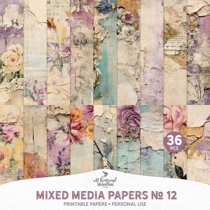
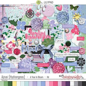
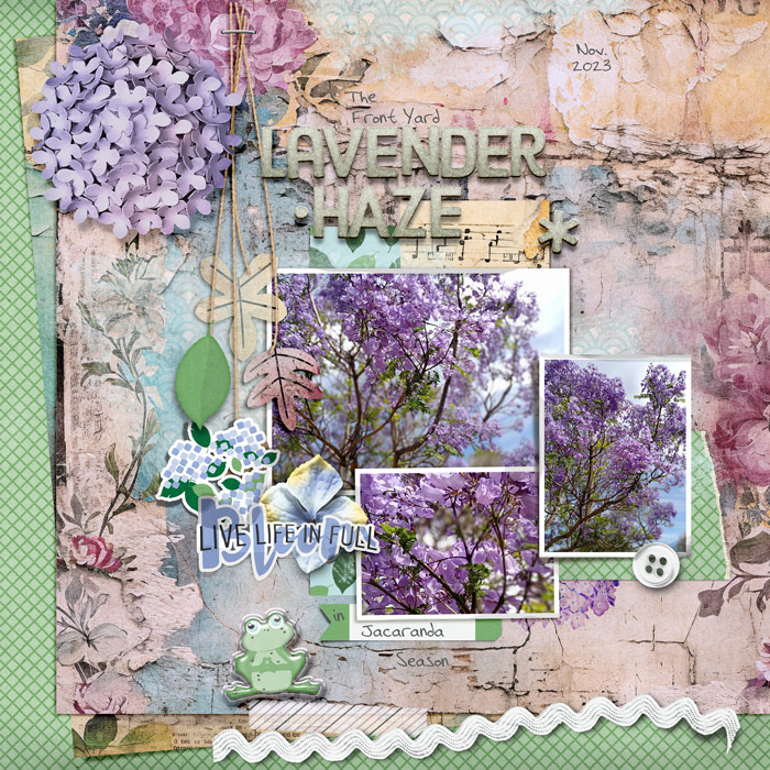
Today to keep my cold-ish Spring photos in true-to-life colour but allow them to be more prominent, I’m going to ‘cool down’ a warmer mixed media paper I had to use from A Whimsical Adventure (Mixed Media Papers No.12 ) that suits both my theme and general colour palette. I’m also planning to fill the page with cooler tones predominantly, maybe not 80% or some quantifiable amount but to try to convey the same chilly Spring day feel and I found a kit that although not about Jacaranda trees seems like it should work called Ajisai/ Hydrangeas by ninigoesdigi.
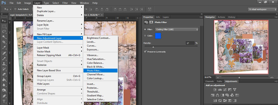
Here’s the dropdown menu of PhotoFilters within CS6 and Adobe describes the differences in the different warming and cooling filters as “Warming Filter (85 and LBA) and Cooling Filter (80 and LBB) are useful for tuning the white balance based on color temperature, whereas Warming Filter (81) and Cooling Filter (82) are best for minor color adjustments. I’m using the LBB option on the background paper shown. (The Red, Orange, etc are the ones I mentioned earlier about helping with Wicked Witch portraits and specific colour cast issues)

So now comparing the top right hand corner of that background paper as well as the thumbnails in the Navigator Palette, the cooling effect of the LBB slider is hopefully obvious. (This is the other method of finding and opening the Photo Filters sliders if your Adjustments Palette is hidden). Using the PhotoFilters is as easy as using the Hue/Sat sliders without having such drastic effects on a muti-coloured paper. You can see this has changed the predominantly aged creams and tans in the background paper closer to white. The blue in the mixed media paint work has also come closer to the sky glimped in the background of my photos.
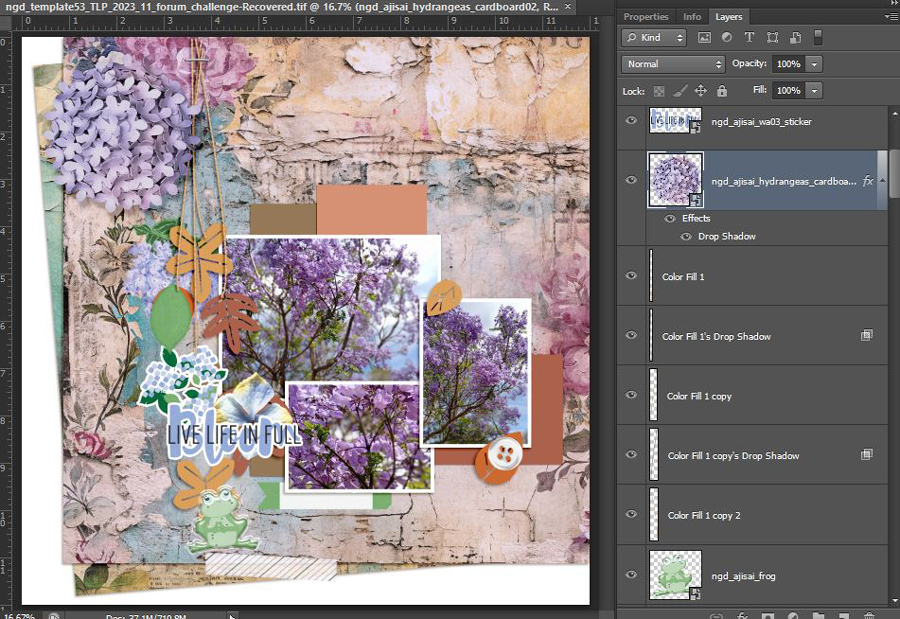
 Now I’m going to add start adding some product and add some more ‘coolness’. The bottom photo is warmer compared to the other two but is also the smallest so has less visual weight. I’m keeping in mind that the brown and terracotta paper placeholders in the template are also contributing warmth to this progress shot as well. I’m using the TLP Nov Template Challenge template by ninigoesdigi available as a freebie in the forum this month as well.
And after some more product and shadow tweaking, here’s the final page, and below that the original paper side by side with my Cooling Filter version. To finish I grabbed Allison Pennington’s Status Glitterbet alphas from my stash for a title – I’ve used these a few times at least before and there’s several colour options in that pack (as well as different styled letters for ‘A’ and ‘R’ as well which I think is extra cool). The torn edge on the green diamond paper piece is from Lynn Grieveson’s previously available MOC Torn Edge template but there are several similar ones available in the store.
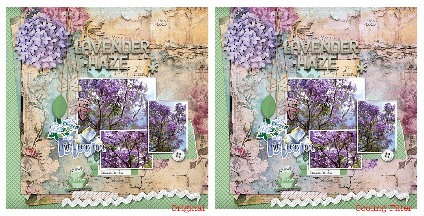
Do you think that one cooling filter layer on the main mixed media paper made a difference? Does the background recede more to make my photos more prominent? Does it overall feel chillier or fresher like Spring?
I feel like the right side page is the one I prefer out of these two. It still has ‘pockets’ of warmth from the music note paper and middle paper layer poking out around the left and bottom of the page and the soft yellow edges to the petal flower behind the sticker wordart. I think the Original page is around the 40% warm colouring mark because of the way the mixed media paper borders most of the page and the burgundy flowers as well as the creamy tones are still there but more subtle. The filtered page brings both the amount and degree of warmth down in the right side page to me and feels more like I remember the weather being on that day the other week. I won’t remember that detail in several years but maybe this filtered page will give me that feeling anyway.
So to sum up this time, if you are not loving a layout you are scrapping, before you bin it, step back for a minute and think about the colour temperature:
- are cool or warm colours dominating the page, and are they right for the mood you want to create:
- does it work with or against your photos?
- is there colour cast or any part you could correct or improve with a quick photo filter layer?


