Scrapping Secrets: Pattern Mixing
Hey! Let’s talk about Patterned Paper Mixing and Matching!
Ok, what was your immediate reaction to reading that just now?
Did you groan and think ‘oh no’? Or were you super excited, or maybe just mildly interested in this topic?
There seems to be a few particular immediate reactions that go with a scrapper’s preferred style.
- Some scrappers are all about embracing all the patterns and are enthusiastic to use as many as possible on the one page, we’ll call them Pattern Mixing Lovers;
- Others prefer for one pattern to be the hero without any other patterned papers on the page, we’ll call them Pattern Minimalists;
- And others steer further away from patterns and prefer to stick to solids only, or more subtle tone on tone patterns or minimal designs that might read as a textured solid, maybe with creases or woodgrain. We’ll call this group Pattern Deniers ** (please note that these are labels I’m just making up as I go along and are meant to be descriptive but also a bit humourous and in no way are meant to offend, just describe the spectrum of scrapping styles with respect to patterned paper usage).
Personally, I can relate to all 3 responses, and it often depends on my photos or the template I’m using. If my photo is really busy, maybe someone’s wearing a paisley or floral shirt, maybe there’s just a lot of detail (think visual clutter!), then I lean more towards Pattern Minimalism or full-on Pattern Denial so the eye can rest somewhere else on the page. Same goes for busy templates. Maybe there are a ton of shapes or photo spots that means some patterns, larger ones especially, can’t really be seen or appreciated well.
But most of the time when I open a paper pack, I feel spoilt for choice and want to use every paper and am mostly a Pattern Mixing Lover, and y’know what? The designer has usually done the hard work of putting in a combination of patterns that work together in several ways and so I’m here today with some tips and tricks from myself and other team members about using multiple patterned papers on a single layout and making them work harmoniously. We don’t have to worry about wasting paper in digital scrapbooking, every paper can be duplicated so why not use as much as you want?
Here are some tips on easy pattern combining tricks:
Trick 1: Team a large scale pattern with a smaller one. Usually a larger scale print will command more attention but this can depend on the colour scheme. You can also make a larger pattern smaller and less dominant, by scaling it down (using the Edit >Transform > Scale menu in Photoshop or similar) or just using a small section, by effectively cutting the pattern up.
Trick 2: Stripes, polka dots, woodgrain, text papers and checks/tartan/plaid can really go with everything! These are classics for a reason, we decorate with them and wear them and have done for decades. If in doubt or more a Pattern Denier, use and experiment with these kind of patterns and trust in their historical value!
Trick 3: For a busy pattern, soften it with paint or layering it under other papers. Splatter paint on it or use a more densely brushes area to reduce the shock value or calm an intense patterned paper. Or use the bolder pattern in a paper stack and use it effectively as a photo matt or page border.
Trick 4: Text papers are a great alternative to journalling or using a lot of wordart. Try clipping them to a tag or when you are struggling with a title.
Pattern Mixing in Practice:
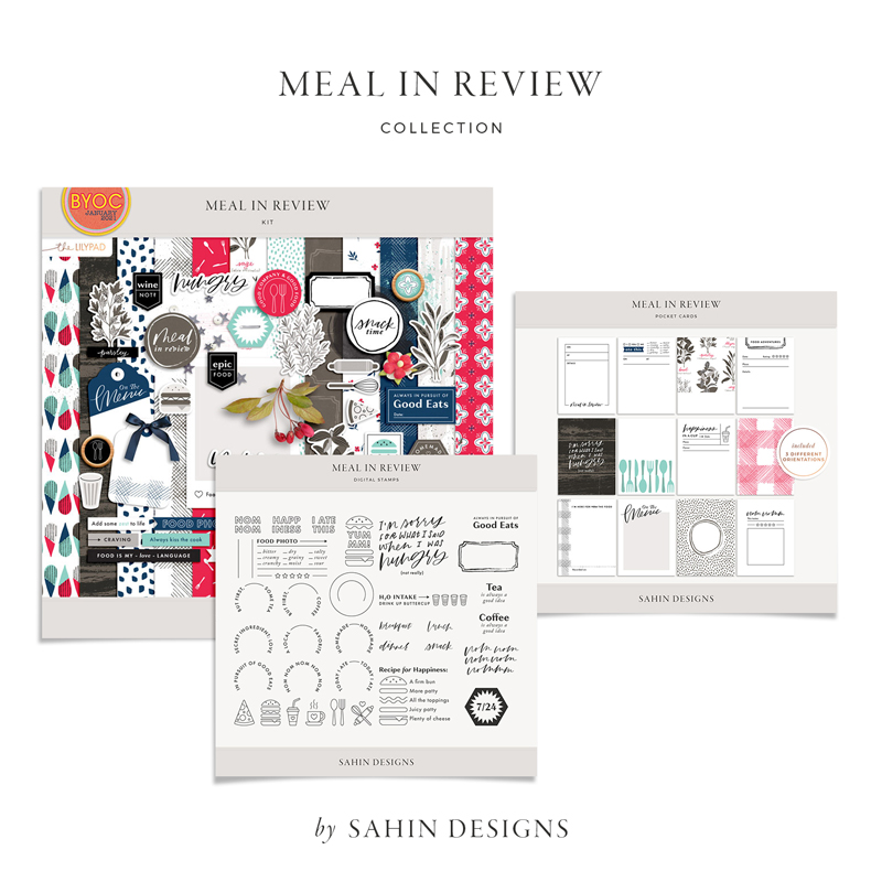
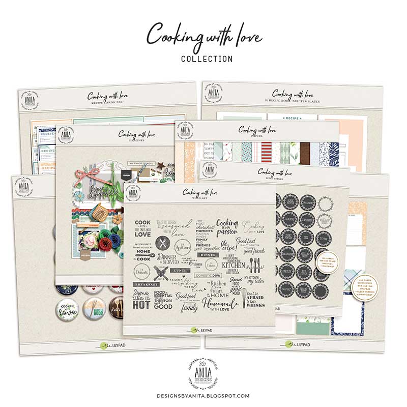
So now let’s look at an example of pattern mixing decisions and let me share my thought process behind those decisions. Here’s a work in progress of mine, scrapping a page with Fiddle Dee Dee’s May Template Designer Challenge and you know I love a mash-up so I’m mashing two foodie/cooking themed collections – Sahin Designs’ Meal in Review and Anita Designs’ Cooking with Love.
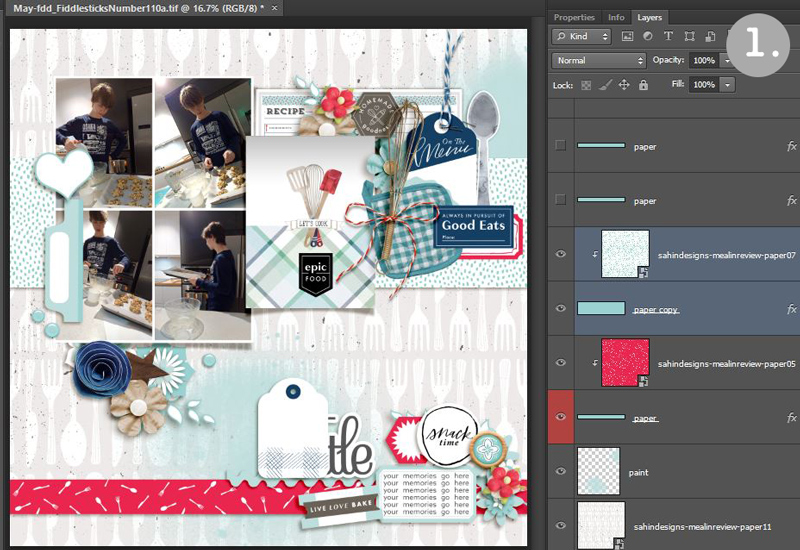
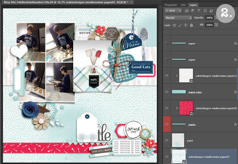
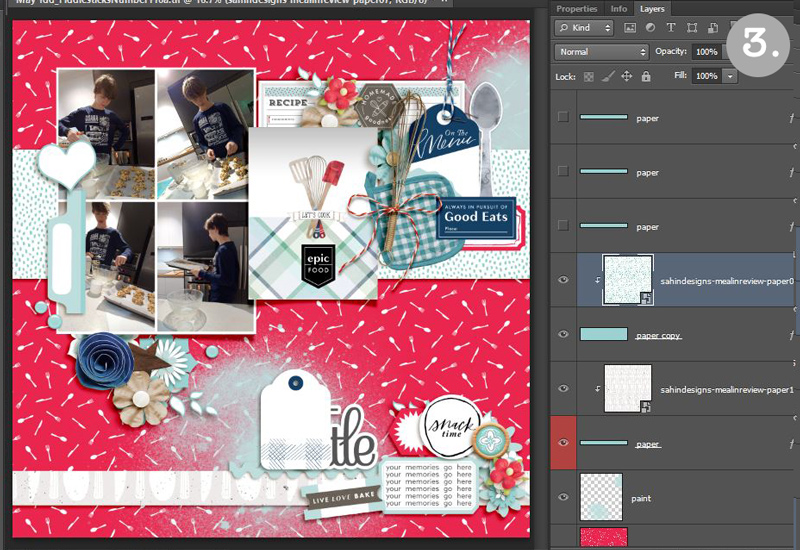
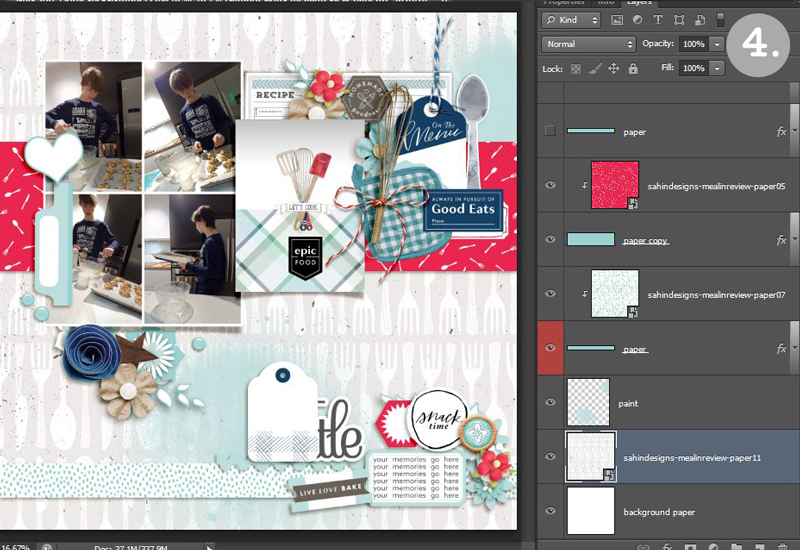
I’ve pulled 3 different scaled papers from Meal in Review paper pack to use in different parts of the template that I’m going to shuffle around and consider as part of my decision making (and for some reason, paper choices are always harder for me than elements but this is how I work through that). The grey cutlery paper is a large scale print, the blue dot is the smallest scale and the red cutlery paper is in the middle but closer to the small scale end. Something else about all 3 papers is that they are all different colours even though they are all from Meal in Review papers. The intense colour of the red cutlery paper gives it visual weight and presence though the pattern is still relatively small, and with the background of the grey cutlery paper being definitely more muted and neutral, that paper has a completely different feel, despite having a relatively large pattern. Experimenting and switching out papers during a work in progress page I have a few options and this is what they look like.
[insert screen grabs]
Which one do you prefer?
If you are more of a Pattern Minimalist or Pattern Denier, all of these may give you anxiety but for me there is a clear preference. I can rule 2 options out straight away and this is my thought process (skip the next 2 paragraphs if you don’t want to read my logic but feel free to scroll down to see the final decision and finished page if you are curious or just like to know everything was resolved).
- The large scale print can’t be appreciated as cutlery when in the small strip at the bottom, as shown in number 3. It needs a bigger area so the cutlery is recognisable and so works best, I think, as the main background, as in number 1 & 4.
- The red cutlery paper is a bit intense and as the main background in number 3 it feels like it’s too much and competes with the photos and element clusters for attention, so the paper set up in number 3 is ruled out.
- The red cutlery paper at the bottom in 1 and 2 pulls attention to the journalling and title in the corner, which may be overlooked and get overwhelmed by the journal card, tag and recipe card cluster if the red paper were put along the middle position, as in number 4. So I’m ruling out number 4 as well.
- The bottom strip is large enough for the smaller red cutlery pattern to be recognisable, and the blue dot works well in a ‘supporting role’ across the wide middle strip of 1, tying in with the colours of the plaid strip on the journal card, which even though those elements come from a different collection and different designer, works cohesively with the Meal in Review papers. The pattern is also fairly generic, a twist on traditional polka dots, and calming compared to the others, so this gives enough of a white space/eye rest zone in a moderately sized area of the page….. So combined with how the neutral cutlery paper looks and feels, and given the food theme of my page and that big cutlery pattern, overall, page 1 is my clear preferred arrangement.
This is my final page using the No.1 paper arrangement. The intense red paper strip grounds the design and to avoid making the page feel top heavy, the red elements are only sprinkled through the top 3/4 of the page. Added depth and contrast come from the darker blue elements, that complement my son’s shirt and the dark woodgrain and grey and black pieces that go with the background cabinetry in the photo. These are all distributed around the page to create balance and as a guide around the page for the eye. You can also see I also used some of the Easy Pattern Combining Tricks from above.

I used Trick 1, the cutlery is my large scale pattern. It actually ties in with the journalling too because big cutlery could be considered ‘ultimate cutlery’ to him;
I used Trick 2 – the blue dot is a variation on a polka and therefore works with the other two papers, as well as the journal card containing plaid (and that cute realistic gingham check pot holder and tiny polka red rick rack element) and being of a complementary colour scheme to the other papers – these timeless patterns work well and add a few more pops of pattern and interest.
And I also used Trick 3 – there are large kraft/oatmeal cookie dough coloured paint splatter areas that soften the cutlery print, giving the eyes an obvious resting place and physically tying the two patterned sections together in places that they overlap.
I’ll be back soon with another post with examples from some of the Pollys on how they approach Pattern Mixing.


