Tips & Tricks: Another way to scrap multiple photos
Living in the age of digital photos, when every device has a camera, is both a blessing and a curse for the scrapbooker. Maybe you have family albums from bygone decades or generations on top of this but it creates the often heard scrapbooker problem of too many photos, and not enough time to scrap them all. I’m one of those and so that’s why I’m all for multi-photo pages (and template designers that help me do that!) and also why I started to embrace the ‘Then and Now’ approach to layouts. I can use various photos that have something connecting them across different days years or generations! It makes me feel like I’ve got more photos in albums and off my hard drives and is more freeing rather than feeling limited to making endless repetitive pages.
Usually for me, Then & Now pages mean I’m scrapping the same child or event years apart, but they don’t even need to have long periods in between for this to work. Any collection of photos that share a theme can work on a page. Much like in the Mash-up Monday series, when we looked at shared themes to enable mixing and matching of kits; the same principle can work with photos. Maybe your child has played the same sport for years and you have a thousand soccer photos or even if it’s different family members reading, for instance, who, where and when, it doesn’t really matter what combination of photos you have, the soccer or reading theme is the common factor to build your page around. It might take a slight change in thinking and if you have your photos stored with ‘tags’, it may make them easier to find for pages like these but that doesn’t have to stop you.
Which brings me to the page I’m scrapping today. Having seen this month’s inspiration challenge by Ashley was all about columns, it made me think pages of text and reading newspapers, as well as stacks of books on a bedside table, so today’s page started taking shape in my mind and after I saw Bella Gypsy’s Booktrovert collection was in SOSN, I pulled some photos from my (large and untagged) ‘to scrap’ folder that worked with those colours and the book theme, and they were all of my daughter from opposite ends of the year.

I love that while somethings change, somethings stay the same and photos are proof of this. Using photos that share a theme like this can make those changes and also the lack of change obvious. Looking back now, I’m reminded that she went through a stage of sleeping with her head at the foot of the bed but her head in a book was a constant around this age.
So here’s my starting point with my photos, resizing them and dropping them in a template by Designed by Soco (Starting Blocks templates vol2). 0
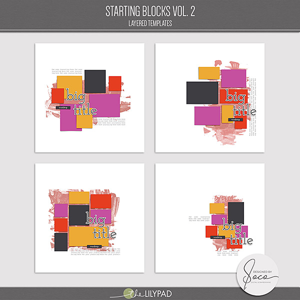
This template gave me the feel of ‘wonky’ columns that stacks of books create, I liked the sideways column of journalling and the interesting mix of blocks. I also liked the included mixed media/paint mask that enhances the handcut blocks and ‘perfectly imperfect’ look. To be able to see and judge the size I need to shrink a photo to for a template, reducing the Opacity of the photo layer will allow the photo spot to show through the more transparent photo and makes resizing quicker and easier. When the photo looks the right size, I clip it to the photo spot in the Layers Palette and restore the Opacity to 100%.

And now onto the fun part with key elements I was drawn to in the Booktrovert kit – this premade shelf and open book were no brainer decisions. I love the sense of movement the open book brings and that shelf is really pulling the weight of quite a few elements, and so if this were a Minimalist/Maximalist Monday, the page wouldn’t need a lot more to achieve my minimalist end point…

but my ‘inner minimalist’ was overwhelmed by all the colour and goodies in the Booktrovert collection so I kept adding without really thinking about it. In fact, Soco’s templates as I’ve blogged before really suit minimalist through to maximalist scrapping – they can stand alone with straight out swaps or clipping masks, or you can fill the free space with extras.

Even though the paint mask softens the fairly linear design, I decided to bring in some curved elements like the wooden bracket and title with extended doodly lines. I like when something functional like a title can also work with the aesthetic and Bella Gypsy always have stacks of wordart like that.
Time to add papers and this is when the full range of colours hit me. The purples in the kit started making my daughters purple room look more blue and grey so instead of using a solid purple background or the big rainbow striped/column paper ‘xp4’, I opted for the peachy and orange tones. The arrows seemed too busy filling the background so I split the page into about 2/3 and 1/3 and limited the arrows to the smaller column. I tried the purple, her favourite colour, as the paint mask but it was feeling really Halloween in an unfortunate way.

I then went with a much more neutral white (which is part of the arrow pattern as well as the rainbow chevron paper) to tie it together and added some texture by ‘bevel embossing ‘ the paint mask layer. To keep the edges less ‘black’ and harsh I used the arrow orange paper as my ‘Shadow Mode’ colour with the colour picker tool.

I started shadowing and also added a bit more of a pop of white using Mommyish’s Just the Basics: Layer Styles – the sticker one to give the bookshelf some more definition and echo the title wordart stroke around the text. Using the same style is a quick and easy way to make elements from different kits ‘match’ more when Mash Up scrapping using different kits.

After filling the remaining paper spots and trying to find a large-ish date spot, I ended up making a cluster in the bottom left corner with some more mixed media and another wood piece to repeat the textures and colours already in the page so it didn’t look like too out of place or like an obvious after thought. Hopefully it still feels balanced. As a finishing touch, with some extra paint splatters, I used a basic ‘soft round brush’ (8% Hardness so it didn;t have hard defined edges to the circle shape) in a yellowy tone to just stamp a glow around the lamp and illuminating the open book element at the bottom

And here’s my final page. Not a traditional interpretation of columns, but inspired by them nevertheless. I continued the column styling with the stack of books element under the lamp to add some more length to the page after removing the sideways journaling spot. Check out other column inspired pages including Polly Ashley’s here

Here are the take-aways from today’s post:
- If you have a lot of photos to deal with, think about grouping some around a theme rather than scrapping individual pages for each photo on a different occasion as a twist on the Then & Now approach to scrapping.
- Break up a busy patterned background or a ‘boring’ solid one with a ‘column’ of contrasting paper even if there isn’t one on your template you can customise it.
- Adding a bevel/emboss style to paint work can give it an instant texture boost.
- If you are trying to make elements look more cohesive, whether mash-up mixing and matching or just kit scrapping, Layer Styles like sticker styles can be helpful. Try to match up the stroke size.
See you next time