Mixed Media with Extractions using Quick Selections
Hi there! I’ve been scrapping a lot this month but it’s definitely been more on the ‘clean’ side, then today I started feeling the call of mixed media and that grungey vibe again (more on grunge from a few month’s back here). I decided to merge both the clean and the grunge styles and that has converged in this layout using this month’s August Template challenge template with Heather, kindly provided by Elif Sahin Designs. The photo spots and some photos I planned to use as well as some of layouts I’ve seen around the gallery this weekend encouraged me to do some extractions, both complete and the out of the frame kind.
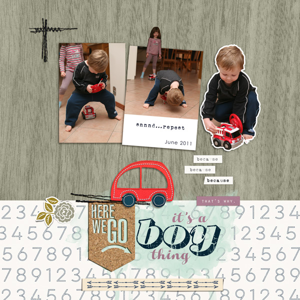
What is an Extraction? If you aren’t familiar with digital extractions, it’s simply taking a particular object from a photo and isolating it (like cutting it out) or making it stand out by removing the background. A partial extraction can mean having just a portion of the object extend beyond the edge of the photo and is generally easier to do and still quite effective. Let me show you an example from way back.
See the middle photo how my daughter is popping out the top of the middle photo, as well as the way my son has been cut out on the left (and made into a sticker with a border)? The middle photo uses the partial extraction technique whereas my son and the firetruck were fully extracted and removed from the background to create this look. It’s been ages since I’ve done this but I’ll include my process today.
- Extraction Process: Let me start by saying I have an old version of Photoshop (CS6) so I’m sure there are faster and more accurate ‘one click’ selection methods in newer programs but for now I’m using the Quick Selection Brush tool to select the parts of the photo I want to extract. It can be a bit clunky depending on the level of contrast and detail within an image but Undo is my friend so let’s look at my method.
I made a duplicate of my photo layer and then selected the Quick Selection tool from the Magic Wand menu. I made sure the ‘Add to selection’ option was on up the top (the circled brush with the + sign) but it will default to this if the initial ‘New selection ‘ brush on the left is active after a few clicks. I started by clicking and dragging a line following the edge of the portion I want to extract. The more contrast there is between that section and the background, the cleaner and easier it will be for the computer to follow where you are clicking.
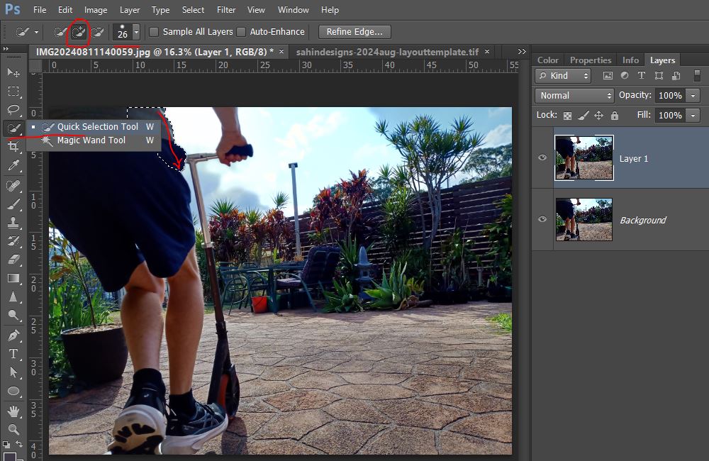
I kept following the edge and the selection automatically got bigger as the computer figured out what I was selecting. It automatically included the rest of his shirt and shorts as I dragged the mouse down which you can see from the dashed lines.
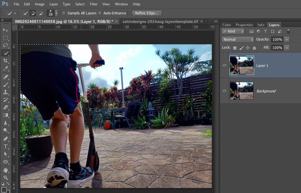
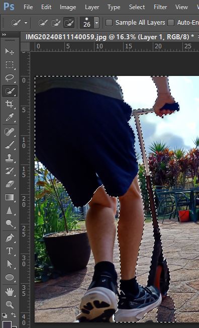
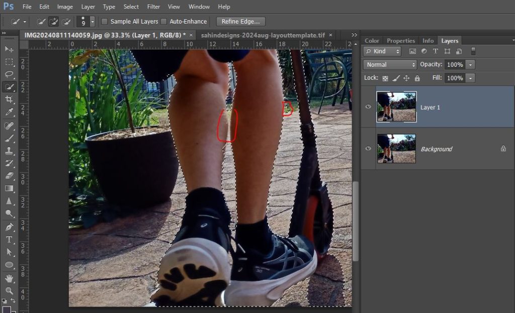
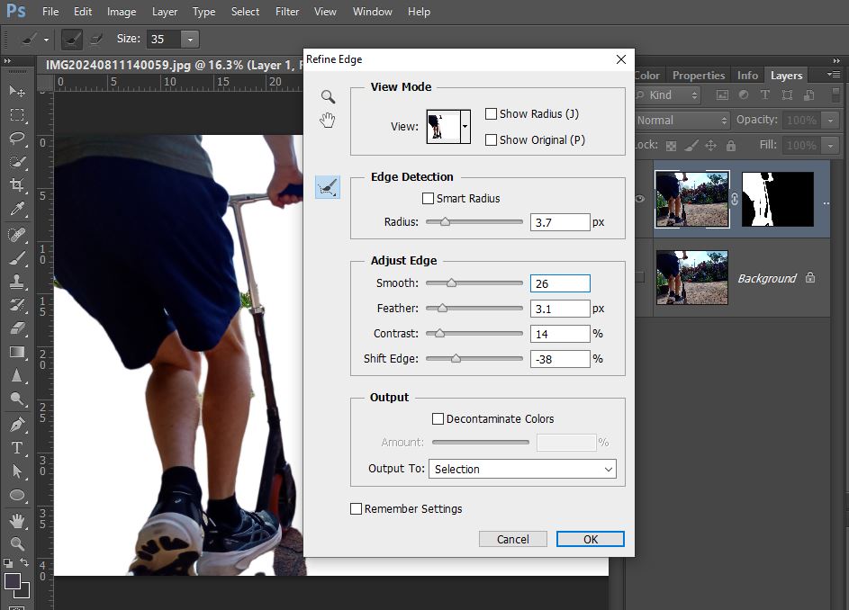
Everything inside the dashed lines will be extracted. I could stop here and just hit copy and paste and cut out this part of the photo, then start another selection for the legs and scooter and cut the whole photo into parts like a bespoke jigsaw really, but for my purposes today, I’d prefer the whole of him and the scooter on one layer and nothing else to make it easier to work with on my layout so I’m going to keep ‘adding to the selection’ and then I will just mask out the rest of the image. As I’m clicking along the skinnier scooter handle, it selects some of the plants in the background near it because the contrast is lower so I use the ‘Subtract from selection’ brush option at the top to refine what’s within my dashed lines and keep clicking.
It’s not always perfect but the way I’m going to use this doesn’t have to be. We can also refine our extraction with the Refine Edge menu pop-up options that I’ll show you in a minute.
So now I have everything within my dashed lines, I add a mask and turn off the background layer to see what I have extracted.
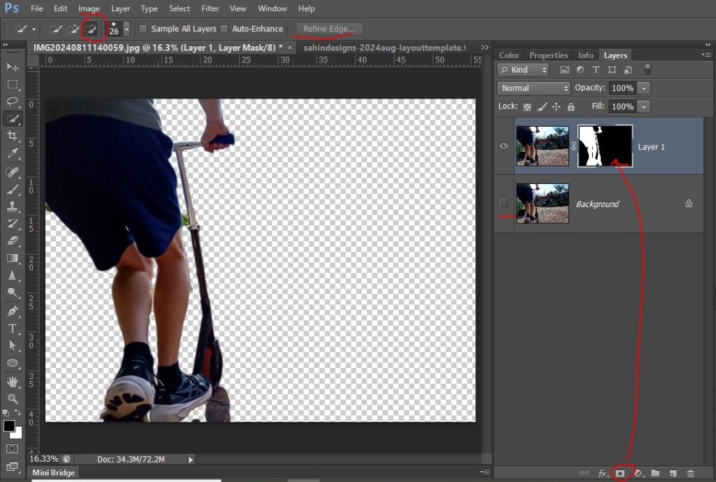
Good enough for me but the edges can be smoothed and made a bit more forgiving by playing with the sliders here.
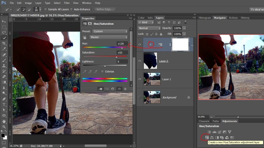
- Bonus tip: This is the same way I would select part of a photo I want to recolour. Not happy with the colour of his clothes? Select them with the Quick Selection wand like this, hit Ctrl+C then Ctrl+V to put that selection on a new layer, and add an Adjustment Layer as a clipping mask just to the extracted part so you can alter the Hue/Saturation sliders and make them whatever colour you want.
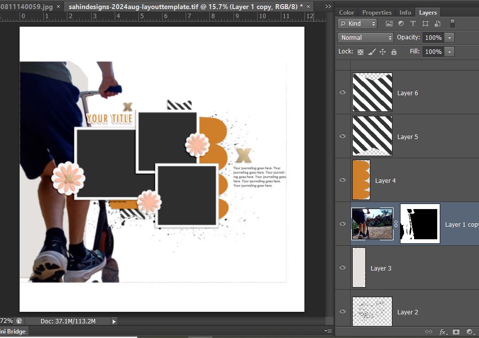
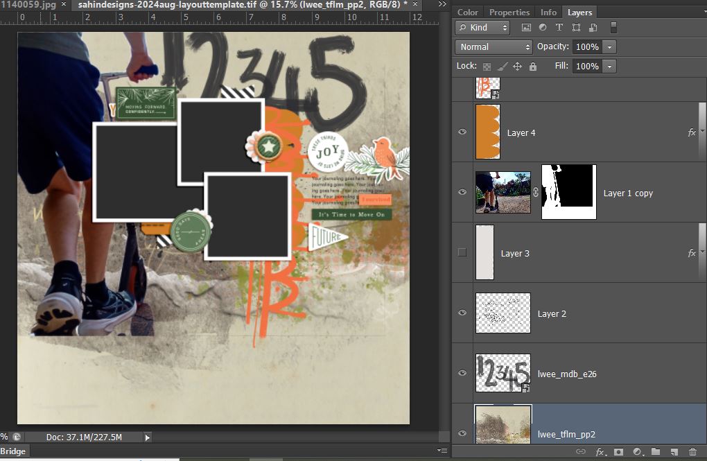
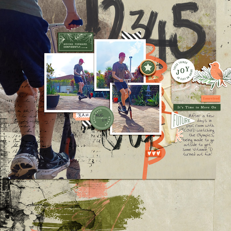
- The Scrapping Process: So now to start my template challenge page, here is the template by Elif from the challenge thread and my full extraction that will sit down the side in place of the handcut paper piece (named Layer 3 in the template Layers Palette).
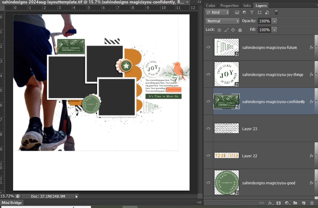
I like to throw in key elements that I was intially drawn to in choosing scrapping product at this point too so they don’t get lost or forgotten and so here’s my next step. Everything so far is from Magic is You elements by Elif Sahin Designs. It’s has a Christmas vibe but it’s always the sign of a good kit that I can use it a bit off-topic. I moved everything up so that the top of my extraction lined up with the top edge of the background. My thought process while doing this was to extend the shadow below the scooter down the page with mixed media.
So now I started to add some grungey and mixed media elements to the template. I liked the hand-cut, perfectly imperfect pieces that Elif included in this template like the scallop paper piece (Layer 4 in the Layers Palette) and went about finding something that would fit that spot and came across a few things from Li Li Wee that I thought would fit. The orangey graffiti scallops are hard to see here and I modifeied them a little later but that and the large painted numbers I pulled from My Daily Battle elements and because I wanted texture and to blend my large extraction into some kind of subtle scene or paintwork that gives a garden and path kind of aesthetic I grabbed Thank You For Loving Me kit as well and the papers I used both come from that kit. You can see comparing the above screeen shot and this one as well as from the thumbnail of the paper in the Layers Palette that this first paper has exactly what I was going for and the right colours to go with Elif’s elements I’ve already used.
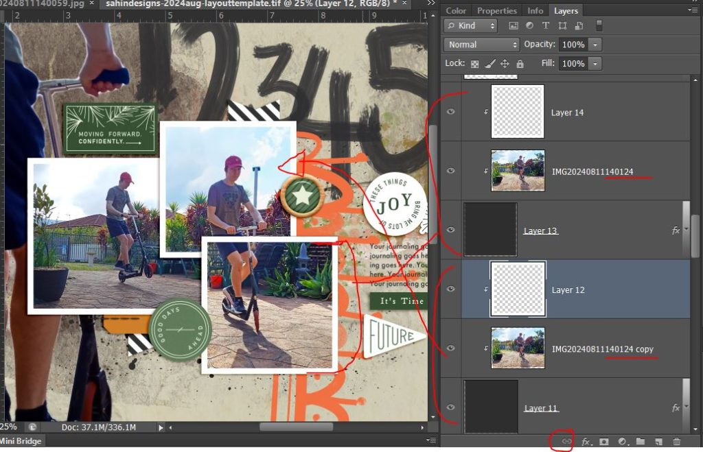
Now I’m dragging in and clipping in my other photos and have decided that instead of changing the template to have one landscape and one portrait photo spot, I’ll work with the two overlapping squares and span my portrait orientation photo across both square spots. To do this, I’ve just duplicated my photo and clipped it to both Layer 13 and Layer 11 photo spots. (I should have linked them with the chain icon I’ve circled at the bottom of the Layers Palette so that if I accidently moved one of the photos, the other one would move the same amount too but I hadn’t done that at this point apparently). Now seeing the white frame cutting across him and his scooter, this cried out for the Out of the Frame or Out of the Box technique so my son would pop out of the frame and so here comes the partial extraction steps.
Partial Extraction Process: With the 2 photos locked, I duplicate the photo again (see copy 2 in Layers palette) and move it above the frame layer in the Layers Palette and drop the opacity so I can see the frame through it.
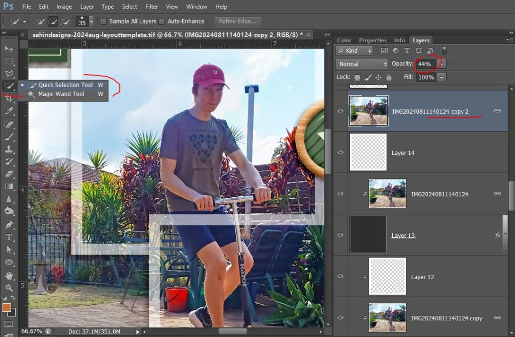
I use the quick selection method to isolate and mask the area that overlaps the frame that I want to keep (in this case his shorts and the scooter handlebars). I clip that to the frame and turn the opacity back to 100%.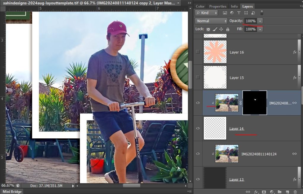
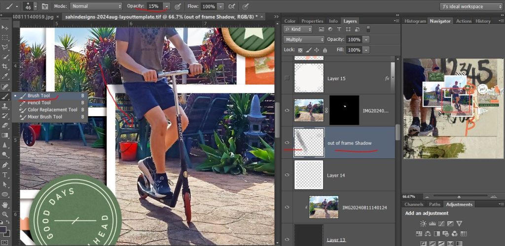
Now to give this extra pop and really give that jumping out of the frame effect I brush on a shadow. ( I actually did this almost last so the next few screenshots won’t have this in it but for the sake of continuing this idea, I’m posting this screenshot in now).
So all I’ve done is select a soft brush (low opacity and low hardness on the Hardness slider – low to me is either in the single digits or close to – here the opacity is at 15%) in a colour that is just darker than the bushes behind him and on a new layer that I’ve called out of frame shadow, I just dragged a curved line following his leg basically. If it’s not darker enough, you can go over it again or Undo and choose a darker opacity but switching the Layer to Multiply will make it darker anyway. It is important though that the new layer needs to be between the frame and the pop-out layer in the Layers Palette so the shadow is only brushed onto the layers behind the pop-out image.
So that’s a spoiler for what’s coming. I went back to adding more scrappy product first though. While I was thinking about shadows, I added another scallopy scribble under the botto photo frame to kind of continue the scooter’s shadow into the page and added some folded masking tape under the orangey scallop. Using the bottom of the full extraction image of my son’s shoes as a natural end point for one paper, I popped another of Li Li’s papers underneath that again had some greenish and peachy tones. It’s messy-ish but still kind of clean so I’m going to change that.
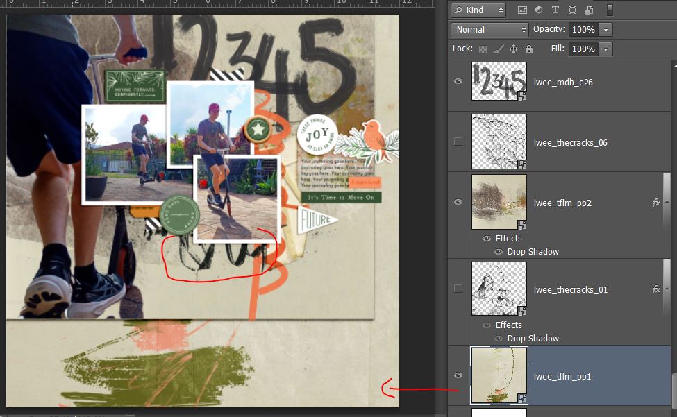
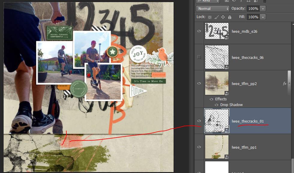
Here I’ve added one of the My Daily Battle Cracks overlays and positioned it to again extend the lines of the photo so it looks like it’s bleeding down the page. They’re transparent so they won’t really change the colour of the layers they are stacked on top of so that was great here.
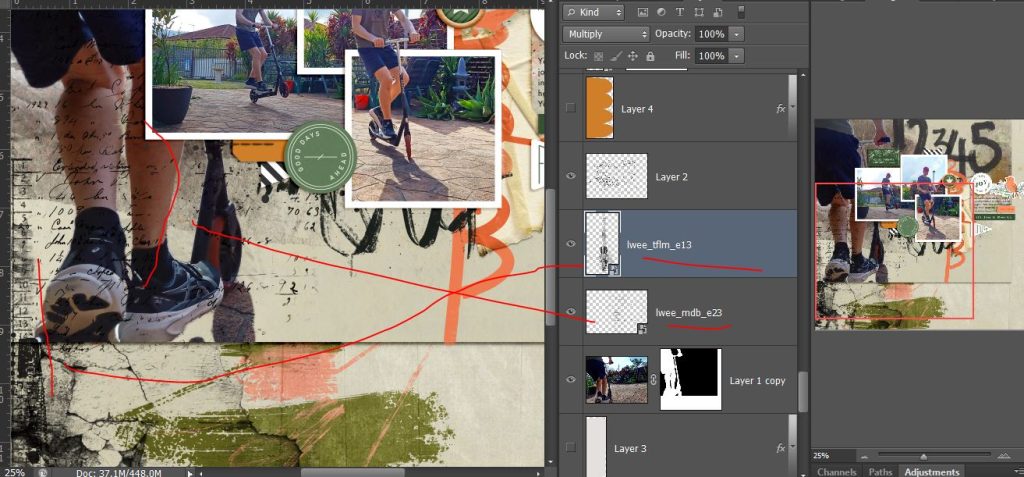
To give the big extraction a more integrated look, I reduced the opacity of it slightly to get some of the paper texture to show through then added some of Li Li’s stamps, a text stamp over the blend (you can see the numbers over his legs) and a layered stamping element down the side, overlapping where the 2 papers meet. Sandwiching the extracted image with mixed media and using the blend mode I think gives this an artistic but grungey look.
And here’s my final page and some take away messages:
- The Quick Selection tool can be a good way to isolate and extract images for use in mixed media pages.
- Blending and sandwiching the extraction between layers can integrate it into the page design better
- Partial extractions can add impact and hand-shadowing can make them really pop
- The same method can be useful if you need to recolour part of a photo
See you next time