Froggy Finds – Alphabets
Hello, Froggy friends!
Happy almost-weekend! Last April, Polly Liana (yellowpeep) did a duet of blog posts about alphabets. Her posts showcased over a dozen alphabets in multiples styles for making impactful titles. If you missed the first articles, here they are:
Now I know why Liana made two separate blog posts about alphas, and I might have to do this, too! There are almost 700 amazing alphabets and sets in the alphabet section of the site, and alphas are always trending. In this post, I’ll feature current alphabets a wide variety of styles, including some of my all-time favorites.
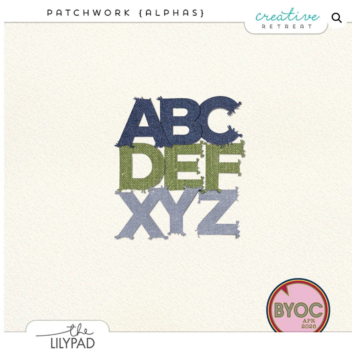
First off, let’s talk about Patchwork Alphas, by Creative Retreat, from this month’s BYOC. The patchwork design is clean, casual and cozy, with bold round shapes. As I look at the colors, I imagine blue jeans, relaxing on the lawn, spring flowers, the blue sea, fashion / fabric, and connectedness.
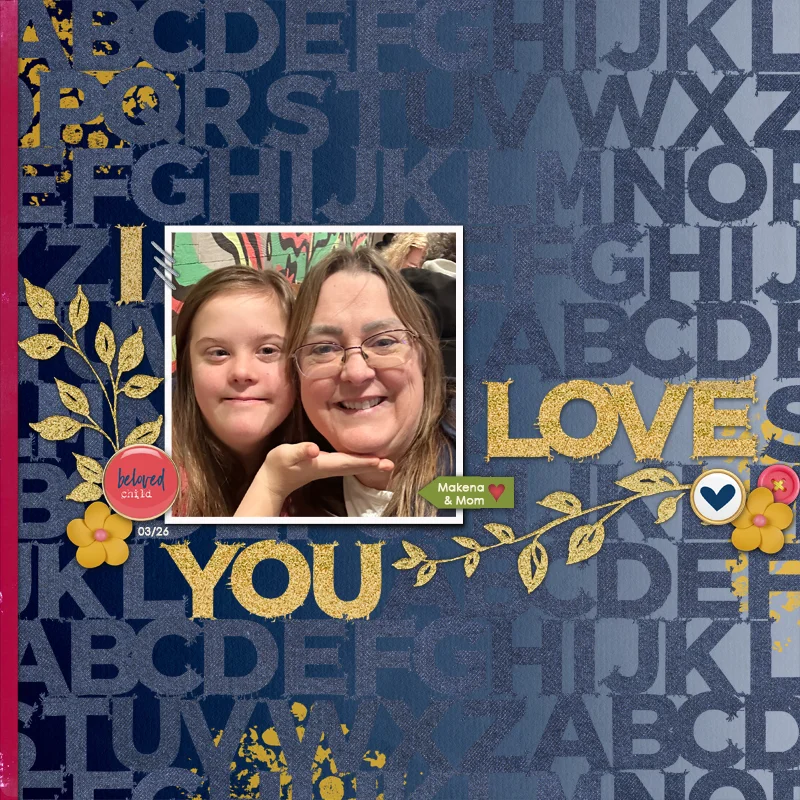
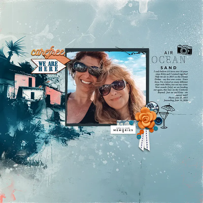
Here’s a layout I made with the alphabet, along with Dreamcoat elements and still Blooming papers by Pixel Giraffe.
My next feature is Just Jamie’s set, Blank Page Mega Alphabet Pack. Talk about a versatile set! There’s a huge variety of styles here, eight to be exact. Plus, the dimensional styles come in nine colors and the cork comes in two colors. While my daughter is in her K-pop era, I’m imagining using the stamped alphabet, coloring it with a bright paper, and then having a cut-out photo of her dancing in front or alongside it, with a couple of pictures of her favorite pand, Black Pink. The neutral colors in dimensional alphas are also perfect for my many (many many) cat layouts. That’s it! I’m buying this set!
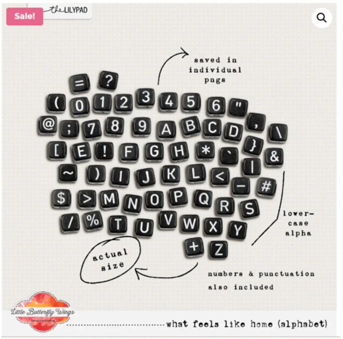
What Feels Like Home, by Little Butterfly Wings, is a high-contrast white-on black alphabet with a petite size. I adore this set because of its smallness. These little letters would be perfect for long titles, subtitles under or across a large messy painted alpha, layouts about writing, typing, school, etc.
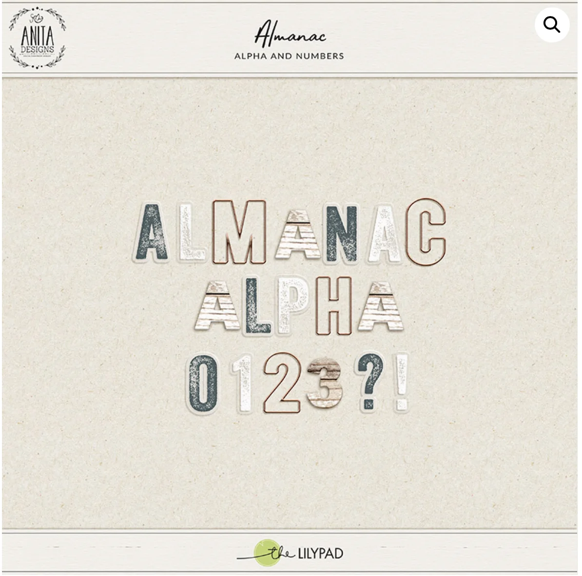
Almanac, by Anita Designs. This is another versatile set, with 2 different velllums, a copper wire, and a wood alphabet. I love wood alphas for anything outdoorsy, country, fall, campfire, or homey. The vellums will go with absolutely everything, giving a little peek-through to the photo beneath.
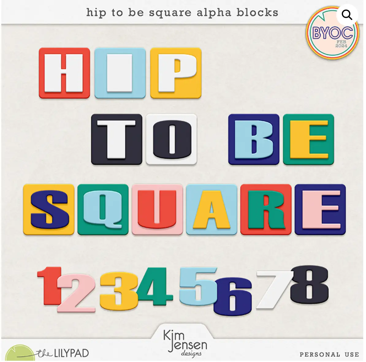
As an enthusiastic person, I tend to use more exclamation points than the average writer. This alphabet, however, justifies a lot of exclamations! It’s Hip to be Square, by Kim Jensen.This layout is FUN! It’s youthful, bright, cheery, bold, and it needs to be BIG on your layouts! The tone-on-tone letters on squares make me think of school colors. The yellow, blues, and white would be wonderful for outdoors, especially boating. The squares also remind me of bright packages, so this could go great on a birthday layout.
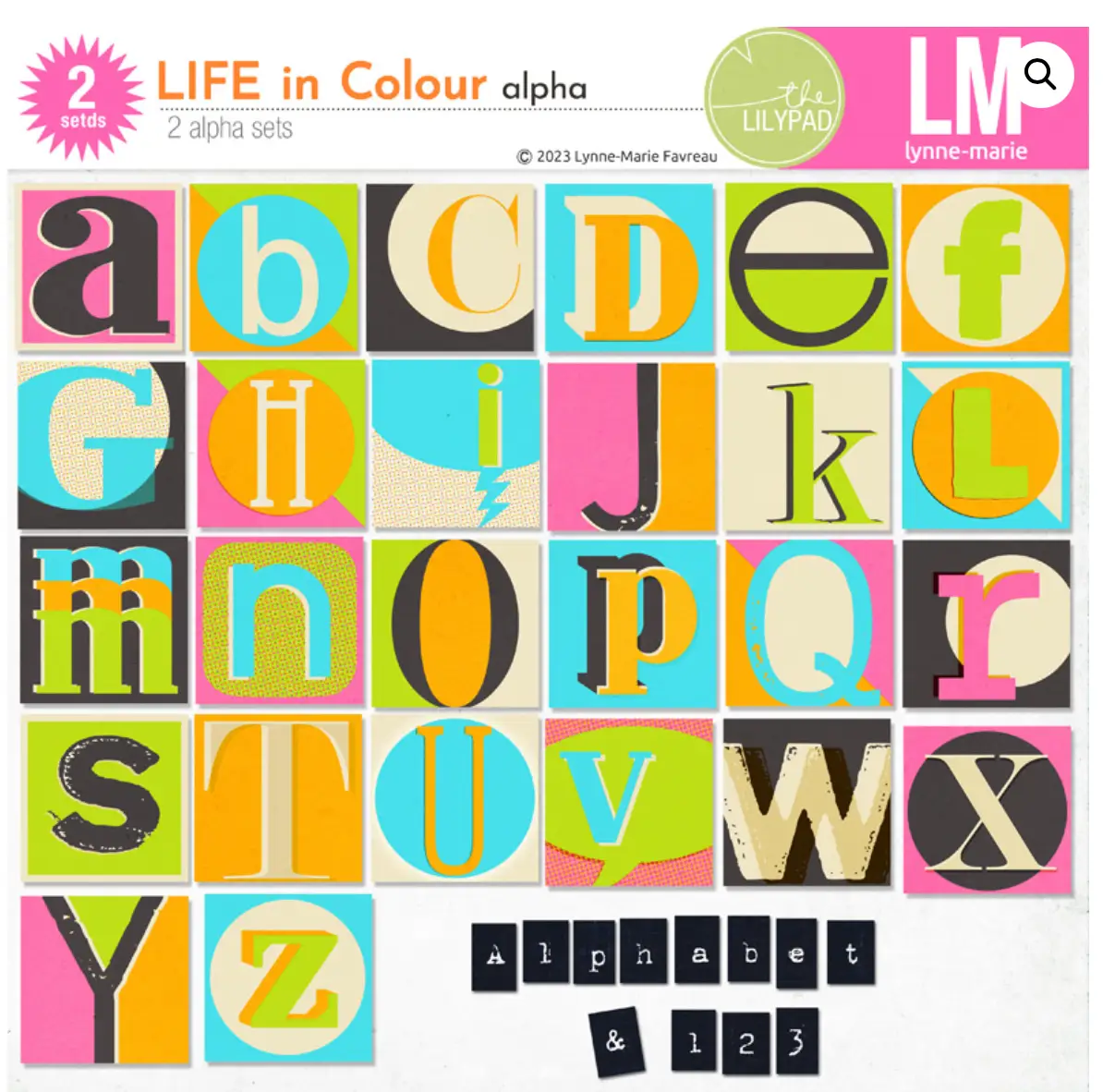
Equally bold, but in a completely different way, check out Lynne Marie’s alphabet, Life in Colour! Make a unique statement in vivid colors and round shapes! There are two alphas here, the bright square letters, and a tiny companion alpha that looks like dymo labels. This alpha screams party, teenage girl, summer, creativity, imagination, freedom, and individuality.
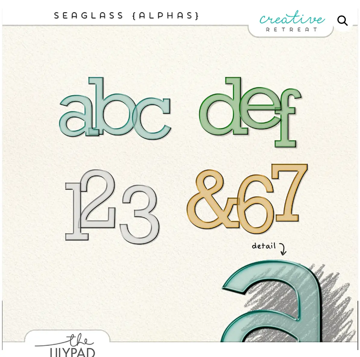
Now, we have a lovely, tranquil set of four colored alphabets by Creative Retreat – Seaglass Alphas. Counting clouds. Bare feet in moss. Sun’s first peek above the horizon. All of these things speak to me through these alphas. They also have a crisp shape that would make them great for kid’s layouts, learning to read, etc. The soft pastels would also make these alphas wonderful for baby layouts.
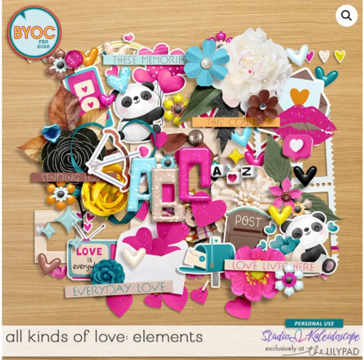
Studio Kaleidoscope did something cool with this element set, All Kinds of Love Elements. She included four alphas along with other elements. There are bright fuchsia, beige, sky blue shiny plastic alphas, plus a little alphabet with letters and symbols on dice. Super-cute, and by including them in an element pack, they already coordinate with multiple themes and accents.
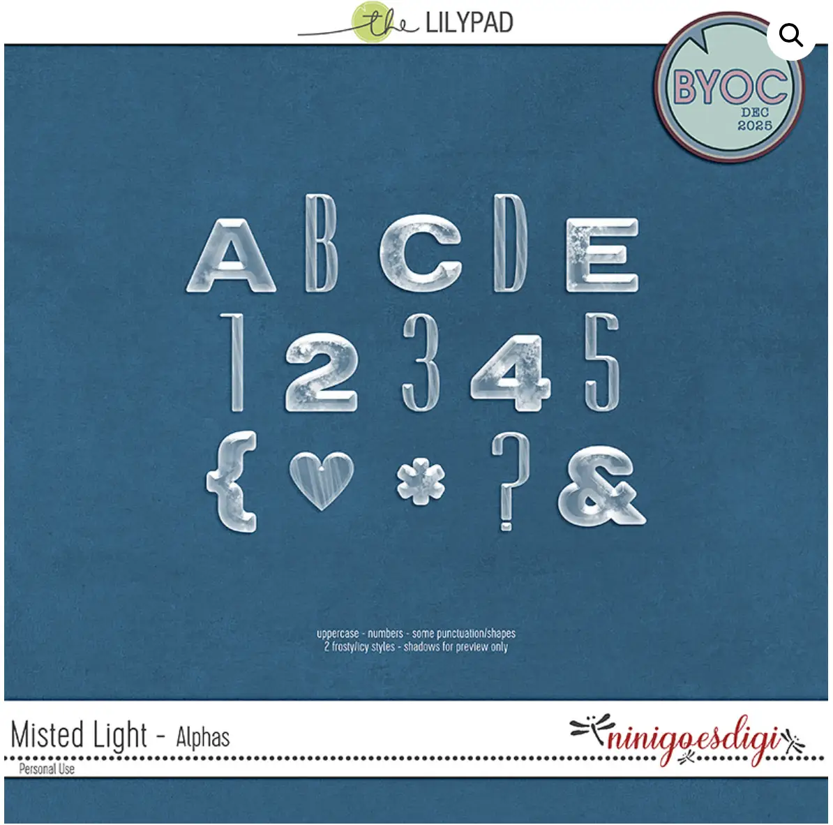
Ninigoesdigi created this next feature, Misted Light Alpha, which goes along with a kit of the same name. These alphas came out in December for Winter and snowy activities, and they’re perfect for those layouts. I think they’d also be perfect for any type of “cold” theme – a cold drink, a brisk walk on a cool day, even frozen lemonade on a hot summer’s day. Also, a clear alphabet matches everything, so it could go with just about any topic.
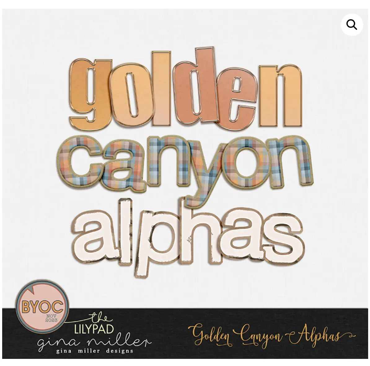
Golden Canyon by Gina Miller Designs. While this alphabet set evokes sunsets, canyons, desert plains, and flannel, it has versatility beyond the outdoors. I’m also seeing gingerbread, hot coca, sewing, frosting, and pets.
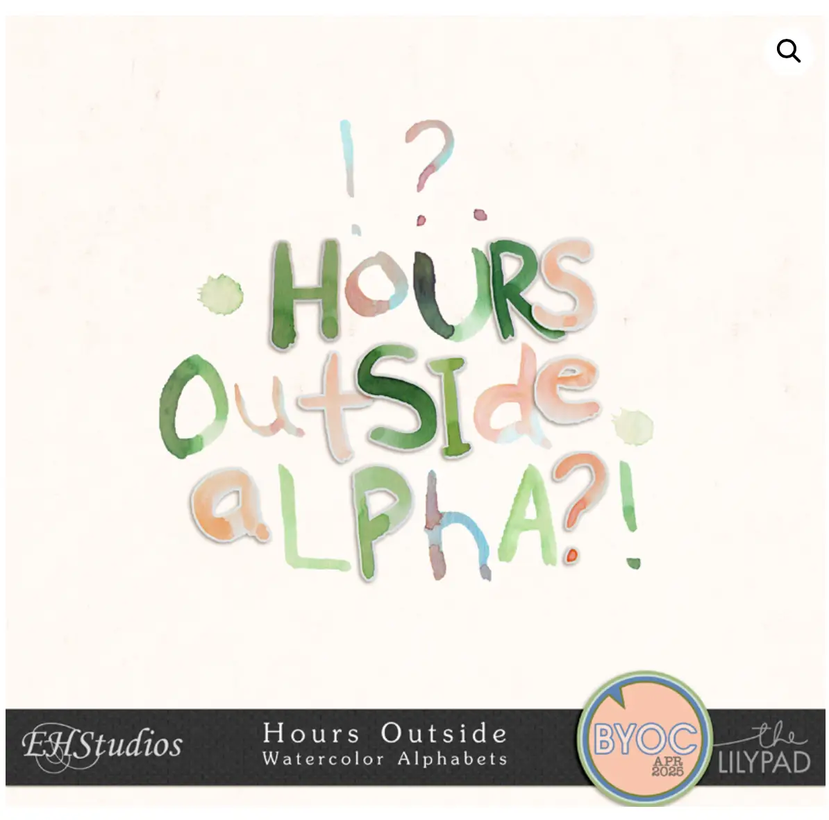
EH Studios created this next feature, a gorgeous set of four alphabets called Hours Outside. The set has two upper-case and two lower-case alphas. It speaks to all things Spring, fresh air, and new beginnings. The color variations of the watercolor make it easy to coordinate with a wide range of photos.
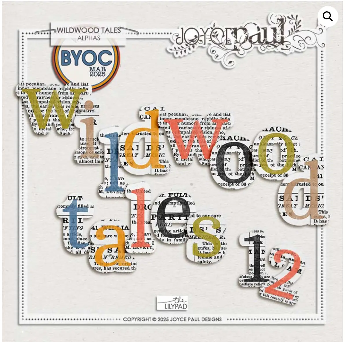
Last, but very much not least, enjoy this unique alphabet by Joyce Paul Designs, Wildwood Tales. The look of stamping on top of newsprint looks bold and distinctive. A title using this lettering will really stand out. Outdoors, forests, Halloween. The sophisticated font also reminds me of higher education – layouts about collegiate studies, facts and figures, applying to graduate schools, and journalism.
With all the glorious alphabets in the store, it was hard to limit the blog post to just a few products. I’m planning another feature with more great alphabets created by our TLP designers. Which of the alphabets above are your favorites? Which alphabets should I have included in the post? Drop a comment below and let us know what you think!
I was born and raised in the Pacific Northwest, currently residing in Oregon with my husband and 2 fledgling adult children. Although I’ve spent my life living within a 200 mile radius, i’ve been to 28 countries and am planning my visits to countries 29, 30 and 31 within the next year. I work in the fitness industry as a pilates instructor, personal trainer, and mentor to other instructors.
My creative style can be all over the map as I enjoy trying new styles. My default style is lots of photos with story-telling journalng. Reading family scrapbooks is what taught our daughter (special needs, Down Syndrome) how to read. She loves seeing pictures of herself, and I include lots of photos for her to highlight her activities with journaling to encourage her to read aloud. A lot of family history, vocabulary and education can be snuck into scrapbook pages!
I’m a HUGE fan of templates! About half the time, I’ll use them as is, and half the time I’ll move things around, add or delete shapes, or even merge two templates.
If you’re new to scrapbooking, my biggest piece of advice would be to enjoy the process and know that your work is beautiful and meaningful just as it is. There is no one better at documenting your memories, or creating your heart’s visions, than YOU.
Ah! So many fabulous alphas in our store and you found some great ones to feature here! As a self proclaimed alpha addict, it’s crazy that you even featured a few that I don’t own… yet! Ha ha!
Love this — I found a couple I didn’t know about and want to add to my stash!