KimJ, thank you SO much for this challenge! Here's my submission:
I think the only way to illustrate just how BAD these three images were/are is to show you what they looked like, SOOC (straight out of camera):
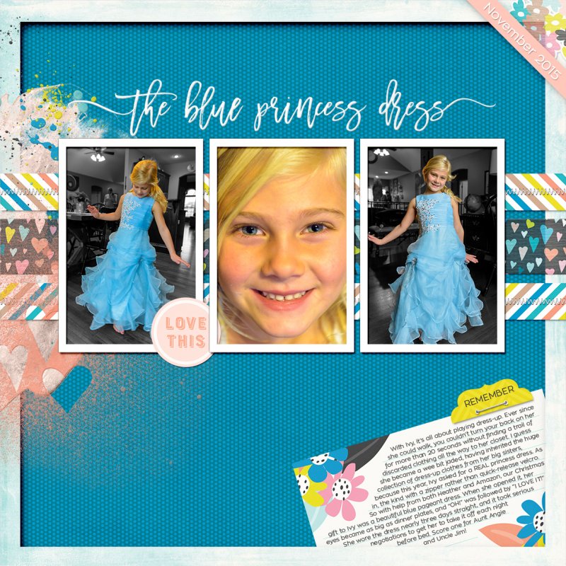
The center image was horribly underexposed, since I thought I had my camera in Aperture-priority mode and it was really in manual. Thankfully, I was shooting in RAW, so I was able to use Lightroom to bring up the exposure by 3 stops and run a LR preset and Photoshop Nik action to reduce the noise.
The two outside images, in addition to being underexposed, had really busy backgrounds, filled with competing colors and lines. (I couldn't take her outside to shoot like I wanted to, since the weather was awful.) And the image on the left was actually blurry because I couldn't get my shutter speed up high enough to freeze her twist.
I almost deleted them. I'm so glad I didn't! Thanks to this challenge, I took a closer look and got creative. To improve the two outside images, I used masking and gradient maps to turn everything except my niece to black-and-white. Then those wispy pieces of her dress where the golden wood of the floor shows through, I used masks and a desaturation layer to remove all the color, and a mask on a solid color layer in blue, set to color blending mode, to paint back in the blue. I don't know if that made a bit of sense ... here's a photo to illustrate:
The photos still aren't perfect, but they're SO much better than they were!

") Great challenge though to help us be a bit forgiving about the quality of shots and focus more on the reality of it all. Thanks Kim.
Great challenge though to help us be a bit forgiving about the quality of shots and focus more on the reality of it all. Thanks Kim.


