ta_merkins
Pay no attention to the man behind the curtain
- Joined
- Aug 20, 2012
- Messages
- 770
Follow along with the video below to see how to install our site as a web app on your home screen.
Note: This feature may not be available in some browsers.
")
You can use Filter/Edge/Draw Edges - and play with the different thresholds that's what I did, but I'm not liking it as much as some of the things I've seen here, so may play with the online site we were given.
@tinkerbell1112 @BevG I've been messing around with this for about an hour. I found the best results came from not converting to black and white, and to use a color that matched the photo (at least for mine). I haven't yet tried to raise the contrast of the original photo to see if that would bring out more pronounced lines. I'm off to try that next.In Artisan 5 - I think 4 also has these options, if I remember correctly.
You can also use Filter, Stylize, Show Edges. There is even a box to check for color and it will draw it in color. Play with the adjustments. I did not check color in my example.
You can also use Filter, Stylize, Threshold. Play with the colors to get the look you want.
Play with the options and see what you get. It will also depend on the photo you want to use. Here is a quick example of each filter. I did not convert to B&W to start with. You can also try that as a first step. It will most likely give you different results.
View attachment 198755
If you look at the pages people have posted already, most have used a photo with distinct lines. My example photo has too many subtle color/shade differences that don't clearly define the object. So your picture would really make a difference in the end result.
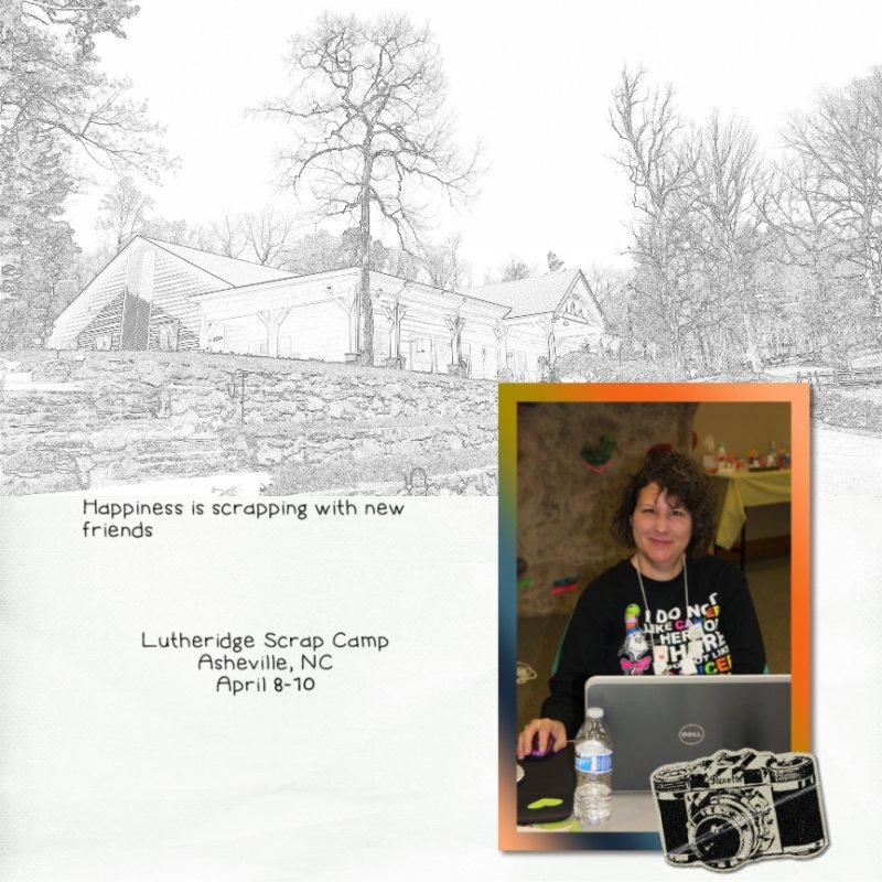
Here is one I did for the speed scrap earlier this month. I used Stylize, Show Edges.

Are you doing this in artisan? If so I may play around again this weekend@tinkerbell1112 @BevG I've been messing around with this for about an hour. I found the best results came from not converting to black and white, and to use a color that matched the photo (at least for mine). I haven't yet tried to raise the contrast of the original photo to see if that would bring out more pronounced lines. I'm off to try that next.