Beginners Mixed Media: Using stamped elements & big paint splats
To some of us, there is nothing more nerve-wracking than attempting a scrapping style out of your comfort zone or more daunting than a blank canvas with infinite possibilities.
(OK, yes, I’m talking about me personally but I’m sure this applies to others as well!)
So in this blog series, I’m attempting to make Mixed Media less daunting by giving you (and me) some jumping off points. Where to begin with digi – mixed media scrapping? Right here for Mixed Media Beginners!
- Recap & Introduction
As a template scrapper and mixed media beginner, in the last 2 blog posts in this series, I’ve used basic linear paint brush strokes and ‘designer painted’ papers to give easy and instant mixed media vibes to my layouts.
This month, I’m building on those last 2 mixed media methods. I’m using watercolour style papers for an instant mixed media base and then adding some big feature stamps instead of the traditional scrapping dimensional or sticker elements I would usually use. Stamps are another common tool in the realm of mixed media scrapping, with many devotees because of their reusable nature and endless possibilities. There are sooooo many techniques to use with them in real world stamping to achieve texture and pattern and really, whatever you want in whatever colour you want, and digital mixed media scrapping can of course emulate all of that with only virtual mess! So that’s was the plan going into today’s page, and finally I’m planning to ‘messy fill’ one of the stamps with some watercolour paint to tie it all in with the ready-made watercolour papers.
- So jumping in…
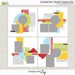
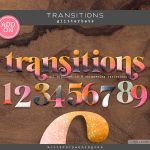
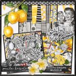
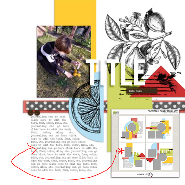
First up, you know I’ve grabbed a template because that’s my ‘go-to’. I’m using Scrapping with Liz’s Geometric Shapes templates that have a clean and graphic style, and my stamps, splats and watercolor paint styled papers are all coming from Paula Kesselring’s Lemon Drop Bundle. (Spoiler alert: I realise I need an alpha for a title later and pull out Allison Pennington’s Transitions Glitterbets that come in a stack of colour variations).
Because I wanted my stamps to be big and obvious, I placed them early on. That semi-circle made the perfect spot for a lemon slice stamp and the larger branch stamp works in the large white space at the top and can also serve as a bit of background for my title, with those journal lines highlighting the date strip & paper triangle.
- Contrast is Important & Layer Order Matters.
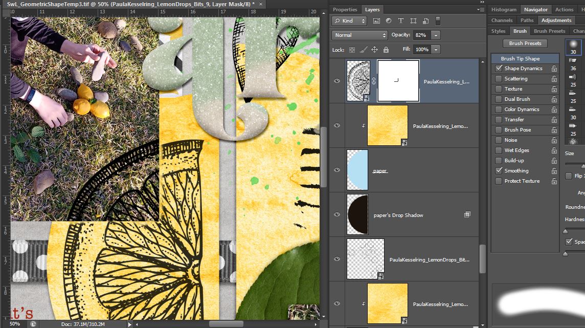
Knowing I wanted to keep the stamps obvious, I left them the default inky black planning on using only a light colour wash style background paper for contrast. Next I wanted to add some more colour, so I added some paint splats that were also in the Lemon Drops Bundle (recolouring them from grey) but I still wanted to ‘keep it real’ to me. I’ve been playing around with real life watercolor paints and pens and I know I’m not great at precisely filling in details with watercolors, and that the colour often ‘bleeds’ out of the area it’s applied to. So in the name of ‘perfectly imperfect’ realism (and a touch of laziness), I changed the order of my paint and branch stamp layers in the Photoshop Layers Palette so that it looks like I added a blob of yellow watercolour first, then stamped, then added green watercolour on top with a brush and it ran down the page a big. Here’s a closer look.

- Digital Stamping Tip!
While we’re talking ‘imperfection’ and realism, you might notice the lemon slice stamp on that blue semi-circle paper spot above looks a bit funny in the corner where it crosses the photo.
To take into account the real life depth of that photo, I often duplicate the stamp layer I’m using in a digital page, placing one above and the other copy below the photo (or paper) layer (like I did with the yellow and green paint splats, sandwiching the stamp layer, but in this case it’s the photo or paper layer) but misaligning them. (Sometimes just nudging them is enough, sometimes I alter the angle like 1 degree). If you ‘clip’ the top stamp layer to the photo, you get a clean edge, and then on the lower stamp layer, erasing a tiny bit around the outside of the photo layer creates a sense of that depth because my real-life stamping ends up looking like that the parts of the stamp that run over multiple layers of paper or creases rarely line up. Paula’s journal line stamp, placed over that red triangle paper, already has these breaks in the stamping visible and it just so happened to line up where I would erase parts of the stamp myself! Too easy!
I reduced the opacity a bit on the bottom lemon slice layer too because the same ink on 2 different surfaces tends not to look identical to me. The photo surface and the watercolour paper all mottled and yellow would absorb the ink and colour differently. This is possibly just me overthinking but it’s something I do again for me and for realism.
- The Finish Line
So here it is, with all the ‘instant watercolor effect’ papers dragged in and clipped to the template shapes (the red paper is actually from Paula’s Honey Bunny watercolour papers to go with the ephemera label I cut up that says ‘Lemon’). Last but not least, some extra ‘gluey’ splatter & Allison Pennington’s Transitions: Glitterbet alpha added in for a title (I used number 8, there’s so many cool complete alpha colour varieties in that big pack).
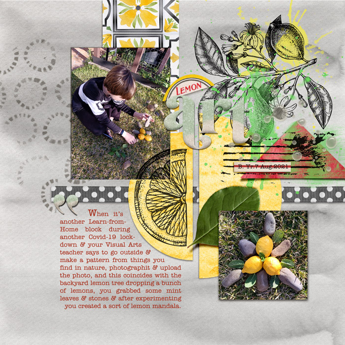
The cool variation in that bunch of broken circle stamps on the left against the watercolor background was a last minute addition but I thought it added to the realism without any effort on my end! All I did was drag it in and elements like that really make stamping an easy way to get that mixed media look, beginner or not!