Minimal & Maximal Monday: Same photos, kit & template, 2 different style layouts
Hi there! Back in February, I challenged myself to use the same photos and products (same kit and template) to produce two different styled layouts. It was an interesting experiment and I’m back for another Minimal and Maximal Monday! … but this time I’m changing up my method – and I ended up with an interesting realisation from the process but I’m getting ahead of myself…
The plan: Last time I started minimalistic scrapping with a ‘dressed down’ template then made it busier and added more pattern and product, which I openly admit is easier for me. This time I’m planning to make my more maximal page with a busier template first, then shrink the template and photo cluster from that maximal layout and pare it all back for a more minimal look, which is how I generally scrap if there is a minimal challenge but subtracting is nowhere near as easy for me (decluttering in real life and digi life is hard but the principles are the same so I’ll share them as I go).
So enough preamble, here we go. Here’s my products for today.
Template: from Studio Liv |In the Round
Kit: Lynn Grieveson | Late Summer
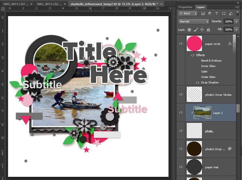
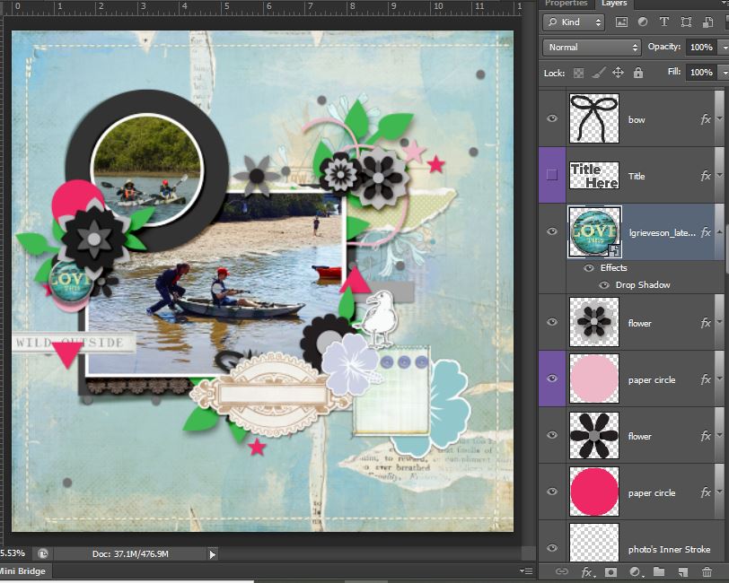
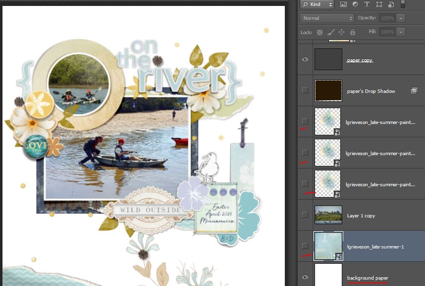
Photos in first and clipped to the template photo spots – I don’t love how much greenery is at the top of the circular photo. The way it is a 50/50 split between the water and land doesn’t feel right to me because of the rule of thirds, but there wasn’t enough water below them in the shot to move it up (you can see a thumbnail of the full landscape shot in the Layers palette). I may ‘fake’ or extend some extra water later but for now the land horizontal line is placed to extend into and follow the line of that pink ribbon under the title.
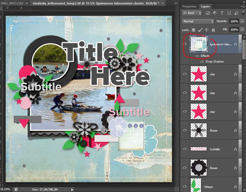
For quick maximal scrapping layouts, I use added value papers and LynnG always has some great ones. I picked the Last Summer kit for the colours and vibe and torn pieces (which remind me of the foam as water laps on the shore) This next shot looks like I’ve added a lot since the previous screen – stitching and torn paper layers as well as a cluster of a few flowers and buttons – but nope, 1 jpeg background and 1 PNG layer as shown in the Layer’s Palette.
So now adding more elements using the Studio Liv template layers as guides. I replaced the ribbon with a torn paper element to extend the line of sand in the main photo and added a mixed media transfer beneath it to bring a bit more yellow into the page. Using larger pieces like that scalloped label over a few smaller template pieces is another one of my faster maximalist style tricks.
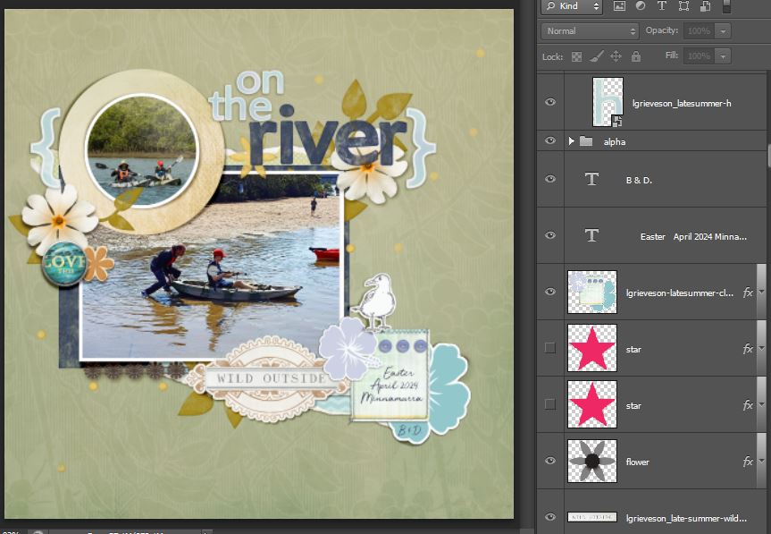
The kit also has an alpha so I started working on a title – probably “On the river”, still thinking how to ‘fix’ that circular cropped photo or wether I run part of the title across it, hiding some of the greenery.
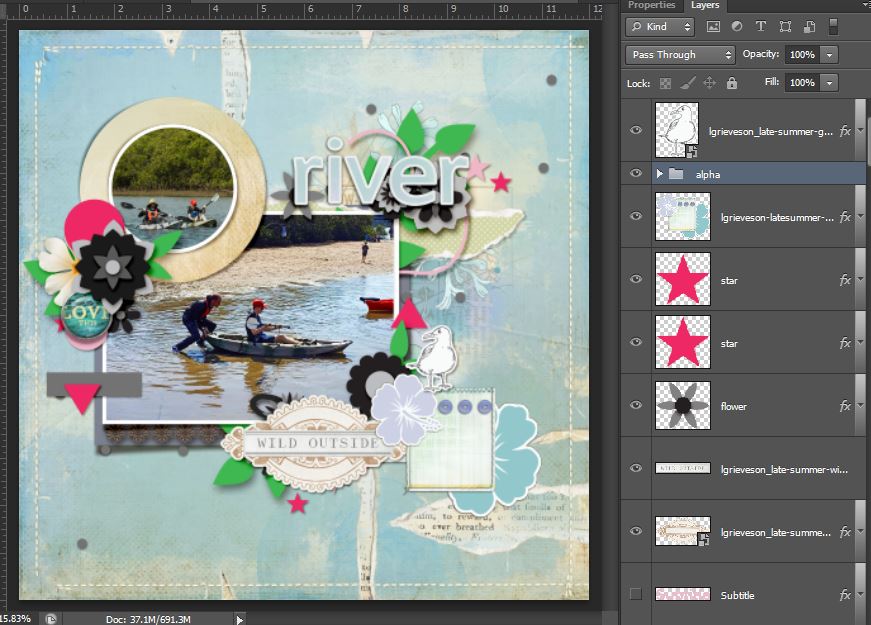
Now I feel like I need to hide some of the pink layers and other elements from the template to see what I really have now that the sandy coloured paper is matting the circular photo. I think I can definitely keep some of the flower and leaf layers and maybe add a Photoshop Layer Style to them to get some additional colour and contrast on the page but the curly string (an element I always struggle with) and stars can go. I also shrunk the alpha and nestled in the rest of the title
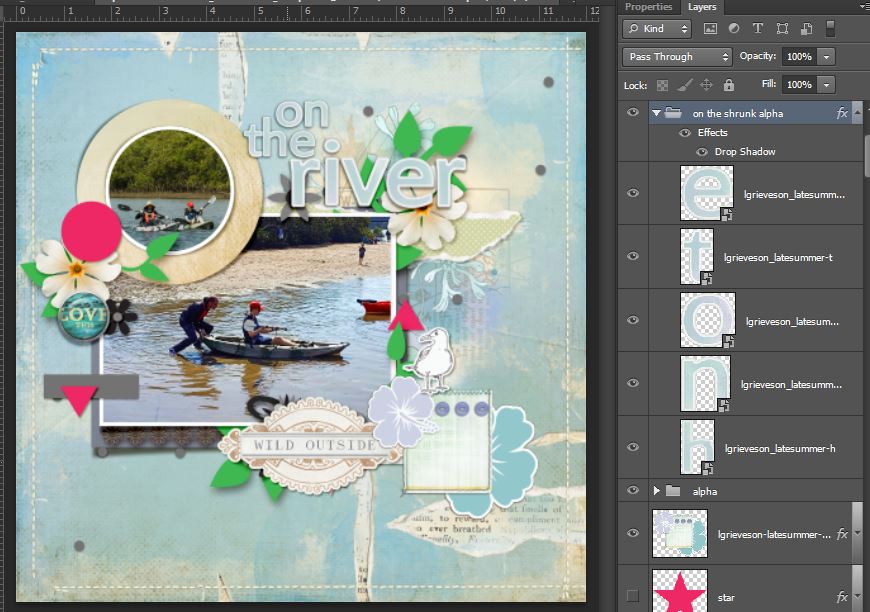
Having decided to just add some more mixed media to the page, how the top of that circular photo turned out was a ‘happy accident’. Here it is a bit closer so you can see the texture of that transfer that I duplicated and layered a few times which I often do with paint layers that I want to be thicker and less transparent. You can also see the Mommyish Design’s MPM Origin Watercolor Layer Styles on the leaves and Painted Birch styles on what was the hot pink circle paper and asterisk shaped flower next to Lynn’s Love This brad. Bringing in the rusty orange tone and warmer yellows as well as a navy watercolour on the large rectangular photo mat that I enlarged a bit from the template to add more contrast and anchor the whole cluster.
And here’s the whole maximal page finished up
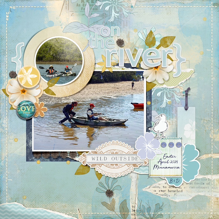
I added another torn piece at the bottom left of the whole page and tucked in a long tag next to the seagull to frame the photo cluster a bit more – the darker string (pre-threaded! thanks Lynn!) brought more of that dark blue to the right side of the page and helped balance the colours on the page too. Cutting little pieces from the brown floral lace and dotting them around the page gave another visual triangle centring over the focal point in that main photo.
Ok let’s start decluttering and make this more minimal.
In real life, the steps for decluttering usually start with grab a rubbish bag and throw any expired products or anything that can’t be reused or recycled in it – absolutely not the case in digi! So my first method is to try to calm things down with a less busy background – if only painting walls or switching out tiles were as easy! A few clicks and we’re back to a blank background but it’s still rather busy with all the elements even without the mixed media and the white feels really stark.
I switched in a cleaner background, a subtle tone on tone pattern because I still like colour on minimal pages (and in reality, that was the colour of the river water, not the clearest after a lot of rainy days recently) and I also took some additional elements like the tag and torn pieces away. Decluttering and minimalism values space around items so we can appreciate them more, or at least grouping them so that the eye doesn’t read ‘mess’ everywhere, more just one curated grouping of items with space to rest around them.
I also added the navy watercolour style to the title alpha to give it a new look and shrunk the matching navy matt under the main photo but I think it’s all a bit much still so using the Transform tools and shrinking it all is my next plan.
So I made layer groups as discussed previously in my process blog posts and grouped all the cluster layers and duplicated the group. I called the original one ‘maximal’ and the duplicate group ‘minimal’ and shrunk the whole of the minimal group to 80% (or maybe 85% I can’t remember which exactly – 70% looked too small because I know I won’t want to have to squint at my photos in my printed books when I’m several years older). I moved the whole cluster around until I found it felt like it suited placement in that bottom left corner of the layout This one step really made a big impact on the overall minimal style vibe. Keeping the ‘maximal’ group was a bit of a safety net – if some of the elements looked wrong too small, instead of enlarging it and risking pixel quality, I could just copy the layer from the ‘maximal’ group (or drag it in from the kit again really).
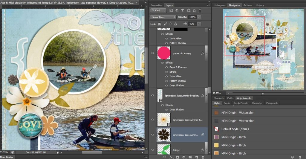
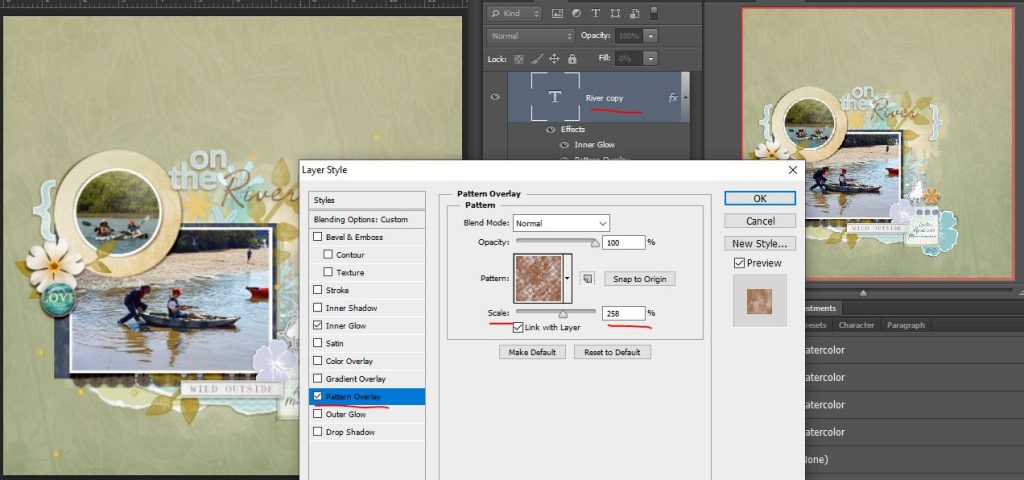
I reduced the opacity on the watercolor leaf layers to reduce the intensity and contrast there and give it more of a sense of calm. After that it felt like the navy block title style was a bit jarring so I switched to a font and added the watercolour style in rust to it (in this screenshot, I’m changing the scale of the pattern layer in one of Mommyish’s watercolour MPM Origin’s Layer Styles that means you can customise how solid or dispersed the colour on your watercolour effect is which is a tweak I love when using it one some layers – watercolours and paints give imperfect and random results anyway so increasing it gave my title a more scratchy, stampy look and that felt a good fit). I also moved the asterisk style orangey painted Birch flower over to the seagull to balance the colours better.
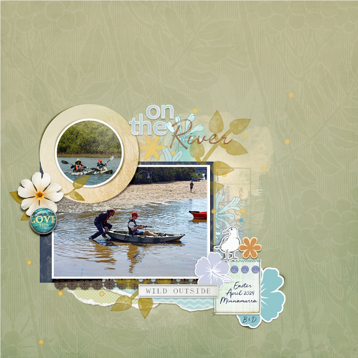
And how could I not bring back some mixed media and the greenish torn piece? Adding that to the bottom and behind the title just anchored and balanced the whole cluster and connected everything so the eye still reads it as one curated cluster with plenty of free space around it. I kept the yellow painty splatter/scatters as they weren’t visually heavy but added to the casual vibe and colour palette. So here’s the final minimal page.
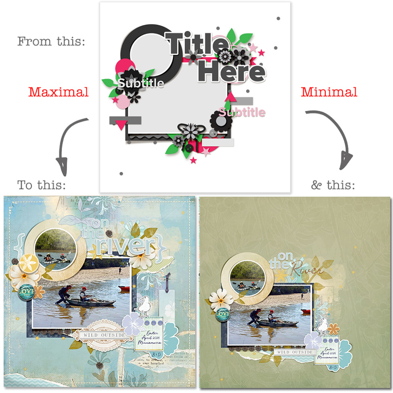
Here are the maximal and minimal layouts side by side. What do you think? For now, tell me in the status bar down the side of the forum at TLP.
What I learnt and found most interesting experimenting with Minimal Maximal Monday this time is that some of the main things I kept in the minimalist version were the first elements I knew I had to use when I started my maximal style page – like the flower/button cluster PNG, the ‘love this’ brad, seagull and the yellow centred flowers.
I do quite like the minimalist version I made and the calming feel it has and this realisation does reinforce the basic premises of minimalism in life. I actually thought before this that to be happy with the page, I needed ‘all the things’ on the page but I’m starting to understand the practical value of ‘less is more’ in a new way. Scrapping wise, I can be happy creating with less overall on the page and the things I need on the page to be happy with the result, I instinctively add and am drawn to from the start. No matter the template, I think this could hold true too, and even though I ‘decluttered’ the template effectively, I think it’s bones are still clearly visible and probably easier to appreciate. If only decluttering the house were as fun!
See you next time!